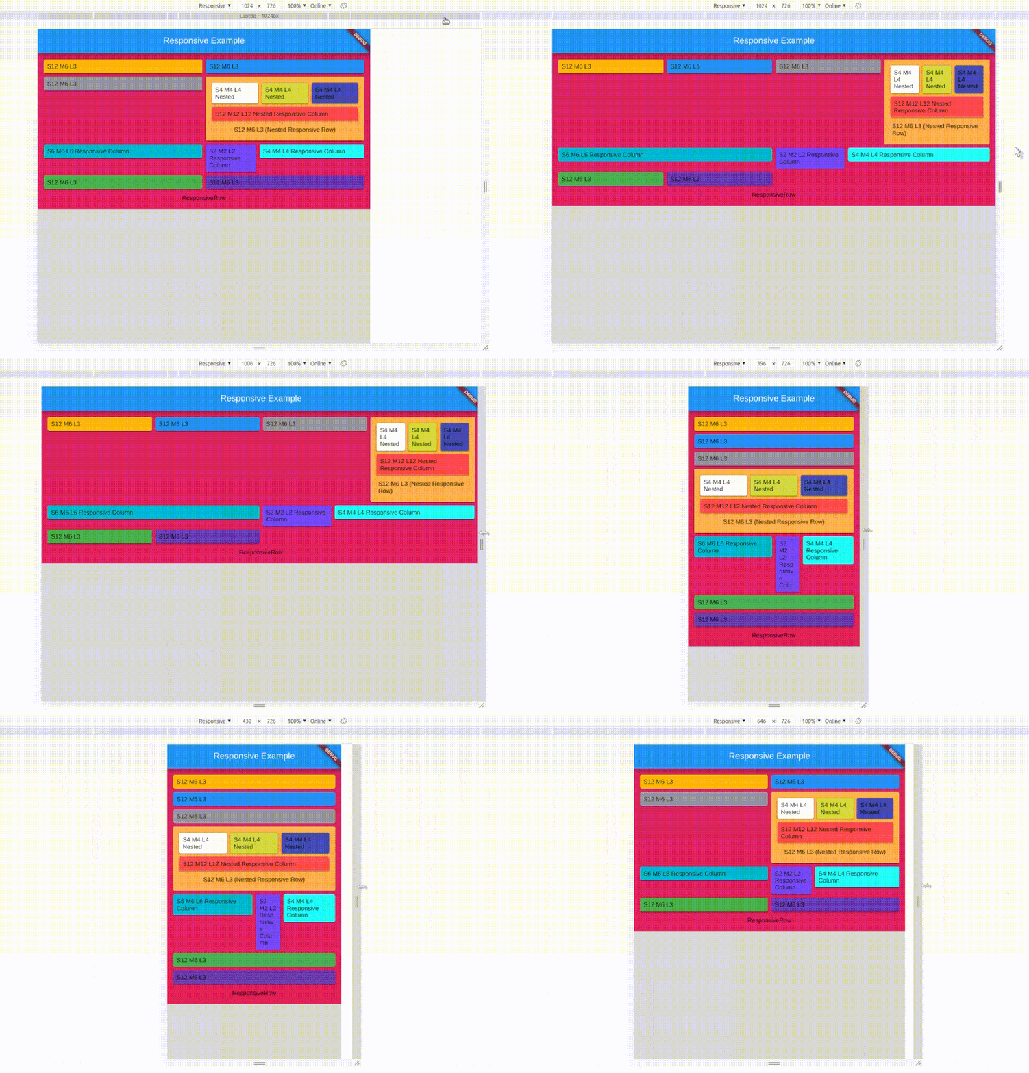
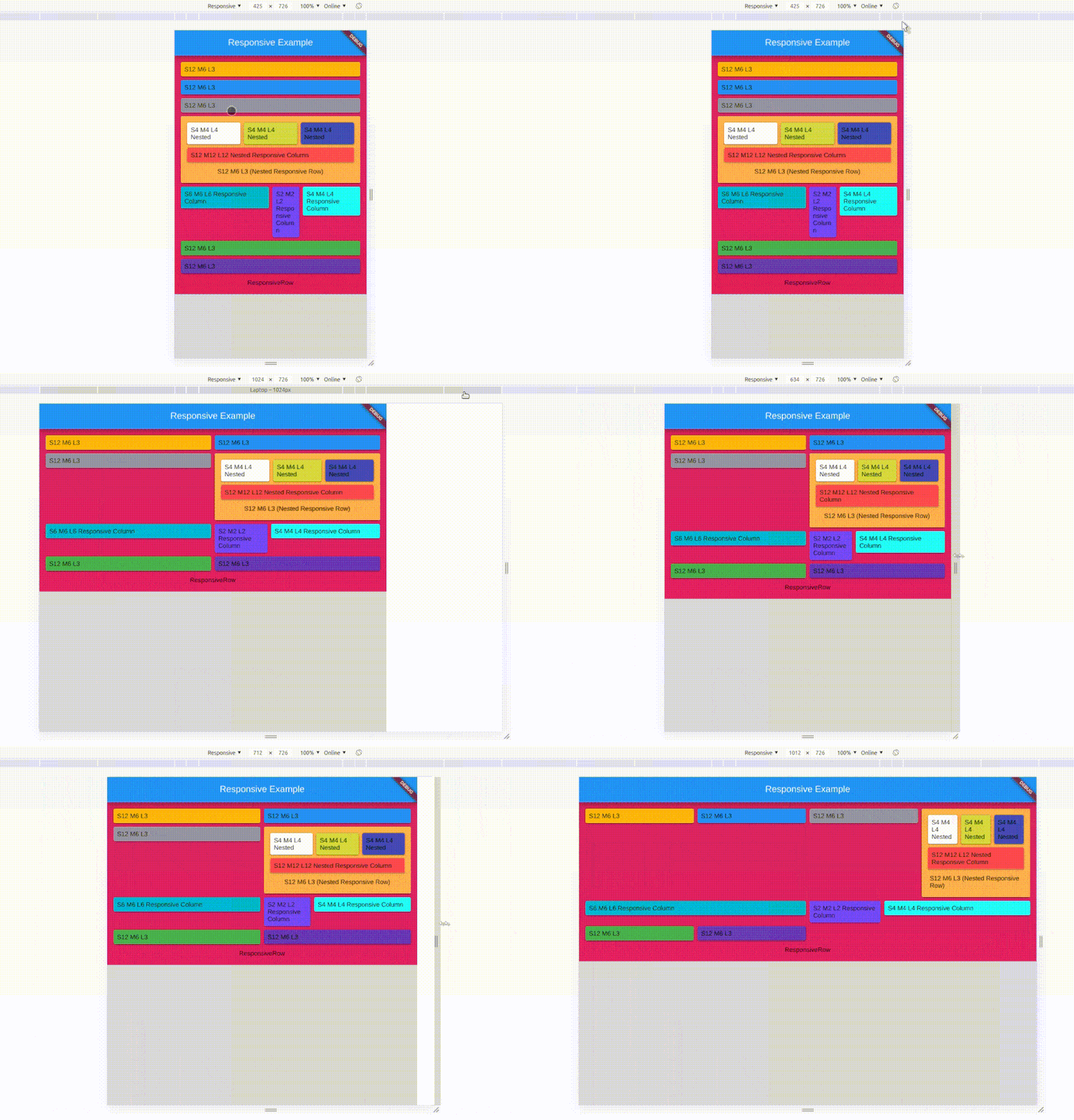
responsive_ui 패키지는 여러 플랫폼과 화면 방향에서 Flutter에서 적응형 레이아웃을 만드는 것을 간소화합니다. Android, iOS, 웹, macOS, Windows, Linux를 포함한 다양한 기기 크기에 자동으로 조정되는 반응형 및 중첩된 반응형 위젯을 개발자가 쉽게 만들 수 있도록 합니다. 세로 및 가로 모드에 대한 내장 지원으로 수동 미디어 쿼리 처리 없이 일관된 UI 경험을 보장합니다. 유연하고 확장 가능한 디자인을 필요로 하는 앱에 이상적입니다.
사용 사례
크로스플랫폼 모바일 및 웹 앱
태블릿 및 데스크톱용 적응형 레이아웃
중첩된 반응형 컴포넌트
화면 크기에 따라 동적으로 UI 조정
다양한 방향을 지원하는 앱
반응형 대시보드
주요 기능
모든 주요 플랫폼을 지원합니다
자동 방향 적응
중첩된 반응형 위젯 구조
간소화된 반응형 디자인 로직
미디어 쿼리와 호환됨
장치 간 일관된 사용자 인터페이스
적합한 대상
다중 플랫폼 앱을 개발하는 개발자
복잡한 코드 없이 반응형 레이아웃이 필요한 팀
다양한 화면 크기를 대상으로 하는 프로젝트
UI 중심 애플리케이션
확장성이 필요한 디자인 시스템
고려 사항
새로운 위젯 패턴을 배워야 할 수 있습니다
내장된 반응형 로직을 넘어서는 사용자 정의가 제한적
깊이 중첩된 구조로 인한 성능 영향 가능성
매우 동적인 런타임 레이아웃 변경에 최적화되지 않음
정적 또는 예측 가능한 반응형 요구 사항에 가장 적합
원본 README
연결된 소스 저장소의 README 원문 스냅샷입니다. 최신 내용은 저장소에서 확인하세요.
Responsive UI
responsive_ui package helps you to create a responsive widget and Nested responsive widgets. Works on all Platforms.
It works as same as Bootstrap / Materialize Row Column method, Splitting screen into 12 columns and placing widget by combining column based on screen size.
The Responsive UI Package contains two simple widgets.
Div()
Responsive()
1. Div()
Arguments
inputs
if null / default to
child
Widget
required
division
Division
if null defaluts to Division()
Divison() intakes column sizes and offSets.
Arguments
inputs
if null / default to
colXS
(int) 0-12
12
colS
(int) 0-12
colXS value
colM
(int) 0-12
ColS value
colL
(int) 0-12
ColM value
colXL
(int) 0-12
ColL value
offsetXS
(int) 0-12
0
offsetS
(int) 0-12
0
offsetM
(int) 0-12
0
offsetL
(int) 0-12
0
offsetXL
(int) 0-12
0
(XS = Extra Small, S = small, M = medium, L = large, XL = Extra Large)
0 - 0.0 width (gone) (replaced with SizedBox.shrink())
12 - full width (provided by parent widget not screen width)
Parent widget should not be a horizontal scroll type widget
To offset, simply add offsetS / offsetM / offsetL to the Div() widget with colS / colM / colL respectively.
Offset works for their respective column sizes.
2. Responsive()
Responsive intakes List<Widget> or List<Div> with default column/screen size for each widget can be declared.
Arguments
inputs
if null / default
children
List / List
not null / required / empty[]
alignment
WrapAlignment
WrapAlignment.start
runAlignment
WrapAlignment
WrapAlignment.start
crossAxisAlignment
WrapCrossAlignment
WrapCrossAlignment.start
runSpacing
double
0.0
Note
Responsive widget is a Wrap widget.
Responsive & Div() widget need Finite width to work.
Div() works with vertical scroll not in horizontal scroll, as it calculations are base on width only.
Div() works as expected when it placed as a direct child of Responsive() widget's children.
Sum of the offset and the respective col should be <= to 12
Nested Responsive
Place a Responsive() widget into a Div().
The nested Responsive() widget takes the width provided by parent Div() widget and not the screen width
sample
Screen Types
Type
Default Size
Xtra small
< 375.0
Small
375.0 - 596.0
Medium
596.0 - 897.0
Large
897.0 - 1232.0
Xtra Large
>1232.0
Override / Set your default size
Yes, now you can set your own breakpoints, that applies to all the Responsive & Div widgets.
voidmain() {
// sample 1Responsive.setGlobalBreakPoints(400.0, 600.0, 997.0, 1380.0);
// Sample 2 Responsive.setGlobalBreakPoints(0, 596.0, 897.0, 1232.0);
// Since the first value is 0 : colXS is always neglectedrunApp(constMyApp());
}
responsive_ui is made simply using Wrap() and LayoutBuilder() with a bits of logics.