패키지, 저장소 및 앱 카테고리 검색

rolling_bottom_bar 표지
패키지 상세v0.2.2

rolling_bottom_bar

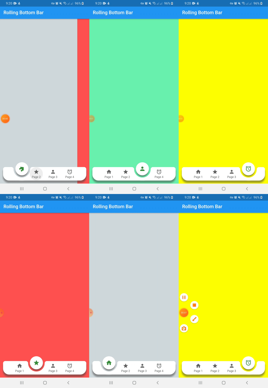
볼을 인디케이터로 사용하는 동적 하단 바를 표시하는 패키지입니다.

AndroidiOSWebmacOSWindowsLinux
30일 다운로드
162
좋아요
38
Pub 점수
140

패키지 설치

flutter pub add rolling_bottom_bar

패키지 개요

공개 정보를 바탕으로 생성한 선택 가이드입니다.

롤링 볼 인디케이터를 갖춘 동적 하단 네비게이션 바를 구현하는 플러터 패키지입니다. 공은 바를 부드럽게 움직여 현재 선택된 탭을 나타내며, 현대적이고 상호작용적인 사용자 경험을 제공합니다. 안드로이드, iOS, 웹, 맥OS, 윈도우, 리눅스 등 여러 플랫폼을 지원합니다. 가볍고 사용자 정의가 가능하여 개발자가 색상, 크기, 애니메이션 속도를 조정할 수 있습니다. 유려한 전환 효과와 시각적으로 매력적인 네비게이션 인터페이스를 원하는 앱에 적합합니다.

사용 사례

  • 모바일 앱 탐색
  • 웹 애플리케이션 인터페이스
  • 크로스 플랫폼 UI 디자인
  • 인터랙티브 탭 전환
  • 현대 앱 미학

주요 기능

  • 롤링 볼 인디케이터
  • 부드러운 애니메이션
  • 크로스 플랫폼 지원
  • 사용자 정의 가능한 외관
  • 경량 구현

적합한 대상

  • 현대적인 탐색을 찾는 개발자
  • 여러 탭을 가진 앱
  • 디자인 중심의 플러터 프로젝트
  • 인터랙티브 UI 컴포넌트
  • 다중 플랫폼 애플리케이션

고려 사항

  • 저사양 기기에서는 성능 조정이 필요할 수 있습니다
  • 복잡한 애니메이션에 대한 사용자 정의가 제한되어 있음
  • 간단한 정적 탐색에 적합하지 않음
  • Flutter 애니메이션 원칙을 이해해야 합니다
  • 3~5개의 탭을 가진 앱에 가장 적합

원본 README

연결된 소스 저장소의 README 원문 스냅샷입니다. 최신 내용은 저장소에서 확인하세요.

Rolling Bottom Bar

This packages, based on this demo by Kabo showing a bottom bar with a dynamic ball indicator.

New Features 💥
  • Capability to avoid the bottom bar shadow by flat property on false
  • Setting active color by each item define on color property of RollingBottomBarItem widget

Demo

Instalation

Include rolling_bottom_bar in your pubspec.yaml file:

dependencies:
  flutter:
    sdk: flutter
  rolling_bottom_bar: version

Usage

To use this package, just import it into your file, build your bottom bar together with a PageView and enjoy it.

import 'package:rolling_bottom_bar/rolling_bottom_bar.dart';
import 'package:rolling_bottom_bar/rolling_bottom_bar_item.dart';

...

@override
  Widget build(BuildContext context) {
    return Scaffold(
      appBar: AppBar(
        title: Text('Rolling Bottom Bar'),
      ),
      body: PageView(
        controller: _controller,
        children: <Widget>[
          ColoredBox(color: Colors.blueGrey.shade100),
          ColoredBox(color: Colors.redAccent),
          ColoredBox(color: Colors.greenAccent),
          ColoredBox(color: Colors.yellowAccent),
        ],
      ),
      extendBody: true,
      bottomNavigationBar: RollingBottomBar(
        controller: _controller,
        items: [
          RollingBottomBarItem(Icons.home, label: 'Page 1'),
          RollingBottomBarItem(Icons.star, label: 'Page 2'),
          RollingBottomBarItem(Icons.person, label: 'Page 3'),
          RollingBottomBarItem(Icons.access_alarm, label: 'Page 4'),
        ],
        activeItemColor: Colors.green.shade700,
        enableIconRotation: true,
        onTap: (index) {
          _controller.animateToPage(
            index,
            duration: const Duration(milliseconds: 400),
            curve: Curves.easeOut,
          );
        },
      ),
    );
  }
}

...

Options for Rolling Bottom Bar Item use

Name Description Required Default
iconData IconData to use as item icon True
label String to use as label item False
activeColor Color to use when icon is active. Only works with useActiveColorByDefault property of RollingBottomBarItem set on true False Colors.green

Options for Rolling Bottom Bar use

Name Description Required Default
controller PageView controller to use to move between pages True
items List of RollingBottomBarItem to render into bottom bar True
onTap Function triggered when an item is tapped True
color Color value to use as background False Colors.white
itemColor Color value to use with inactive items False Colors.grey[700]
activeItemColor Color value to use with active items False Colors.green
enableIconRotation Boolean value to indicate when rotation effect is triggered False false
flat Boolean value to indicate if the bottom bar has shadow or not False false
useActiveColorByDefault Boolean value to indicate when to use individual active color for each child False true

카테고리

소스 저장소

이 패키지를 사용하는 프로젝트

아직 데이터가 없습니다.