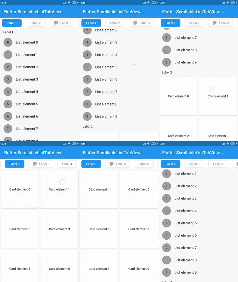
스크롤 가능한 목록과 사용자 정의 탭 뷰를 동기화하는 플러터 위젯으로, 두 구성 요소 간의 부드러운 정렬을 보장합니다. 사용자는 스크롤을 통해 콘텐츠를 탐색하면서 동시에 선택된 탭을 업데이트할 수 있으며, 그 반대도 가능합니다. 리스트 항목과 탭이 밀접하게 관련된 일관되고 상호작용적인 인터페이스를 만들기에 적합합니다. 이 패키지는 가볍고 기존 플러터 프로젝트에 원활하게 통합될 수 있도록 설계되었습니다.
사용 사례
동기화된 목록 및 탭 탐색
콘텐츠가 풍부한 대시보드 만들기
가이드된 온보딩 흐름 구축
스크롤 가능한 탭 인터페이스 구현
주요 기능
스크롤과 탭 간 실시간 동기화
사용자 정의 가능한 탭 스타일
동적 콘텐츠를 지원합니다
기존 위젯과의 간단한 통합
장치 간 반응형 동작
적합한 대상
탭 기반 콘텐츠 레이아웃을 구축하는 개발자
동기화된 스크롤링 및 탭 선택이 필요한 앱
인터랙티브한 탐색 패턴을 찾는 UI 디자이너
고려 사항
탭 항목 데이터를 수동으로 처리해야 합니다
제한된 플랫폼별 최적화
내장 애니메이션 없음
매우 복잡한 중첩 탐색에 적합하지 않음
원본 README
연결된 소스 저장소의 README 원문 스냅샷입니다. 최신 내용은 저장소에서 확인하세요.
scrollable_list_tabview
A Flutter widget which synchronize a ScrollView and a custom tab view.
The main idea is to create a custom tab view synchronizing with inner ScrollView. The scroll activity will trigger custom tab view at the top to follow the index of the inner scroll view widget.
Installation
Add dependency for package on your pubspec.yaml:
dependencies:
    scrollable_list_tabview: <latest>
Usage
To use this widget we must first define how our tabs will look like.
ListTab
Parameter
Definition
Widget icon
Trailing widget for a tab, typically an Icon.
Widget label
Label to be shown in the tab, must be non-null.
BorderRadiusGeometry borderRadius
BorderRadius value for a single tab.
Color activeBackgroundColor
Color to be used when the tab is selected.
Color inactiveBackgroundColor
Color to be used when the tab isn't selected.
bool showIconInList
Decide whether show icon widget in the scrollable view.
Color borderColor
Color of the border of tab when its not selected
Then we can use LisTab in ScrollableListTab.
ScrollableListTab
Parameter
Definition
ListTab tab
Data model used for rendering tab widgets.
ScrollView body
An individual inner scrollable widget.
Then ScrollableListTabView will take a list of ScrollableListTab as an argument.
ScrollableListTabView
Parameter
Definition
List<ScrollableListTab> tabs
List of tabs to be built.
double height
Height of the tab at the top of the view.
Duration tabAnimationDuration
Duration of tab change animation.
Duration bodyAnimationDuration
Duration of inner scroll view animation.
Curve tabAnimationCurve
Animation curve used when animating tab change.
Curve bodyAnimationCurve
Animation curve used when changing index of inner ScrollView(s).
There are some limitations on this package. For example we only support ScrollView to be the body. Also, we could have used builder pattern to build the widgets.
I would like to thank Google developers for creating awesome package called ScrollablePositionedList.
Contribution
Contributions are accepted via pull requests. For more information about how to contribute to this package, please check the contribution guide.
License
This project is licensed under the MIT license, additional knowledge about the license can be found here.