연결된 소스 저장소의 README 원문 스냅샷입니다. 최신 내용은 저장소에서 확인하세요.
ScrollableReordableNavbar for Flutter
A flutter plugin for create bottom nav bar that can be scrolled when there are than 5 nav items to display. It also let user swipe items position and item can be deleted from the navbar.
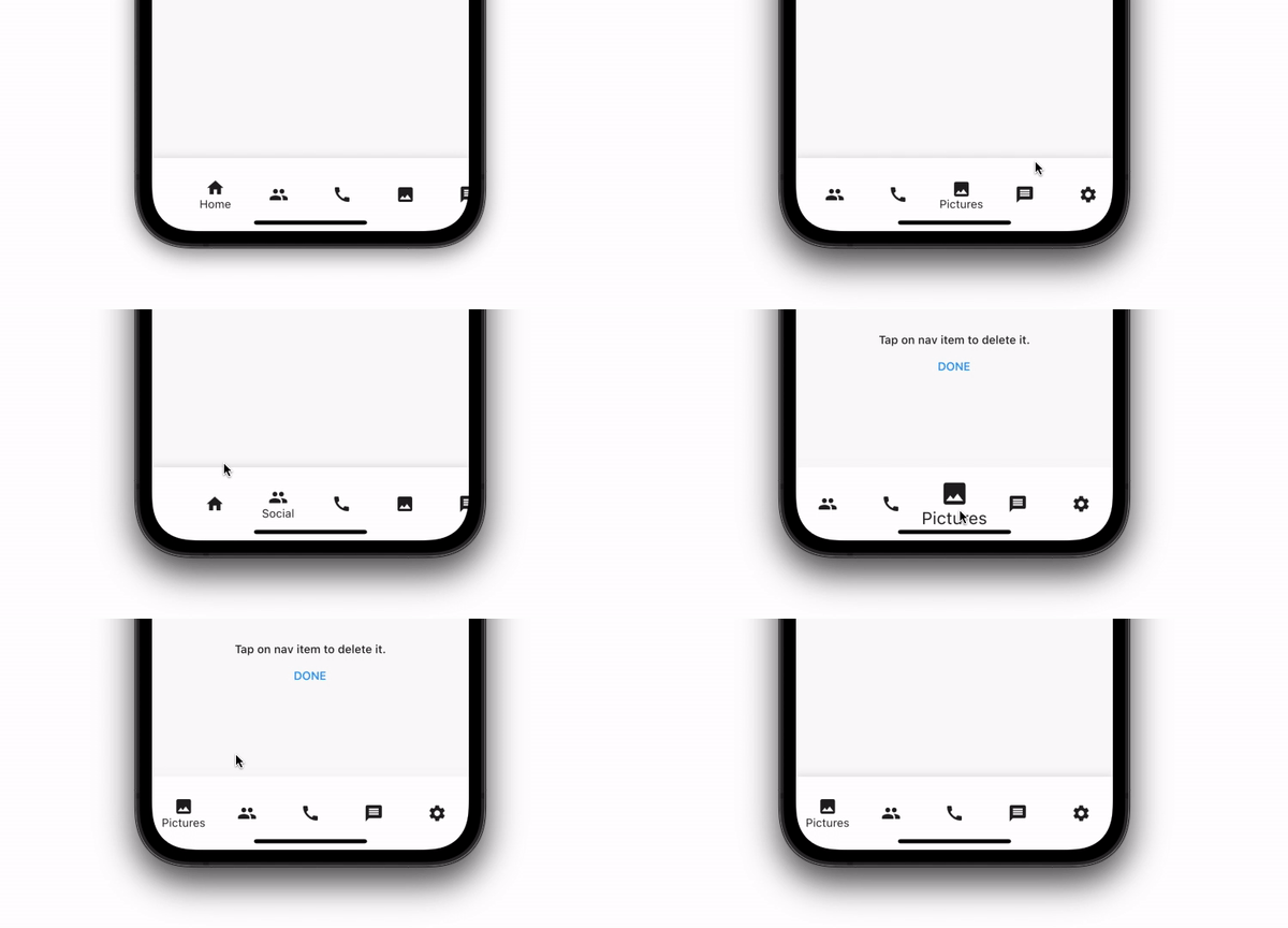
Installing:
In your pubspec.yaml
dependencies:
  scrollable_reorderable_navbar: ^0.0.1
import 'package:scrollable_reorderable_navbar/scrollable_reorderable_navbar.dart';
Basic Usage:
    ScrollableReorderableNavBar(
      onItemTap: (arg) {
        setState(() {
          _selectedIndex = arg;
        });
      },
      onReorder: (oldIndex, newIndex) {
        final currItem = _items[_selectedIndex];
        if (oldIndex < newIndex) newIndex -= 1;
          final newItems = [..._items], item = newItems.removeAt(oldIndex);
          newItems.insert(newIndex, item);
        setState(() {
          _items = newItems;
          _selectedIndex = _items.indexOf(currItem);
        });
      },
    items: _items,
    selectedIndex: _selectedIndex,
    onDelete: (index) => setState(() => _items.removeAt(index)),
    deleteIndicationWidget: Container(
      padding: const EdgeInsets.only(bottom: 100),
      child: Align(
        alignment: Alignment.bottomCenter,
        child: Wrap(
          alignment: WrapAlignment.center,
          crossAxisAlignment: WrapCrossAlignment.center,
          direction: Axis.vertical,
          children: [
            Text("Tap on nav item to delete it.",
              style: Theme.of(context).textTheme.bodyText1,
              textAlign: TextAlign.center),
            TextButton(onPressed: () {}, child: const Text("DONE"))
          ],
        ),
      ),
    ),
  )
Custom usage
There are options that let you custom the navbar:\
| Properties |
Description |
List<NavBarItem> items |
Items composing the navbar, every items should have different names |
int selectedIndex |
The index of the selected NavBarItem |
ValueChanged<int> onItemTap |
Which behaviour should have after the user tap on a NavBarItem |
ReorderCallback onReorder |
Which behaviour should have after user swap 2 NavBarItem |
Widget deleteIndicationWidget |
The Widget displayed on top of the delete overlay to show user that he can tap on NavBarItem to delete them |
ValueChanged<int> onDelete |
Which behaviour should have after user delete a NavBarItem |
ReorderItemProxyDecorator? proxyDecorator |
How the widget should look like on a reorder operation |
Color backgroundColor |
Background color of the navbar |
Duration duration |
Duration of the animations |
BoxDecoration? decoration |
Decoration of the entire navbar. You should use either backgroundColor or this one |
Additional information
Don't hesitate to suggest any features or fix that will improve the package!
