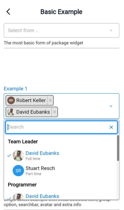
Select2dot1은 검색 기능, 그룹화된 옵션, 사용자 정의 옵션 세부 정보 및 아바타 지원과 같은 고급 기능을 갖춘 단일 또는 다중 선택 드롭다운을 생성하기 위한 매우 사용자 정의 가능한 Flutter 패키지입니다. 오버레이와 모달을 사용하여 구축되어 모든 플랫폼에서 원활한 사용자 경험을 제공합니다. 풍부한 상호작용과 시각적 맞춤이 필요한 양식 및 데이터 선택 인터페이스에 적합합니다. Android, iOS, Web, macOS, Windows, Linux를 포함한 모든 주요 플랫폼을 지원합니다.
사용 사례
검색 가능한 옵션을 가진 폼 입력
대시보드에서 다중 선택 드롭다운
그룹화된 카테고리 선택
아바타와 함께 사용자 프로필 선택
대규모 데이터셋의 동적 필터링
주요 기능
검색 가능한 드롭다운
그룹 옵션 지원
사용자 지정 가능한 옵션 위젯
아바타 및 추가 정보 표시
오버레이 기반 모달 구현
적합한 대상
풍부한 선택 컴포넌트가 필요한 개발자
복잡한 데이터 선택 요구 사항을 가진 앱
크로스플랫폼 애플리케이션
UI 중심 폼 및 관리 패널
고려 사항
최적의 UX를 위해 신중한 스타일링이 필요합니다
매우 큰 데이터 세트를 사용할 경우 성능 조정이 필요할 수 있습니다
오버레이 동작은 플랫폼별 조정이 필요할 수 있습니다
원본 README
연결된 소스 저장소의 README 원문 스냅샷입니다. 최신 내용은 저장소에서 확인하세요.
Select2dot1
Introduction
Select2dot1 gives you a customizable single/multiple select box with support for searching, group option, extra info and avatar. Select2dot1 utilizes overlays on (web, desktop) and modal for mobile. Its entirely customizable through settings and builder.
ScrollController is used to control anchor position of dropdown menu. You can pass your own ScrollController to Select2dot1 widget.
Fully Customizable
If you want to change something that is not available in settings, you will have to make your own component through using the builder option.
Check the customization section for more information.
Components and Settings
Components View
In this section you can see how the components of Select2dot1 widget look like as well as their hierarchy. You can also see how to customize them by settings and builder. For more details hierarchy of components , go to Tree View Components with Settings section.
If you want to see treeview components with all settings you can access here.
Miro is an absolutely wonderful app that im familiar with, i would highly recommend you checking it outTree View was created by . If you want to customize any of the components of Select2dot1 widget, you can use Tree View to see all the components and settings.
Customization
If you want to customize Select2dot1 widget you can do it through utilizing the settings and builder.
The first option you can try to use is to use settings to customize, if you have a hard time with that you can use builder.
By Settings
Use global settings to customize all components of Select2dot1 widget
You can pass global settings to Select2dot1 widget. Global settings will be used by the components of Select2dot1 widget.
In the following example you will be shown how to customize mainColor and fontFamily for all the components of Select2dot1 widget.
Use single component settings to customize only one component of Select2dot1 widget
You can pass the single component settings to Select2dot1 widget. Single component settings will be used only by one component of Select2dot1 widget.
In the following example you will be shown how to customize the CategoryNameOverlay component and CategoryItemOverlay component in Dropdown (modification of the design only be done through desktop overlay).
Using builder you can customize all components of Select2dot1 widget. You can use your own components or you can use the default components that are available in Select2dot1 widget.
Create your own component completely
You can create your own component by using Select2dot1Builder class. You have to pass your own component to Select2dot1Builder class and then pass this class to Select2dot1 widget. When you are using builder you have access to all data that you need to create your own component.
If you want to change the layout of your component you can utilize other component templates, so you can use the default components that are available.
Remember that when using this builder, you must make sure that the code thats written is correct before you do anything else.
ATTENTION: For better performance create SelectDataController as field in class not in build
class_BasicExample1StateextendsState<BasicExample1> {
finalSelectDataController selectDataController = SelectDataController(
data: ExampleData.exampleData1,
);
@overrideWidgetbuild(BuildContext context) {
// Do not create SelectDataController in build method!// return Select2dot1(selectDataController: SelectDataController(data: ExampleData.exampleData1))returnSelect2dot1(selectDataController: selectDataController);
}
}
SelectDataController is a controller that is used to manage the data in Select2dot1 widget. You can use it to add, remove, select and deselect data. All the data that you want to display in Select2dot1 widget must be added to SelectDataController
Remember that when isMultiple is false, you can add only one position to initialSelectedData.
In SelectDataController you can also set:
inital selected data
multiple select or single select
Select2dot1(
selectDataController:
SelectDataController(
data: exampleData,
isMultiple: false,
initialSelectedData: [ // Remember that when isMultiple is false, you can add only one position to initialSelectedData.SingleItemCategoryModel(
nameSingleItem: 'Stuart Resch',
value: 'Stuart Resch 1',
),
],
),
);
Contributing
Pull requests (the pull request template is available for use) are welcome. For major changes, please open an issue first to discuss what you would like to change. More information about contributing you can find here. Remember to follow the code of conduct.
Issues
If you find any issues (bug, feature, performance or other), please report them here.
Please do not ask questions in the issue tracker. Use Q&A section instead.
Please do not report security vulnerabilities on the public issue tracker. The SECURITY page details the procedure for disclosing security issues.
Security
If you discover any security related issues, please go to SECURITY page.
Contributors
Roman Dykyj (@romanjrdykyj)
QA
If you have any questions, feel free to ask them here.
FAQ
How to get selected item?
Use 'onChanged' Callback Function
You can pass callback function to Select2dot1 widget. This function will be called every time when user select an item.
Select2dot1(
    selectDataController: SelectDataController(data: exampleData),
    onChanged: (value) {
        print(value); // value is a list of selected items
    },
),
How to used only overlay or modal mode on all platforms?
It is not possible to use only overlay or modal mode on all platforms. It is automatically set by the package. Overlay mode is used on desktop and modal mode is used on mobile.
How to set NO group select?
If you dont want to group select, you dont need to use name parameter in SingleCategoryModel.
staticconstList<SingleCategoryModel> exampleData3 = [
SingleCategoryModel(
nameCategory: null, // If you dont want to group select, you dont need to use name parameter in SingleCategoryModel or set it to null.
singleItemCategoryList: [
SingleItemCategoryModel(nameSingleItem: 'Alabama',),
SingleItemCategoryModel(nameSingleItem: 'Arkansas'),
SingleItemCategoryModel(nameSingleItem: 'Illonois'),
],
),
];
License
This package is licensed under the MIT license. To see the full license text, see the LICENSE file.