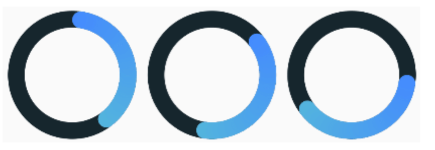
간단한 원형 진행률 표시기를 만들기 위한 가볍고 오픈소스인 Flutter 패키지입니다. 최소한의 설정으로 로딩 상태나 진행 상황을 깔끔하고 사용자 정의 가능한 방식으로 표시할 수 있습니다. 이 패키지는 Android, iOS, Web, macOS, Windows, Linux 등 모든 주요 플랫폼을 지원합니다. 복잡한 진행률 UI의 간편한 대안을 찾는 개발자를 위해 설계되었으며, 부드러운 애니메이션과 간단한 구성 옵션을 제공합니다. 폼, 데이터 로딩 화면 또는 진행 중인 프로세스에 대한 시각적 피드백이 필요한 모든 상황에서 이상적입니다.
사용 사례
로딩 상태 표시기
양식 제출 진행 상황
데이터 가져오기 시각화
게임 또는 앱 레벨 진행 상황
사용자 정의 가능한 UI 요소
주요 기능
간단한 API
크로스 플랫폼 지원
부드러운 애니메이션
사용자 지정 가능한 색상 및 크기
최소 종속성
간편한 통합
적합한 대상
초보자 플러터 개발자
간단한 로딩 UI
성능에 민감한 앱
빠른 프로토타이핑
경량 진행 표시기가 필요한 앱
고려 사항
고급 패키지에 비해 사용자 지정이 제한적입니다
내장된 텍스트 레이블 없음
복잡한 진행 추적에 적합하지 않습니다
동적 값의 수동 처리가 필요합니다
기본적인 원형 진행 상황 요구 사항에 가장 적합
원본 README
연결된 소스 저장소의 README 원문 스냅샷입니다. 최신 내용은 저장소에서 확인하세요.
Simple circular progress bar
Open source Flutter package, simple circular progress bar.
The maximum value of the progress bar. The values will vary from 0 to [maxValue].
startAngle double
0
The angle from which the countdown of progress begins.
progressStrokeWidth double
15
Thickness of the progress line.
backStrokeWidth double
15
Line thickness of the background circle. If you don't need a background circle, set this parameter to 0.
progressColors List
Progress bar can be either with or without a gradient. For a gradient, specify more than one color in the [progressColors] field and if a gradient is not needed specify only one color.
fullProgressColor Color
The color of the circle at 100% value. It only works when [mergeMode] equal to true.
backColor Color
The color of the background circle.
animationDuration int
Duration(seconds: 6)
Animation duration. If you don't need animation, set this parameter to zero Duration.
mergeMode bool
false
When this mode is enabled the progress bar with a 100% value forms a full circle with [fullProgressColor]. If no [fullProgressColor] is specified, the last color from [progressColors] is taken.
valueNotifier ValueNotifier
The object designed to update the value of the progress bar. By default, creates a ValueNotifier with the maximum value.
onGetText Text Function(double)
Callback to generate a new Text widget located in the center of the progress bar. The callback input is the current value of the progress bar.
YouTube video
You can see how the application works from the example in this video.