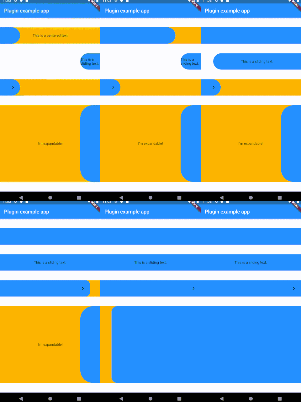
SlideButton은 다양한 기기에서 볼 수 있는 '슬라이드하여 잠금 해제' 기능에서 영감을 받은 사용자 정의 가능한 Flutter 위젯입니다. 색상, 형태, 애니메이션에 대한 광범위한 스타일링 옵션을 제공하며 부드럽고 상호작용적인 슬라이딩 경험을 제공합니다. 개발자는 다양한 UI 요구 사항에 맞게 외관과 동작을 조정할 수 있어 인증 프롬프트, 토글 또는 사용자와의 몰입형 상호작용에 이상적입니다. 이 위젯은 가볍고 기존의 Flutter 프로젝트에 쉽게 통합할 수 있습니다.
사용 사례
인증 프롬프트
인터랙티브 UI 요소
사용자 지정 토글 스위치
온보딩 화면
사용자 확인 대화상자
주요 기능
높은 사용자 정의 가능한 외관
부드러운 슬라이딩 애니메이션
사용자 정의 가능한 트랙 및 썸 스타일
슬라이드 완료 시 콜백 지원
경량이고 성능이 뛰어남
적합한 대상
직관적인 잠금 해제 인터페이스를 구축하는 개발자
상호작용 위젯을 찾는 디자이너
사용자 확인 동작이 필요한 앱
사용자 정의 슬라이더 요구 사항이 있는 프로젝트
고려 사항
제한된 플랫폼별 동작
내장된 접근성 기능 없음
경계 사례에 대한 수동 처리가 필요합니다
복잡한 제스처 인식을 위한 최적화되지 않음
원본 README
연결된 소스 저장소의 README 원문 스냅샷입니다. 최신 내용은 저장소에서 확인하세요.
Sliding Button
A sliding Flutter widget, based on the slide to unlock function from multiple devices.
Heavily customizable and flexible.
Installing
Add the following to your pubspec.yaml:
dependencies:slide_button:^0.2.8
Usage
Install
Use the SlideButton widget anywhere
???
Profit
Properties
Several properties are present and can be customized:
| Properties              	| Description                                                                                                                                                            	|
|-------------------------	|------------------------------------------------------------------------------------------------------------------------------------------------------------------------	|
| height                  	| Height of the Widget, leave blank to get the parent constraints.                                                                                                       	|
| backgroundChild         	| A child to be put on the background bar, NOT centered by default.                                                                                                      	|
| slidingChild            	| A child tobe put on the sliding bar, NOT centered by default.                                                                                                          	|
| backgroundColor         	| The color of the background bar.                                                                                                                                       	|
| slidingBarColor         	| The color of the sliding bar.                                                                                                                                          	|
| confirmPercentage       	| How much of the bar width have to be slided to confirm the action.                                                                                                     	|
| initialSliderPercentage 	| The initial (and resting) percentage of the sliding bar.                                                                                                               	|
| isDraggable             	| Is this widget draggable?                                                                                                                                              	|
| onButtonSlide           	| Callback that returns a `Double` value containing the drag percentage.                                                                                                 	|
| onButtonOpened          	| Callback called when the button is slided all the way.                                                                                                                 	|
| onButtonClosed          	| Callback called when the button is back to the initialSliderPercentage.                                                                                                	|
| slideDirection          	| Either SlideDirection.RIGHT or SlideDirection.LEFT, sets the sliding direction of the sliding bar.                                                                     	|
| shouldCloseBorders      	| This updates the borders when the button reaches 0.9 percent dragged, and set the borderRadius to zero, giving the impression of a "closed" button. Defaults to `true` 	|
| shouldCloseBorders      	| BorderRadius for the sliding bar, default is 50. 	                                                                                                                        |
TODO
[x] Create the repo
[x] Make it work
[ ] Fix text on the sliding bar
[ ] Find a better activation function capable of activating between x and y percentages
[ ] More listeners?
[ ] Parallax effect?
[ ] Make it pop
Inspiration
This widget was partially made possible by inspecting elements from sliding_up_panel.