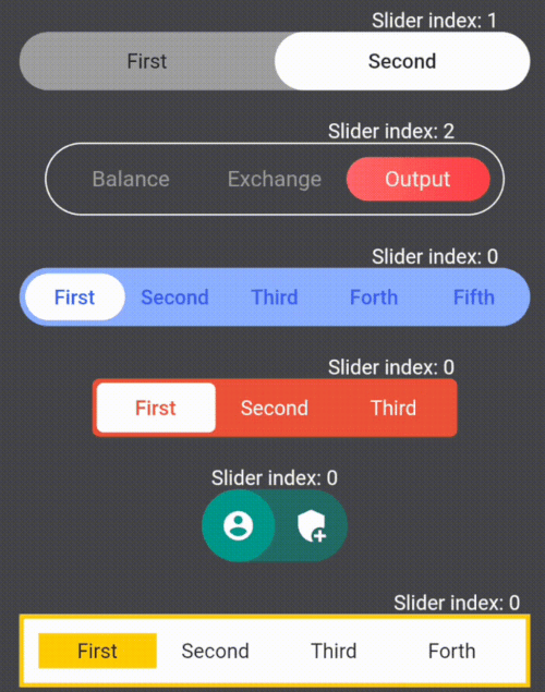
사용자 정의 가능한 슬라이딩 스위치 위젯을 만들기 위한 플러터 패키지로, 외관과 동작에 대한 광범위한 제어 기능을 제공합니다. 부드러운 애니메이션, 사용자 지정 색상, 모양 및 크기를 갖춘 인터랙티브 토글 스위치를 개발자가 쉽게 만들 수 있도록 합니다. 설정 패널, 테마 전환 또는 시각적인 케이스/오프 상태 변경이 필요한 모든 UI에 적합합니다. 이 패키지는 모바일, 웹, 데스크톱 등 모든 주요 플랫폼을 지원하여 크로스플랫폼 경험을 일관되게 유지합니다. 직관적인 구성 옵션을 통해 현대적이고 반응성 있는 스위칭 인터페이스 구현을 간편하게 만듭니다.
사용 사례
테마 전환
설정 패널
on/off 제어
폼 입력
사용자 선호도 선택
주요 기능
사용자 지정 색상
부드러운 애니메이션
다양한 사이즈 옵션
크로스 플랫폼 지원
사용자 정의 가능한 트랙 및 탐
상태 지속성
적합한 대상
설정 UI를 구축하는 개발자
인터랙티브 토글이 필요한 디자이너
다크/라이트 모드를 지원하는 앱
크로스 플랫폼 앱
사용자 지정 폼 컴포넌트
고려 사항
Flutter 위젯 트리에 대한 이해가 필요합니다
복잡한 레이아웃을 위해 추가 스타일링이 필요할 수 있습니다
많은 인스턴스로 인한 성능 영향
제한된 내장 접근성 기능
고주파 상태 변경에 최적화되지 않음
원본 README
연결된 소스 저장소의 README 원문 스냅샷입니다. 최신 내용은 저장소에서 확인하세요.
Library for creating and customizing sliders
Widget customization variations
Here are some examples of the library's features:
First I suggest you get familiar with what container and sliders are in the library
The library lets you change the style of containers and sliders using the fields in the table below
List and description of the functionality:
Fields
Description
children
Widgets that placed inside sliders / required
onSelect
The function takes an index variable that changes depending on the index of the current slider / required
containerHeight
Container height / required
containerWight
Container width / required
slidersColors
The color of each slider. A single color in the array will fill all sliders / white by default
slidersGradients
The gradient of each slider. A single gradient in the array will fill all sliders
containerBorder
Container border widget
slidersBorder
Slider border widget
containerBorderRadius
Container corner rounding radius
containerColor
Container fill color / grey by default
indents
Indents between the container and sliders (the same on all sides) / 0 by default
direction
Defining the direction of the slider swipe / horizontal by default
isAllContainerTap
A shadow cast by a box
containerBoxShadow
Ability to tap on the current slider and change its index to the opposite (available only for 2 children) / false by default
initialIndex
Initial index of the slider, which is rendering for the first time
Creating your own SlideSwitcher
SlideSwitcher is an ordinary widget. In order to create it you have to specify the obligatory parameters:
"children" - texts, icons, pictures and any other widgets that will be stored in the sliders;
"onSelect" - the function which will be executed during the change of the focused slider;
"containerHeight" - container height; "containerWight" - container width. To customize the widget
you should use the optional parameters from the table above.
To change the state of the screen it is recommended to create a variable storing the index of the current slider and call its setState
in the "onSelect" function
List of exceptions for cases that are not supported by the library:
List of exceptions
All widgets from the list of "children" do not fit into the given container size
The "isAllContainerTap" parameter can be "true" only when "children" length is 2
The first error from the table occurs when the smallest side of the container(determined by the direction of the swipe)multiplied by the length of the "children" by half is greater than the largest side of the container.Only occurs when the borders of the container are maximum rounded
NEW
Vertical Switchers.
The direction parameter of this library is responsible for the direction of the switch's movement.
Just add direction: Axis.vertical to your widget:
If you need a switch with two children to determine whether to turn something on or off, then
add empty containers to children parameters and parameter isAllContainerTap: true: