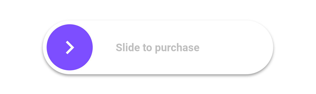
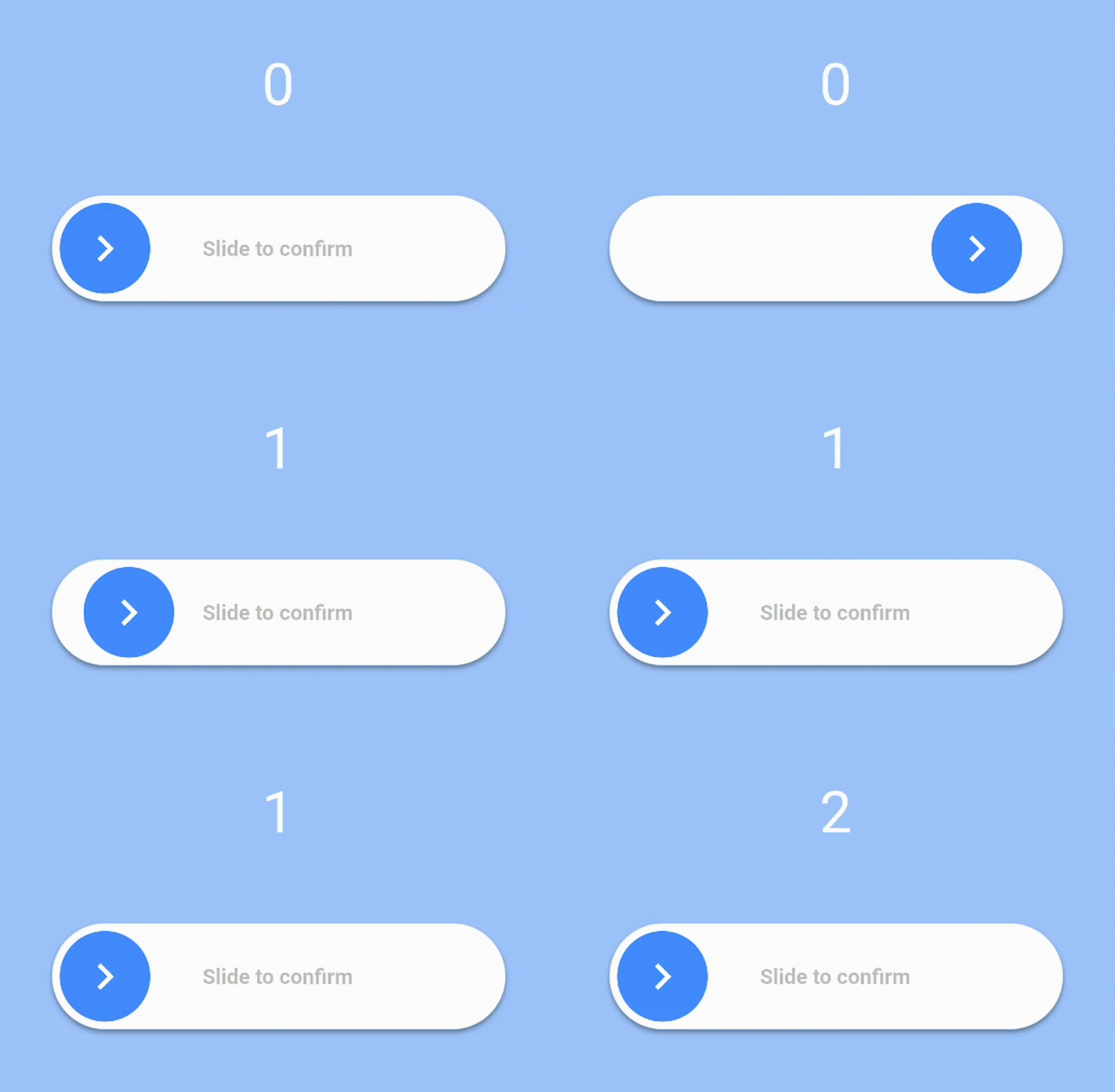
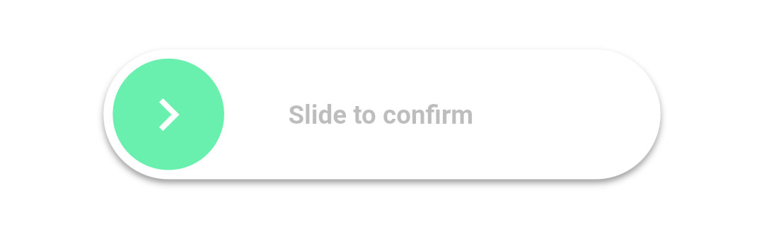
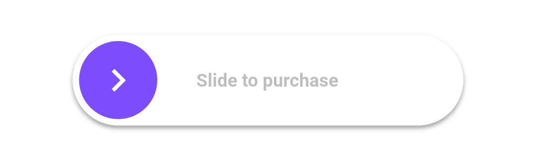
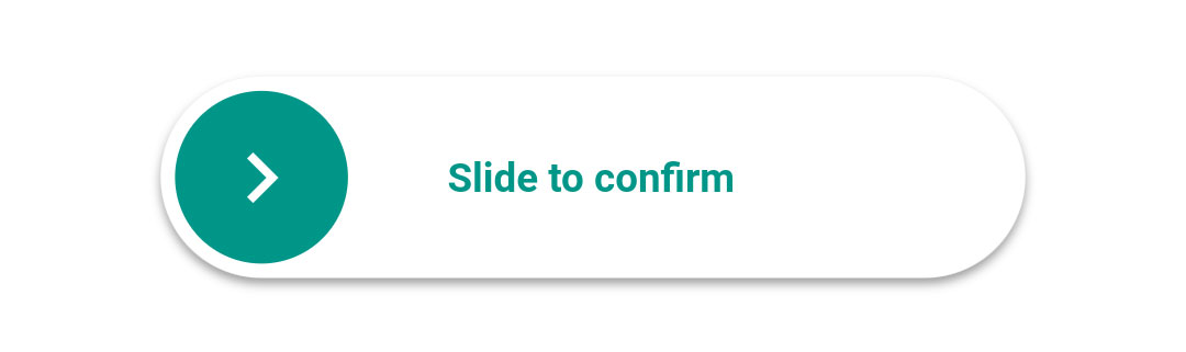
사용자가 슬라이더를 완전히 100%까지 스와이프했을 때 콜백을 트리거하도록 설계된 사용자 정의 가능한 슬라이더 위젯을 제공하는 플러터 패키지입니다. 항목 삭제나 폼 제출과 같은 작업을 확인할 때 일반적으로 사용되며, 의도적인 제스처를 요구함으로써 사용자 인터랙션을 향상시킵니다. 부드러운 애니메이션을 지원하며, 사용자 지정 색상, 크기 및 레이블로 스타일링할 수 있습니다. 안드로이드, iOS, 웹, 맥OS, 윈도우, 리눅스 등 주요 모든 플랫폼에서 작동합니다.
사용 사례
파괴적 조치 확인
제출 전 사용자 확인
폼 상호작용 향상
의도하지 않은 탭 방지
상호작용 피드백 추가
사용자 정의 확인 제스처
주요 기능
완전한 100% 슬라이드 활성화
사용자 지정 가능한 색상 및 크기
완료 시 콜백
부드러운 애니메이션
크로스 플랫폼 지원
사용자 정의 가능한 레이블 텍스트
적합한 대상
폼 확인
삭제 작업 프롬프트
인터랙티브 UI 요소
사용자 참여 기능
접근성 향상된 컨트롤
간단하지만 효과적인 제스처 입력
고려 사항
완료하려면 사용자 주의가 필요합니다
접근성 조정이 필요할 수 있습니다
단일 방향으로만 슬라이딩 가능
빠른 입력에 적합하지 않음
시각적 피드백은 명확해야 합니다
복잡한 레이아웃의 성능 영향
원본 README
연결된 소스 저장소의 README 원문 스냅샷입니다. 최신 내용은 저장소에서 확인하세요.
slide_to_confirm
A customizable slider that will activate a callback when the user slides it to 100%.
Installation
In the dependencies: section of your pubspec.yaml, add the following line:
heightdouble: Height of the slider. Defaults to 70.
widthdouble: Width of the slider. Defaults to 300.
backgroundColorColor: The color of the background of the slider. Defaults to Colors.white.
backgroundColorEndColor: The color of the background of the slider when it has been slide to the end. By giving a value here, the background color will gradually change from backgroundColor to backgroundColorEnd when the user slides. Is not used by default.
foregroundColorColor: The color of the moving element of the slider. Defaults to Colors.blueAccent.
iconColorColor: The color of the icon on the moving element if icon is IconData. Defaults to Colors.white.
sliderButtonContentWidget or : The icon widget used on the moving element of the slider. Defaults to Icon(Icons.chevron_right).
shadowBoxShadow: The shadow below the slider. Defaults to BoxShadow(color: Colors.black38, offset: Offset(0, 2),blurRadius: 2,spreadRadius: 0,).
textString: The text showed below the foreground. Used to specify the functionality to the user. Defaults to "Slide to confirm".
textStyleTextStyle: The style of the text. Defaults to TextStyle(color: Colors.black26, fontWeight: FontWeight.bold,).
onConfirmationVoidCallback: The callback when slider is completed. This is the only required field.
onTapDownVoidCallback: The callback when slider is pressed.
onTapUpVoidCallback: The callback when slider is release.
foregroundShapeBorderRadius: The shape of the foreground (the moving element of the slider). Defaults to a circular border radius.
backgroundShapeBorderRadius: The shape of the background of the slider. Defaults to a circular border radius.
stickToEndbool: Bool that indicates if stick or not the cursor at end of slide
Example
View the Flutter app in the example directory to see a working example of how to use and implement the slider.