패키지, 저장소 및 앱 카테고리 검색

패키지 상세v0.0.5

slider_controller

슬라이더 컨트롤러와 사용자 지정 위젯을 제공하는 패키지입니다. 이 위젯은 슬라이더 위젯의 간편한 맞춤 설정에 사용됩니다.

AndroidiOSWebmacOSWindowsLinux
30일 다운로드
36
좋아요
40
Pub 점수
160

패키지 설치

flutter pub add slider_controller

패키지 개요

공개 정보를 바탕으로 생성한 선택 가이드입니다.

slider_controller 패키지는 Flutter 애플리케이션용 사용자 정의 가능한 슬라이더 컨트롤러 및 위젯을 제공합니다. 외관과 동작에 대한 강화된 제어를 통해 슬라이더의 생성과 관리를 간소화합니다. 개발자는 특정 디자인 요구 사항에 맞게 슬라이더의 모양과 기능을 쉽게 조정할 수 있습니다. 이 패키지는 Android, iOS, Web, macOS, Windows, Linux 등 모든 주요 플랫폼을 지원하여 다양한 장치에서 일관된 성능을 보장합니다. 직관적인 API를 통해 기존 프로젝트에 쉽게 통합할 수 있습니다.

사용 사례

  • 사용자 정의 슬라이더 디자인
  • 인터랙티브 UI 요소
  • 범위 선택이 있는 폼 입력
  • 크로스 플랫폼 슬라이더 컴포넌트
  • 동적 값 조정

주요 기능

  • 간편한 사용자 정의
  • 크로스 플랫폼 지원
  • 내장 컨트롤러 로직
  • 반응형 디자인 통합
  • 확장 가능한 위젯 구조

적합한 대상

  • UI 개발자
  • Flutter 초보자
  • 디자인 중심 앱
  • 인터랙티브 폼
  • 다중 플랫폼 프로젝트

고려 사항

  • 기본적인 플러터 지식이 필요합니다
  • 슬라이더 전용 사용 사례에 국한
  • 복잡한 레이아웃을 위해 추가 스타일링이 필요할 수 있습니다
  • 고급 기능을 위해 외부 종속성에 의존합니다
  • 슬라이더가 아닌 위젯에는 적합하지 않습니다

원본 README

연결된 소스 저장소의 README 원문 스냅샷입니다. 최신 내용은 저장소에서 확인하세요.

slider_controller

Flutter Website Dart Website MIT License

A package that gives us a slider controller a custom widget. This widget is used for easy customization for the slider widget.

Key Features

  • Ready to use custom slider widget.
  • Easy customization for the slider widget.

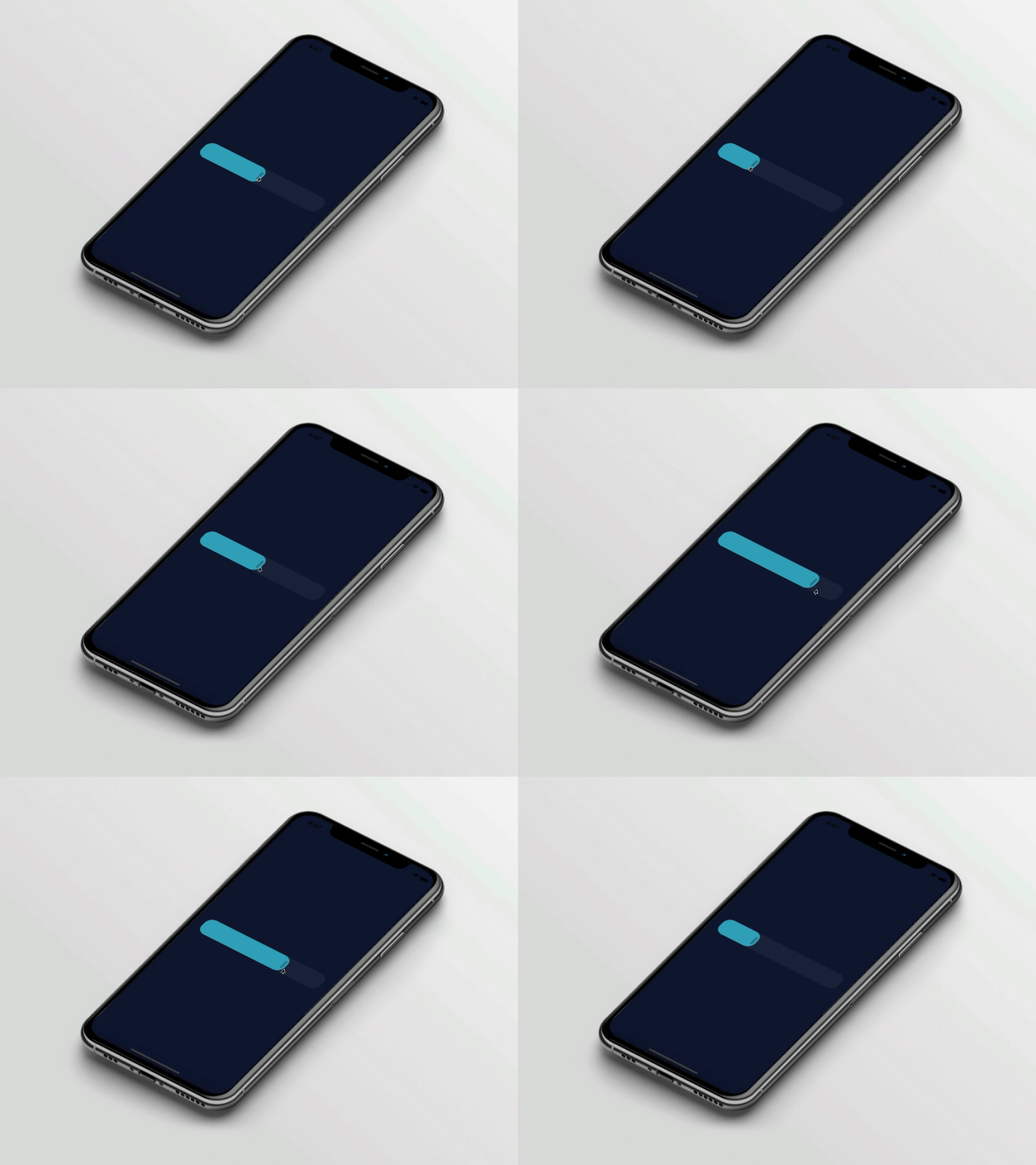
Preview

slider_controller

Basic Usage

Import it to your project file

import 'package:slider_controller/slider_controller.dart';

And add it in its most basic form like it:

SliderController(
  value: 50.0,
  onChanged: (value) {
    print('slider value : $value');
  },
);
Required parameters of SliderController

Parameter Description
double value Indicates the default slider thumb value between the 0.0 to 100.0
ValueChanged onChanged Called during a drag when the user is selecting a new value for the slider by dragging
Optional parameters of SliderController

Parameter Default Description
ValueChanged? onChangeEnd - Called when the user is done selecting a new value for the slider
ValueChanged? onChangeStart - Called when the user starts selecting a new value for the slider
double min 0.0 Indicates the Minimum value for the slider
double max 100.0 Indicates the Maximum value for the slider
SliderDecoration sliderDecoration -- Used to Decorate the Slider Widget
bool isDraggable true Used to Enable or Disable Drag Gesture of Slider
Optional parameters of SliderDecoration

Parameter Default Description
Color inactiveColor Colors.blueGrey Defines the background color of the inactive part of the slider
Color activeColor Colors.blue Defines the background color of the active part of the slider
Color thumbColor Colors.white Defines the thumb color of the slider
double borderRadius 20.0 Indicates the rounded border radius for the slider
double height 50.0 Indicates the height of the slider
bool isThumbVisible true Indicates that slider thumb is visible or not
double thumbHeight 25.0 Indicates the height of the slider thumb
double thumbWidth 5.0 Indicates the width of the slider thumb
Guideline for contributors

  • Contribution towards our repository is always welcome, we request contributors to create a pull request for development.
Guideline to report an issue/feature request

It would be great for us if the reporter can share the below things to understand the root cause of the issue.

  • Library version
  • Code snippet
  • Logs if applicable
  • Device specification like (Manufacturer, OS version, etc)
  • Screenshot/video with steps to reproduce the issue
  • Library used

LICENSE!

slider_controller is MIT-licensed.

Let us know!

We’d be really happy if you send us links to your projects where you use our component. Just send an email to sales@mindinventory.com And do let us know if you have any questions or suggestion regarding our work.

카테고리

소스 저장소

이 패키지를 사용하는 프로젝트

아직 데이터가 없습니다.