패키지, 저장소 및 앱 카테고리 검색

sliding_clipped_nav_bar 표지
패키지 상세v3.1.1

sliding_clipped_nav_bar

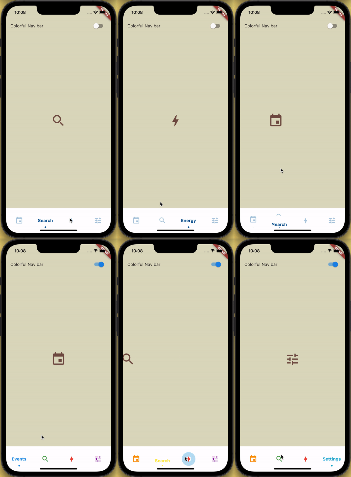
슬라이딩 메뉴 아이콘과 클리핑 효과를 가진 하단 탐색 바이며, 탭 시 리플 효과도 제공합니다.

AndroidiOSWebmacOSWindowsLinux
30일 다운로드
233
좋아요
339
Pub 점수
150

패키지 설치

flutter pub add sliding_clipped_nav_bar

패키지 개요

공개 정보를 바탕으로 생성한 선택 가이드입니다.

아이콘과 레이블에 슬라이딩 애니메이션을 제공하는 사용자 정의 가능한 하단 탐색 바로, 클리핑 효과와 탭 시 리플 피드백으로 강화되었습니다. 현대적이고 상호작용적인 UI를 위해 설계되었으며 Android, iOS, Web, macOS, Windows, Linux 등 여러 플랫폼을 지원합니다. 부드러운 전환과 시각적 완성도를 제공하여 동적 피드백이 필요한 직관적인 탐색을 필요로 하는 앱에 적합합니다. pub.dev를 통해 Flutter 프로젝트에 원활하게 통합할 수 있습니다.

사용 사례

  • 모바일 앱 탐색
  • 웹 애플리케이션 인터페이스
  • 크로스 플랫폼 UI 디자인
  • 인터랙티브 하단 바
  • 현대 앱 미학

주요 기능

  • 슬라이딩 아이콘 및 텍스트 애니메이션
  • 시각적 깊이를 위한 클리핑 효과
  • 터치 시 리플 효과
  • 크로스 플랫폼 호환성
  • 사용자 정의 가능한 외관
  • 부드러운 전환 애니메이션

적합한 대상

  • 애니메이션 바텀 네비게이션을 찾는 플러터 개발자
  • 디자인 중심 애플리케이션
  • 높은 사용자 상호작용을 가진 앱
  • 다중 플랫폼을 대상으로 하는 개발자
  • UI/UX 개선 프로젝트

고려 사항

  • 오래된 장치에서는 성능 조정이 필요할 수 있습니다
  • 핵심 기능을 넘어서는 사용자 정의 제한
  • 복잡한 위젯에서의 잠재적인 레이아웃 충돌
  • 매우 큰 탐색 세트에 최적화되지 않음
  • Flutter의 렌더링 파이프라인에 의존합니다

원본 README

연결된 소스 저장소의 README 원문 스냅샷입니다. 최신 내용은 저장소에서 확인하세요.

Loading Animation Widget

YouTube Badge Twitter Badge Patreon Badge BMC Badge pub package WateryDesert


How to use?

Add sliding_clipped_nav_bar: to your pubspec.yaml dependencies then run flutter pub get

Add from git [Latest and experimental version]

 dependencies:
  sliding_clipped_nav_bar:
    git:
      url: https://github.com/watery-desert/sliding_clipped_nav_bar  

Add from pub [Stable]

 dependencies:
  sliding_clipped_nav_bar:

Then import the package to use

import 'package:sliding_clipped_nav_bar/sliding_clipped_nav_bar.dart';

Add SlidingClippedNavBar() to bottomNavigationBar property of Scaffold() and add PageView() to body with NeverScrollableScrollPhysics() don't try to upate the seleted index from onPageChanged or will see some weird behaviour. You can use Stack() or AnimatedSwitcher() for custom page transition animation.

API reference

barItems → List<BarItem>

  • List of bar items that shows horizontally, Minimum 2 and maximum 4 items.
    required

selectedIndex → int

  • Selected index of the bar items.
    required

iconSize → double

  • Size of all icons (inactive items), don't make it too big or will be clipped.
    optional [30]

fontSize → double

  • FontSize of the text.
    optional [16]

fontWeight → FontWeight

  • FontWeight of the text.
    optional [FontWeight.bold]

fontStyle → FontStyle

  • FontStyle of the text.
    optional [null]

activeColor → Color

  • Color of the selected item which indicate selected.
    required

inactiveColor → Color?

  • Inactive color of item, which actually color icons.
    nullable

onButtonPressed → OnButtonPressCallback

  • Callback when item is pressed.
    required

backgroundColor → Color

  • background color of the bar.
    optional [Colors.white]

Design Credit & screen recording

Toolbar icons animation by Cuberto

Do and don't
  • Don't make icon size too big.

    • FontAwesomeIcons: 24
    • MaterialIcons: 30
  • Using SlidingClippedNavBar() when you want global active and inactive color.

 return Scaffold(
     
      body: PageView(
      physics: NeverScrollableScrollPhysics(),       
      controller: controller,
...
      ),
      bottomNavigationBar: SlidingClippedNavBar(
        backgroundColor: Colors.white,
        onButtonPressed: (index) {
          setState(() {
            selectedIndex = index;
          });
          controller.animateToPage(selectedIndex,
              duration: const Duration(milliseconds: 400),
              curve: Curves.easeOutQuad);
        },
        iconSize: 30,
        activeColor: Color(0xFF01579B),
        selectedIndex: selectedIndex,
        barItems: [
          BarItem(
            icon: Icons.event,
            title: 'Events',
          ),
          BarItem(
            icon: Icons.search_rounded,
            title: 'Search',
          ),
           /// Add more BarItem if you want
        ],
      ),
    );
  • Using SlidingClippedNavBar.colorful() when you want to set individual item active & inactive color.
return Scaffold(
    
     body: PageView(
     physics: NeverScrollableScrollPhysics(),
     controller: controller,
...
     ),
     bottomNavigationBar: SlidingClippedNavBar.colorful(
       backgroundColor: Colors.white,
       onButtonPressed: (index) {
         setState(() {
           selectedIndex = index;
         });
         controller.animateToPage(selectedIndex,
             duration: const Duration(milliseconds: 400),
             curve: Curves.easeOutQuad);
       },
       iconSize: 30,
       selectedIndex: selectedIndex,
       barItems: [
         BarItem(
           icon: Icons.event,
           title: 'Events',
           activeColor: Colors.amber,
           inactiveColor: Colors.red,
         ),
         BarItem(
           icon: Icons.search_rounded,
           title: 'Search',
           activeColor: Colors.red,
           inactiveColor: Colors.green,
         ),
        /// Add more BarItem if you want

       ],
     ),
   );
FAQ
  • How do I change the height?

The height must be constant because the animation is in vertical direction. According to me 60 is perfect. But if you think needs to be reduced then please create an issue with a screenshot. I will see if I can do something.

  • How do I add drop shadow?

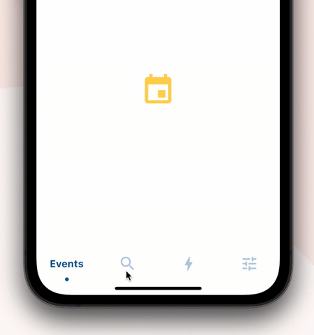
Wrap SlidingClippedNavBar with DecoratedBox or Container and pass BoxDecoration to decoration property. BoxDecoration takes list of boxShadow there you can pass your drop shadow.

DecoratedBox(
    decoration: BoxDecoration(
      boxShadow: [
        BoxShadow(
            color: Colors.black.withOpacity(0.2),
            offset: Offset(0, 4),
            blurRadius: 8.0)
      ],
    ),
    child: SlidingClippedNavBar()
)
  • How do I change the corner radius of the navigation bar?

Wrap SlidingClippedNavBar with ClipRRect and pass BorderRadius to borderRadius property.

  ClipRRect(
      borderRadius: const BorderRadius.vertical(
        top: Radius.circular(16),
      ),
      child: SlidingClippedNavBar(
    )                

All flutter packages

➜ Sliding Clipped Nav Bar
● Water Drop Nav Bar
● Swipeable Tile
● Loading Animation Widget


카테고리

소스 저장소

이 패키지를 사용하는 프로젝트

아직 데이터가 없습니다.