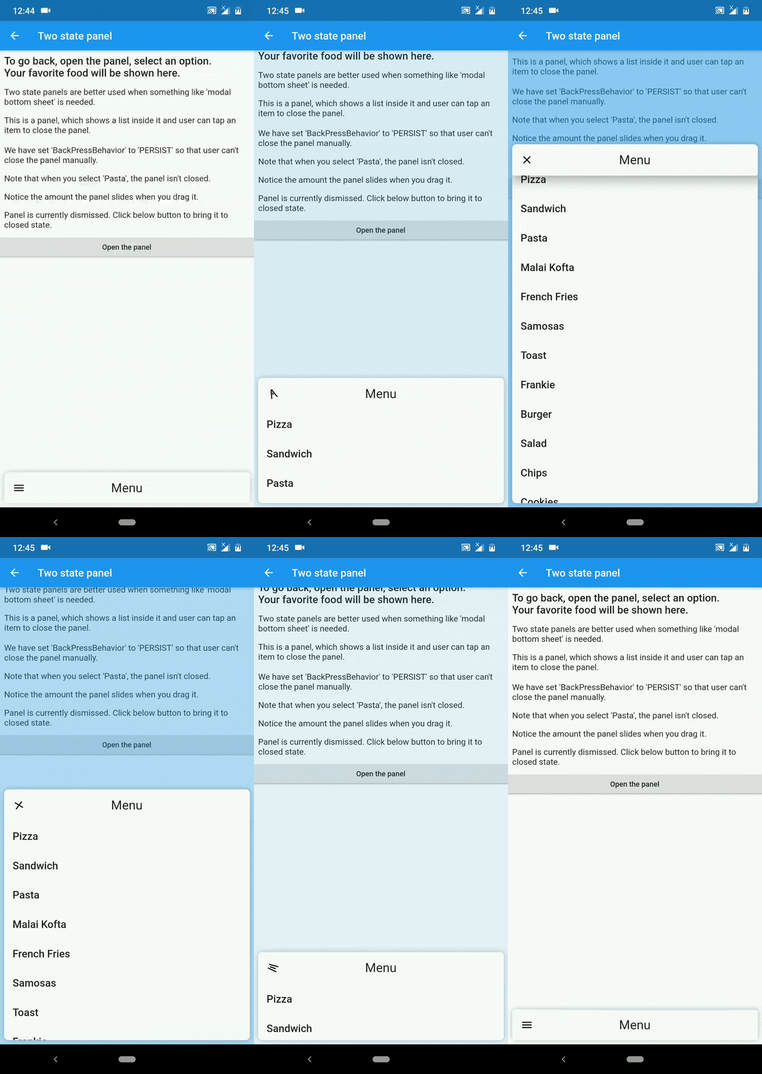
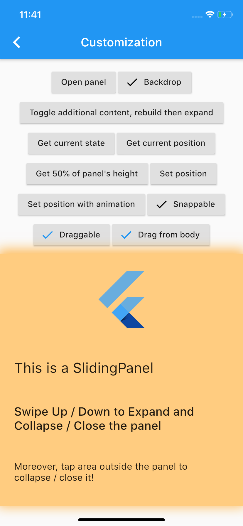
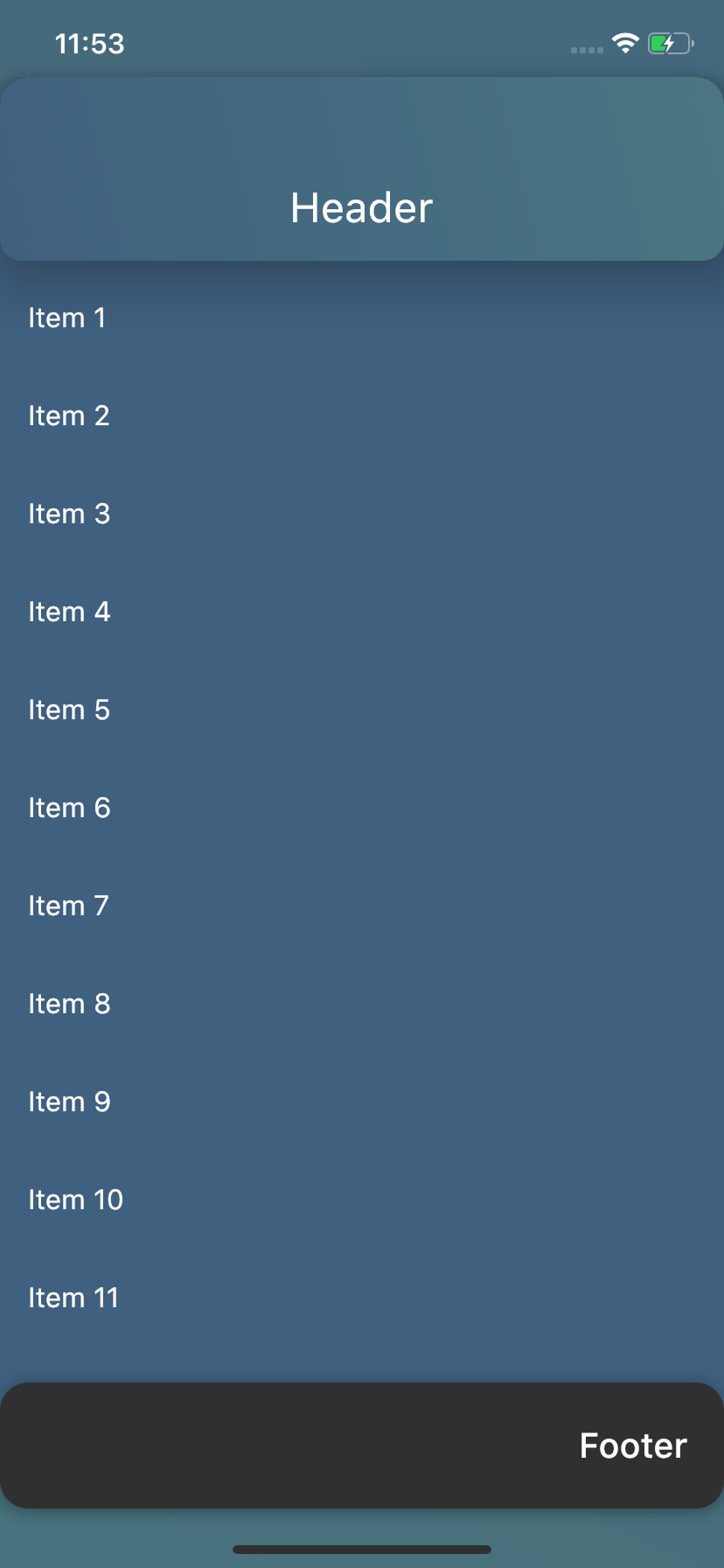
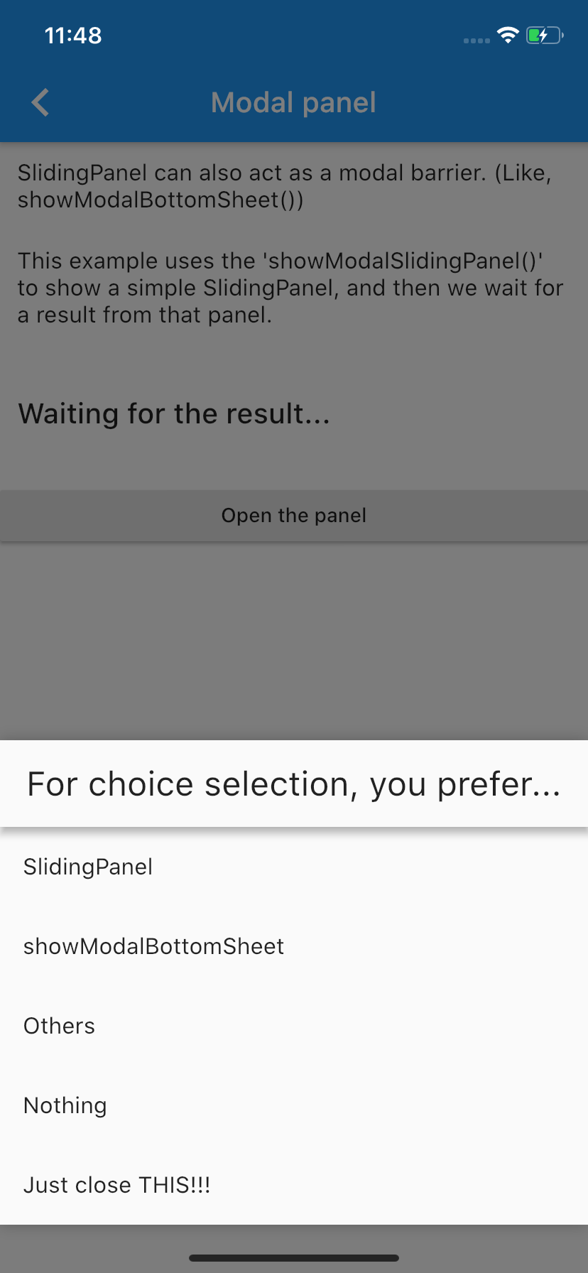
Flutter용으로 매우 사용자 정의가 가능한 하단 슬라이딩 패널로, 외관, 동작 및 애니메이션에 대한 완전한 제어를 제공합니다. 유연하고 직관적인 설계로 개발자가 패널 크기, 드래그 제스처, 스냅 포인트, 시각적 스타일을 원하는 디자인 요구사항에 맞게 조정할 수 있습니다. 모달, 필터 또는 화면 하단에서 슬라이드되는 인터랙티브 오버레이에 적합합니다. 패키지는 가볍고 성능을 고려해 제작되었으며 다양한 기기에서 부드러운 상호작용을 지원합니다.
사용 사례
사용자 지정 바닥 시트
인터랙티브 필터
모달 대화상자
스와이프 업 드로어
동적 콘텐츠 패널
주요 기능
완전히 사용자 정의 가능한 외관
여러 스냅 포인트
부드러운 드래그 제스처
사용자 정의 애니메이션
중첩 스크롤을 지원합니다
경량이며 성능이 뛰어남
적합한 대상
유연한 하단 패널이 필요한 개발자
복잡한 하단 시트 상호작용을 가진 앱
사용자 정의 전환을 필요로 하는 디자인 중심의 UI
기본 BottomSheet의 가벼운 대안을 원하는 프로젝트
맞춤 설정과 통제를 우선시하는 팀
고려 사항
상태 관리를 수동으로 처리해야 합니다
기본 사용법 외에 문서가 제한적
iOS 스타일의 파라럭스 효과에 대한 내장 지원 없음
성능 조정 없이 매우 큰 콘텐츠 목록에 최적화되지 않음
원본 README
연결된 소스 저장소의 README 원문 스냅샷입니다. 최신 내용은 저장소에서 확인하세요.
sliding_panel
The most customisable bottom sliding panel you can find on pub.dev. Just as you want it!
Features you would love
Take control
Customize the way you want
Various purposes
Easily put your content in the panel, customize it and then just use the panel for various purposes like,
Showing some persistent content on bottom of the screen.
Can be used like showModalBottomSheet() from Flutter to make user choices.
Also use like DraggableScrollableSheet() and put scrollable content inside the panel.
:point_right: How to use sliding_panel:
Please visit the Wiki to see how you can get this working.
The latest stable release (v1.0.1) has landed with many improvements. There are some breaking changes, too. For that, visit the Migration guide.
A note for v0.2.0 and v0.1.0 users :worried:
From version 0.5.0, we have a LOADS of breaking :boom: changes, which means that simply updating the package won't give you all the bells and whistles of new version. :pensive: For updating guide, please go to the Migration guide.
After following this guide, you will enjoy new features.