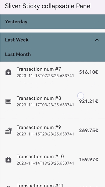
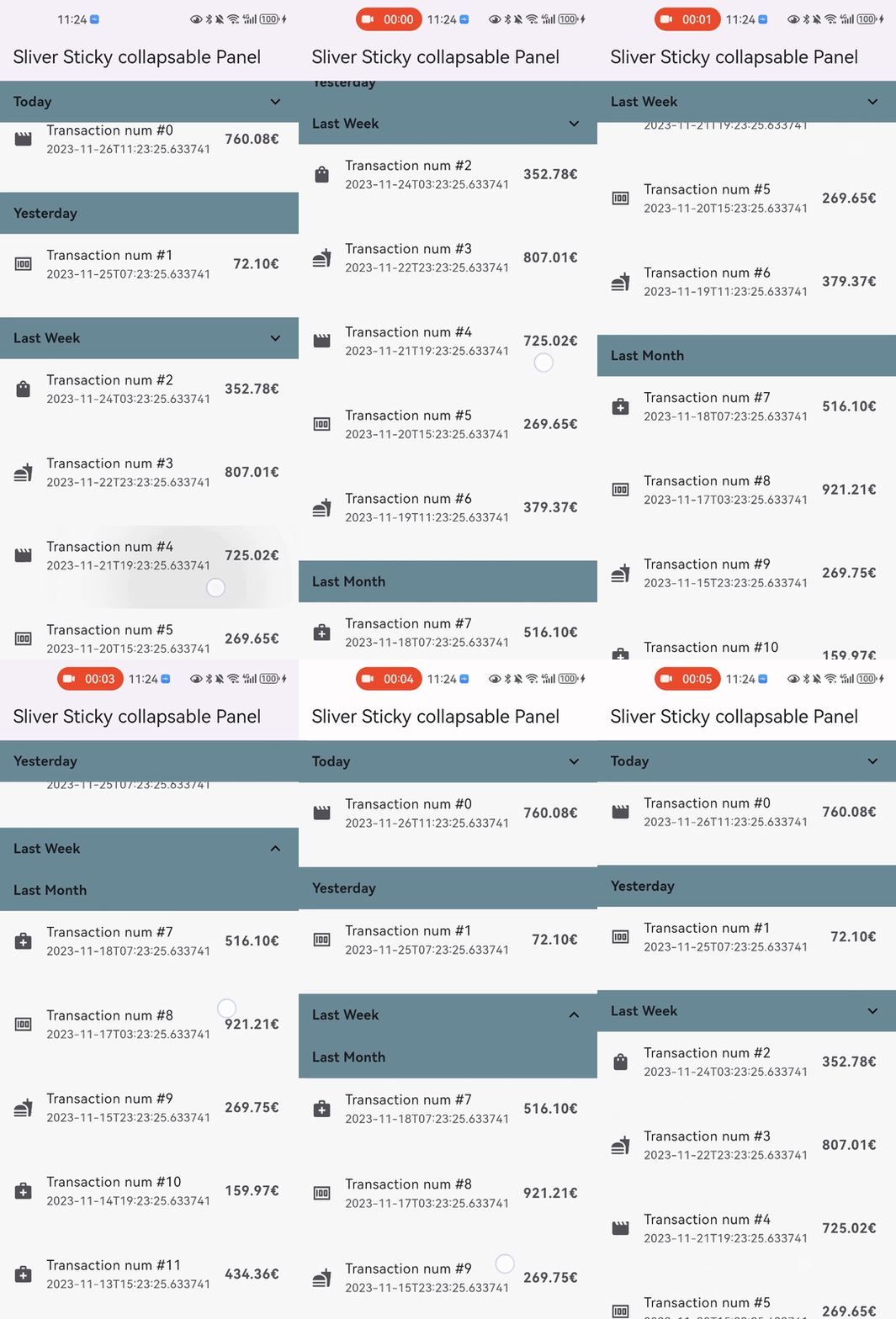
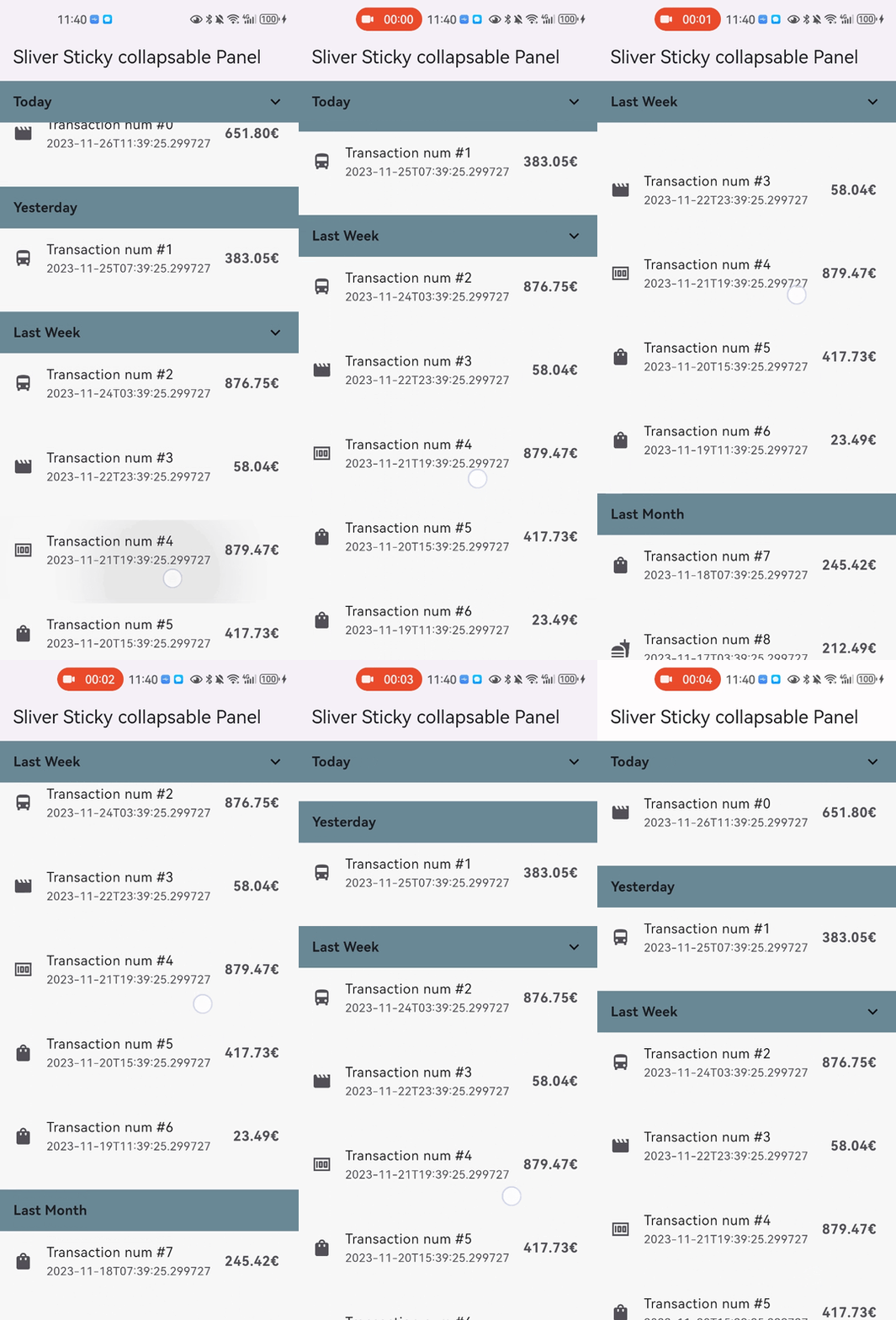
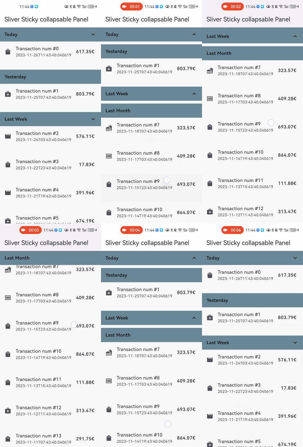
스크롤 상태에 따라 동적으로 헤더를 재구성하는 스틱키하고 접을 수 있는 패널을 구현하는 슬리버 기반 위젯입니다. 패널이 확장되거나 축소될 때 업데이트되는 사용자 정의 박스 헤더를 포함하며, 패널 콘텐츠용 슬리버 자식을 수락합니다. 복잡한 목록에서 효율적인 스크롤링을 위해 설계되었으며, 여러 플랫폼에서 CustomScrollView 레이아웃에 원활하게 통합됩니다.
사용 사례
인터랙티브 헤더가 있는 스크롤 목록
스크롤 중 동적 헤더 상태
스티키 패널이 필요한 복잡한 UI
전개/접기 가능한 콘텐츠 섹션
사용자 정의 가능한 스크롤 기반 상호작용
주요 기능
스티키 패널 동작
스크롤 시 헤더 재구성
Sliver 호환 레이아웃
접을 수 있는 콘텐츠 섹션
플랫폼에 관계없는 구현
적합한 대상
스크롤 가능한 인터페이스를 개발하는 개발자
반응형 헤더가 필요한 앱
CustomScrollView 통합
크로스플랫폼 모바일 및 웹 앱
계층적 스크롤 가능한 콘텐츠를 가진 UI
고려 사항
CustomScrollView 내에서 통합이 필요합니다
은색 기반 레이아웃에 제한됨
헤더 로직은 맞춤 조정이 필요할 수 있습니다
성능은 자식의 복잡성에 따라 달라집니다
스크롤되지 않는 컨텍스트에는 적합하지 않습니다
원본 README
연결된 소스 저장소의 README 원문 스냅샷입니다. 최신 내용은 저장소에서 확인하세요.
sliver_sticky_collapsable_panel
A Sliver implementation of sticky collapsable panel, with a box header rebuild on status and a sliver child as panel content.
Snap Shot
Features
Relying solely on the Flutter framework itself, no any other dependencies.
Pure Dart implementation, running on any platform who supports Flutter.
Command style support for expand/collpase the panel.(it's still compatible with declarative style)
Accept one box child as header and one sliver child as panel content.
Header can overlap panel content (useful for sticky side header for example).
Notify and rebuild the header when status changed (scroll outside the viewport for example).
Support not sticky headers (with sticky: false parameter).
Support a controller which notifies the scroll offset of the current sticky header.
Support click the header to collapse the panel, or disable collapse (with disableCollapsable = true parameter in panelController).
Support iOS style sticky header, just like iOS's system contact app (with iOSStyleSticky = true parameter).
Support add padding for sliver child (with paddingBeforeCollapse parameter).
Support add padding after the header even the panel collapsed (with paddingAfterCollapse parameter).
Getting started
In the pubspec.yaml of your flutter project, add the following dependency:
You can add padding for sliver child (with paddingBeforeCollapse), even if the panel is collapsed, the padding still work between headers with paddingAfterCollapse.