패키지, 저장소 및 앱 카테고리 검색

stylish_bottom_bar 표지
패키지 상세v1.1.1

stylish_bottom_bar

Flutter용 애니메이션 바텀바 및 버블 바텀바와 같은 스타일리시한 바텀 네비게이션 바 모음.

AndroidiOSWebmacOSWindowsLinux
30일 다운로드
8.2천
좋아요
331
Pub 점수
150

패키지 설치

flutter pub add stylish_bottom_bar

패키지 개요

공개 정보를 바탕으로 생성한 선택 가이드입니다.

애니메이션 및 버블 스타일 디자인을 포함한 시각적으로 매력적인 하단 탐색 바를 제공하는 플러터 패키지입니다. 부드러운 전환과 현대적인 미학으로 사용자 인터페이스를 향상시켜 독특한 탐색 경험을 원하는 앱에 이상적입니다. 여러 플랫폼을 지원하며 기존 플러터 프로젝트에 쉽게 통합할 수 있습니다. 사용자 정의 옵션을 통해 개발자는 복잡한 코드 작성 없이도 매력적인 하단 바를 간편하게 구현할 수 있습니다. 모바일 및 웹 애플리케이션에서 세련되고 현대적인 외관을 추구하는 경우에 적합합니다.

사용 사례

  • 애니메이션 효과를 통한 앱 탐색 향상
  • 버블 스타일의 하단 바를 사용하여 고유한 UI 만들기
  • 시각적 피드백을 통한 사용자 참여도 향상
  • 크로스 플랫폼 앱을 위한 현대적인 인터페이스 설계
  • 하단 탐색에 동적 전환 추가
  • 최소 코드로 탐색 보기 맞춤 설정

주요 기능

  • 애니메이션 바텀바 전환
  • 버블 스타일 하단 탐색 디자인
  • 크로스 플랫폼 지원 (Android, iOS, Web, macOS, Windows, Linux)
  • Flutter 프로젝트와의 간편한 통합
  • 사용자 정의 가능한 색상 및 애니메이션
  • 경량이고 성능이 뛰어난 구현

적합한 대상

  • 현대적인 UI 컴포넌트를 찾는 플러터 개발자
  • 눈에 띄는 탐색이 필요한 앱
  • 디자인 중심의 모바일 및 웹 애플리케이션
  • 빠른 UI 향상을 원하는 개발자
  • 사용자 경험과 시각적 매력에 중점을 둔 프로젝트
  • 즉시 사용 가능한 스타일링된 네비게이션 바를 찾는 팀

고려 사항

  • 복잡한 테마에 대해 추가 스타일링이 필요할 수 있습니다
  • 제공된 애니메이션 유형 외에 제한된 사용자 정의
  • Flutter 버전 호환성에 따라 다릅니다
  • 중량 있는 애니메이션으로 인한 성능 영향 가능성
  • 미니멀리즘 디자인 선호에 적합하지 않습니다
  • 고급 수정을 위해서는 Flutter의 위젯 시스템에 대한 이해가 필요합니다

원본 README

연결된 소스 저장소의 README 원문 스냅샷입니다. 최신 내용은 저장소에서 확인하세요.

Hello stylish_bottom_bar Version

A collection of stylish bottom navigation bars like animated bottom bar and bubble bottom bar for flutter.

Table of contents

⭐ Installing

dependencies:
    stylish_bottom_bar: ^1.2.0-beta

⚡ Import

import 'package:stylish_bottom_bar/stylish_bottom_bar.dart';

📙 How To Use

items:
option:
backgroundColor:
elevation:
currentIndex:
iconSize:
padding:
inkEffect:
inkColor:
onTap:
opacity:
borderRadius:
fabLocation:
hasNotch:
barAnimation:
barStyle:
unselectedIconColor:
bubbleFillStyle:
iconStyle:
selectedIcon:
dotStyle:

Properties

items → List<BottomBarItem>
option → AnimatedBarOptions
option → BubbleBarOptions
option → DotBarOptions
option → BarBlurOptions
backgroundColor → Color
elevation → double
currentIndex → int
iconSize → double
padding → EdgeInsets
inkEffect → bool
inkColor → Color
onTap → Function(int)
opacity → double
borderRadius → BorderRadius
fabLocation → StylishBarFabLocation
hasNotch → bool
barAnimation → BarAnimation
barStyle → BubbleBarStyle
unselectedIconColor → Color
bubbleFillStyle → BubbleFillStyle
iconStyle → IconStyle
dotStyle → DotStyle
BarStyle
BubbleBarStyle.vertical
BubbleBarStyle.horizotnal
BubbleFillStyle
BubbleFillStyle.fill
BubbleFillStyle.outlined
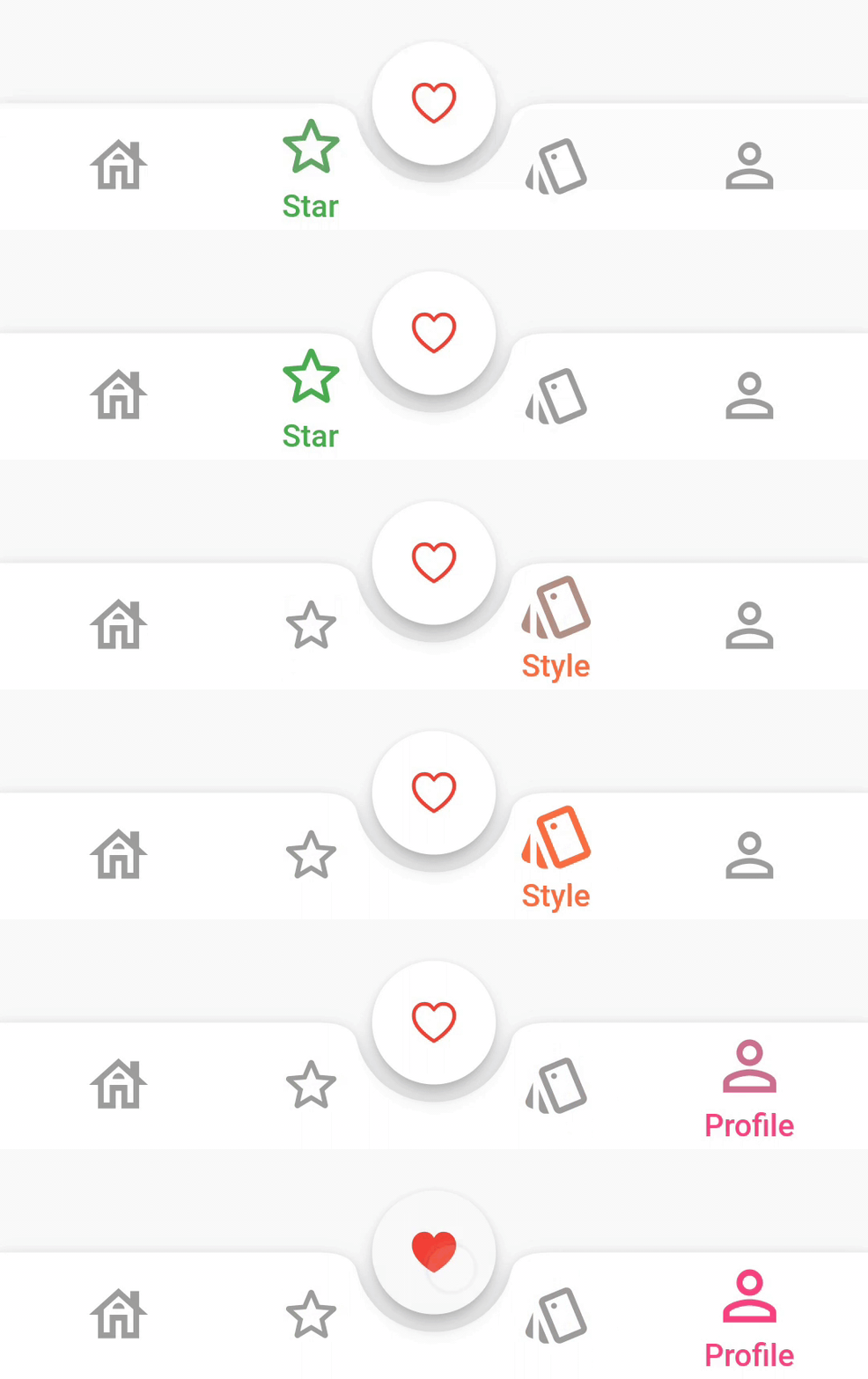
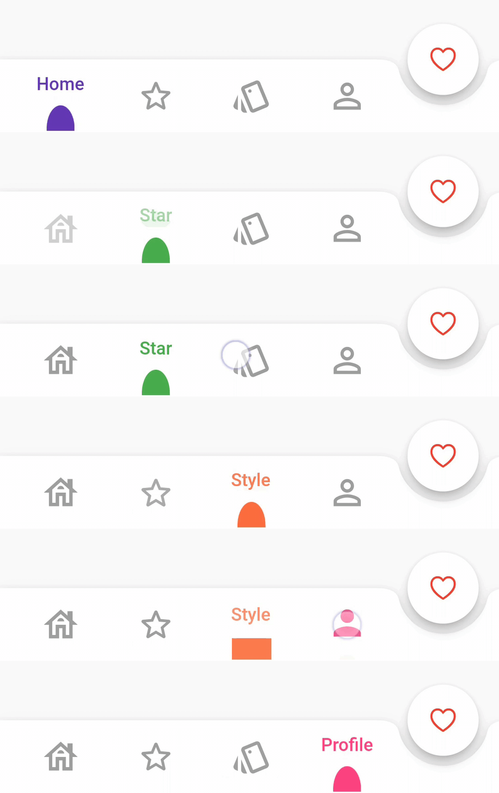
FabLocation
StylishBarFabLocation.center
StylishBarFabLocation.end
BarAnimation
BarAnimation.fade
BarAnimation.blink
BarAnimation.transform3D
BarAnimation.liquid
BarAnimation.drop
IconStyle
IconStyle.Default
IconStyle.simple
IconStyle.animated
DotStyle
DotStyle.circle
DotStyle.tile
NotchStyle
NotchStyle.circle
NotchStyle.square
NotchStyle.themeDefault
Event
onTap: (index){
    
}

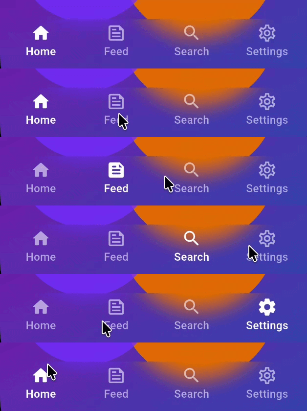
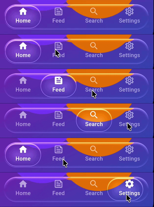
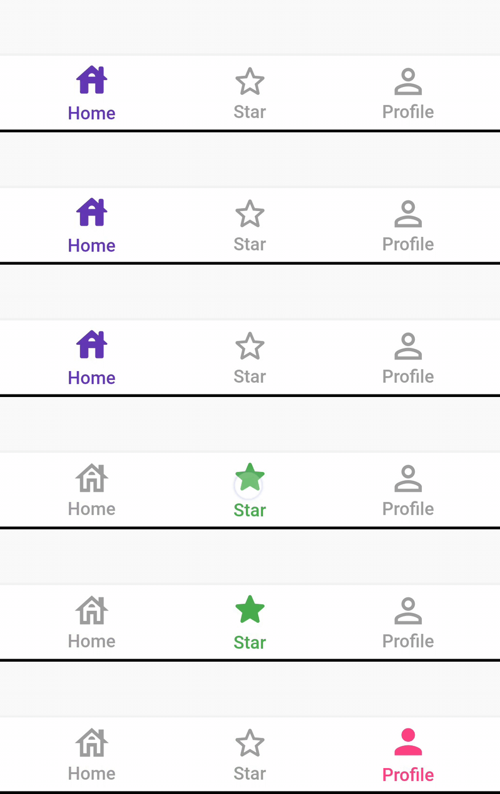
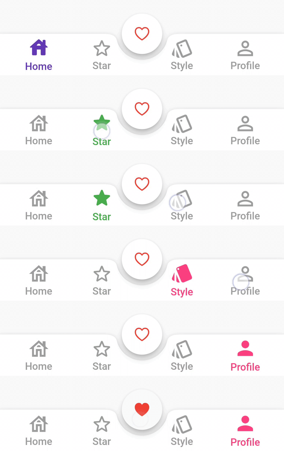
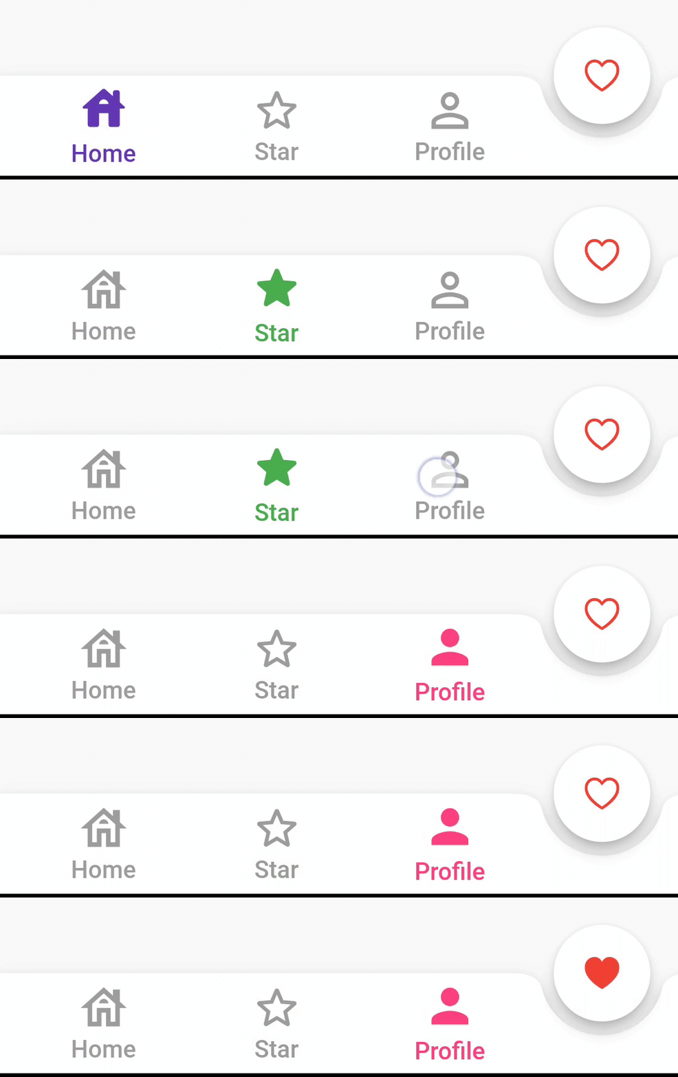
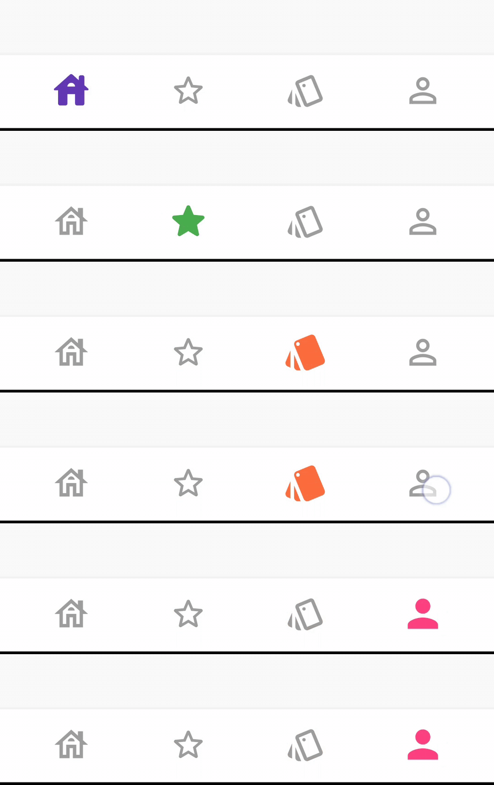
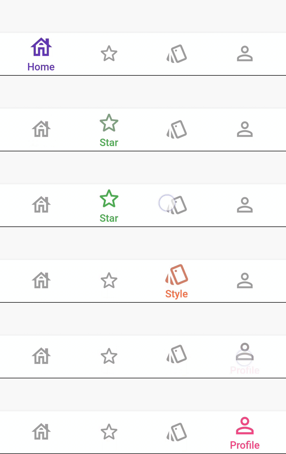
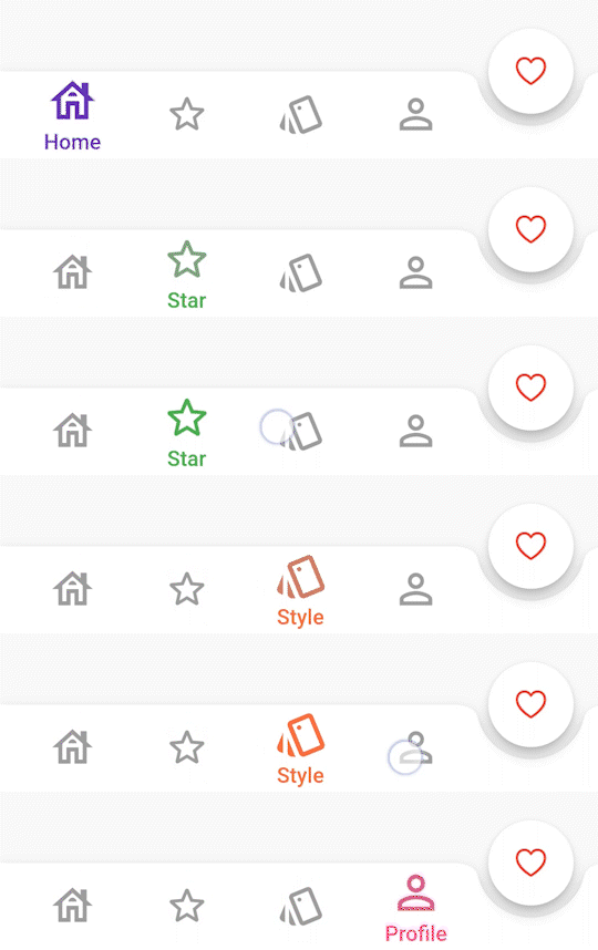
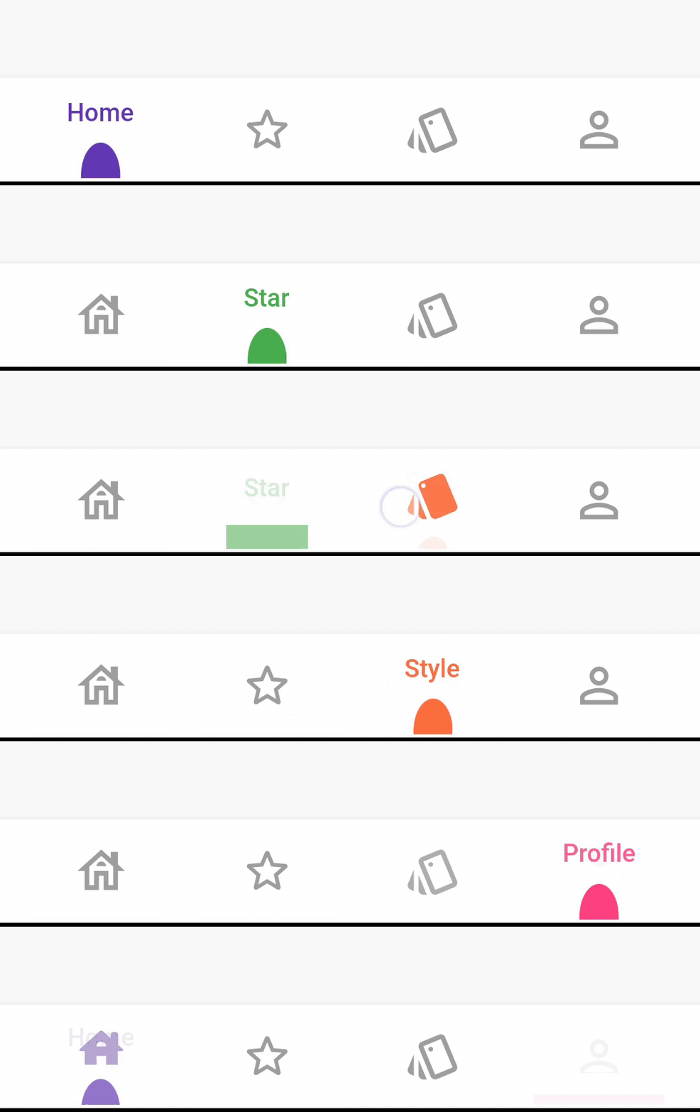
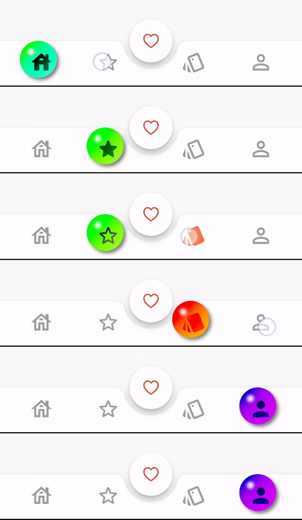
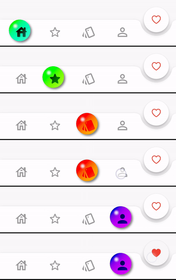
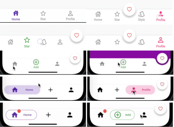
Showcase

BarBlurOptions

BarBlurOptions.frosted()


BarBlurOptions.liquidGlass()

AnimatedBarOptions

IconStyle.Default


IconStyle.simple


IconStyle.animated


BarAnimation.fade


BarAnimation.blink


BarAnimation.liquid


BarAnimation.drop


DotBarOptions

DotStyle.circle


DotStyle.tile

BubbleBarOptions

BubbleBarStyle.horizotnal

BubbleFillStyle.outlined

BubbleBarStyle.vertical

BubbleFillStyle.outlined

Migrate to 1.0.0

List<dynamic> items is changed to List<BottomBarItem> items

From version 1.0.0 option: AnimatedBarOptions and BubbleBarOptions will be used to change the bar items type and properties.

Example

StylishBottomBar(
//  option: const BarBlurOptions.liquidGlass(),
//
//  option: const BarBlurOptions.frosted(),
//
//  option: AnimatedBarOptions(
//    iconSize: 32,
//    barAnimation: BarAnimation.liquid,
//    iconStyle: IconStyle.animated,
//    opacity: 0.3,
//  ),
//
//  option: BubbleBarOptions(
//    barStyle: BubbleBarStyle.horizotnal,
//    // barStyle: BubbleBarStyle.vertical,
//    bubbleFillStyle: BubbleFillStyle.fill,
//    // bubbleFillStyle: BubbleFillStyle.outlined,
//    opacity: 0.3,
//  ),
//
  option: DotBarOptions(
    dotStyle: DotStyle.tile,
    gradient: const LinearGradient(
      colors: [
        Colors.deepPurple,
        Colors.pink,
      ],
      begin: Alignment.topLeft,
      end: Alignment.bottomRight,
    ),
  ),
  items: [
    BottomBarItem(
      icon: const Icon(Icons.abc),
      title: const Text('Abc'),
      backgroundColor: Colors.red,
      selectedIcon: const Icon(Icons.read_more),
    ),
    BottomBarItem(
      icon: const Icon(Icons.safety_divider),
      title: const Text('Safety'),
      backgroundColor: Colors.orange,
    ),
    BottomBarItem(
      icon: const Icon(Icons.cabin),
      title: const Text('Cabin'),
      backgroundColor: Colors.purple,
    ),
  ],
  fabLocation: StylishBarFabLocation.end,
  hasNotch: true,
  currentIndex: selected,
  onTap: (index) {
    setState(() {
      selected = index;
      controller.jumpToPage(index);
    });
  },
)

Contributions and pull requests are welcome! We value your input and appreciate any improvements or suggestions you can provide. Feel free to submit a pull request with your changes. Don't forget to star the repository if you find it useful. Thank you for your collaboration!

카테고리

소스 저장소

이 패키지를 사용하는 프로젝트