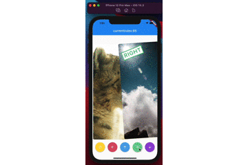
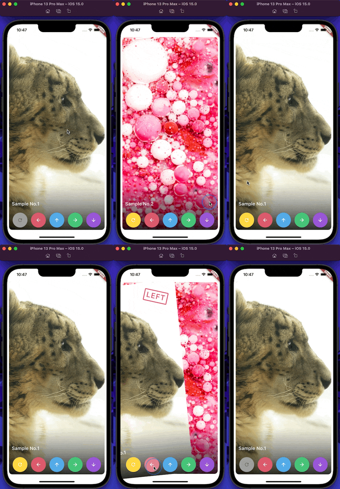
Tinder를 영감으로 삼아 수평 및 수직 스와이프 애니메이션을 부드럽게 구현하는 인터랙티브 카드 스택을 만드는 플러터 위젯입니다. 사용자는 직관적인 제스처로 카드를 왼쪽 또는 오른쪽(또는 위/아래)으로 스와이프하고 우아한 전환 효과를 경험할 수 있습니다. 데이트 앱, 제품 쇼케이스, 콘텐츠 탐색 기능 등 스와이프 기반 인터페이스가 필요한 앱에 적합합니다. 이 패키지는 Android, iOS, 웹, macOS, Windows, Linux 등 여러 플랫폼을 지원하며 장치 간 일관된 동작을 보장합니다.
사용 사례
데이트 앱 인터페이스
제품 또는 항목 탐색
스와이프 제스처를 통한 콘텐츠 탐색
인터랙티브 온보딩 흐름
게임화된 사용자 참여
스와이프 기반 퀴즈
주요 기능
부드러운 수평 및 수직 스와이프
사용자 정의 가능한 애니메이션 곡선
피드백이 있는 제스처 인식
다중 플랫폼 지원
기존 UI와의 간편한 통합
사용자 정의 가능한 카드 정렬 및 간격
적합한 대상
스와이프 기반 UI를 구축하는 개발자
상호작용 카드 경험을 원하는 디자이너
제스처 기반 탐색이 필요한 앱
크로스플랫폼 모바일 및 웹 애플리케이션
인터랙티브 레이아웃 프로토타이핑
고려 사항
큰 카드 스택에 대한 성능 튜닝이 필요할 수 있습니다
복잡한 애니메이션에 대한 내장 사용자 정의 기능이 제한적
빠른 스와이프 중에는 상태를 신중하게 다뤄야 합니다
매우 높은 주파수의 스와이프 상호작용에 최적화되지 않음
반응성을 유지하기 위해 중간 수준의 카드 수에 가장 적합합니다
원본 README
연결된 소스 저장소의 README 원문 스냅샷입니다. 최신 내용은 저장소에서 확인하세요.
swipable_stack
A widget for stacking cards, which users can swipe horizontally and vertically with beautiful animations like Tinder UI.
(Sorry, the package name swipable_stack is typo of swipeable stack)
Usage
builder
A SwipableStack uses a builder to display widgets.
You can set the clipBehaviour of the stack with the stackClipBehaviour.
Change it to Clip.none to exceed the boundaries of parent widget size.
SwipableStack(
  stackClipBehaviour: Clip.none,
)
The default is Clip.hardEdge.
allowVerticalSwipe
Disable vertical swipe with allowVerticalSwipe.
Changing to false disable vertical swipe capabilities
SwipableStack(
  allowVerticalSwipe: false,
)
The default is true.
swipeTopAnchor
Set the swipe anchor with swipeAnchor with the following enum
SwipeAnchor.top : card rotation on bottom and anchored on top
SwipeAnchor.bottom : card rotation on top and anchored on bottom