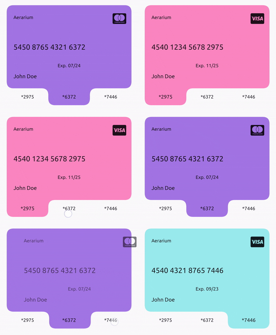
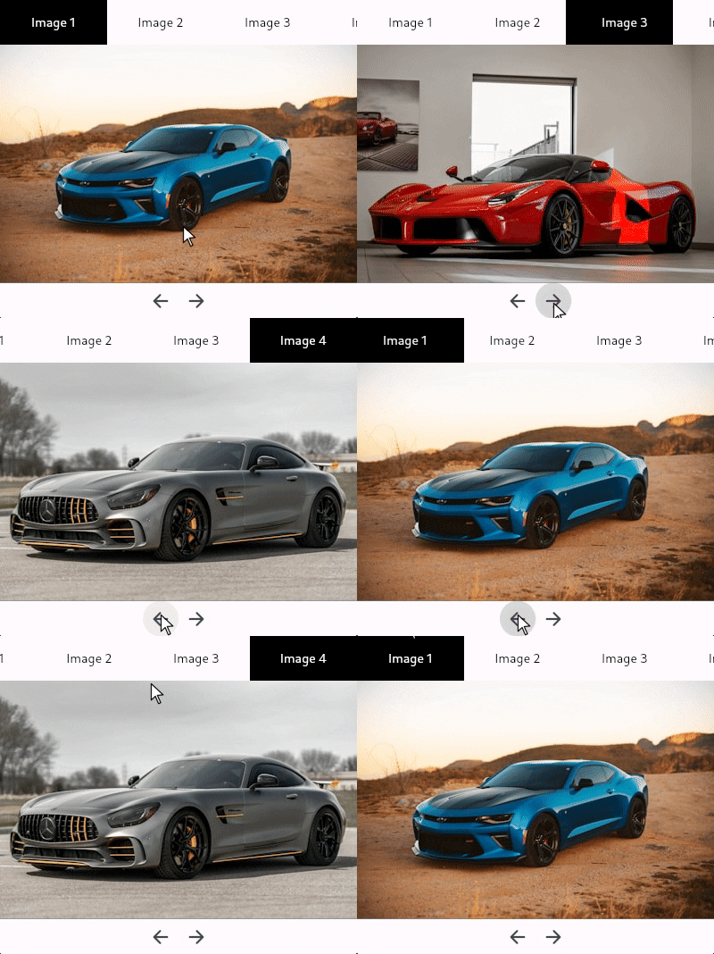
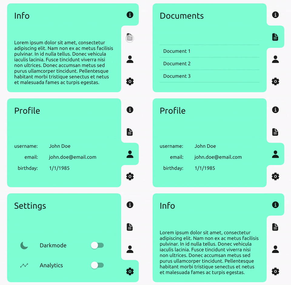
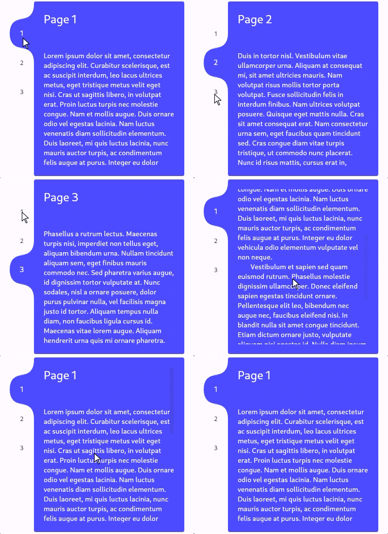
TabContainer는 Flutter용 사용자 정의 가능한 탭 뷰 및 카루셀 위젯으로, 탭 간을 부드럽게 전환하는 애니메이션 인디케이터를 갖추고 있습니다. TabController를 통해 수동으로 탭을 전환하거나 자식 기반 직접 탐색을 지원합니다. 사용자는 탭 위치(상단, 하단, 왼쪽, 오른쪽)를 맞춤설정하고 색상을 적용하며 앱 디자인에 맞게 시각 스타일을 조정할 수 있습니다. 여러 콘텐츠 섹션을 포함한 동적이고 상호작용적인 인터페이스를 만들기에 적합합니다.
사용 사례
스와이프 가능한 탭 인터페이스 만들기
사용자 지정 탭 캐러셀 만들기
애니메이션 탭 인디케이터 구현
여러 뷰를 사용하여 반응형 레이아웃 설계하기
양식 또는 대시보드에 상호작용형 탐색 추가
주요 기능
애니메이션 탭 인디케이터
TabController 지원
사용자 정의 가능한 탭 위치
색상 사용자 지정
유연한 자식 조합
크로스 플랫폼 호환성
적합한 대상
탭 기반 UI를 구축하는 개발자
애니메이션 전환을 필요로 하는 디자이너
반응형 탭 레이아웃을 필요로 하는 앱
다중 보기 탐색이 있는 프로젝트
Android, iOS, Web, macOS, Windows 및 Linux를 대상으로 하는 Flutter 앱
고려 사항
고급 사용을 위해서는 TabController에 대한 이해가 필요합니다
복잡한 테마를 위해 추가 스타일링이 필요할 수 있습니다
대량의 탭으로 인한 성능 영향
제한된 내장 접근성 기능
매우 긴 탭 목록에 최적화되지 않음
원본 README
연결된 소스 저장소의 README 원문 스냅샷입니다. 최신 내용은 저장소에서 확인하세요.
Tab view/carousel widget with a beautifully animated indicator and simple usage.
Just pass in a list of children and a list of tabs and it will handle the rest, or you can customise
by using a TabController, changing the tab side, adding color(s), and much more.
TabContainer intentionally has no built-in focus implementation. Create your own or,
to add one that maps arrow keys to the index, you can wrap your TabContainer with TabContainerFocus:
By default, TabContainer will no longer impose any additional semantic information onto the tabs or children.
It will just describe its own semantics configuration using onIncrease and onDecrease to change the tab index.
You can completely override this by supplying your own SemanticsConfiguration in the semanticsConfiguration: property.
If you want to prevent accessibility tools from getting stuck in your tab bar, you can wrap each tab in ExcludeSemantics or,
if you do want them to be accessed, you can wrap each one similarly to below:
classTabContainerextendsStatefulWidget{
constTabContainer({
super.key,
this.duration = constDuration(milliseconds: 300),
this.curve = Curves.easeInOut,
this.controller,
this.children,
this.child,
requiredthis.tabs,
this.childPadding = EdgeInsets.zero,
this.borderRadius = constBorderRadius.all(Radius.circular(12.0)),
this.tabBorderRadius = constBorderRadius.all(Radius.circular(12.0)),
this.tabExtent = 50.0,
this.tabEdge = TabEdge.top,
this.tabsStart = 0.0,
this.tabsEnd = 1.0,
this.tabMinLength = 0.0,
this.tabMaxLength = double.infinity,
this.color,
this.colors,
this.transitionBuilder,
this.semanticsConfiguration,
this.overrideTextProperties = false,
this.selectedTextStyle,
this.unselectedTextStyle,
this.textDirection,
this.enabled = true,
this.enableFeedback = true,
this.childDuration,
this.childCurve,
}) : assert((children == null) != (child == null)),
assert((children != null) ? children.length == tabs.length : true),
assert(controller == null ? true : controller.length == tabs.length),
assert(!(color != null && colors != null)),
assert((colors ?? tabs).length == tabs.length),
assert(tabExtent >= 0),
assert(0.0 <= tabsStart && tabsStart < tabsEnd && tabsEnd <= 1.0),
assert(tabMinLength >= 0),
assert(tabMaxLength >= tabMinLength),
assert((selectedTextStyle == null) == (unselectedTextStyle == null));
/// Changes tab selection from elsewhere in your app.////// If you provide one, you must dispose of it.finalTabController? controller;
/// The list of children you want to tab through, in order.////// Must be equal in length to [tabs] and [colors] (if provided)./// Must be null if [child] is supplied.finalList<Widget>? children;
/// Supply this if you want to control the child view yourself using [TabController].////// Must be equal in length to [tabs] and [colors] (if provided)./// Must be null if [children] is supplied;finalWidget? child;
/// What will be displayed in each tab, in order.////// Must be equal in length to [children] and [colors] (if provided).finalList<Widget> tabs;
/// Sets the border radius surrounding the children////// Defaults to [BorderRadius.all(Radius.circular(12.0))]finalBorderRadius borderRadius;
/// Sets the border radius surrounding each tab////// Defaults to [BorderRadius.all(Radius.circular(12.0))]finalBorderRadius tabBorderRadius;
/// Sets the padding to be applied around all [children].////// Defaults to [EdgeInsets.zero].finalEdgeInsets childPadding;
/// Height of the tabs perpendicular to the [TabEdge].////// If the [tabs] are on the left/right then this will be the their visual width, otherwise it will be their visual height./// Defaults to 50.0.finaldouble tabExtent;
/// Determines which side the [tabs] will be on.////// Defaults to [TabEdge.top].finalTabEdge tabEdge;
/// Fraction of the way down the [TabEdge] that the first tab should begin.////// Defaults to 0.0.finaldouble tabsStart;
/// Fraction of the way down the [TabEdge] that the last tab should end.////// Defaults to 1.0.finaldouble tabsEnd;
/// Minimum width of each tab parallel to the [TabEdge].////// Defaults to 0.0finaldouble tabMinLength;
/// Maximum width of each tab parallel to the [TabEdge].////// Defaults to [double.infinity].finaldouble tabMaxLength;
/// The background color of this widget.////// Must not be set if [colors] is provided.finalColor? color;
/// The list of colors used for each tab, in order.////// The first color in the list will be the background color when tab 1 is selected and so on./// Must not be set if [color] is provided.finalList<Color>? colors;
/// Duration used by [controller] to animate tab changes.////// Defaults to Duration(milliseconds: 300).finalDuration duration;
/// Curve used by [controller] to animate tab changes.////// Defaults to Curves.easeInOut.finalCurve curve;
/// Duration of the child transition animation when the tab selection changes.////// Defaults to [duration]./// Not used if [child] is supplied.finalDuration? childDuration;
/// The curve of the child transition animation when the tab selection changes.////// Defaults to [curve]./// Not used if [child] is supplied.finalCurve? childCurve;
/// Sets the child transition animation when the tab selection changes.////// Defaults to [AnimatedSwitcher.defaultTransitionBuilder]./// Not used if [child] is supplied.finalWidgetFunction(Widget, Animation<double>)? transitionBuilder;
/// The [SemanticsConfiguration] for the [RenderObject] of [TabContainer] itself, not its children or tabs./// You can completely control the accessibility behaviour by supplying this and wrapping your child and tabs in their own semantics.////// If non-null, this will be used instead of the default implementation.finalSemanticsConfiguration? semanticsConfiguration;
/// Set to true if each [Text] tabs given properties should be used instead of the implicitly animated ones.////// Defaults to false.finalbool overrideTextProperties;
/// The [TextStyle] applied to the text of the currently selected tab.////// Must specify values for the same properties as [unselectedTextStyle]./// Defaults to Theme.of(context).textTheme.bodyMedium.finalTextStyle? selectedTextStyle;
/// The [TextStyle] applied to the text of currently unselected tabs.////// Must specify values for the same properties as [selectedTextStyle]./// Defaults to Theme.of(context).textTheme.bodyMedium.finalTextStyle? unselectedTextStyle;
/// The [TextDirection] for tabs and semantics.////// Defaults to Directionality.of(context).finalTextDirection? textDirection;
/// Whether tab selection changes on tap.////// Defaults to true.finalbool enabled;
/// Whether detected gestures on tabs should provide acoustic and/or haptic feedback.////// Defaults to true.finalbool enableFeedback;
}