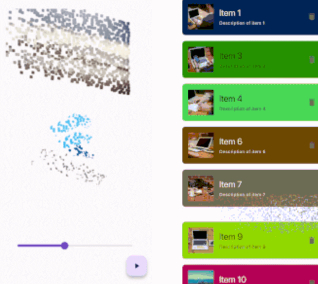
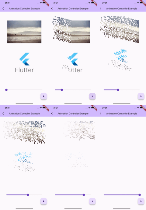
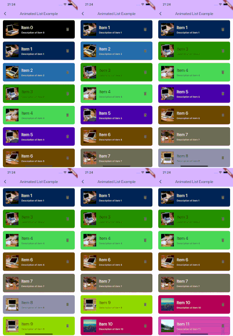
The thanos_snap_effect 패키지는 Flutter 앱에 고성능이고 사용자 정의 가능한 '탄노스 스냅' 애니메이션을 제공합니다. 개발자가 안드로이드, iOS, 웹, 맥OS, 윈도우, 리눅스 등 여러 플랫폼에서 아이콘적인 스냅 효과(요소가 드라마틱하게 사라지는 효과)를 쉽게 구현할 수 있도록 도와줍니다. 부드러운 전환과 광범위한 사용자 정의 옵션을 통해 게임, 인터랙티브 UI 또는 재미있는 앱 기능에서 사용자 참여도를 높입니다. 이 패키지는 가볍고 잘 문서화되어 있으며, 유연성을 희생하지 않고도 간단함을 목표로 설계되었습니다.
사용 사례
게임 UI 효과
인터랙티브 앱 애니메이션
재미있는 사용자 인터페이스
디지털 스토리텔링
앱 온보딩 시퀀스
주요 기능
고성능 렌더링
크로스 플랫폼 지원
사용자 지정 가능한 애니메이션 속도
사용자 정의 가능한 페이드 및 스케일 효과
기존 위젯과의 간편한 통합
다양한 화면 크기 지원
적합한 대상
재미있는 애니메이션을 찾는 플러터 개발자
어린 연령층을 대상으로 하는 앱
게임화 애플리케이션
동적 효과를 탐구하는 UI/UX 디자이너
고려 사항
미니멀리즘 디자인 스타일에 적합하지 않을 수 있습니다
최적의 UX를 위해 신중한 타이밍이 필요합니다
접근성에 중요한 인터페이스에는 적합하지 않음
저사양 기기에서는 성능이 다를 수 있습니다
원본 README
연결된 소스 저장소의 README 원문 스냅샷입니다. 최신 내용은 저장소에서 확인하세요.
High-performance, high-customizable, and easy-to-use "Thanos Snap" effect for Flutter.
Getting started
IMPORTANT: This package uses the custom fragment shader, so you should include the shader file in your pubspec.yaml file.
This package provides a 'Snappable' widget.
The principle of using this widget is similar to "Transition" widgets, like "FadeTransition", "ScaleTransition", etc.
Just wrap your widget with the Snappable widget and pass the AnimationController (or any Animation descendant) object to the "animation" property.
Then just start the animation and see the magic!
Snappable(
  animation: animationController, // AnimationController object, or any other animation object with double tween from 0.0 to 1.0
  child: MyWidget(), // Your widget that you want to animate
);
You can customize the effect by passing the "outerPadding" or "style" properties to the Snappable widget.
Snappable(
animation: _animationController,
child: MyWidget(),
outerPadding: constEdgeInsets.all(40.0), // The padding around the widget where particles can appear. Default value is EdgeInsets.all(40.0)
style: SnappableStyle(
particleLifetime: 0.6, // Lifetime of particle before it disappears. Default value is 0.6. Must be between 0.0 and 1.0
fadeOutDuration: 0.3, // Duration of fade out animation of particle. Fade out effect starts in particleLifetime - fadeOutDuration and ends when particleLifetime ends. Default value is 0.3. Must be between 0.0 and particleLifetime
particleSpeed: 1.0, // Speed of particles. Default value is 1.0
particleSize: constSnappableParticleSize.squareFromRelativeWidth(0.01), // Size of 1 particle
),
);
Mastering the particleSize property
There are 2 ways to define the size of particles:
Relative to the size of the widget
SnappableParticleSize.relative(width: 0.01, height: 0.02) // 1% of the width and 2% of the height of the widgetSnappableParticleSize.squareFromRelativeWidth(0.01) // 1% of the width of the widget. The height will be calculated to keep the square shapeSnappableParticleSize.squareFromRelativeHeight(0.01) // 1% of the height of the widget. The width will be calculated to keep the square shape
Absolute size (in dp)
SnappableParticleSize.absoluteDp(width: 16, height: 8) // 16dp width and 8dp height