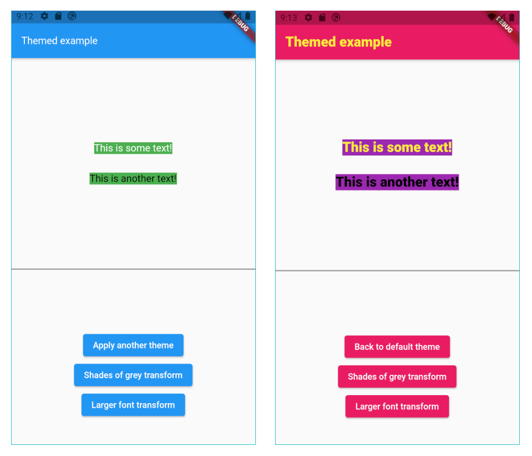
테마 패키지는 개발자가 const 값으로 테마를 정의할 수 있게 해주며, 앱 간에 UI 외관을 유연하게 관리할 수 있는 방법을 제공합니다. 불변 상수를 사용하고 있지만, Dart의 기능을 활용하여 런타임 시 동적으로 테마를 변경할 수 있습니다. 이는 밝은 모드와 어두운 모드 간의 부드러운 전환 또는 사용자 지정 테마 변형이 필요한 애플리케이션에 이상적이며, 성능이나 타입 안전성을 희생하지 않습니다. 패키지는 가볍고 Flutter 프로젝트에 원활하게 통합됩니다.
사용 사례
다이나믹 테마 전환
라이트 모드 및 다크 모드 지원
사용자 지정 테마 변형
런타임 테마 업데이트
다양한 플랫폼 간의 UI 일관성
대규모 앱에서의 테마 관리
주요 기능
상수 기반 테마 정의
런타임 테마 수정
최소한의 보일러플레이트
크로스 플랫폼 호환성
유형 안전한 테마 처리
효율적인 재렌더링
적합한 대상
테마가 필요한 플러터 앱
간단한 테마 관리를 원하는 개발자
다크 모드를 지원하는 앱
성능을 우선시하는 프로젝트
일관된 테마를 원하는 팀
다중 플랫폼을 대상으로 하는 앱
고려 사항
기본 테마 속성에만 제한됨
Dart의 const 의미를 이해해야 합니다
내장된 테마 지속성 없음
복잡한 테마 계층 구조에 적합하지 않습니다
테마 상태 수동 처리
외부 상태 관리에 의존함
원본 README
연결된 소스 저장소의 README 원문 스냅샷입니다. 최신 내용은 저장소에서 확인하세요.
Sponsor
themed
The Themed package:
Lets you define a theme with const values, but change them dynamically anyway.
ChangeColors widget to change the brightness, saturation and hue of widgets or images.
Color extension methods like decolorize, addOpacity, removeOpacity,
darker, lighter, average and more.
Static methods ColorUtil.rgbaToArgb and ColorUtil.abgrToArgb.
TextStyle extension methods: var myStyle = TextStyle(fontSize: 15) + Colors.blue and
more.
Const values that you can change
As we all know, using const variables is the easiest way to create and use themes:
The Themed package is a competitor to writing Theme.of(context).xxx in your build
methods, but it’s NOT a competitor to Flutter’s native theme system and the Theme
widget. It’s there to solve a different problem, and it’s usually used together with
the Theme widget. For example, if you want to set a global default color for all
buttons, you’ll use the Theme widget. You may use it together with the Themed
package however, meaning that Themed colors and styles may be used inside
a ThemeData widget:
Each theme should be a Map<ThemeRef, Object>, where the keys are your ColorRef
and TextStyleRef const values, and the values are the colors and styles you want to
use on that theme. For example:
At any point in your app you can just change the current theme by doing:
// Setting a theme:Themed.currentTheme = theme1;
// Setting another theme:Themed.currentTheme = theme2;
// Removing the current theme (and falling back to the default theme):Themed.clearCurrentTheme();
// This would also remove the current theme:Themed.currentTheme = null;
Resetting
Calling the static method Themed.reset() will remove the entire widget tree inside
the Themed widget for one frame, and then restore it, rebuilding everything. This can
be helpful when some widgets are not responding to theme changes. Usage of this method
is not usually necessary. A side effect is that the all stateful widgets below Themed
will be recreated, and you'll need to have mechanisms to recover their state, like for
example having the state come from above Themed widget, or using a proper state
management solution.
The lighter method makes the color lighter (more white). Example:
// 20% more white.Colors.blue.lighter(0.2);
The darker method makes the color darker (more black). Example:
// 20% more black.Colors.blue.darker(0.2);
The average method makes the current color more similar to the given color. Example:
// 50% blue and 50% red.Colors.blue.average(Colors.red);
// 20% blue and 80% red.Colors.blue.average(Colors.red, 0.8);
The decolorize method makes the current color more grey. Example:
// Grey, with luminance similar to the original blue.Colors.blue.decolorize();
// Blue with 20% less color.Colors.blue.decolorize(0.2);
The addOpacity method makes the current color more transparent than it already is, by
the given amount. The removeOpacity method makes the current color less transparent than
it already is, by the given amount. This is different from the withOpacity method,
as you can see below.
// 50% transparent blue.Colors.blue.addOpacity(0.5);
// 80% transparent black.Colors.transparent.removeOpacity(0.2);
// Also 50% transparent blue.Colors.withOpacity(0.5);
// 75% transparent blue, because we add 50% and then more 50%.Colors.blue.addOpacity(0.5).addOpacity(0.5);
// This is 50% transparent blue, because the opacity is replaced, not added.Colors.withOpacity(0.5).withOpacity(0.5);
There are also two static methods for advanced color representation conversion:
The ColorUtil.rgbaToArgb method converts the RGBA color representation to ARGB.
The ColorUtil.abgrToArgb method converts the ABGR color representation to ARGB.
TextStyle transform
You can also create a style transformation. For example, this will make your fonts
larger:
staticTextStylelargerText(TextStyle textStyle) =>
textStyle.copyWith(fontSize: textStyle.fontSize! * 1.5);
// Turn it on:Themed.transformTextStyle = largerText;
// Then, later, turn it off:Themed.clearTransformTextStyle();
TextStyle extension
With the provided extension, you can make your code more clean-code by creating new text
styles by adding colors and other values to a TextStyle. For example:
const myStyle = TextStyle(...);
// Using some style:Text('Hello', style: myStyle);
// Making text black:Text('Hello', style: myStyle + Colors.black);
// Changing some other stuff:Text('Hello', style: myStyle + FontWeight.w900 + FontSize(20.0) + TextHeight(1.2));
Beware not to define the same constant
Please remember Dart constants point to the same memory space.
In this example, colorA, colorB and colorC represent the same variable:
If you later change the color of colorA, you are also automatically changing the color
of colorB and colorB.
If you want to create 3 independent colors, and be able to change them independently, you
have to create different constants. You can provide an id string, just to
differentiate them. For example:
The defaultTheme and currentTheme are both optional. They are simply theme maps, as
explained below.
When a color/style is used, it will first search it inside the currentTheme.
If it's not found there, it searches inside of defaultTheme.
If it's still not found there, it uses the default color/style which was defined in the
constructor. For example, here the default color is white: ColorRef(Colors.white).
Please note: If you define all your colors in the defaultTheme, then you don't need to
provide default values in the constructor. You can then use the fromId constructor:
You can save themes with keys, and then later use the keys to set the theme. The keys can
be anything (Strings, enums etc.):
// Save some themes using keys.enumKeys {light, dark};
Themed.save(key: Keys.light, theme: { ... })
Themed.save(key: Keys.dark, theme: { ... })
// Then set the theme.Themed.setThemeByKey(Keys.light);
It also works the other way around:
If you use the key first, and only save a theme with that key later:
// Set the theme with a key, even before saving the theme.Themed.setThemeByKey(Keys.light);
// The theme will change as soon as you save a theme with that key.Themed.save(key: Keys.light, theme: { ... })
Note: You can also use the methods saveAll to save many themes by key at the same time,
and clearSavedThemeByKey to remove saved themes.
Important: When I say "save" above, I mean it's saved in memory, not in the device disk.
Copyright
This package is copyrighted and brought to you
by
Parkside Technologies, a company which is simplifying global access to US stocks.
This package is published here with permission.
Please, see the license page for more information.