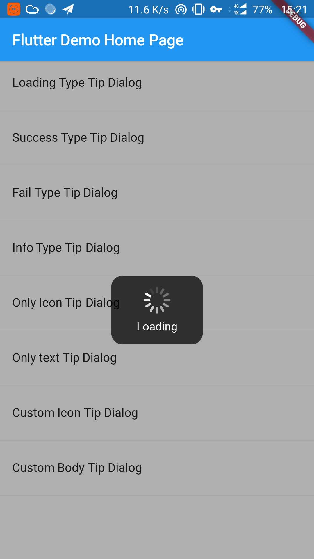
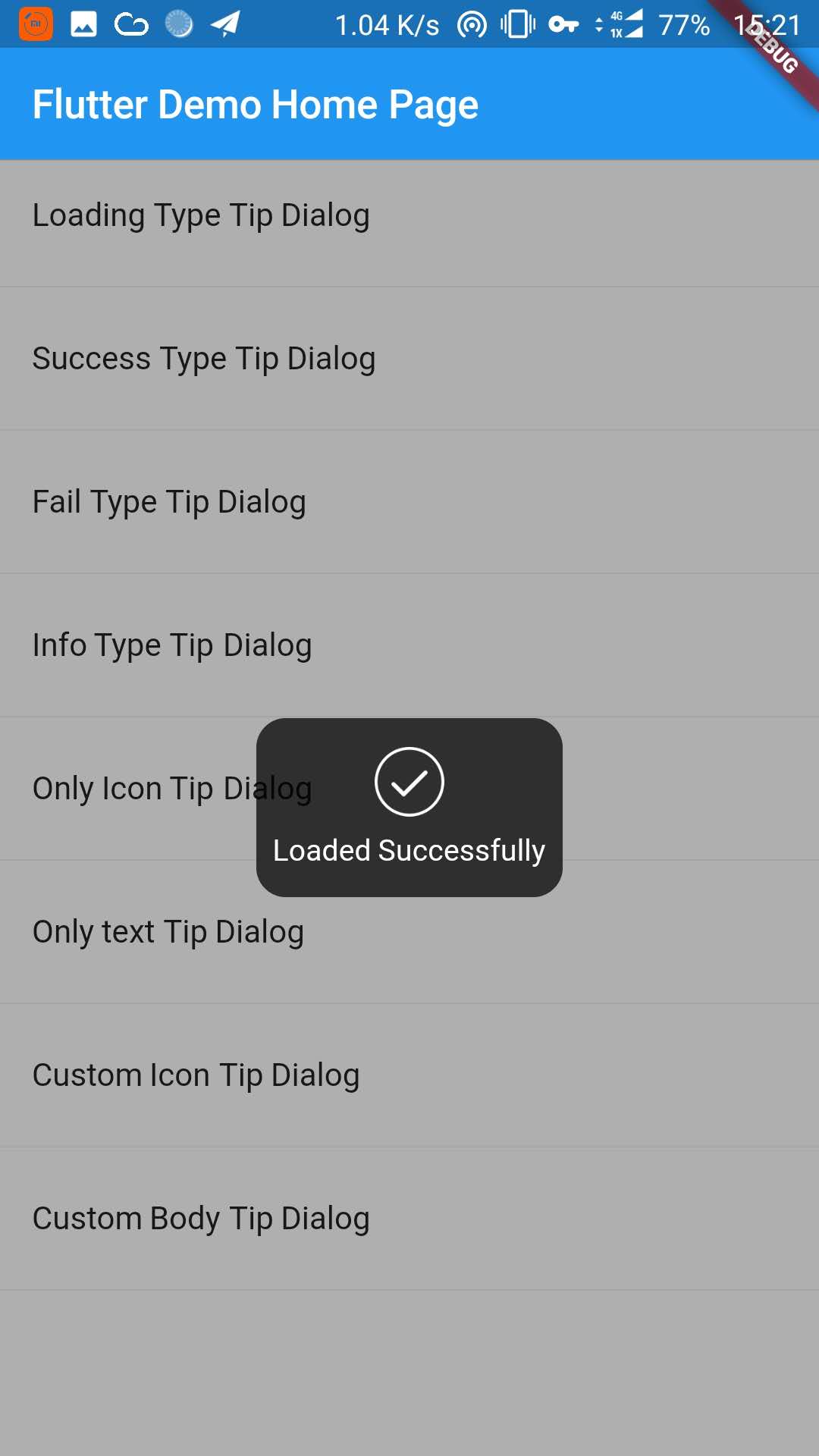
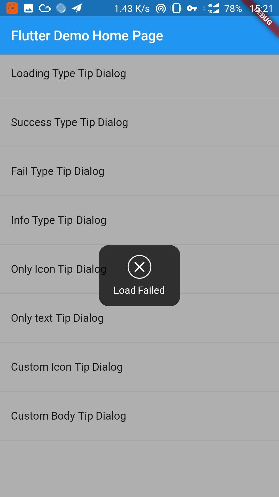
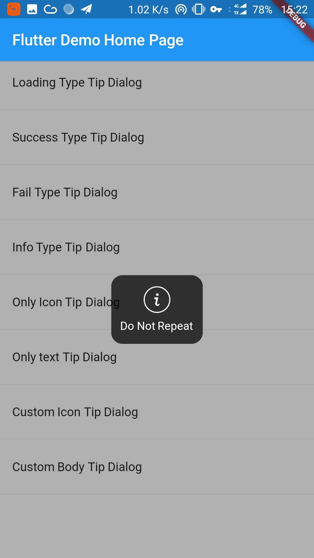
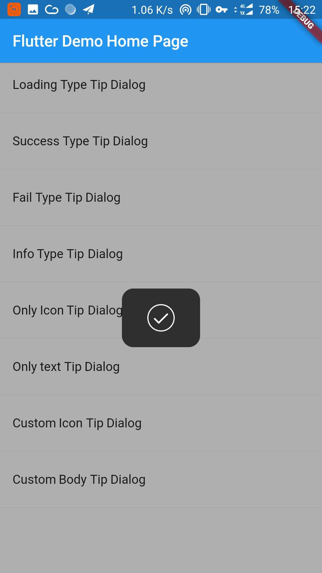
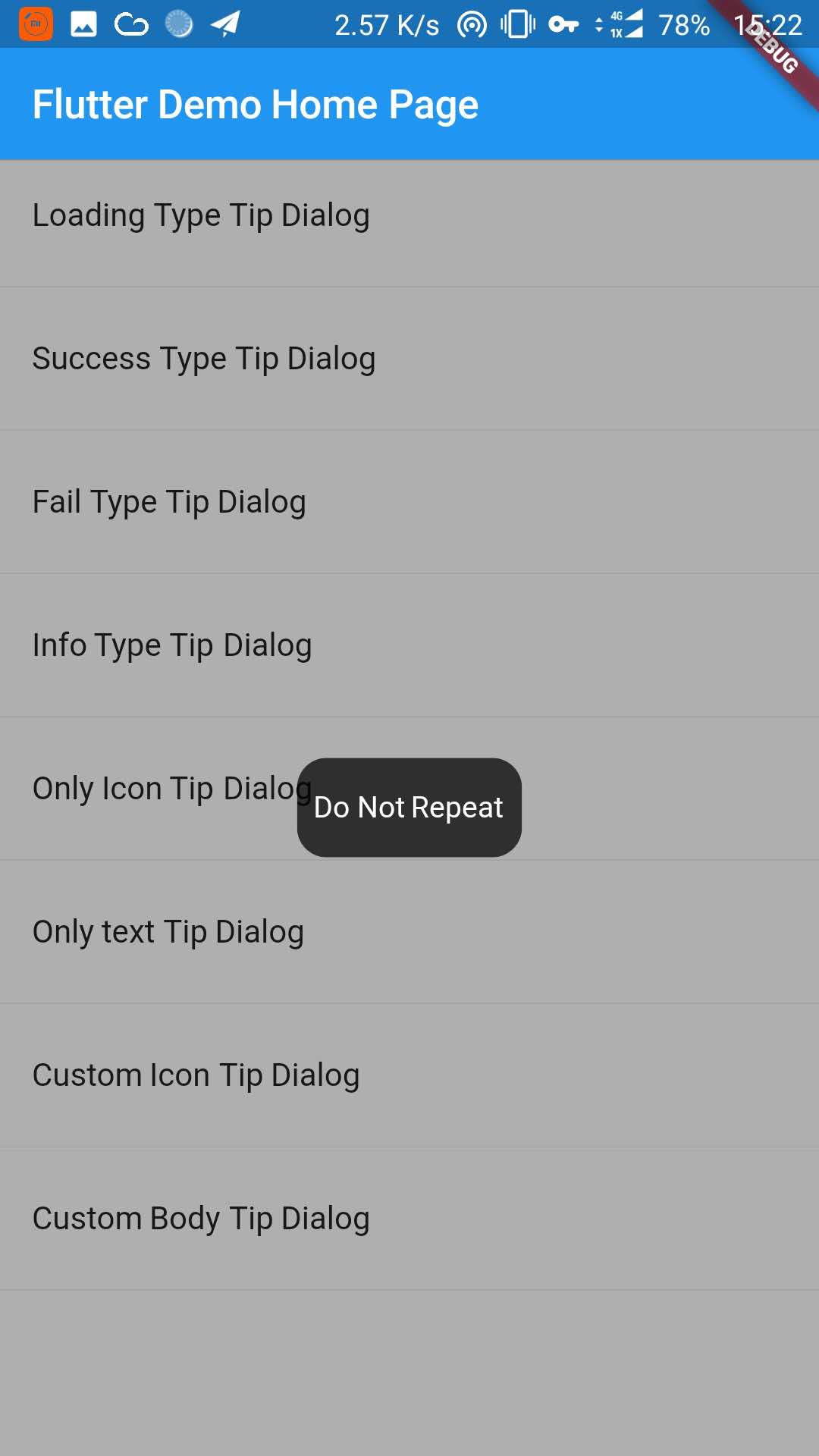
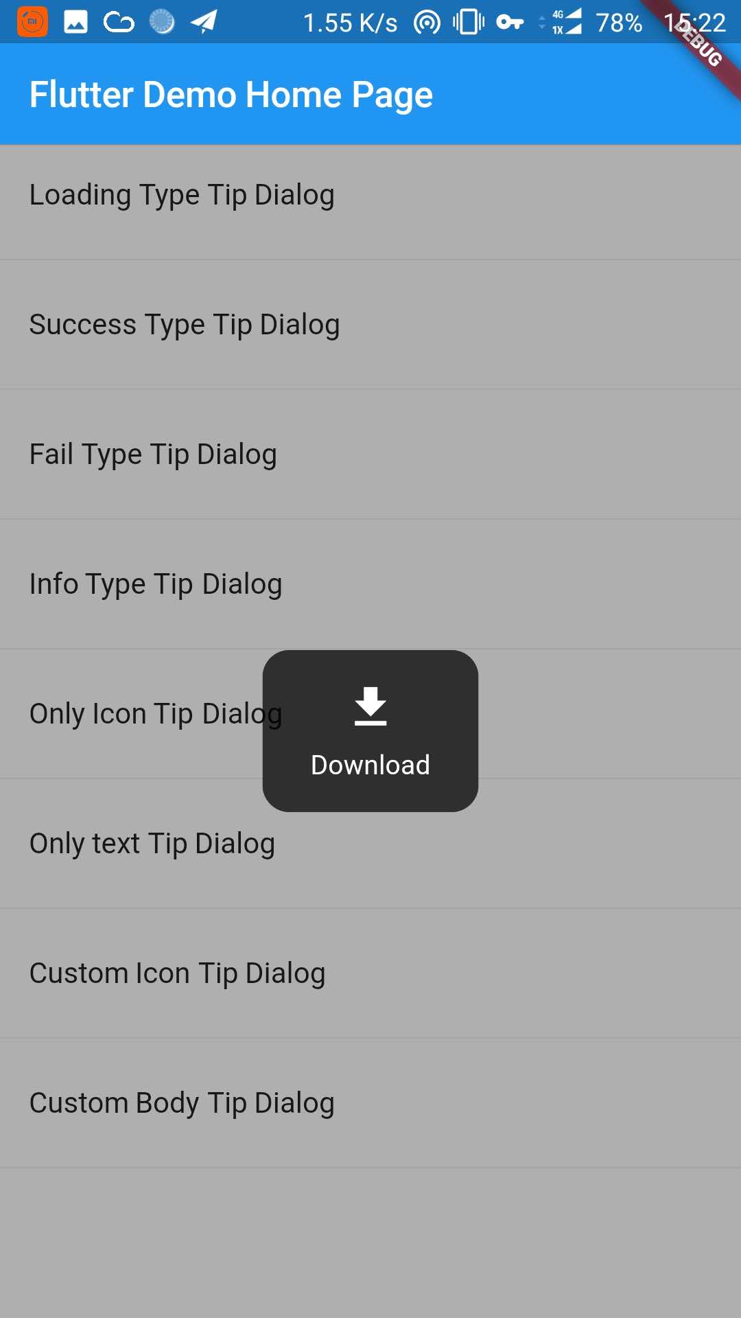
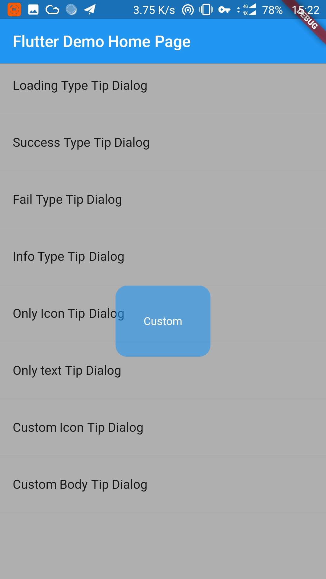
사용자에게 짧은 메시지나 알림을 표시하기 위한 사용자 정의 가능한 팝업 대화 상자를 제공하는 플러터 패키지입니다. 간단하고 통합이 용이하도록 설계되었으며, 안드로이드, 아이오스, 웹, 맥OS, 윈도우즈, 리눅스 등 여러 플랫폼을 지원합니다. 깔끔하고 현대적인 스타일로 유용한 팁, 상태 업데이트 또는 경고를 표시하는 데 사용할 수 있습니다. 가볍고 최소한의 비침습적 피드백 메커니즘을 필요로 하는 애플리케이션에 적합합니다. 이 패키지는 inrush.cn에서 유지 관리되며 pub.dev를 통해 이용 가능합니다.
사용 사례
사용자 안내 팁 표시
임시 상태 메시지 표시
온보딩 힌트 제공
사용자에게 작업 알림
UI 피드백 향상
주요 기능
크로스 플랫폼 지원
사용자 정의 가능한 외관
간단한 API
경량 설계
Flutter 앱과의 간편한 통합
사용자 정의 가능한 지속 시간 및 애니메이션
적합한 대상
모바일 및 웹 애플리케이션
온보딩 흐름
사용자 교육 기능
미니멀리스트 UI 디자인
빠른 피드백 시스템
고려 사항
기본 대화 기능에 제한됨
내장된 로컬라이제이션 없음
닫기 로직을 수동으로 처리해야 합니다
복잡한 양식이나 모달에 적합하지 않습니다
단기적이고 비중요한 메시지에 최적
원본 README
연결된 소스 저장소의 README 원문 스냅샷입니다. 최신 내용은 저장소에서 확인하세요.
TipDialog
Please use 3.0.0 or above version, because earlier versions have serious performance issues
You can install packages from the command line:
with Flutter:
$ flutter packages get
3. Import it
Now in your Dart code, you can use:
import'package:tip_dialog/tip_dialog.dart';
4. Use
Available attributes
/// [TipDialogContainer]@requiredthis.child,
/// automatically disappear timethis.duration: constDuration(seconds: 3),
/// mask layer alphathis.maskAlpha: 0.3// outside touchable, default false// if true and onOutsideTouch not set, when use TipDialogHelper.loading(), you can touch mask layer to dismiss// if true and onOutsideTouch set, when touching the mask layer, onOutsideTouch will be called.this.outsideTouchable: false// outside touch callback {@link OutsideTouchCallback}this.onOutsideTouch
Global Use
/// Use [TipDialogContainer] globally/// This widget can be globally supportedvoidmain() => runApp(newMyApp());
classMyAppextendsStatelessWidget{
@overrideWidgetbuild(BuildContext context) {
returnnewMaterialApp(
title: 'TipDialog Demo',
theme: newThemeData(),
home: Stack(
children: <Widget>[
MyHomePage(title: 'TipDialog Demo Home Page'),
// add [TipDialogContainer] widget hereTipDialogContainer(duration: constDuration(seconds: 2))
],
),
);
}
}
/// use TipDialogHelper to show or dismiss tipWidgetbuild(BuildContext context) {
returnnewScaffold(
appBar: newAppBar(
title: newText(widget.title),
elevation: 0.5,
),
body: newListView(children: <Widget>[
_buildItem("Loading Type Tip Dialog", () async {
TipDialogHelper.loading("Loading");
awaitnewFuture.delayed(newDuration(seconds: 5));
TipDialogHelper.dismiss();
}),
newDivider(),
_buildItem("Success Type Tip Dialog", () async {
TipDialogHelper.success("Loaded Successfully");
}),
newDivider(),
_buildItem("Only text Tip Dialog", () async {
TipDialogHelper.show(newTipDialog(
type: TipDialogType.NOTHING,
tip: "Do Not Repeat",
));
}),
newDivider(),
_buildItem("Custom Icon Tip Dialog", () async {
TipDialogHelper.show(newTipDialog.customIcon(
icon: newIcon(
Icons.file_download,
color: Colors.white,
size: 30.0,
textDirection: TextDirection.ltr,
),
tip: "Download",
));
}),
newDivider(),
_buildItem("Custom Body Tip Dialog", () async {
TipDialogHelper.show(newTipDialog.builder(
bodyBuilder: (context) {
returnnewContainer(
width: 120.0,
height: 90.0,
alignment: Alignment.center,
child: newText(
"Custom",
style: newTextStyle(color: Colors.white),
/// if TipDialogContainer are outside of MaterialApp,/// here is a must to set
textDirection: TextDirection.ltr,
),
);
},
color: Colors.blue.withAlpha(150),
));
}),
newDivider(),
]));
}
Use a custom widget when using [TipDialogContainer] globally, there may be appear some unexpected errors.
such as Text or Icon, will appear similar to the following error.
No Directionality widget found.
Just set TextDirection just fine. See the custom Widget in the example for details.
5. Default Dialog Type
enumTipDialogType { NOTHING, LOADING, SUCCESS, FAIL, INFO }
NOTHING:noiconLOADING:havealoadingiconSUCCESS:haveasuccessiconFAIL:haveafailiconINFO:haveainfoiconCUSTOM:customtipdialogtype,justasign,donothing
6. TipDialogHelper Method
/// tipDialog: Need to display the widget////// isAutoDismiss: decide whether to disappear automatically, default is true/// if true, the dialog will not automatically disappear/// otherwise, the dialog will automatically disappear after the [Duration] set by [TipDialogContainer]voidshow(Widget tipDialog, {bool isAutoDismiss: true});
/// dismiss dialogvoiddismiss();
/// show info dialogvoidinfo(String tip);
/// show fail dialogvoidfail(String errMsg);
/// show success dialogvoidsuccess(String success);
/// show loading dialogvoidloading(String loadingTip);
See the example directory for more details.
7. Change log
[4.0.0]
migrating to null safety
[3.1.0]
add outside touchable features
[3.0.0]
fix performance issues
easier way to call
[2.1.0]
add TipDialogHelper and deprecated TipDialogConnector