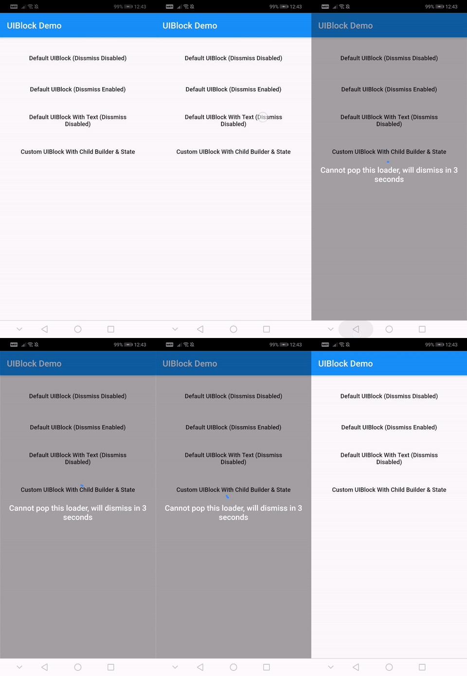
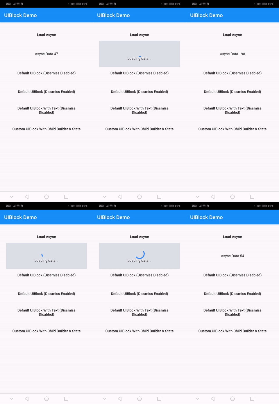
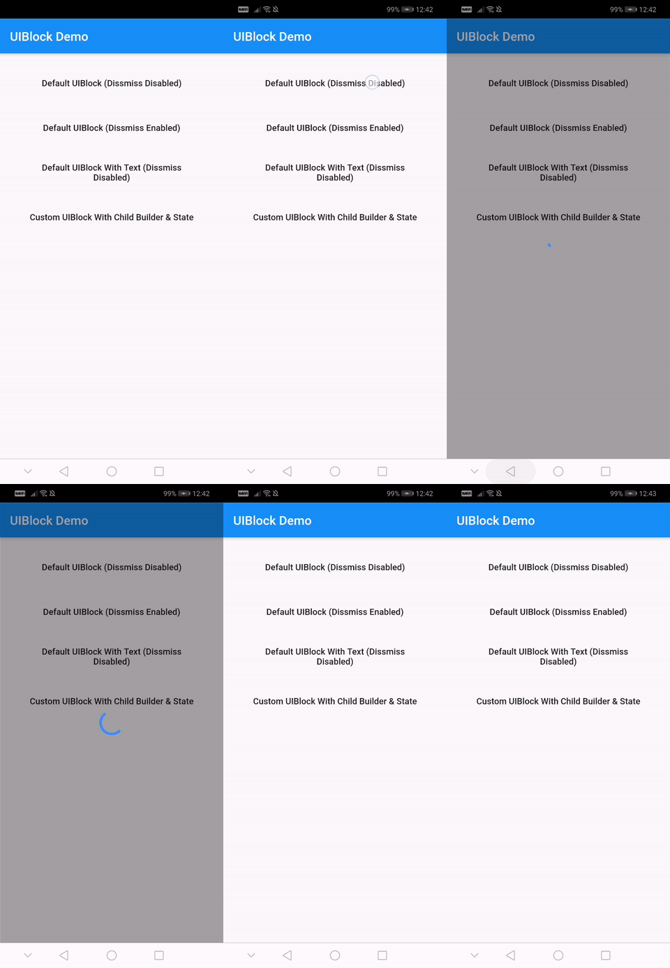
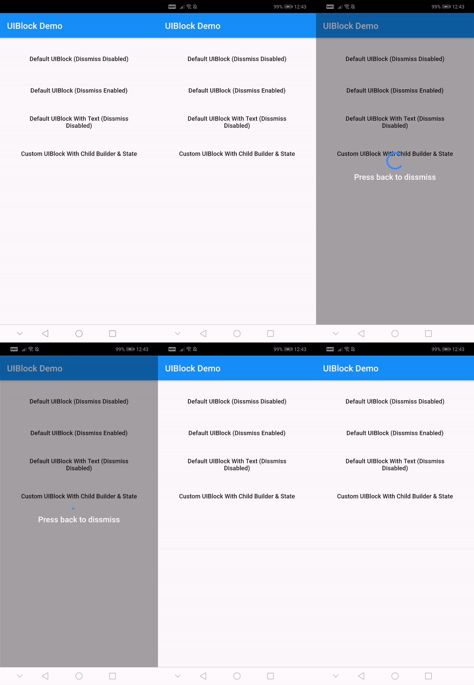
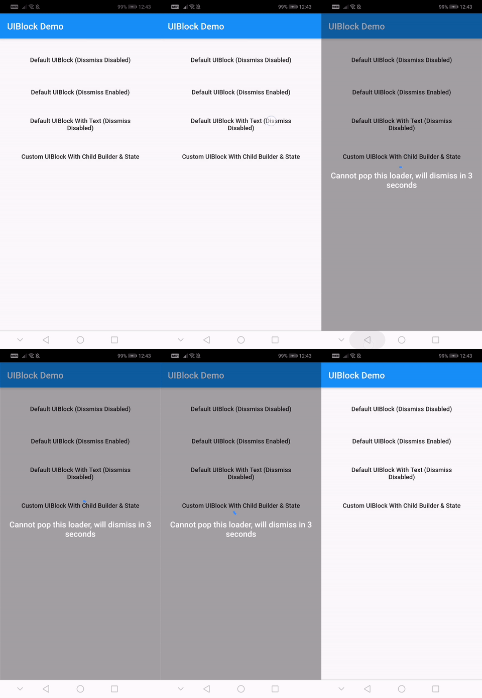
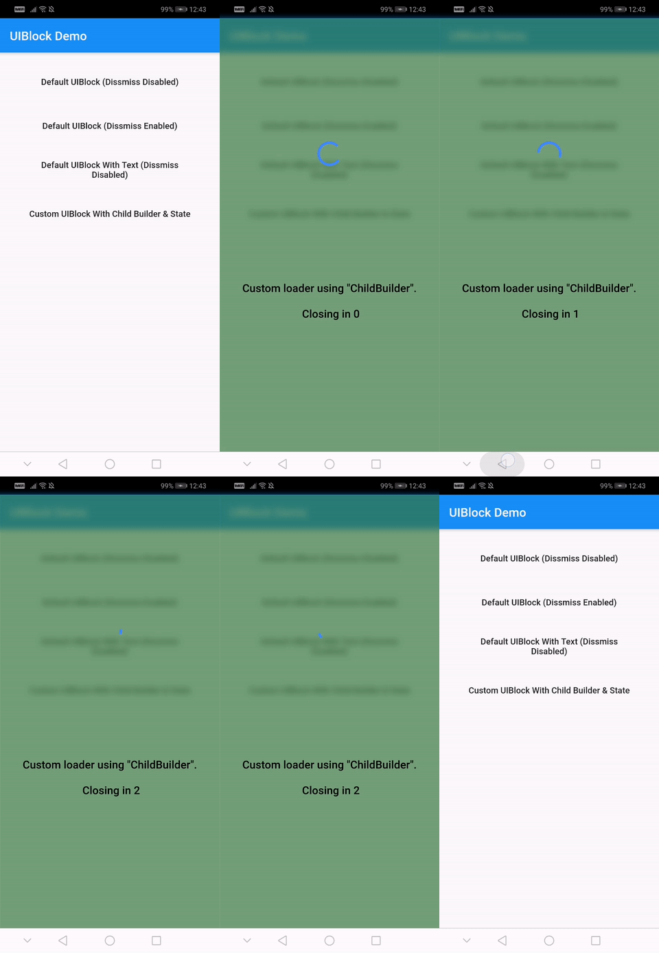
앱에서 UI 차단 요소를 구현하기 위한 완전히 사용자 정의가 가능하고 사용하기 쉬운 플러터 패키지입니다. 비동기 작업 중 사용자가 알림을 받을 수 있도록 로딩 인디케이터, 프로그레스 바 또는 사용자 지정 위젯으로 콘텐츠를 오버레이하는 간단한 방법을 제공합니다. 데이터 로드 또는 처리 중 상호작용을 방지하는 데 이상적이며, Android, iOS, Web, macOS, Windows, Linux 등 모든 주요 플랫폼을 지원합니다. 가볍고 기존 플러터 프로젝트에 원활하게 통합될 수 있도록 설계되었습니다.
사용 사례
데이터 로딩 중에 UI 차단
사용자 정의 로딩 오버레이 표시
비동기 작업 중 사용자 상호작용 방지
시각적 피드백을 통한 사용자 경험 향상
새로 고침 표시기 구현
모달 로딩 화면 만들기
주요 기능
완전히 사용자 정의 가능한 외관
빠른 통합을 위한 간단한 API
모든 플러터 플랫폼을 지원합니다
사용자 정의 오버레이를 위한 확장 가능
경량이며 성능이 뛰어남
내장된 로딩 및 진행률 표시기
적합한 대상
빠른 UI 차단 솔루션을 찾는 개발자
일관된 로딩 상태가 필요한 앱
사용자 경험 향상에 집중하는 팀
크로스 플랫폼 요구 사항이 있는 프로젝트
Flutter를 사용하는 프론트엔드 개발자
자주 비동기 작업을 수행하는 애플리케이션
고려 사항
복잡한 디자인을 위해 추가 스타일링이 필요할 수 있습니다
사용자 정의 오버레이에는 수동 구현이 필요합니다
제한된 내장 테마
고주기 업데이트에 최적화되지 않음
정확한 위젯 트리 구조에 의존합니다
적절한 상태 관리와 함께 사용하는 것이 가장 좋습니다
원본 README
연결된 소스 저장소의 README 원문 스냅샷입니다. 최신 내용은 저장소에서 확인하세요.
uiblock
Easiest and simplest method to block/unblock ui for your flutter apps.
One line of code to block/unblock ui and stop user from navigating during loading or processing in your flutter apps. You could use it as a widget or directly as a global service/util.
Fully customizable
Android and IOS
Easy and Simple
No other dependencies
Well documented
Production ready
Installation
With null-safety
      dependencies:
        uiblock: ^2.0.1
Without null-safety
      dependencies:
        uiblock: 1.2.0
Getting Started
Add the dependency to your project and start using uiblock everywhere:
Import the package.
import'package:uiblock/uiblock.dart';
To block ui
// defaultUIBlock.block(context);
//OR// if using globalKeyUIBlock.block(_scaffoldGlobalKey.currentContext);
To unblock ui
// call unblock after blockui to dissmissUIBlock.unblock(context);
//OR// if using globalKeyUIBlock.unblock(_scaffoldGlobalKey.currentContext);
// easily create custom block ui bodyUIBlock.block(
_scaffoldGlobalKey.currentContext,
backgroundColor: Colors.green.withOpacity(0.5),
imageFilter: ImageFilter.blur(sigmaX: 5.0, sigmaY: 5.0),
childBuilder: (BuildContext context) {
// return your widget here
},
);
// Don't forget to call unblock after block :)
Creating custom block modal transitions (only applicable on static UIBlock.block)
// NOTE : only for on UIBlock.block as this uses Modal Barrier// widget block is inline widget replacement with loader widgetUIBlock.block(
//...// more code
customBuildBlockModalTransitions:
(context, animation, secondaryAnimation, child) {
returnRotationTransition(
turns: animation,
child: child,
);
},
// ...
);
Using with data return
// NOTE : canDissmissOnBack is alaways truevar result = awaitUIBlock.blockWithData(
_scaffoldGlobalKey.currentContext,
loadingTextWidget: Padding(
padding: constEdgeInsets.all(8.0),
child: FlatButton(
onPressed: () {
// unblock and return dataUIBlock.unblockWithData(context, "hello world");
},
child: Text(
'Press here to dissmiss with data. Back for null',
textAlign: TextAlign.center,
style: TextStyle(
color: Colors.white,
fontSize: 18.0,
fontWeight: FontWeight.w600,
),
),
),
),
);
print(result);
For more details have a look at the other examples.
Properties
Property
Type
Default
Note
context (required)
BuildContext
-
childBuilder
Function
-
customLoaderChild
Widget
-
loadingTextWidget
Widget
-
imageFilter
ImageFilter
-
backgroundColor
Color
Transparent
canDissmissOnBack
bool
false
safeAreaLeft
bool
true
Set as 'false' to disable 'Left' Safe Area
safeAreaTop
bool
true
Set as 'false' to disable 'Top' (usually status bar) Safe Area
safeAreaRight
bool
true
Set as 'false' to disable 'Right' Safe Area
safeAreaBottom
bool
true
Set as 'false' to disable 'Bottom' Safe Area
safeAreaMinimumPadding
EdgeInsets
EdgeInsets.zero
safeAreaMaintainBottomViewPadding
bool
false
isSlideTransitionDefault
bool
true
Toggle between slide or fade transition
buildBlockModalTransitions
Function
-
Use this to create custom transition other than fade/slide
Widget Properties
Property
Type
Default
builder
Function
you implement it
loadingStateFromFuture
Future Function()
your future function (APIs,etc)
loaderBuilder
Function
-
customLoaderChild
Widget
-
loadingTextWidget
Widget
-
offset
offset
-
barrierOpacity
double
0.4
barrierColor
Color
black45
canDismiss
bool
false
hideBuilderOnNullData
bool
false
Improve
Help me by reporting bugs, submit new ideas for features or anything else that you want to share.