수평 및 수직 레이아웃을 모두 지원하는 유니버설 스테퍼 위젯을 제공하는 다재다능한 Flutter 패키지입니다. 모든 주요 플랫폼에서 양식, 온보딩 흐름 또는 다단계 프로세스를 위한 단계별 인터페이스를 간편하게 만들 수 있습니다. 사용자 정의가 가능하며 기존 Flutter 애플리케이션에 원활하게 통합됩니다. 유연성과 사용 편의성을 고려해 설계되어 최소한의 코드로 일관된 UI 패턴을 유지할 수 있도록 도와줍니다. 크로스플랫폼 호환성으로 Android, iOS, Web, macOS, Windows, Linux에서 동일한 동작을 보장합니다.
사용 사례
온보딩 워즈드
다단계 폼 탐색
결제 프로세스 설계
진행 상황 추적 인터페이스
설치 워즈드
주요 기능
수평 및 수직 방향을 지원합니다
크로스 플랫폼 호환성
사용자 지정 스타일
간단한 API 통합
재사용 가능한 단계 컴포넌트
적합한 대상
가이드된 워크플로를 구축하는 개발자
일관된 스텝퍼 UI가 필요한 팀
다중 단계 사용자 입력이 필요한 앱
재사용 가능한 컴포넌트로 디자인 시스템 설계하기
크로스플랫폼 애플리케이션
고려 사항
복잡한 테마에 맞추기 위해 추가적인 스타일링이 필요할 수 있습니다
제한된 내장 애니메이션 옵션
선형 단계 시퀀스에 가장 적합
매우 동적인 단계 로직에는 적합하지 않음
단계 제어에는 적절한 상태 관리에 의존합니다
원본 README
연결된 소스 저장소의 README 원문 스냅샷입니다. 최신 내용은 저장소에서 확인하세요.
A simple package to build steppers with custom elements. You can set up your own body content, badges, and paths using indexed builders.
Vertical Stepper
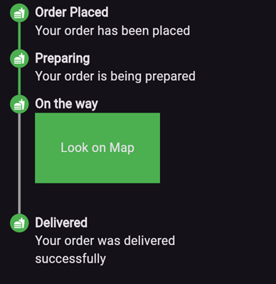
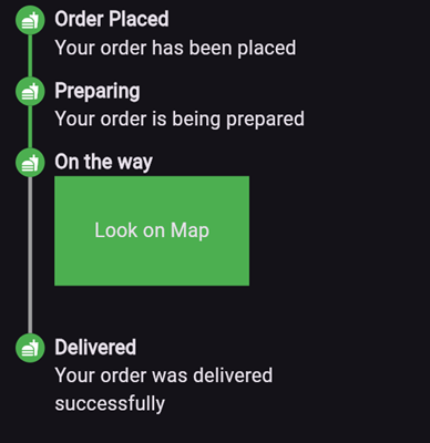
To create a vertical stepper, set stepperDirection to Axis.vertical.
Here’s an example of what the result might look like:
Parameters
elementBuilder: A builder for the content of the stepper.
badgeBuilder: A builder for the badge.
badgePosition: Determines the alignment of the badge. Options include StepperBadgePosition.start, StepperBadgePosition.center, or StepperBadgePosition.end.
pathBuilder: A builder for the main path (e.g., a line, dotted line, etc.). This is the most commonly used path.
subPathBuilder: A builder for the secondary path, used when badgePosition is set to StepperBadgePosition.center. This path is displayed under the badge and allows you to control its visibility based on the active step.
elementCount: The number of elements in the stepper.
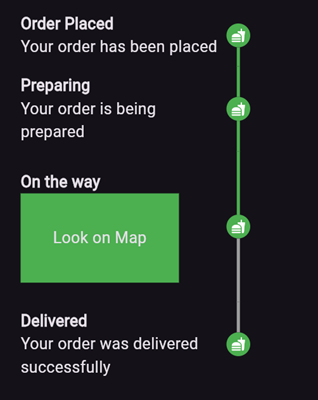
inverted: A flag to invert the position of the path and badge relative to the element. By default, this is false, and for vertical steppers, the path appears on the left. When set to true, the path appears on the right. For horizontal steppers, the path appears on the top and when set to true, the path appears on the bottom.
For example, if you set inverted to true and badgePosition to StepperBadgePosition.center, the result will look like this:
Horizontal Stepper
To create a horizontal stepper, set stepperDirection to Axis.horizontal.