
 v2.0.2
animated_rail
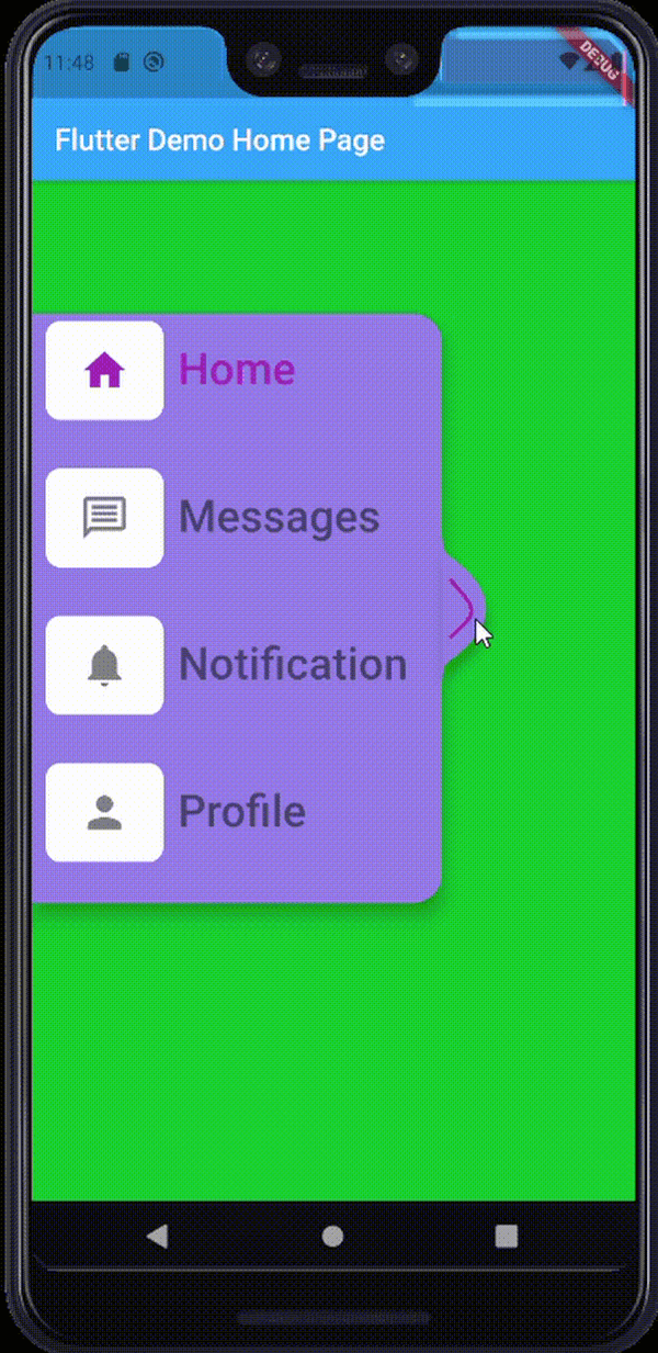
帶有各種酷炫效果和選項(例如開啟和關閉軌道)的 Flutter 動畫導航軌道。
50喜歡 152近 30 天下載150Pub 分數
AndroidiOSWebmacOSWindowsLinux
youssefali424/AnimatedRail open-source repository details.

{"sdk":"flutter"}{"sdk":"flutter"}^2.0.1以下為英文專案原文快照,最新內容請造訪 GitHub。
Flutter Animated Naviation Rail with multiple cool effects see example project.
gif
Add the package to your pubspec.yaml:
animated_rail: any
In your dart file, import the library:
import 'package:animated_rail/index.dart';
  AnimatedRail(
        background: hexToColor('#8B77DD'),
        maxWidth: 275,
        width: 100,
        expand: false,
        isStatic: true,
        railTileConfig: RailTileConfig(
            iconSize: 22,
            iconColor: Colors.white,
            expandedTextStyle: TextStyle(fontSize: 15),
            collapsedTextStyle: TextStyle(fontSize: 12, color: Colors.white),
            activeColor: Colors.indigo,
            iconPadding: EdgeInsets.symmetric(vertical: 5),
            hideCollapsedText: true,
        ),
        items: [
          RailItem(
              icon: Icon(Icons.home),
              label: "Home",
              screen: _buildScreen('Home')),
          RailItem(
              icon: Icon(Icons.message_outlined),
              label: 'Messages',
              screen: _buildScreen('Messages')),
          RailItem(
              icon: Icon(Icons.notifications),
              label: "Notification",
              screen: _buildScreen('Notification')),
          RailItem(
              icon: Icon(Icons.person),
              label: 'Profile',
              screen: _buildScreen('Profile')),
        ],
      )
| Name | Description | Required | Default value |
|---|---|---|---|
items |
the tabs of the rail as a list of object type [RailItem] | required | - |
width |
the width of the rail when it is opened | required | 100 |
maxWidth |
the max width the rai will snap to, active when [exapnd] is equal true | - | 350 |
direction |
direction of rail if it is on the right or left | required | TextDirection.ltr |
selectedIndex |
current selected Index dont use it unlessa you want to change the tabs programmatically | - | 0 |
background |
background of the rail | - | 0 |
expand |
if true the the rail can exapnd and reach [maxWidth] and the animation for text will take effect | - | true |
isStatic |
if true the rail will not move vertically | - | false |
railTileConfig |
Rail tile config | - | - |
cursorSize |
Size of cursor | - | Size(100,100) |
cursorActionType |
adds click trigger option to use on cursor | - | CursorActionTrigger.drag |
builder |
custom widgt builder for rail menu items | - | - |
[x] full custom tab [x] add more customization to rail item [ ] custom rail pointer [ ] custom rail shape