सार्वजनिक जानकारी से बना चयन मार्गदर्शन। केवल संदर्भ हेतु।
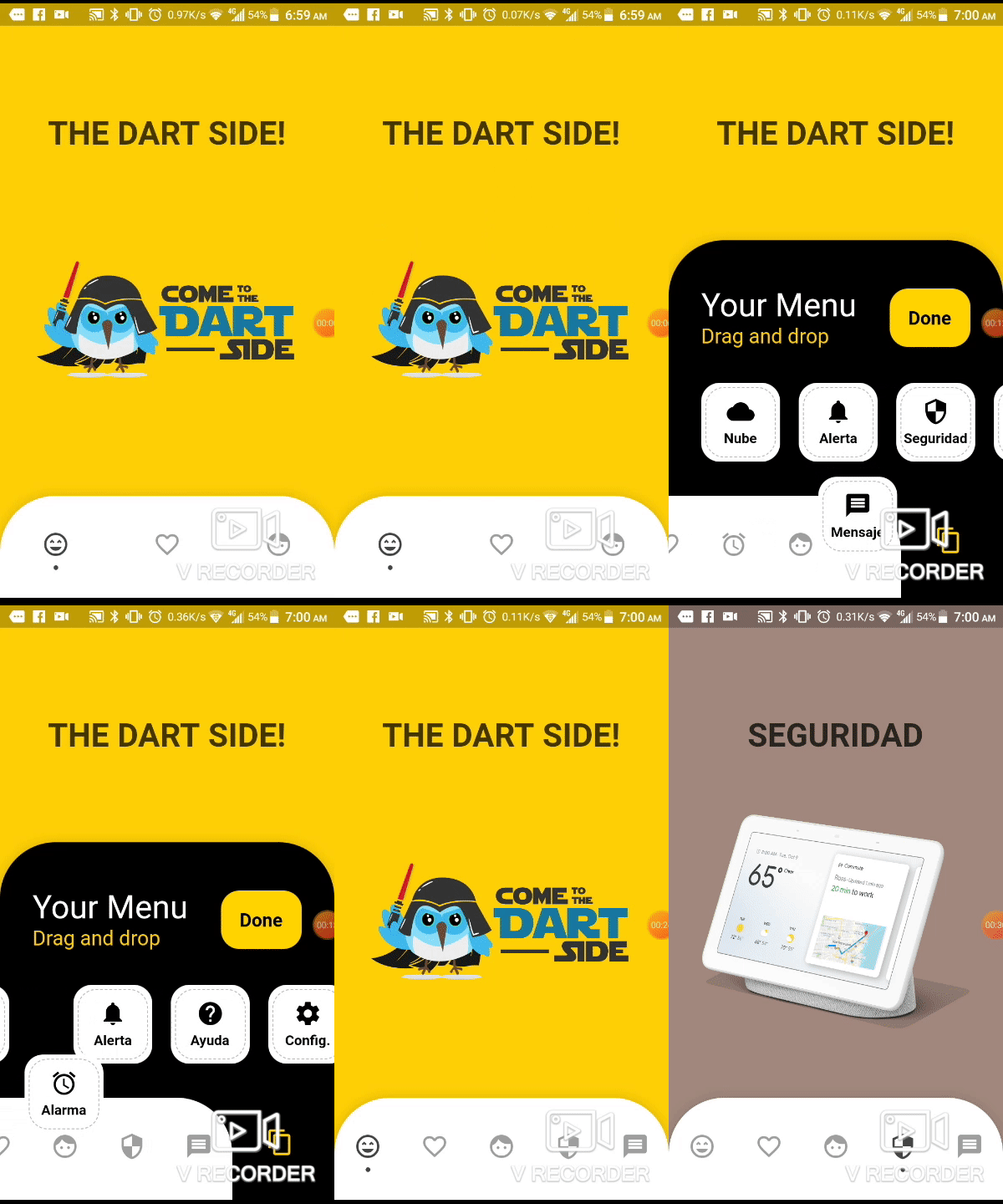
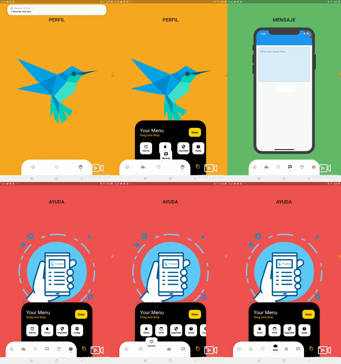
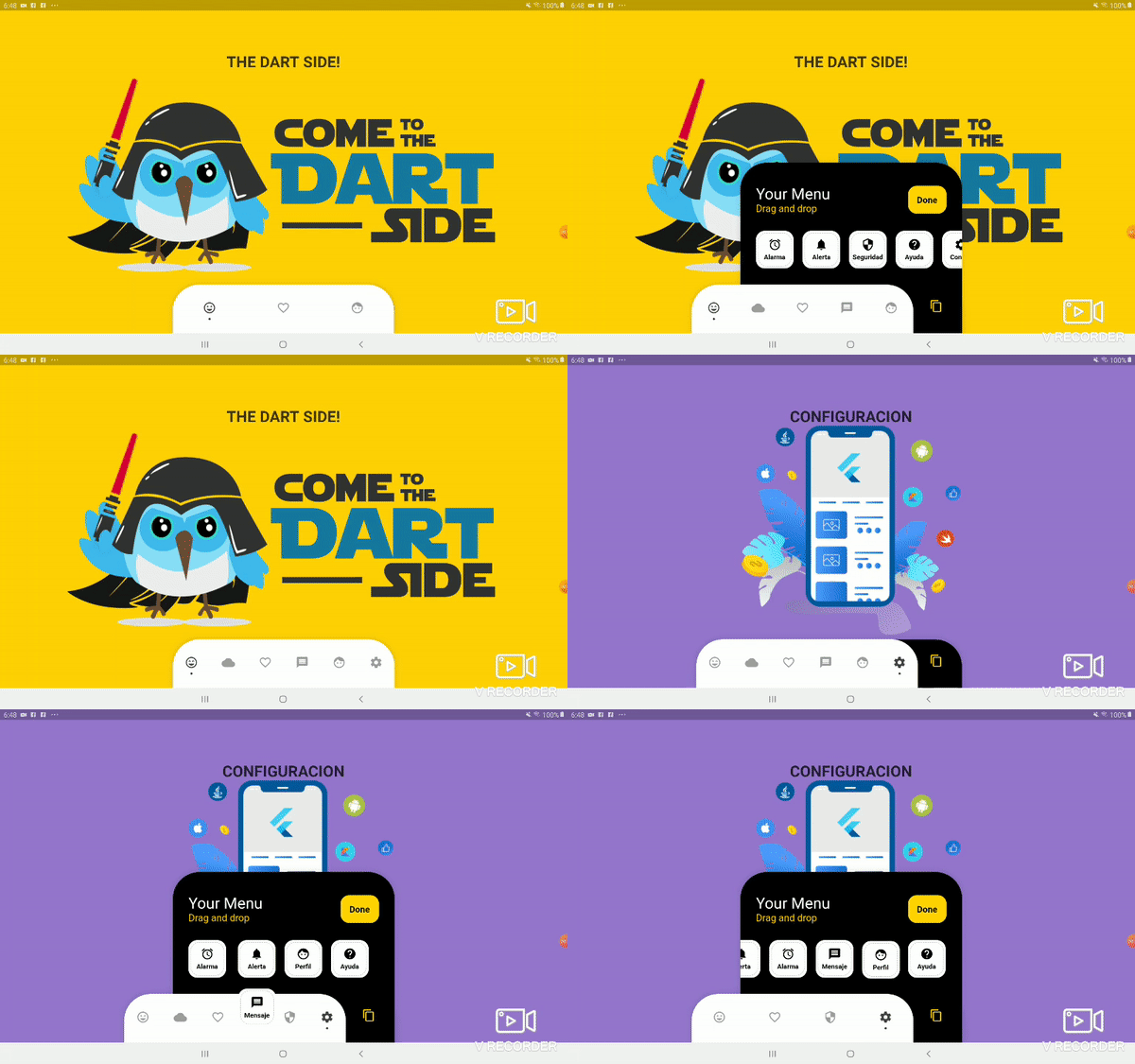
फ्लटर में एक कस्टमाइज़ेबल बॉटम नेविगेशन बार जो उपयोगकर्ताओं को अपने लेआउट को व्यक्तिगत बनाने के लिए आइटम को ड्रैग और ड्रॉप करने की अनुमति देता है। यह नेविगेशन आइकन को व्यवस्थित करने के लिए एक डायनामिक, इंटरैक्टिव अनुभव प्रदान करता है और उपयोगकर्ता को दिखावट और व्यवहार पर पूर्ण नियंत्रण देता है। लचीले नेविगेशन पैटर्न की आवश्यकता वाले ऐप्स के लिए आदर्श, यह पैकेज सीधे अनुकूलन के माध्यम से उपयोगकर्ता भागीदारी को बढ़ाता है। बार स्मूथ ट्रांज़िशन और रिस्पॉन्सिव डिज़ाइन का समर्थन करता है, जिससे यह आधुनिक मोबाइल ऐप्स के लिए उपयुक्त है।
उपयोग
कस्टमाइज़ेबल ऐप नेविगेशन
उपयोगकर्ता-निर्देशित इंटरफेस लेआउट
इंटरैक्टिव बॉटम बार
मोबाइल ऐप व्यक्तिगतकरण
डायनामिक यूआई पुनर्व्यवस्था
मुख्य विशेषताएँ
ड्रैग-एंड-ड्रॉप आइटम पुनर्क्रमण
पूरी तरह से कस्टमाइज़ किए गए डॉट संकेतक
प्रतिक्रियाशील डिज़ाइन समर्थन
Flutter के साथ आसान एकीकरण
कस्टम स्टाइलिंग का समर्थन करता है
इनके लिए उपयुक्त
इंटरैक्टिव नेविगेशन की तलाश में डेवलपर्स
उपयोगकर्ता-केंद्रित डिज़ाइन वाले ऐप्स
कस्टमाइज़ेबल मोबाइल इंटरफेस
गतिशील बॉटम बार की आवश्यकता वाले Flutter प्रोजेक्ट
डिज़ाइन-केंद्रित एप्लिकेशन विकास
विचार योग्य बातें
सीमित प्लेटफॉर्म-विशिष्ट दस्तावेज़
मूल ट्रांज़िशन के अलावा कोई बिल्ट-इन एनीमेशन नहीं है
अवस्था प्रबंधन के लिए हस्तचालित प्रबंधन की आवश्यकता होती है
बड़ी संख्या में आइटम के लिए अनअनुकूलित
जटिल थीम के लिए अतिरिक्त स्टाइलिंग की आवश्यकता हो सकती है
मूल README
संबंधित सोर्स रिपॉज़िटरी के मूल README का स्नैपशॉट। नवीनतम सामग्री के लिए रिपॉज़िटरी देखें।
Bottom Personalized Dot Bar
A bottom navigation bar that you can customize with the options you need, without any limits. You can also customize the appearance of the navigation bar.
List of items to be displayed in the navigation bar
hiddenItems
List of items that will be hidden
keyItemSelected
Item key that is selected
width
Navigation bar width
height
Navigation bar height
borderRadius
Navigation bar radius
selectedColorIcon
Selected Icon color
unSelectedColorIcon
Unselected Icon color
navigatorBackground
Navigator Container Background color
settingBackground
Setting Container Background color (Hidden items)
iconSetting
Settings button icon
iconSettingColor
Settings button icon color
settingTitleText
Setting Title Text
settingTitleColor
Setting Title color
settingSubTitleText
Setting Sub-Title Text
settingSubTitleColor
Setting Sub-Title color
doneText
Done button Text
textDoneColor
Text Done Color
buttonDoneColor
Button done color
hiddenItemBackground
Background of hidden item
iconHiddenColor
Icon Hidden Color
textHiddenColor
Text Hidden Color
dotColor
Selection Indicator Color (Dot
boxShadow
Shadow of container
onOrderHideItems
Event when you sort the hidden options, this has as parameter the list of hidden options with the new order. onOrderHideItems: (List<BottomPersonalizedDotBarItem> hiddenItems) { /* Your action */ }
onOrderItems
Event when ordering browser options, this has as parameter the list of options with the new order onOrderItems: (List<BottomPersonalizedDotBarItem> items) { /* Your action */ }
onAddItem
Event when you add a new option to the navigation bar, this has as parameters the item you add and the list of options. onAddItem: (BottomPersonalizedDotBarItem itemAdd, List<BottomPersonalizedDotBarItem> items) { /* Your action */ }
onRemoveItem
Event when you delete an option from the navigation bar, this has as parameters the element to delete and the list of hidden options. onRemoveItem: (BottomPersonalizedDotBarItem itemRemove, List<BottomPersonalizedDotBarItem> hiddenItems) { /* Your action */ }
BottomPersonalizedDotBarItem
Attribute
Description
keyItem
Unique key
icon
Item icon
name
Item name
onTap
Event with you press the item. onTap: (String keyItem) { /* Your action */ }