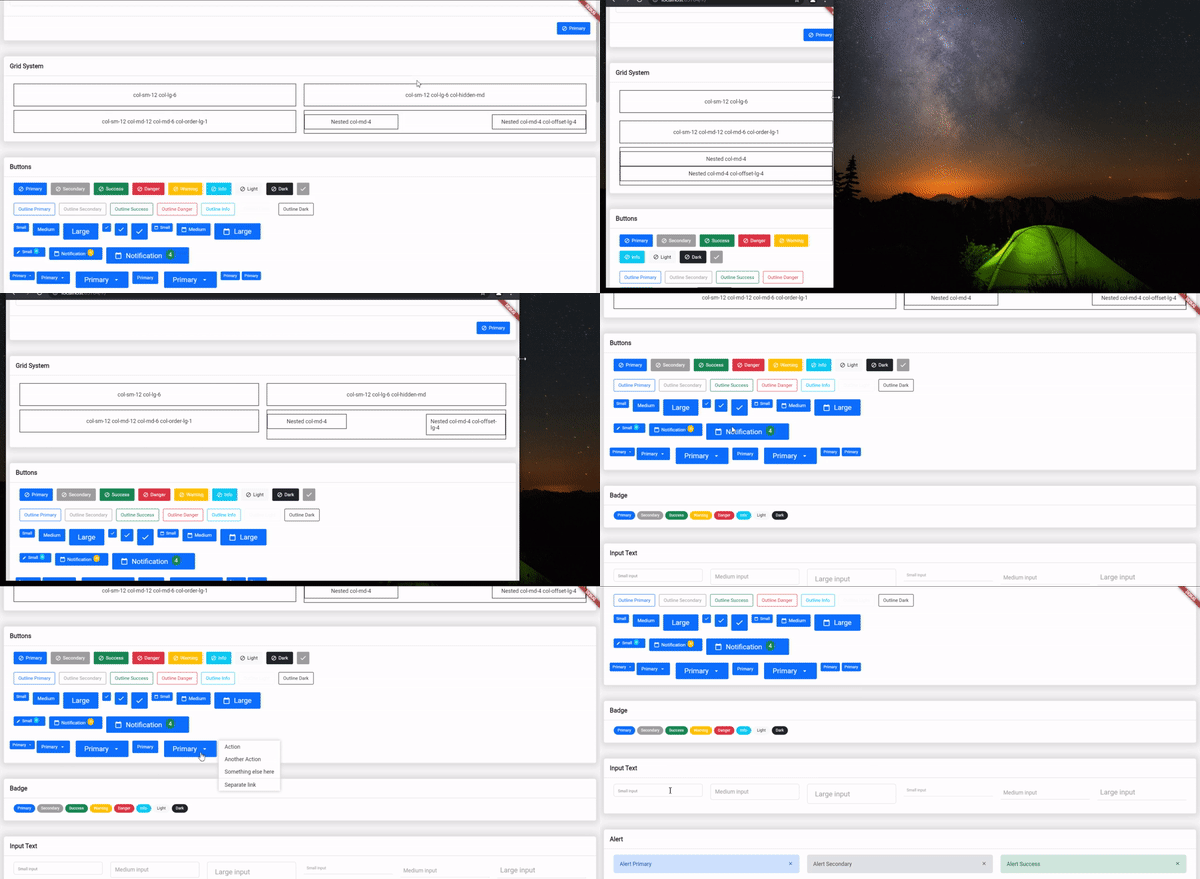
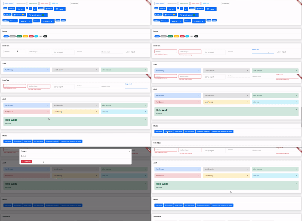
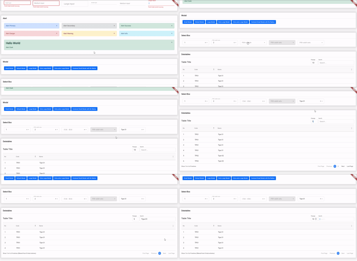
संबंधित सोर्स रिपॉज़िटरी के मूल README का स्नैपशॉट। नवीनतम सामग्री के लिए रिपॉज़िटरी देखें।
Bootstrap's Flutter
Simple flutter widget from Bootstrap v5 component, including responsive grid layout based on bootstrap grid system
Avaiable Components
Utilities
This plugin helps you to migrate from html based to dart in creating web interfaces. More specifically for those who are already able to use bootstrap
Getting Started
Add the dependency in pubspec.yaml:
dependencies:
  ...
  bs_flutter: any
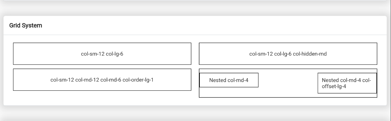
Responsive Grid / Grid System
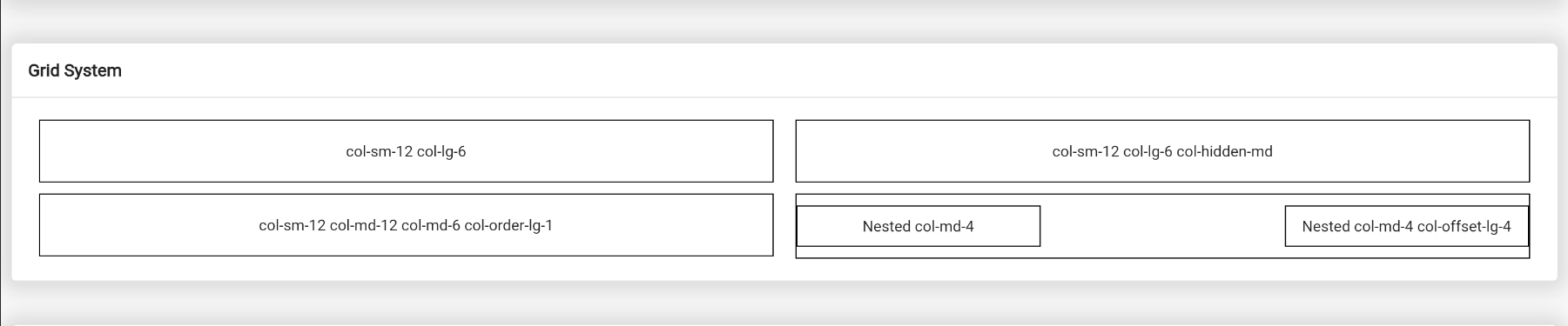
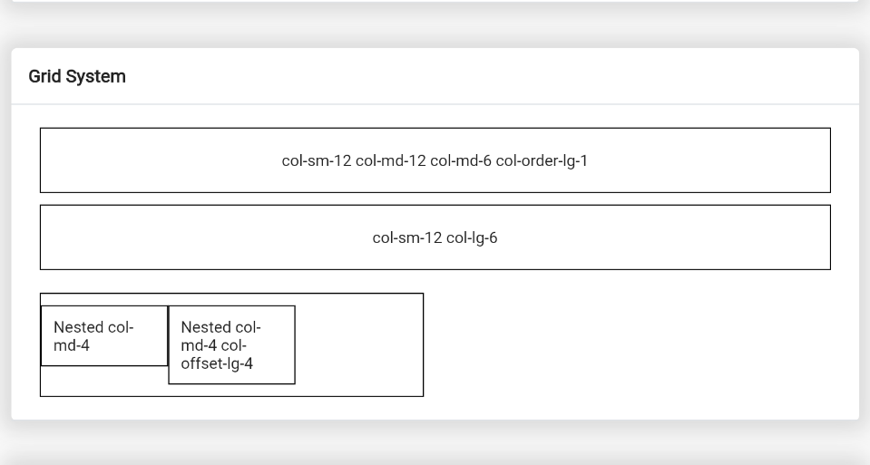
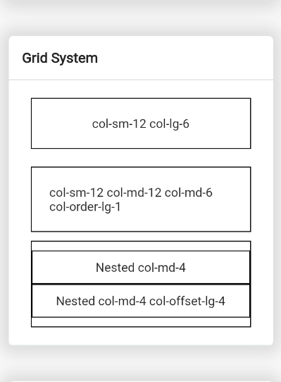
Example: example_grid.dart
Grid system is very important when you create some web application. Especially for create responsive layout. This plugin is help to solve it
To create responsive layout you must using widget BsRow and BsCol or if in bootstrap use class="row" and class="col-*"
Create row container of grid system:
BsRow (
gutter: EdgeInsets .only (left: 10.0 , right: 10.0 , top: 5.0 , bottom: 5.0 ),
children: <BsCol >[
]
);
After that you can add column:
BsRow (
children: <BsCol >[
BsCol (
decoration: BoxDecoration (
border: Border .all (color: Colors .black),
),
padding: EdgeInsets .all (20.0 ),
sizes: ColScreen (sm: Col .col_12, lg: Col .col_6),
child: Center (child: Text ('col-sm-12 col-lg-6' )),
),
BsCol (
decoration: BoxDecoration (
border: Border .all (color: Colors .black),
),
visibility: BsVisibility .hiddenMd,
padding: EdgeInsets .all (20.0 ),
sizes: ColScreen (sm: Col .col_12, lg: Col .col_6),
child: Center (child: Text ('col-sm-12 col-lg-6 col-hidden-md' )),
),
BsCol (
decoration: BoxDecoration (border: Border .all (color: Colors .black)),
padding: EdgeInsets .all (20.0 ),
sizes: ColScreen (sm: Col .col_12, md: Col .col_12, lg: Col .col_6),
order: ColOrder (md: 1 ),
child: Center (child: Text ('col-sm-12 col-md-12 col-md-6 col-order-lg-1' )),
),
BsCol (
decoration: BoxDecoration (border: Border .all (color: Colors .black)),
padding: EdgeInsets .only (top: 10.0 , bottom: 10.0 ),
sizes: ColScreen (md: Col .col_6),
child: BsRow (
children: [
BsCol (
decoration: BoxDecoration (
color: Colors .white,
border: Border .all (color: Colors .black),
),
padding: EdgeInsets .all (10.0 ),
sizes: ColScreen (md: Col .col_4),
child: Center (child: Text ('Nested col-md-4' )),
),
BsCol (
decoration: BoxDecoration (
color: Colors .white,
border: Border .all (color: Colors .black),
),
padding: EdgeInsets .all (10.0 ),
sizes: ColScreen (md: Col .col_4),
offset: ColScreen (lg: Col .col_4),
child: Center (child:Text ('Nested col-md-4 col-offset-lg-4' )),
),
],
),
),
]
)
Note
Properties sizes in BsCol is has default value Col.col_12 or 100% of screen width
If need to ordering column use properties order with value BsScreen
If need to custom offset of column use properties offet with value BsScreen
BsVisibility.hiddenMd will hide widget in max screen medium or < 768 px, above it will show
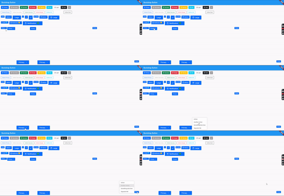
Bootstrap Flutter Buttons
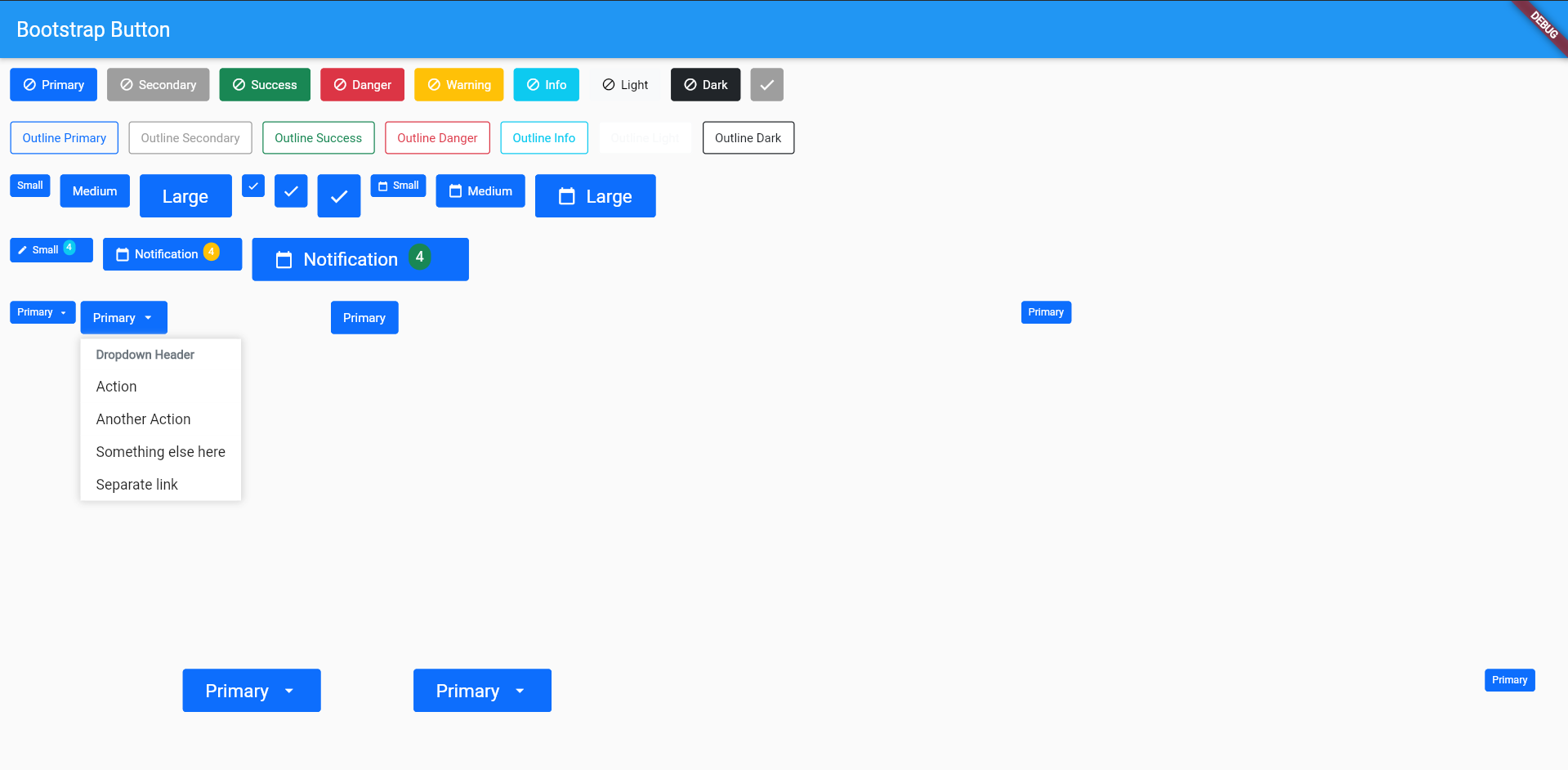
Example: example_buttons.dart
We have 15 button style and 3 button size, but you can create custom size using BsButtonSize and custom style using BsButtonStyle
static const BsButtonStyle primary = BsButtonStyle (
color: Colors .white,
borderColor: BsColor .primary,
backgroundColor: BsColor .primary,
borderRadius: BorderRadius .all (Radius .circular (3.0 ))
);
static const BsButtonSize btnIconSm = BsButtonSize (
iconSize: 12.0 ,
padding: EdgeInsets .only (left: 10.0 , right: 10.0 , top: 10.0 , bottom: 10.0 ),
minimumSize: Size (30.0 , 30.0 ),
);
To create some button use BsButton
BsButton (
margin: EdgeInsets .only (right: 10.0 , bottom: 10.0 ),
onPressed: () {},
style: BsButtonStyle .primary,
size: BsButtonSize .btnIconMd,
prefixIcon: Icons .check,
),
You can create custom size using BsBadgeSize and custom style using BsBadgeStyle
static const BsBadgeStyle primary = BsBadgeStyle (
color: Colors .white,
backgroundColor: BsColor .primary,
);
static const BsBadgeSize rounded = BsBadgeSize (
margin: EdgeInsets .only (right: 5.0 , bottom: 5.0 ),
padding: EdgeInsets .only (left: 10.0 , right: 10.0 , top: 5.0 , bottom: 5.0 ),
fontSize: 10.0 ,
borderRadius: BorderRadius .all (Radius .circular (100.0 ))
);
To create badge use BsBadge, BsBadge is available use in BsButton
BsBadge (
style: BsBadgeStyle .primary,
size: BsBadgeSize .rounded,
child: Text ('Primary' ),
),
Default dropdown button
BsDropdownButton (
margin: EdgeInsets .only (right: 5.0 ),
toggleMenu: (_) => BsButton (
onPressed: () => _.toggle (),
style: BsButtonStyle .primary,
suffixIcon: Icons .arrow_drop_down,
label: Text ('Primary' ),
),
dropdownMenu: BsDropdownMenu (
children: [
BsDropdownHeader (child: Text ('Dropdown Header' )),
BsDropdownItem (child: Text ('Action' )),
BsDropdownItem (child: Text ('Another Action' )),
BsDropdownItem (child: Text ('Something else here' )),
BsDropdownItem (child: Text ('Separate link' )),
],
),
)
To configure maximum/minimum width and height, you can use property dropdownMenuSize
the default of minimum height and width is 150
BsDropdownButton (
dropdownMenuSize: BsDropdownMenuSize (
minWidth: 150 ,
maxWidth: 300 ,
minHeight: 150 ,
maxHeight: 300
),
)
If you want to create dropdown in left/right side of button, you can use property dropdownDirection
BsDropdownButton (
dropdownDirection: Axis .horizontal,
),
If you want to customize dropdown style, you can use property dropdownMenuStyle
BsDropdownButton (
dropdownMenuStyle: BsDropdownMenuStyle (
backgroundColor: Colors .red,
boxShadow: [
BoxShadow (
color: Color (0xffd9d9d9 ),
spreadRadius: 2.0 ,
blurRadius: 5.0
)
]
),
),
You can also set dropdown item to active and disabled
If you want to customize active or disabled style, you can use property activeStyle, activeTextStyle, disabledStyle and disabledTextStyle
BsDropdownButton (
dropdownMenu: BsDropdownMenu (
children: [
BsDropdownItem (
child: Text ('Action' ),
active: true ,
activeStyle: ButtonStyle (),
activeTextStyle: TextStyle (),
),
BsDropdownItem (
child: Text ('Another Action' ),
disabled: true ,
disabledStyle: ButtonStyle (),
disabledTextStyle: TextStyle (),
),
BsDropdownItem (child: Text ('Something else here' )),
BsDropdownDivider (),
BsDropdownItem (child: Text ('Separate link' )),
],
)
),
Bootstrap Flutter Input Text
Example: example_inputtext.dart
Small Input Text with Outline Border
BsInput (
size: BsInputSize .sm,
hintText: 'Small input' ,
controller: TextEditingController (),
validators: [
BsValidator .required
],
),
Small Input Text with Border Bottom
BsInput (
style: BsInputStyle .outlineBottom,
size: BsInputSize .outlineBottomSm,
hintTextLabel: 'Small input' ,
controller: TextEditingController (),
),
BsValidator is custom validator, you can create yours validator using BsValidator
Example:
static BsValidator get required => BsValidator (
validator: (value) {
String valueValidate = value.toString ().trim ();
if (valueValidate.isEmpty) return "Field tidak boleh kosong" ;
return null ;
},
);
validator properties will call when form on validating
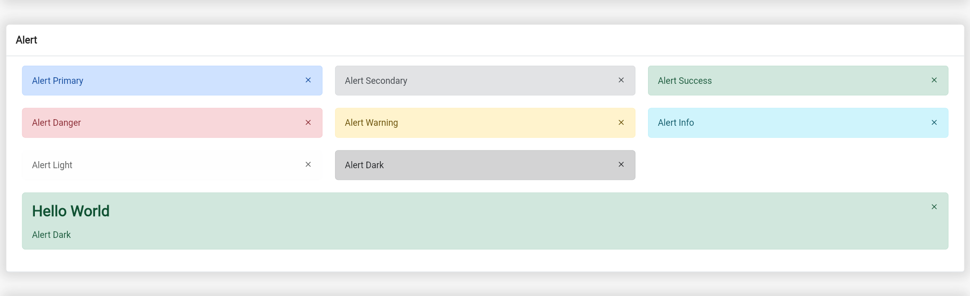
Bootstrap Flutter Alert
Example: example_alert.dart
Alert success
BsAlert (
closeButton: true ,
margin: EdgeInsets .only (bottom: 10.0 ),
child: Text ('Alert Primary' ),
),
Alert with Heading
BsAlert (
closeButton: true ,
margin: EdgeInsets .only (bottom: 10.0 ),
style: BsAlertStyle .success,
heading: Text ('Hello World' ),
child: Column (
crossAxisAlignment: CrossAxisAlignment .start,
children: [
Text ('Alert Dark' ),
],
),
)
You can create custom alert style using BsAlertStyle and alert color using BsAlertColor
static const BsAlertColor primary = BsAlertColor (
color: Color (0xff084298 ),
backgroundColor: Color (0xffcfe2ff ),
borderColor: Color (0xffb6d4fe ),
);
static const BsAlertStyle primary = BsAlertStyle (
color: BsAlertColor .primary,
borderRadius: BorderRadius .all (Radius .circular (5.0 )),
);
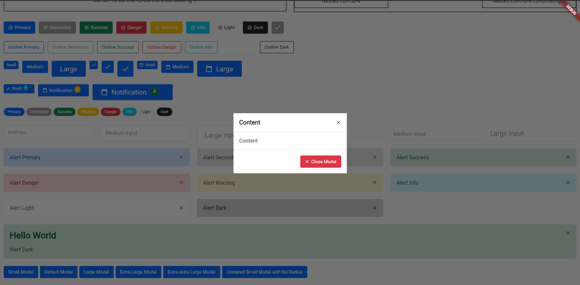
Bootstrap Flutter Modals
Example: example_modal.dart
Modal will be show using showDialog, because BsModal is a Dialog widget
BsButton (
style: BsButtonStyle .primary,
margin: EdgeInsets .only (right: 5.0 , bottom: 10.0 ),
label: Text ('Centered Small Modal with No Radius' ),
onPressed: () => showDialog (context: context, builder: (context) => BsModal (
context: context,
dialog: BsModalDialog (
size: BsModalSize .sm,
crossAxisAlignment: crossAxisAlignment.center,
child: BsModalContent (
decoration: BoxDecoration (
color: Colors .white,
),
children: [
BsModalContainer (title: Text ('Content' ), closeButton: true ),
BsModalContainer (
child: Column (
children: [
Text ('Content' )
]
),
),
BsModalContainer (
crossAxisAlignment: CrossAxisAlignment .end,
actions: [
BsButton (
style: BsButtonStyle .danger,
label: Text ('Close Modal' ),
prefixIcon: Icons .close,
onPressed: () {
Navigator .pop (context);
},
)
],
)
],
),
),
)),
)
Note
BsModalDialog is backdrop layoutBsModalContent is content from modalBsModalContainer is children from BsModalContentChange size properties to change modal size
BsModalContainer can be use as modal-header, modal-body and modal-footerTo set BsModalContent to centered, you can modify crossAxisAlignment on BsModalDialog properties
Bootstrap Flutter Card
Example: example_card.dart
Create box card:
BsCard (
children: [
BsCardContainer (title: Text ('Box Card' )),
BsCardContainer (child: Container (
child: Text ('Box Card Content' ),
)),
BsCardContainer (actions: [
BsButton (
onPressed: () {},
style: BsButtonStyle .primary,
prefixIcon: Icons .block,
label: Text ('Primary' ),
)
])
],
)
Note
To custom card style use BsCardContainerStyle or BsCardStyle
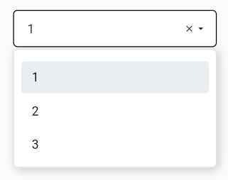
Bootstrap Flutter Select Box
Example: example_selectbox.dart
To create a select box you need to import:
import 'package:bs_flutter_selectbox/bs_flutter_selectbox.dart' ;
After create controller:
BsSelectBoxController _select1 = BsSelectBoxController (
options: [
BsSelectBoxOption (value: 1 , text: Text ('1' )),
BsSelectBoxOption (value: 2 , text: Text ('2' )),
BsSelectBoxOption (value: 3 , text: Text ('3' )),
]
);
After all is done copy the code below:
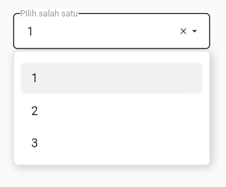
BsSelectBox (
hintText: 'Pilih salah satu' ,
selectBoxController: _select1,
),
If you need to customize size and style, use properties style and size. And create your custom size with class BsSelectBoxSize or BsSelectBoxStyle to custom style
static const BsSelectBoxSize customSize = BsSelectBoxSize (
fontSize: 14.0 ,
optionFontSize: 14.0 ,
searchInputFontSize: 14.0 ,
labelX: 15.0 ,
labelY: 13.0 ,
transitionLabelX: -15.0 ,
transitionLabelY: 5.0 ,
padding: EdgeInsets .only (left: 15.0 , right: 15.0 , top: 12.0 , bottom: 12.0 )
);
static const BsSelectBoxStyle outline = BsSelectBoxStyle (
borderRadius: BorderRadius .all (Radius .circular (5.0 ))
);
Note
labelX and labelY is used to set label position if using hintTextLabeltransitionLabelX and transitionLabelY is used to set label position if using hintTextLabel when have selected valueBsSelectBoxStyle have properties borderRadius, color, placeholderColor, selectedBackgroundColor, selectedColor, disabledBackgroundColor, backgroundColor, borderColor, fontSize, arrowIcon
Select box using hintTextLabel
BsSelectBox (
hintTextLabel: 'Pilih salah satu' ,
selectBoxController: _select1,
),
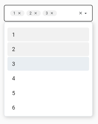
To create a select box with multiple allowed set multiple properties in BsSelectBoxController to true:
BsSelectBoxController _select2 = BsSelectBoxController (
multiple: true ,
options: [
BsSelectBoxOption (value: 1 , text: Text ('1' )),
BsSelectBoxOption (value: 2 , text: Text ('2' )),
BsSelectBoxOption (value: 3 , text: Text ('3' )),
BsSelectBoxOption (value: 4 , text: Text ('4' )),
BsSelectBoxOption (value: 5 , text: Text ('5' )),
BsSelectBoxOption (value: 6 , text: Text ('6' )),
]
);
Note
To get selected value use getSelected or getSelectedAll
If you need returned string use getSelectedAsString, it will be returned string value with , separator
To set selected value use setSelected or setSelectedAll
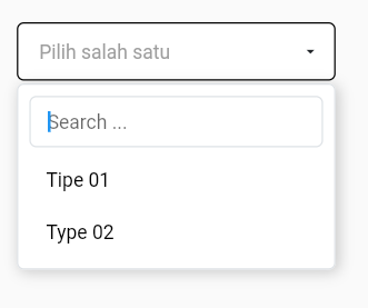
To create a select box with server side data, use serverSide property
BsSelectBox (
hintText: 'Pilih salah satu' ,
searchable: true ,
selectBoxController: _select3,
serverSide: selectApi,
)
Note
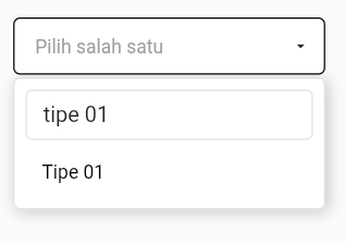
To enable searchable option, set searchable property true
serverSide property need returned Future<BsSelectBoxResponse>
selectApi function
Future <BsSelectBoxResponse > selectApi (Map <String , String > params) async {
Uri url = Uri .http ('localhost' , 'api-json.php' , params);
Response response = await http.get (url);
if (response.statusCode == 200 ) {
List json = convert.jsonDecode (response.body);
return BsSelectBoxResponse .createFromJson (json);
}
return BsSelectBoxResponse (options: []);
}
Json response data
[
{
"value" : "1" ,
"text" : "Tipe 01" ,
"typecd" : "TP01" } ,
{
"value" : "2" ,
"text" : "Type 02" ,
"typecd" : "TP02"
}
]
Note
createFromJson is automatically put response data value, but you cant change it with define manualIf you want to make typecd as value of option, use value parameters of createFromJson
if (response.statusCode == 200 ) {
List json = convert.jsonDecode (response.body);
return BsSelectBoxResponse .createFromJson (json,
value: (data) => data['typecd' ],
);
}
If you want to make typecd as text of option, use renderText parameters of createFromJson
renderText function need returned Widget
if (response.statusCode == 200 ) {
List json = convert.jsonDecode (response.body);
return BsSelectBoxResponse .createFromJson (json,
value: (data) => data['typecd' ],
renderText: (data) => Text (data['typecd' ])
);
}
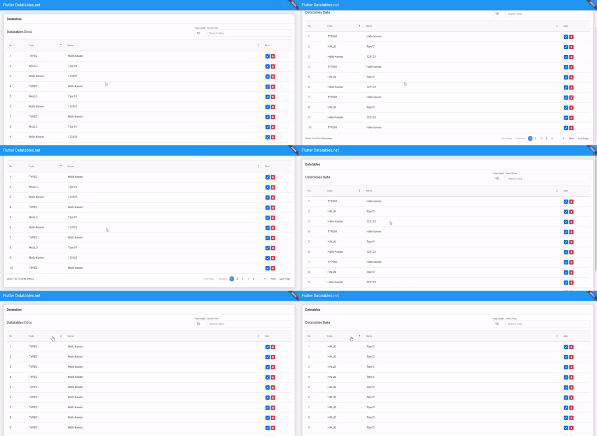
ServerSide Datatables (with datatables response)
Example: main.dart
To create a select box you need to import:
import 'package:bs_flutter_datatable/bs_flutter_datatable.dart' ;
Create source datatable:
class ExampleSource extends BsDatatableSource static List <BsDataColumn > get columns => <BsDataColumn >[
BsDataColumn (label: Text ('No' ), orderable: false , searchable: false , width: 100.0 ),
BsDataColumn (label: Text ('Code' ), columnName: 'typecd' , width: 200.0 ),
BsDataColumn (label: Text ('Name' ), columnName: 'typenm' ),
];
@override
BsDataRow getRow (int index) {
return BsDataRow (index: index, cells: <BsDataCell >[
BsDataCell (Text ('${controller.start + index + 1 } ' )),
BsDataCell (Text ('${response.data[index]['typecd' ]} ' )),
BsDataCell (Text ('${response.data[index]['typenm' ]} ' )),
]);
}
}
To create row event listener you musth defined listener on data source
class ExampleSource extends BsDatatableSource ValueChanged <dynamic > onEditListener = (value) {};
ValueChanged <dynamic > onDeleteListener = (value) {};
}
And then use variable on pressed action
@override
BsDataRow getRow (int index) {
return BsDataRow (index: index, cells: <BsDataCell >[
BsDataCell (Row (
children: [
TextButton (
onPressed: () => onEditListener (response.data[index]['typeid' ]),
child: Container (child: Text ('Edit' ))
),
TextButton (
onPressed: () => onDeleteListener (response.data[index]['typeid' ]),
child: Container (child: Text ('Edit' ))
)
],
))
]);
}
To handle that listener, you can set after request data success
Future loadApi (Map <String , dynamic > params) {
return http.post (
).then ((value) {
setState (() {
_source.onEditListener = (typeid) {
};
_source.onDeleteListener = (typeid) {
};
});
});
}
declare source and controller datatable:
class _MyAppState extends State <MyApp > ExampleSource _source = ExampleSource ();
@override
void initState () {
_source.controller = BsDatatableController ();
super .initState ();
}
}
create table view:
BsDatatable (
source: _source,
title: Text ('Datatables Data' ),
columns: ExampleSource .columns,
serverSide: loadApi,
)
Serverside function to get datatable response
Future loadApi (Map <String , dynamic > params) {
return http.post (
Uri .parse ('http://localhost/flutter_crud/api/public/types/datatables' ),
body: params,
).then ((value) {
Map <String , dynamic > json = jsonDecode (value.body);
setState (() {
_source.response = BsDatatableResponse .createFromJson (json['data' ]);
_source.onEditListener = (typeid) {
};
_source.onDeleteListener = (typeid) {
};
});
});
}
Note
After request data from server has been successfully you need to update response data souece
Future loadApi (Map <String , dynamic > params) {
return http.post (
).then ((value) {
setState (() {
_source.response = BsDatatableResponse .createFromJson (json['data' ]);
});
});
}
To reload data you can use reload function
_source.controller.reload ();
If you want to show data from List variable, you can add data to constructor source
class ExampleSource extends BsDatatableSource ExampleSource ({
List ? data,
}) : super (data: data);
}
And now you cant set List variable in your widget
class Datatables extends StatefulWidget @override
_DatatablesState createState () => _DatatablesState ();
}
class _DatatablesState extends State <Datatables > ExampleSource _source1 = ExampleSource (
data: [
{'typecd' : 'TP1' , 'typenm' : 'Type 1' },
{'typecd' : 'TP2' , 'typenm' : 'Type 2' },
{'typecd' : 'TP3' , 'typenm' : 'Type 3' },
{'typecd' : 'TP4' , 'typenm' : 'Type 4' },
{'typecd' : 'TP5' , 'typenm' : 'Type 5' },
]
);
}
If you want to add data dynamicaly from button or anything, you can call method add or addAll. And if you want to update you call method put for remove call method remove or removeAt
TextButton (
onPressed: () {
_source1.add ({'typecd' : 'TP1' , 'typenm' : 'Type ${_source1.datas.length} ' });
},
child: Text ('Add Row' ),
)