सार्वजनिक जानकारी से बना चयन मार्गदर्शन। केवल संदर्भ हेतु।
बबल बॉक्स एक फ्लटर पैकेज है जो डेवलपर्स को कस्टमाइज़ किए जा सकने वाली विशेषताओं जैसे सीमा, डॉटेड लाइन्स, ग्रेडिएंट, कोण, एडेप्टिव साइज़िंग और दिशात्मक ऑफसेट के साथ दिखाई देने वाले बबल-आकार के कंटेनर बनाने में सक्षम बनाता है। यह एंड्रॉइड, आईओएस, वेब, मैकओएस, विंडोज़ और लिनक्स सहित कई प्लेटफॉर्मों को सपोर्ट करता है। यह पैकेज टिप्स, बैज या इंटरैक्टिव डिज़ाइन घटकों के लिए आदर्श डायनामिक, स्टाइलिश यूआई तत्वों के कार्यान्वयन को सरल बनाता है। सुविधाजनक कॉन्फ़िगरेशन विकल्पों के साथ, यह जटिल कस्टम पेंटिंग के बिना उपयोगकर्ता इंटरफ़ेस की सुंदरता को बढ़ाता है।
उपयोग
एनिमेटेड टिप्स का निर्माण
चैट बबल का डिज़ाइन करना
इंटरैक्टिव बैज बनाना
धुंधले प्रभावों के साथ उपयोगकर्ता इंटरफेस में सुधार करना
प्रतिक्रियाशील बबल लेआउट कार्यान्वयन
मुख्य विशेषताएँ
कस्टमाइज़ किए गए बबल दिशा
अनुकूल चौड़ाई और ऊंचाई
धुंधला रंग समर्थन
डॉटेड लाइन सीमाएं
कोण और ऑफसेट समायोजन
प्लेटफॉर्म क्रॉस-सुमेलन
इनके लिए उपयुक्त
दृश्य आकर्षण की तलाश में UI डिज़ाइनर
चैट इंटरफेस बना रहे डेवलपर्स
गतिशील बैज घटकों की आवश्यकता वाले ऐप्स
दृश्य प्रभावों पर जोर देने वाले प्रोजेक्ट
क्रॉस-प्लेटफ़ॉर्म मोबाइल और वेब एप्लिकेशन
विचार योग्य बातें
अत्यधिक उपयोग से प्रदर्शन प्रभावित हो सकता है
व्यवस्थित लेआउट प्रबंधन की आवश्यकता होती है
मूल उदाहरणों के अलावा सीमित दस्तावेज़न
सरल आयताकार आकृतियों के लिए उपयुक्त नहीं
मूल README
संबंधित सोर्स रिपॉज़िटरी के मूल README का स्नैपशॉट। नवीनतम सामग्री के लिए रिपॉज़िटरी देखें।
A powerful bubble box, which implements basic bubble, border, dotted line, gradient color, angle, adaptive width and height, bubble direction, offset, etc.
This project was wrote with pure dart code,which means it's support both iOS As well as Android, web, windows, linux, etc.
Modified a lot of APIs, please pay attention to upgrade
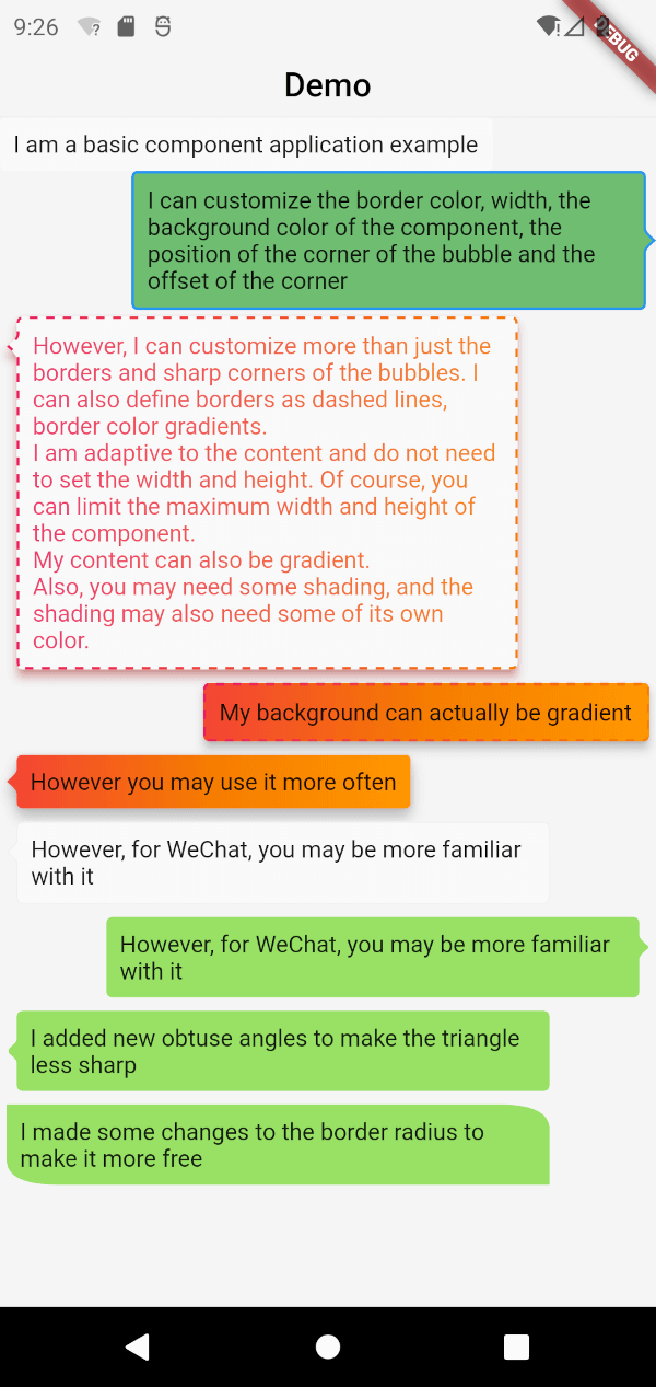
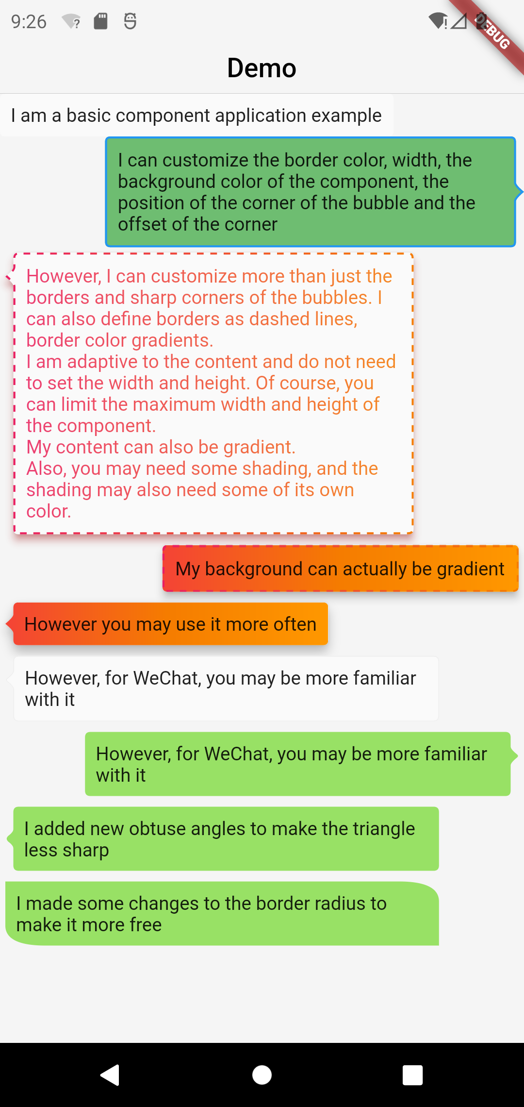
Screenshot
Basic Components
BubbleBox(
    maxWidth: MediaQuery.of(context).size.width * 0.8,
    child: Text('I am a basic component application example'),
)
Customize the border color, width, and component background color
BubbleBox(
maxWidth: MediaQuery.of(context).size.width * 0.8,
shape: BubbleShapeBorder(
border: BubbleBoxBorder(
color: Colors.blue,
width: 3,
),
position: constBubblePosition.center(0),
direction: BubbleDirection.right,
),
backgroundColor: Colors.green.withOpacity(0.8),
child: Text('I can customize the color and width of the border, the background color of the component, the position of the sharp corner of the bubble and the offset of the sharp corner'),
)
Define the border as a dashed line and the border color gradient
BubbleBox(
maxWidth: MediaQuery.of(context).size.width * 0.8,
gradient: LinearGradient(
colors: [
Colors.pink,
Colors.orange[700],
],
),
blendMode: BlendMode.srcATop,
shape: BubbleShapeBorder(
border: BubbleBoxBorder(
gradient: LinearGradient(
colors: [
Colors.pink,
Colors.orange[700],
],
),
width: 3,
style: BubbleBoxBorderStyle.dashed,
),
direction: BubbleDirection.left,
position: constBubblePosition.start(12),
),
margin: EdgeInsets.all(4),
elevation: 5,
shadowColor: Colors.redAccent,
child: Text(
'However, I can not only customize the border and sharp corners of the bubble. I can also define the border as a dashed line and a gradient of border color. \nI am adaptive to the content, there is no need to set the width and height. Of course, you can limit the maximum width and height of the component. \nMy content can also be faded. \nIn addition, you may need some shadows, and the shadows may also need some of their own colors.'),
)
BubbleBox(
maxWidth: MediaQuery.of(context).size.width * 0.85,
shape: BubbleShapeBorder(
direction: BubbleDirection.left,
position: constBubblePosition.start(12),
arrowQuadraticBezierLength: 2,
),
backgroundColor: Color(0xff98E165),
margin: EdgeInsets.all(4),
child: Text(
'We added new obtuse angles so that the triangles are no longer so sharp',
),
),
enhanced radius
BubbleBox(
    maxWidth: MediaQuery.of(context).size.width * 0.85,
    backgroundColor: Color(0xff98E165),
    margin: EdgeInsets.all(4),
    shape: BubbleShapeBorder(
      radius: BorderRadius.only(
          topRight: Radius.elliptical(30, 15),
          bottomLeft: Radius.elliptical(30, 15)),
    ),
    child: Text(
      'We have made some modifications to the border radius to make it more free',
    ),
  ),