सार्वजनिक जानकारी से बना चयन मार्गदर्शन। केवल संदर्भ हेतु।
ControlStyle एक Flutter पैकेज है जो कस्टमाइज़ेबल डेकोरेशन के माध्यम से टेक्स्ट फील्ड और बटन जैसे UI कंट्रोल के दिखावट को बढ़ाता है। यह विकासकर्ताओं को मानक विजेट्स के लुक और फील को लिखे बिना आसानी से ढालने की अनुमति देता है। सभी प्रमुख प्लेटफॉर्मों के समर्थन के साथ, यह एक सुसंगत, चमकदार डिज़ाइन के लिए इंटरफ़ेस कस्टमाइज़ेशन को सरल बनाता है। पैकेज को एक सरल pub add कमांड के माध्यम से मौजूदा Flutter प्रोजेक्ट में बिना किसी दिक्कत के एकीकृत किया जा सकता है।
उपयोग
टेक्स्ट फ़ील्ड सीमाओं को कस्टमाइज़ करना
बटन की सुंदरता में सुधार करना
एकीकृत UI थीम बनाना
फॉर्म इनपुट विजुअल्स में सुधार करना
डिज़ाइन सुसंगतता को सुव्यवस्थित करना
नियंत्रणों में सजावटी प्रभाव जोड़ना
मुख्य विशेषताएँ
Flutter विजेट्स के साथ आसान एकीकरण
क्रॉस-प्लेटफॉर्म संगतता
विस्तार्य डिकोरेशन प्रणाली
आवश्यक बॉलरप्लेट कम से कम
प्रतिक्रियाशील डिज़ाइन का समर्थन करता है
थीम-संवेदनशील स्टाइलिंग
इनके लिए उपयुक्त
दृश्य सुंदरता की तलाश में UI डिजाइनर
फॉर्म बना रहे विकासकर्ता
स्थिर डिज़ाइन प्रणाली बनाए रखने वाली टीमें
कस्टम कंट्रोल उपस्थिति की आवश्यकता वाले ऐप्स
कठोर UI अंतिम तिथि वाले प्रोजेक्ट्स
Flutter शुरुआती लोग विजेट स्टाइलिंग का अन्वेषण कर रहे हैं
विचार योग्य बातें
जटिल लेआउट के लिए अतिरिक्त कॉन्फ़िगरेशन की आवश्यकता हो सकती है
केवल दृश्य सुधार (कोई कार्यात्मक परिवर्तन नहीं)
फ्लटर के रेंडरिंग पाइपलाइन पर निर्भर करता है
बहुत सारे डिकोरेटेड कंट्रोल्स के साथ संभावित प्रदर्शन प्रभाव
निर्दिष्ट दृश्य अनुकूलन की आवश्यकता के लिए उपयुक्त नहीं
Flutter के विजेट ट्री की समझ की आवश्यकता है
मूल README
संबंधित सोर्स रिपॉज़िटरी के मूल README का स्नैपशॉट। नवीनतम सामग्री के लिए रिपॉज़िटरी देखें।
Applies additional appearance settings to Flutter text fields, buttons and other controls. Currently supports: outer shadow, inner shadow, border, inner gradient.
The Flutter library provides limited opportunities to set up the appearance of controls. You usually make this customisation by wrapping the components into a Container widget and configuring it using the decoration parameter. Such an approach has limitations as it leads to increasing the volume of work and complicating the code. Especially time consuming in this case is creating animations for switching between different appearances depending on a state of a control.
In addition, this approach works incorrectly when you are adding shadows to text fields in combination with errorText and helperText:
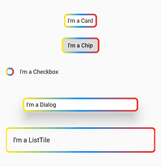
This package helps to solve the aforementioned problem. It provides the most common customisation features for control elements which have shape field such as buttons, text fields, Card, Chip, Checkbox, Dialog, Drawer, inks, ListTile, Material, NavigationBar.
The package provides the same customisation parameters to all controls, which allows for identically decorating any of the controls.
The package enables outer shadow, inner shadow, border and inner gradient styles for Flutter’s standard controls. These can be applied without using external control widgets.
Usage
You can customize all your controls at once via the theme setting of MaterialApp, or separate controls through changing their own styles.
To use the plugin with inputs, you need to wrap InputBorder with DecoratedInputBorder and configure its parameters.
Add the borderGradient or GradientBorderSide parameter to DecoratedInputBorder or DecoratedOutlinedBorder. This parameters differ from the Flutter’ BorderSide in that they use gradient parameter instead of color.
The wrappers DecoratedInputBorder and DecoratedOutlinedBorder reach an element’s border through the child parameter and apply stylization above the default border of this element. In case of an outer shadow, the shadow’s part above the control then gets cut off in order to create an illusion of the shadow being located behind the control.
Decorative styles are applied above the layer that contains an element’s border. Hence, when it comes to buttons, such stylisation overlaps the inner area of an element. Using transparent colours hence used to address this issue. This limitation is due to Flutter itself.
Compatibility
The following borders have been tested.
Inputs:
UnderlineInputBorder
OutlineInputBorder
Buttons:
BeveledRectangleBorder
CircleBorder
ContinuousRectangleBorder
RoundedRectangleBorder
StadiumBorder
Issues
Shadows may overlap nearby elements.
The decoration of the inner area of the button overlaps the button itself.