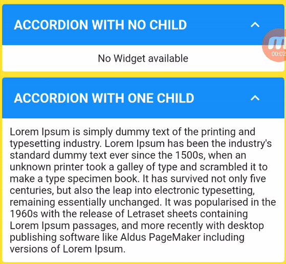
Custom Accordion पैकेज को एक्सपेंडेबल फ्लटर विजेट बनाने की अनुमति देता है जहां प्रत्येक आइटम या आइटम की सूची को सिर्फ हेडर पर क्लिक करके फैलाया या संकुचित किया जा सकता है।
सार्वजनिक जानकारी से बना चयन मार्गदर्शन। केवल संदर्भ हेतु।
Custom Accordion पैकेज फ्लटर के लिए एक लचीला और कस्टमाइज़ करने योग्य विस्तारयोग्य विंडो के लिए प्रदान करता है, जिससे उपयोगकर्ता सरल हेडर क्लिक के माध्यम से संकुचित खंड बना सकते हैं। प्रत्येक आइटम या आइटम समूह को डायनामिक रूप से विस्तारित या संकुचित किया जा सकता है, जो साफ और इंटरैक्टिव तरीके से सामग्री को व्यवस्थित करने के लिए आदर्श है। यह पैकेज Android, iOS, Web, macOS, Windows और Linux जैसे कई प्लेटफॉर्मों को समर्थन देता है, जिससे यह क्रॉस-प्लेटफॉर्म एप्लिकेशन के लिए उपयुक्त है। पैकेज हल्का है और आसानी से एकीकृत किया जा सकता है, और विभिन्न गुणों के माध्यम से डेवलपर्स को स्टाइलिंग और व्यवहार पर पूर्ण नियंत्रण प्रदान करता है।
उपयोग
संक्षिप्त प्रश्न खंड
इंटरैक्टिव फॉर्म विजार्ड
डायनामिक कॉन्टेंट नेविगेशन
नेस्टेड एक्सपैंडेबल सूचियाँ
मोबाइल-अनुकूल डेटा संगठन
मुख्य विशेषताएँ
हेडर-ट्रिगर्ड एक्सपैंशन
बहुआयामी आइटम का समर्थन
कस्टमाइज़ेबल एनीमेशन
क्रॉस-प्लेटफ़ॉर्म सुविधा
मौजूदा विजेट्स के साथ आसान एकीकरण
इनके लिए उपयुक्त
इंटरैक्टिव यूआई बनाने वाले डेवलपर्स
संकलित सामग्री की आवश्यकता वाले ऐप्स
प्रतिक्रियाशील डिज़ाइन की आवश्यकता वाले प्रोजेक्ट
मल्टीप्लेटफॉर्म एप्लिकेशन के लिए फ्लटर का उपयोग करने वाली टीमें
पुनर्उपयोगी घटकों की तलाश में UI डिज़ाइनर
विचार योग्य बातें
अवस्था प्रबंधन के लिए हस्तचालित निर्देशन की आवश्यकता होती है
सीमित बिल्ट-इन थीम विकल्प
जटिल लेआउट के लिए अतिरिक्त स्टाइलिंग की आवश्यकता हो सकती है
बहुत बड़े डेटासेट के लिए अनअप्टिमाइज़्ड
उन्नत विशेषताओं के लिए बाहरी निर्भरता पर निर्भर करता है
मूल README
संबंधित सोर्स रिपॉज़िटरी के मूल README का स्नैपशॉट। नवीनतम सामग्री के लिए रिपॉज़िटरी देखें।
Custom Accordion
Create dynamic, interactive, and visually appealing accordions in your Flutter app with ease using the "Custom Accordion" package. This powerful library simplifies the process of adding collapsible sections to your UI, making it a breeze to manage and customize accordions to suit your design and functionality needs.
CustomAccordion(
title: 'Accordion with one child',
subTitle: 'Accordion Sub Title',
headerBackgroundColor: Colors.blue,
titleStyle: constTextStyle(
fontSize: 18,
fontWeight: FontWeight.bold,
color: Colors.white,
),
subTitleStyle: constTextStyle(
fontSize: 16,
fontWeight: FontWeight.normal,
color: Colors.white,
),
toggleIconOpen: Icons.keyboard_arrow_down_sharp,
toggleIconClose: Icons.keyboard_arrow_up_sharp,
headerIconColor: Colors.white,
accordionElevation: 0,
widgetItems: constText(
'Lorem Ipsum is simply dummy text of the printing and typesetting industry. Lorem Ipsum has been the industry\'s standard dummy text ever since the 1500s, when an unknown printer took a galley of type and scrambled it to make a type specimen book. It has survived not only five centuries, but also the leap into electronic typesetting, remaining essentially unchanged. It was popularised in the 1960s with the release of Letraset sheets containing Lorem Ipsum passages, and more recently with desktop publishing software like Aldus PageMaker including versions of Lorem Ipsum.',
),
),
The following properties can be set for the widget.
Property
Description
Type
Required
Default value
title
Title of Accordion
String
Yes
subTitle
Sub Title of Accordion
String
No
headerBackgroundColor
Header background color
Color
No
Theme.of(context).splashColor
titleStyle
Header text style
TextStyle
No
Theme.of(context).textTheme.titleLarge
subTitleStyle
Sub Title text style
TextStyle
No
Theme.of(context).textTheme.titleSmall
toggleIconOpen
Toggle icon to expand/open widgets
IconData
No
Icons.arrow_drop_down
toggleIconClose
Toggle icon to collapse/close widgets
IconData
No
Icons.arrow_drop_up
headerIconColor
Icon Color
Color
No
Theme.of(context).iconTheme.color
backgroundColor
Background color of widget
Color
No
Theme.of(context).cardColor
accordionElevation
Elevation of accordion widget
double
No
Theme.of(context).cardTheme.elevation
widgetItems
Child Widget(s) of accordion
Widget
No
Text()
widgetItemsPadding
Padding arround children of accordion
EdgeInsetsGeometry
No
EdgeInsets.all(10)
showContent
Make default behaviour of accordion children visible or hidden
bool
No
false
disableToggle
Make default behaviour of accordion toggle
bool
No
false
Contribution
🚀 We believe in the power of collaboration and welcome contributions from our amazing community to make Custom Accordion even more awesome!
Whether you're a developer, designer, or just an enthusiast, you can contribute in various ways:
💡 Feature Ideas: Have a cool feature in mind? Share your ideas with us. We love fresh perspectives!
🐛 Bug Reports: Spotted a bug? Let us know! Help us squash those pesky little critters.
📖 Documentation: Improve our documentation. Clear and concise docs make a world of difference.
🛠 Code Contributions: If you're a developer, dive into the codebase. Tackle open issues or implement new features.
💬 Community Support: Share your knowledge! Help others by answering questions and engaging in discussions.
✏️ Design: If you have design skills, contribute by enhancing our UI/UX.
Dig into CONTRIBUTING.MD, which covers submitting bugs, requesting new features, preparing your code for a pull request, etc.
Please don't forget to like, follow, and star our repo!.
Support the package (optional)
If you find this package useful, you can support it for free by giving it a thumbs up at the top of this page.
Bugs or Requests
If you encounter any problems feel free to open an issue. If you feel the library is missing a feature, please raise a ticket. Pull request are also welcome.