सार्वजनिक जानकारी से बना चयन मार्गदर्शन। केवल संदर्भ हेतु।
एक फ्लटर पैकेज जो डिज़ाइन विशिष्टताओं के साथ एक समांगी रूप से यूआई तत्वों को संरेखित करने में डेवलपर्स की मदद करने के लिए फिग्मा के लेआउट ग्रिड सिस्टम को दृश्य सहायता के रूप में कार्यान्वित करता है। यह फिग्मा के ग्रिड विशेषताओं जैसे कि स्तंभ संख्या, गुटर आकार और ऑफसेट का समर्थन करता है, जिससे डिज़ाइन और कार्यान्वयन के बीच सटीक लेआउट मैचिंग संभव होती है। ग्रिड को स्क्रीन पर ओवरले के रूप में रेंडर किया जाता है, जिससे यह प्रोटोटाइपिंग और विकास के लिए आदर्श होता है। सभी प्रमुख प्लेटफॉर्मों के साथ संगतता रखता है, जिससे डिज़ाइनर और डेवलपर्स के बीच सहयोग को बढ़ावा मिलता है और फिग्मा डिज़ाइन और लाइव फ्लटर ऐप्स के बीच अंतर को कम करता है।
उपयोग
Flutter ऐप में Figma डिज़ाइन के साथ मेल खाना
दृश्य ग्रिड संरेखण के साथ प्रोटोटाइपिंग
डिजाइनर और डेवलपर्स के बीच सहयोग
UI लेआउट में स्थिर अंतराल सुनिश्चित करना
लेआउट सीमाओं का दृश्य डिबगिंग
मुख्य विशेषताएँ
Figma-आधारित ग्रिड प्रणाली
रियल-टाइम विजुअल ग्रिड ओवरले
कॉलम, गटर और ऑफसेट का समर्थन करता है
क्रॉस-प्लेटफ़ॉर्म संगतता
pub add के माध्यम से आसान एकीकरण
कस्टमाइज़ किए गए ग्रिड दिखावट
इनके लिए उपयुक्त
Flutter के साथ काम कर रहे डिज़ाइनर
Figma डिज़ाइन का पालन करने वाले Flutter विकासकर्मी
UI/UX कार्यप्रवाह के लिए Figma का उपयोग करने वाली टीमें
पिक्सेल-परफेक्ट लेआउट संरेखण की आवश्यकता वाले प्रोजेक्ट्स
डिज़ाइन सुसंगतता पर ध्यान केंद्रित फ्रंटएंड टीमें
विचार योग्य बातें
ग्रिड केवल दृश्य सहायता के लिए है, लेआउट तर्क के लिए नहीं
उत्पादन उपयोग के लिए UI रेंडरिंग के लिए नहीं बनाया गया
अत्यधिक उपयोग करने पर प्रदर्शन प्रभावित हो सकता है
रिलीज बिल्ड में अक्षम होना चाहिए
विभिन्न स्क्रीन के लिए हस्ताक्षर कॉन्फ़िगरेशन की आवश्यकता होती है
मूल README
संबंधित सोर्स रिपॉज़िटरी के मूल README का स्नैपशॉट। नवीनतम सामग्री के लिए रिपॉज़िटरी देखें।
Figma layout grid
figma_layout_grid is a Flutter package which imitates Figma's layout grid and all its functionalities. It helps you determine whether your UI components match the design file and align properly.
Basic usage
Wrap a widget with LayoutGrid in order to render a layout grid on top of it.
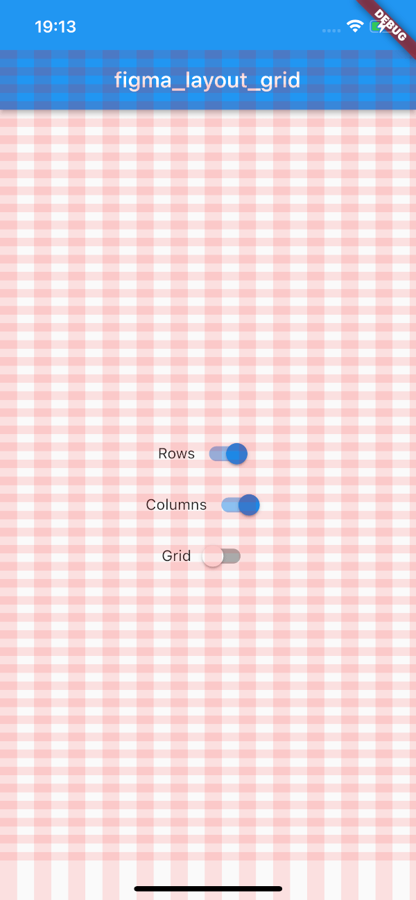
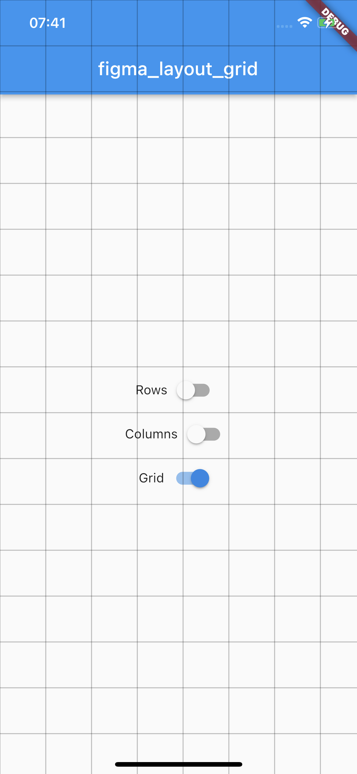
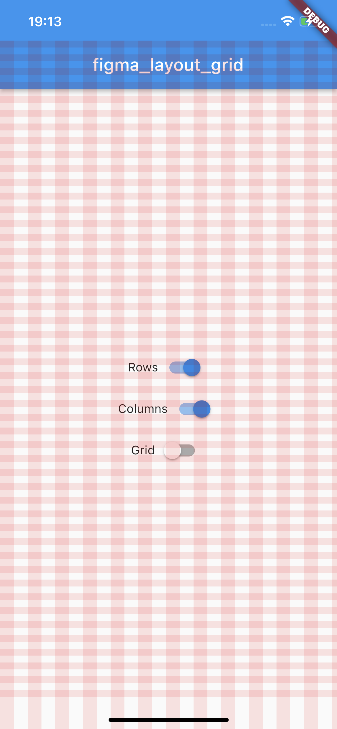
This package supports three types of layout overlays - rows, columns and pixel grid.
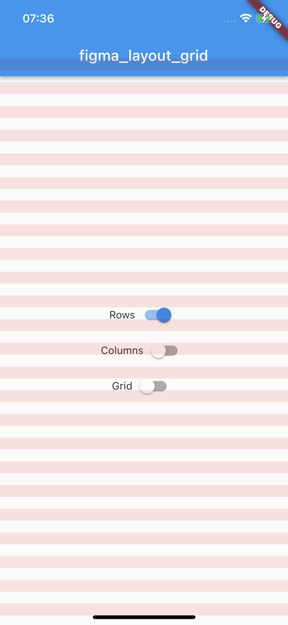
Rows
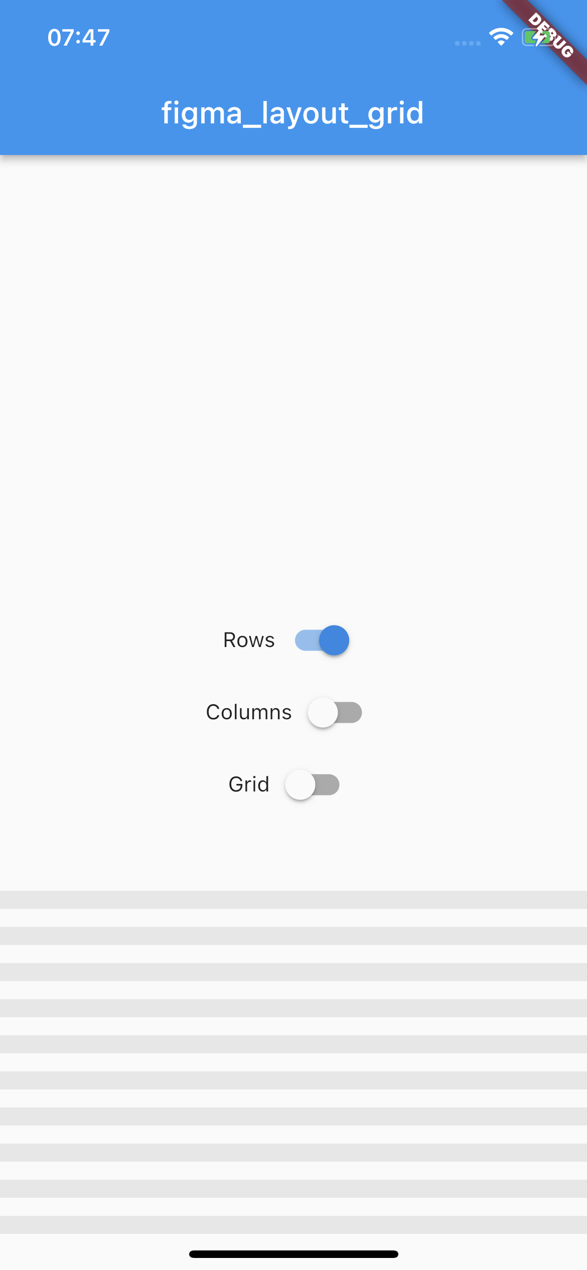
Horizontal stripes with specified height, gutter, margin, offset, arrangement and color.
There is a possibility for fixed rows count with passing desired number in a count parameter, otherwise rows are rendered dynamically due to the screen limits.
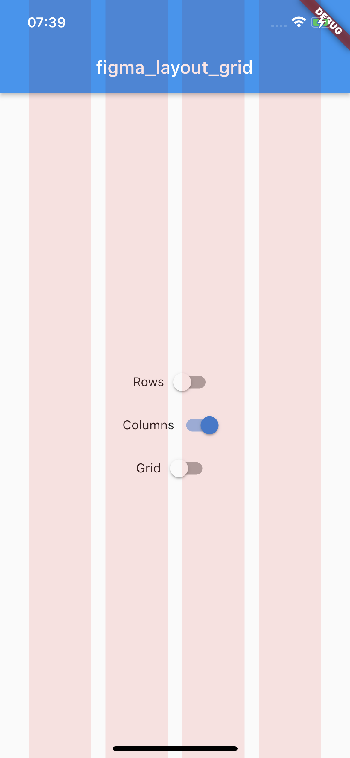
Vertical stripes with specified height, gutter, margin, offset, arrangement and color.
There is a possibility for fixed columns count with passing desired number in a count parameter, otherwise columns are rendered dynamically due to the screen limits.
By default all of the layouts are disabled. In order to manage layout grid state you may use LayoutGrid methods which are accessible via builder context.
bool LayoutGrid.of(context).visibleGrid - returns current grid layout visibility state
Parametrization
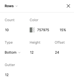
As this package mimics Figma's layout grid features you can directly transfer desired outcome into corresponding parameters. The following example shows columns grid set with count = 10, height = 12, gutter = 12, offset = 24, bottom alignment and some custom color.
There is also a possibility to enable SafeArea for a specific layout.
Each of the three layers has optional SafeAreaParams within you can pass what SafeArea parts should be handled.
The available options are top, bottom, left and right which correspond to SafeArea's parameters with the same names.