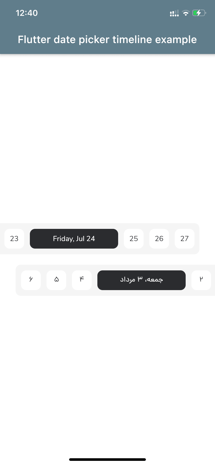
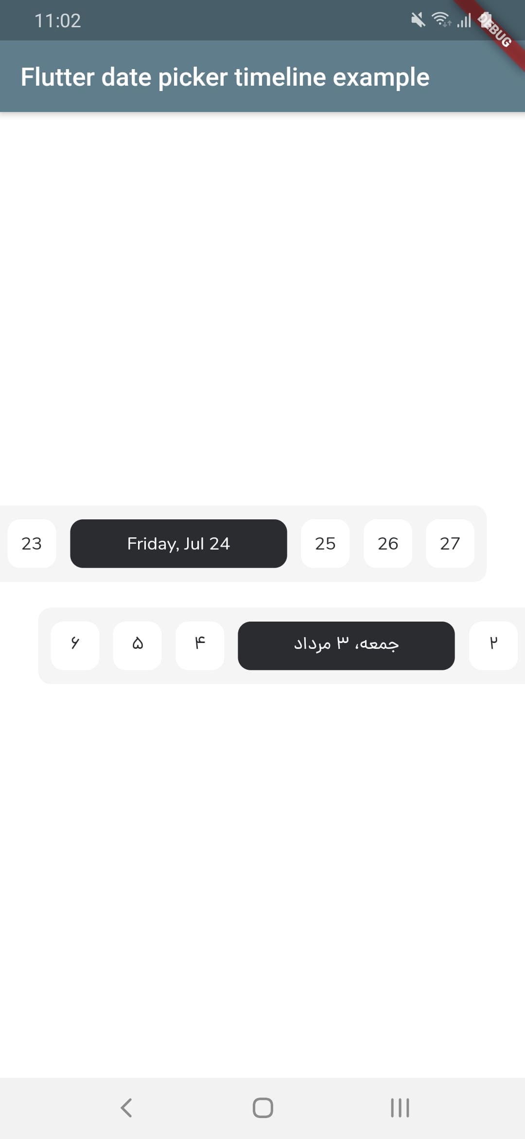
सार्वजनिक जानकारी से बना चयन मार्गदर्शन। केवल संदर्भ हेतु।
एक कस्टमाइज़ेबल डेट पिकर जो फ्लटर में दिनांकों को एक क्षैतिज समय रेखा के रूप में प्रदर्शित करता है, जिसमें ग्रेगोरियन और जलाली (फारसी) कैलेंडर दोनों का समर्थन करता है। यह चिकनी स्क्रॉलिंग और विजुअल फीडबैक के साथ उपयोगकर्ताओं को दिनांक चुनने की अनुमति देता है। इस पैकेज को लंबे समय तक दिनांक नेविगेशन की आवश्यकता वाले ऐप्स के लिए डिज़ाइन किया गया है, जैसे कि शेड्यूलिंग, योजना बनाना या कैलेंडर-आधारित वर्कफ्लो। यह सभी प्रमुख प्लेटफॉर्मों जैसे Android, iOS, Web, macOS, Windows और Linux पर काम करता है।
उपयोग
समय सारणी अनुप्रयोग
कैलेंडर-आधारित टास्क योजनाकर्ता
घटना बुकिंग इंटरफेस
यात्रा योजना प्रबंधन
लंबे समय तक प्रोजेक्ट समयसीमा
मुख्य विशेषताएँ
ग्रेगोरियन और जलाली कैलेंडर का समर्थन करता है
क्षैतिज स्क्रॉल करने योग्य समयरेखा इंटरफ़ेस
कस्टमाइज़ किए गए दिखावट और शैली
क्रॉस-प्लेटफॉर्म संगतता
स्मूथ तिथि नेविगेशन
निर्धारित तिथि सीमा और चयन मोड
इनके लिए उपयुक्त
लंबे समय तक तारीख़ चयन की आवश्यकता वाले ऐप
फ़ारसी भाषी दर्शकों के लिए विकासकर्ता
दोहरे कैलेंडर समर्थन की आवश्यकता वाले प्रोजेक्ट्स
UI-भारी कैलेंडर कार्यान्वयन
मल्टी-प्लेटफॉर्म फ्लटर एप्लिकेशन
विचार योग्य बातें
अनुकूल उपयोगकर्ता अनुभव के लिए अतिरिक्त स्टाइलिंग की आवश्यकता हो सकती है
बहुत बड़े तारीख सीमा के साथ प्रदर्शन
मात्र तिथि चयन के अलावा सीमित निर्मित वैधता
गैर-अंग्रेजी भाषा परिस्थितियों के लिए बाहरी स्थानीयकरण पर निर्भर है
मूल README
संबंधित सोर्स रिपॉज़िटरी के मूल README का स्नैपशॉट। नवीनतम सामग्री के लिए रिपॉज़िटरी देखें।
Flutter Date Picker Timeline
💥 Gregorian and Jalali customizable date picker as a horizontal timeline 💥
FlutterDatePickerTimeline({
Key key,
// Determines the [FlutterDatePickerTimeline] mode.this.calendarMode = CalendarMode.gregorian,
// The first date of [FlutterDatePickerTimeline].@requiredthis.startDate,
// The last date of [FlutterDatePickerTimeline].@requiredthis.endDate,
// Initially selected date.this.initialSelectedDate,
// Initially focused date(If nothing is provided, a [initialSelectedDate] will be used).this.initialFocusedDate,
// Used for setting the textDirection of [FlutterDatePickerTimeline].this.textDirection,
// Used for setting the width of selected items.this.selectedItemWidth = 170,
// Used for setting the width of unselected items.this.unselectedItemWidth = 38,
// Used for setting the height of selected and unselected items.this.itemHeight = 38,
// Used for setting the radius of selected and unselected items background.this.itemRadius = 10,
// Used for setting the padding of [ListView].this.listViewPadding = constEdgeInsets.only(right: 5.5, left: 5.5),
// Used for setting the margin of selected items.this.selectedItemMargin = constEdgeInsets.only(right: 5.5, left: 5.5),
// Used for setting the margin of unselected items.this.unselectedItemMargin = constEdgeInsets.only(right: 5.5, left: 5.5),
// Used for setting the color of selected items background.this.selectedItemBackgroundColor = constColor(0xFF2B2C30),
// Used for setting the color of unselected items background.this.unselectedItemBackgroundColor = Colors.white,
// Used for setting the style of selected items [Text].this.selectedItemTextStyle,
// Used for setting the style of unselected items [Text].this.unselectedItemTextStyle,
// Called whenever any date gets selected.@requiredthis.onSelectedDateChange,
}) : super(key: key);
Props
props
types
defaultValues
calendarMode
CalendarMode
CalendarMode.gregorian
startDate
DateTime
endDate
DateTime
initialSelectedDate
DateTime?
initialFocusedDate
DateTime?
If nothing is provided, a [initialSelectedDate] will be used
textDirection
TextDirection?
If nothing is provided, a [calendarMode] will be used. (CalendarMode.gregorian -> TextDirection.ltr , CalendarMode.jalali -> TextDirection.rtl)