पैकेज, रिपॉज़िटरी और ऐप श्रेणियाँ खोजें

पैकेज विवरणv1.0.3

flutter_multi_carousel

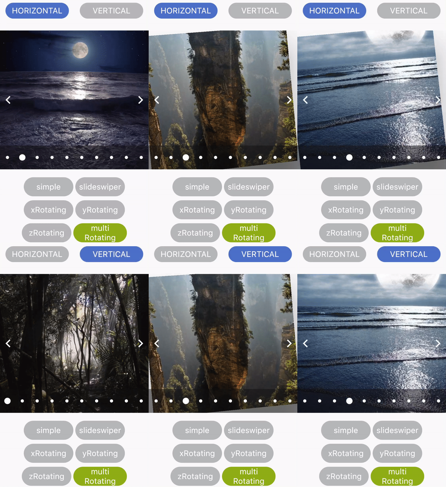
कई प्रकार और कॉन्फ़िगरेशन के साथ एक सरल कैरोसेल पैकेज।

30-दिन डाउनलोड
53
लाइक
30
Pub अंक
25

पैकेज इंस्टॉल करें

flutter pub add flutter_multi_carousel

पैकेज अवलोकन

सार्वजनिक जानकारी से बना चयन मार्गदर्शन। केवल संदर्भ हेतु।

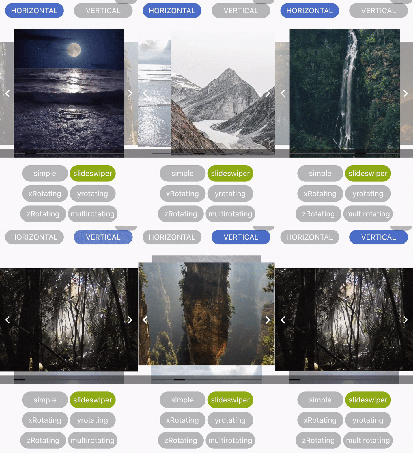
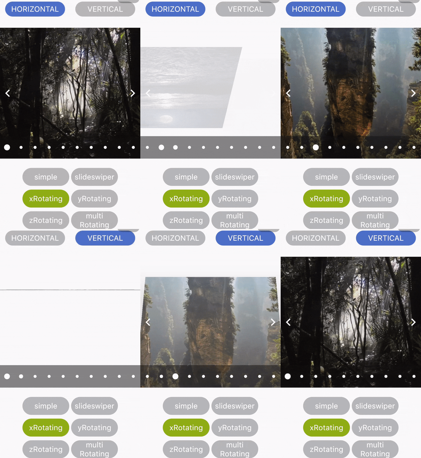
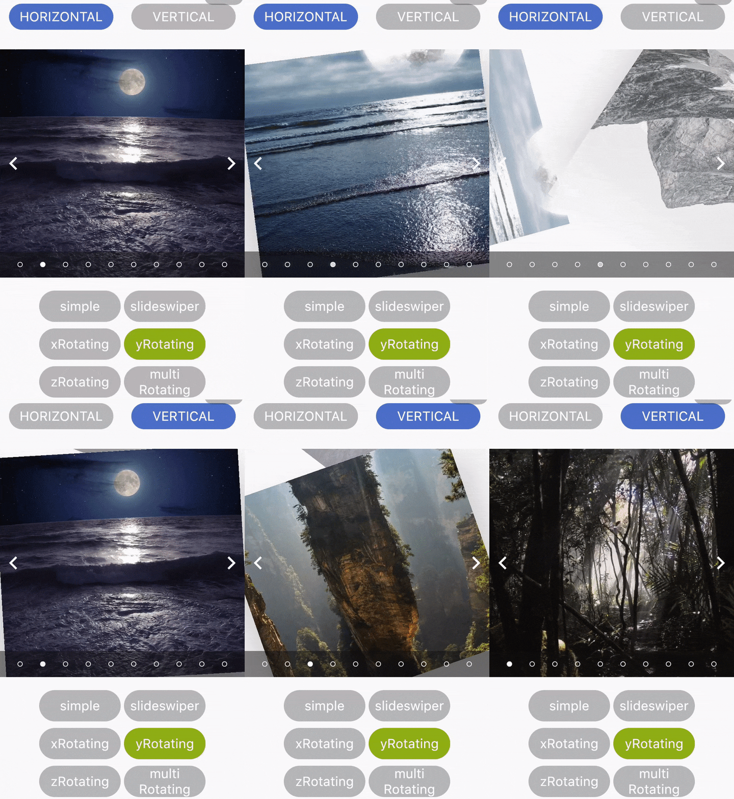
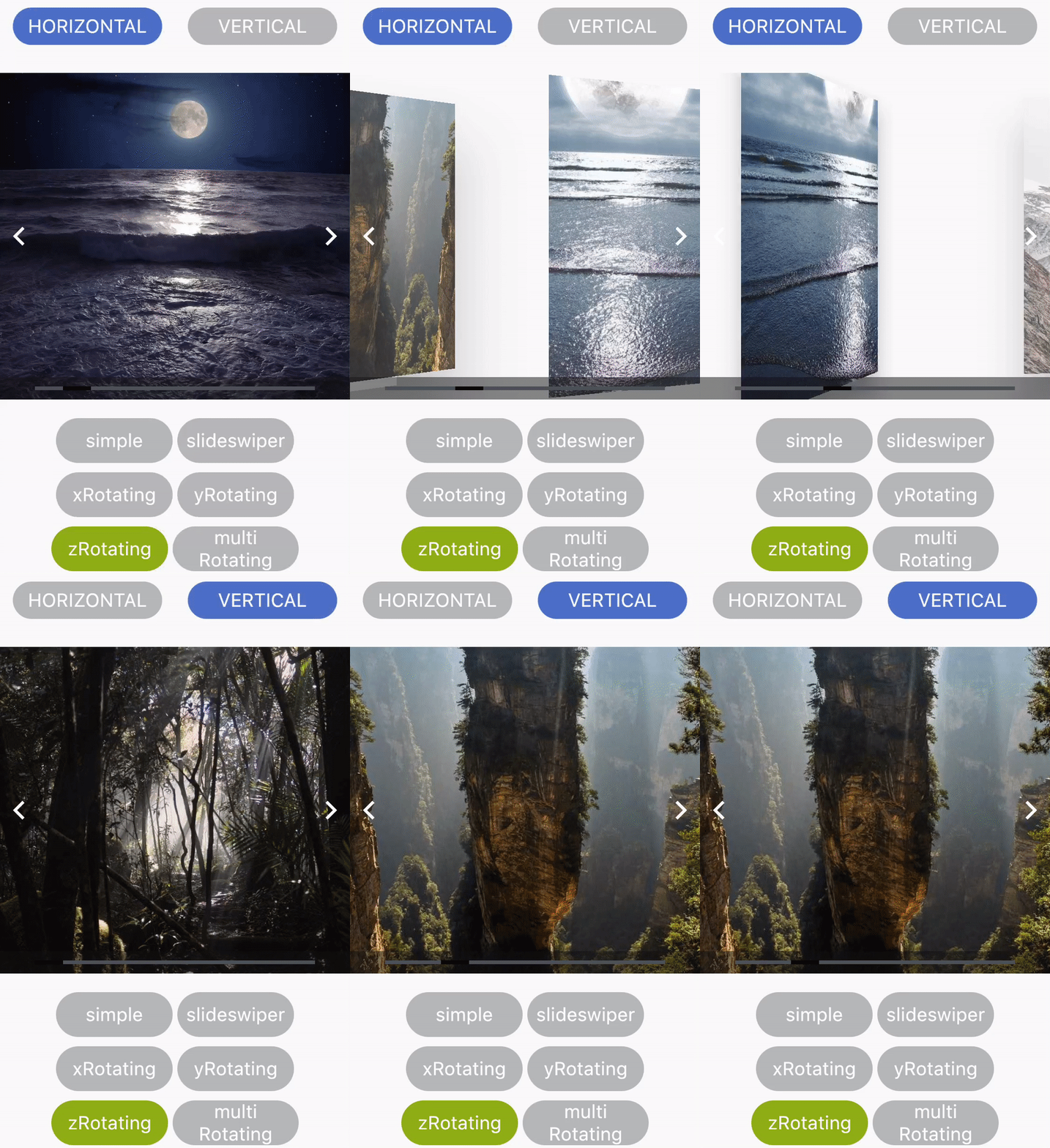
कई प्रकार के कैरोसेल बनाने के लिए एक विविध Flutter पैकेज जिसमें कस्टमाइज़ कॉन्फ़िगरेशन सपोर्ट है। यह विभिन्न कैरोसेल शैलियों, जैसे मानक, कवर फ्लो और इंटरएक्टिव लेआउट को सपोर्ट करता है, जिससे चिकनी स्क्रॉलिंग और रिस्पॉन्सिव डिज़ाइन संभव होता है। छवियों, उत्पादों या सामग्री को दृश्य रूप से आकर्षक तरीके से प्रदर्शित करने के लिए आदर्श। पैकेज हल्का है और आसानी से एकीकृत किया जा सकता है, जिसमें कॉन्फ़िगरेबल एनीमेशन, इंडिकेटर और स्वाइप गेस्चर के माध्यम से लचीलापन प्रदान किया जाता है। जटिल सेटअप के बिना गतिशील, पुनर्उपयोगी कैरोसेल कंपोनेंट्स की तलाश करने वाले डेवलपर्स के लिए डिज़ाइन किया गया है।

उपयोग

  • चित्र गैलरी प्रदर्शित करना
  • उत्पाद सूचियों का प्रदर्शन
  • इंटरैक्टिव कंटेंट स्लाइडर बनाना
  • ऑनबोर्डिंग स्क्रीन्स बनाना
  • एप्स में फीचर्ड आइटम प्रस्तुत करना
  • दृश्य संक्रमण के साथ उपयोगकर्ता भागीदारी में सुधार

मुख्य विशेषताएँ

  • कई कैरोसेल प्रकार (मानक, कवर फ्लो)
  • कस्टमाइज़ेबल एनीमेशन और ट्रांज़िशन
  • निर्मित पृष्ठ संकेतक
  • स्वाइप गेस्चर समर्थन
  • प्रतिक्रियाशील लेआउट संभालना
  • न्यूनतम कॉन्फ़िगरेशन के साथ आसान एकीकरण

इनके लिए उपयुक्त

  • मोबाइल ऐप विकासकर्ता
  • UI/UX डिजाइनर
  • ई-कॉमर्स एप्लिकेशन्स
  • सामग्री से भरपूर एप्लिकेशन
  • इंटरैक्टिव प्रोटोटाइप
  • गतिशील सामग्री प्रदर्शन की आवश्यकता वाले ऐप्स

विचार योग्य बातें

  • सीमित प्लेटफॉर्म-विशिष्ट कस्टमाइज़ेशन
  • कोई बिल्ट-इन ऑटोप्ले नियंत्रण नहीं
  • बड़े डेटासेट के हैंडलिंग के लिए मैन्युअल दखल आवश्यक है
  • जटिल लेआउट के लिए अतिरिक्त स्टाइलिंग की आवश्यकता हो सकती है
  • बहुत उच्च प्रदर्शन दृश्यों के लिए अनअनुकूलित
  • अपडेट के लिए बाहरी भंडार पर निर्भर करता है
मूल README

संबंधित सोर्स रिपॉज़िटरी के मूल README का स्नैपशॉट। नवीनतम सामग्री के लिए रिपॉज़िटरी देखें।

Flutter_Carosel

A simple Carousel Widget with multiple configuration option.

...
dependencies:
 ...
 flutter_multi_carousel: ^1.0.0
...

And install it using flutter packages get on your project folder. After that, just import the module and use it:

import 'package:flutter/material.dart';
import 'package:flutter_multi_carousel/carousel.dart';

void main() => runApp(MyApp());

class MyApp extends StatelessWidget {
  // This widget is the root of your application.
  @override
  Widget build(BuildContext context) {
    return MaterialApp(
      title: 'Carousel Demo',
      home: CarouselExample(),
    );
  }
}

class CarouselExample extends StatelessWidget {
  @override
  Widget build(BuildContext context) {
    return Scaffold(
      body: Center(
        child: Carousel(
            height: 350.0,
            width: 350,
            initialPage: 3,
            allowWrap: false,
            type: Types.slideSwiper,
            onCarouselTap: (i) {
              print("onTap $i");
            },
            indicatorType: IndicatorTypes.bar,
            arrowColor: Colors.black,
            axis: Axis.horizontal,
            showArrow: true,
            children: List.generate(
                7,
                (i) => Center(
                      child:
                          Container(color: Colors.red.withOpacity((i + 1) / 7)),
                    ))),
      ),
    );
  }
}

For detailed demonstration refer this GitHub link

https://github.com/jaiswalshubham84/Flutter-Carousel

Getting Startedslide

Properties Type Default Value Description
height Double null Defines height of carousel.This field is required
width Double null Defines width of carousel. This field is required
axis Axis Axis.horizontal Defines axis of carousel.
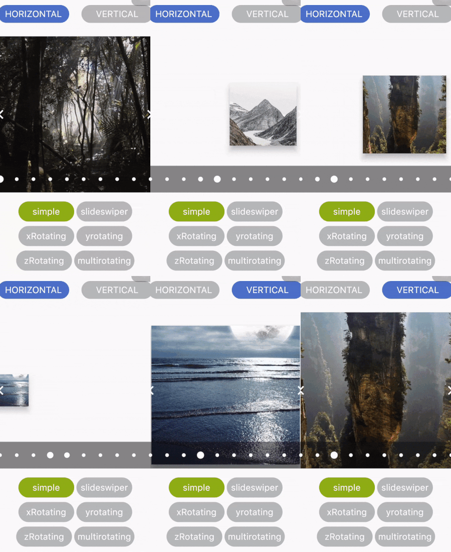
type Types "simple" Defines type of carousel.
for ex: Types.simple, Types.slideSwiper, Types.xRotating, Types.yRotating, Types.zRotating, Types.multiRotating
onCarouselTap Function null A callback function
arrowColor Color Colors.white Define the color of arrow
showIndicator Bool true Choice to show indicator in carousel
indicatorType IndicatorTypes bar Defines the type of indicator.
For ex: IndicatorTypes.bar, IndicatorTypes.dot, IndicatorTypes.bubble
initialPage int 0 Start your carousel with custom initial page number
activeIndicatorColor Color Colors.white Defines the color of active indicator
unActiveIndicatorColor Color Colors.black Defines the color of unactive indicator
indicatorBackgroundColor Color Color(0xff121212) Defines the background color of indicator
indicatorBackgroundOpacity Double 0.5 Defines the opacity of indicator background
allowWrap bool true Defines if the carousel should wrap once you reach the end or if your at the begining and go left if it should take you to the end


Credits

Developed by Shubham Jaiswal <jaiswal.shubham84@gmail.com>

Contributing

Feel free to Contribute!

For help getting started with Flutter, view our online documentation.

श्रेणियाँ

सोर्स रिपॉज़िटरी

इस पैकेज का उपयोग करने वाले प्रोजेक्ट

अभी कोई डेटा उपलब्ध नहीं है।