पैकेज, रिपॉज़िटरी और ऐप श्रेणियाँ खोजें

पैकेज विवरणv4.0.1

flutter_widget_catalogue

Flutter के दृश्य, संरचनात्मक, प्लेटफ़ॉर्म, UI और इंटरैक्टिव विजेट्स के संग्रह के साथ बहुत तेजी से शानदार ऐप्स बनाएं।

AndroidiOSmacOSWindowsLinux
30-दिन डाउनलोड
151
लाइक
34
Pub अंक
160

पैकेज इंस्टॉल करें

flutter pub add flutter_widget_catalogue

पैकेज अवलोकन

सार्वजनिक जानकारी से बना चयन मार्गदर्शन। केवल संदर्भ हेतु।

Flutter Widget Catalogue एक व्यापक संग्रह है पूर्व-निर्मित, दृश्य रूप से आकर्षक विजेट का जो ऐप विकास को तेज करने के लिए डिज़ाइन किया गया है। इसमें दृश्य डिज़ाइन, संरचनात्मक लेआउट, प्लेटफॉर्म-विशिष्ट व्यवहार और अंतरक्रियात्मक तत्वों के लिए विस्तृत श्रेणी में UI घटक उपलब्ध हैं। Flutter के लिए बनाया गया, यह विकासकर्ताओं को शुरुआत से नहीं शुरू किए बिना चमकदार, प्रतिक्रियाशील एप्लिकेशन बनाने में सक्षम बनाता है। यह पुस्तकालय Android, iOS, macOS, Windows और Linux जैसे कई प्लेटफॉर्म का समर्थन करता है, जिससे क्रॉस-प्लेटफॉर्म अनुभव सुनिश्चित होता है। त्वरित प्रोटोटाइपिंग और उत्पादन-तैयार इंटरफेस के लिए आदर्श।

उपयोग

  • त्वरित UI प्रोटोटाइपिंग
  • उत्पादन एप्लिकेशन को तेजी से बनाना
  • क्रॉस-प्लेटफॉर्म एप्प डेवलपमेंट
  • सुसंगत UI पैटर्न बनाना
  • विकासक प्रोडक्टिविटी में सुधार करना

मुख्य विशेषताएँ

  • पूर्व-डिज़ाइन किए गए विजुअल विजेट्स
  • प्लेटफॉर्म-अनुकूल घटक
  • इंटरैक्टिव यूआई तत्व
  • संरचित लेआउट टूल्स
  • pub.dev के माध्यम से आसान एकीकरण

इनके लिए उपयुक्त

  • शुरुआती Flutter विकासकर्ता
  • तेजी की तलाश में अनुभवी विकासकर्ता
  • UI सुसंगतता पर ध्यान केंद्रित टीमें
  • त्वरित समय-बाजार में आने की आवश्यकता वाली स्टार्टअप
  • डिज़ाइनर डेवलपर्स के साथ सहयोग कर रहे हैं

विचार योग्य बातें

  • अद्वितीय डिजाइन के लिए कस्टमाइजेशन की आवश्यकता हो सकती है
  • प्रकाशक के रखरखाव पर निर्भर करता है
  • कुछ क्षेत्रों में सीमित दस्तावेज़
  • अत्यधिक विशेषज्ञता वाले UI की आवश्यकताओं के लिए उपयुक्त नहीं
  • अत्यधिक उपयोग करने पर संभावित निर्भरता ब्लॉट

मूल README

संबंधित सोर्स रिपॉज़िटरी के मूल README का स्नैपशॉट। नवीनतम सामग्री के लिए रिपॉज़िटरी देखें।

🚀 Flutter Widget Catalogue

pub package GitHub stars License: MIT Flutter Compatible Platform


A collection of visual, structural, platform-adaptive, and interactive widgets to help you build beautiful and functional Flutter apps faster.
🎯 100% Dart | 💙 Flutter-ready | ✅ Easy to use | 🧩 Modular components


✨ Available Components

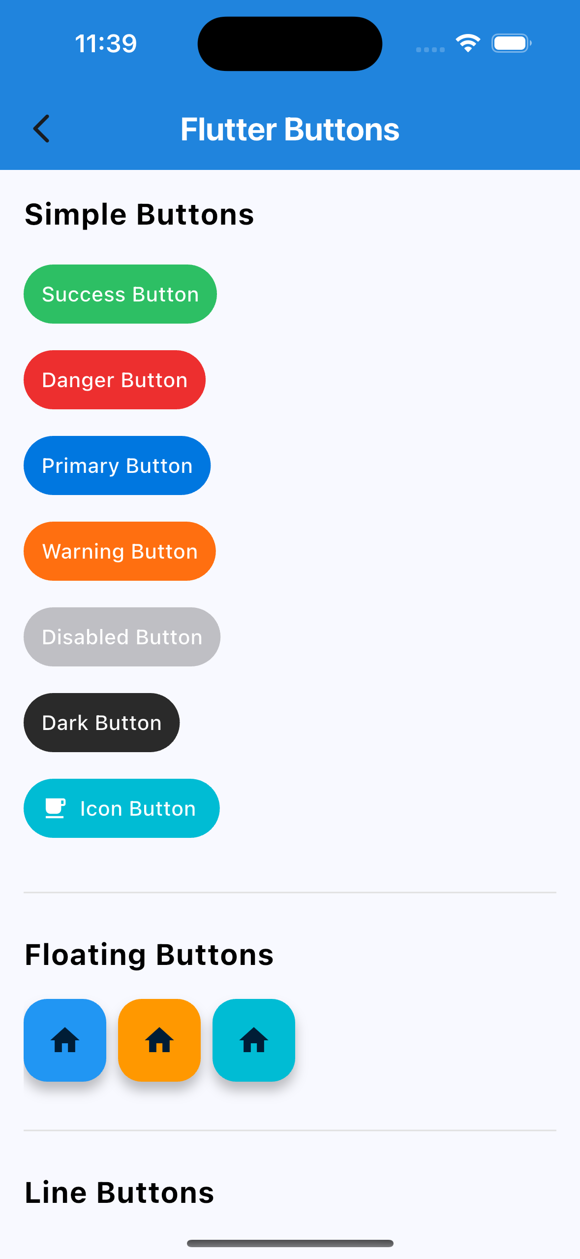
🔘 Buttons
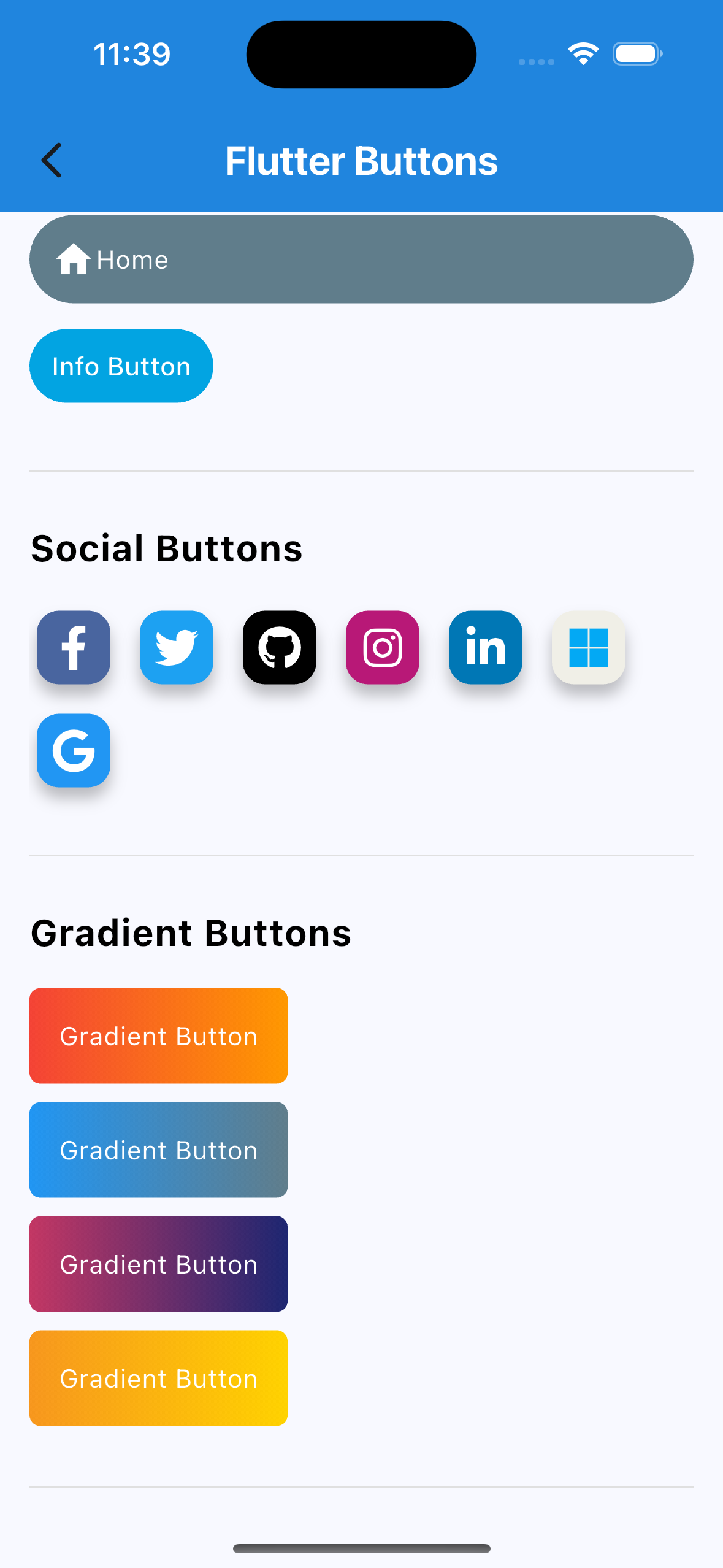
  • Social Auth Buttons (Google, Facebook, Apple, etc.)
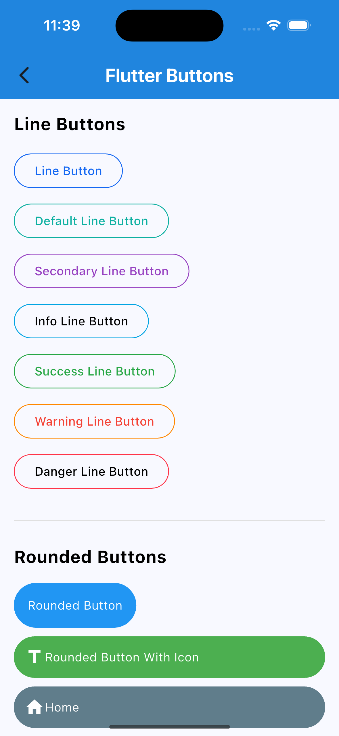
  • Rounded Buttons
  • Icon Buttons
  • Line Buttons
  • Gradient Buttons
  • Many more…
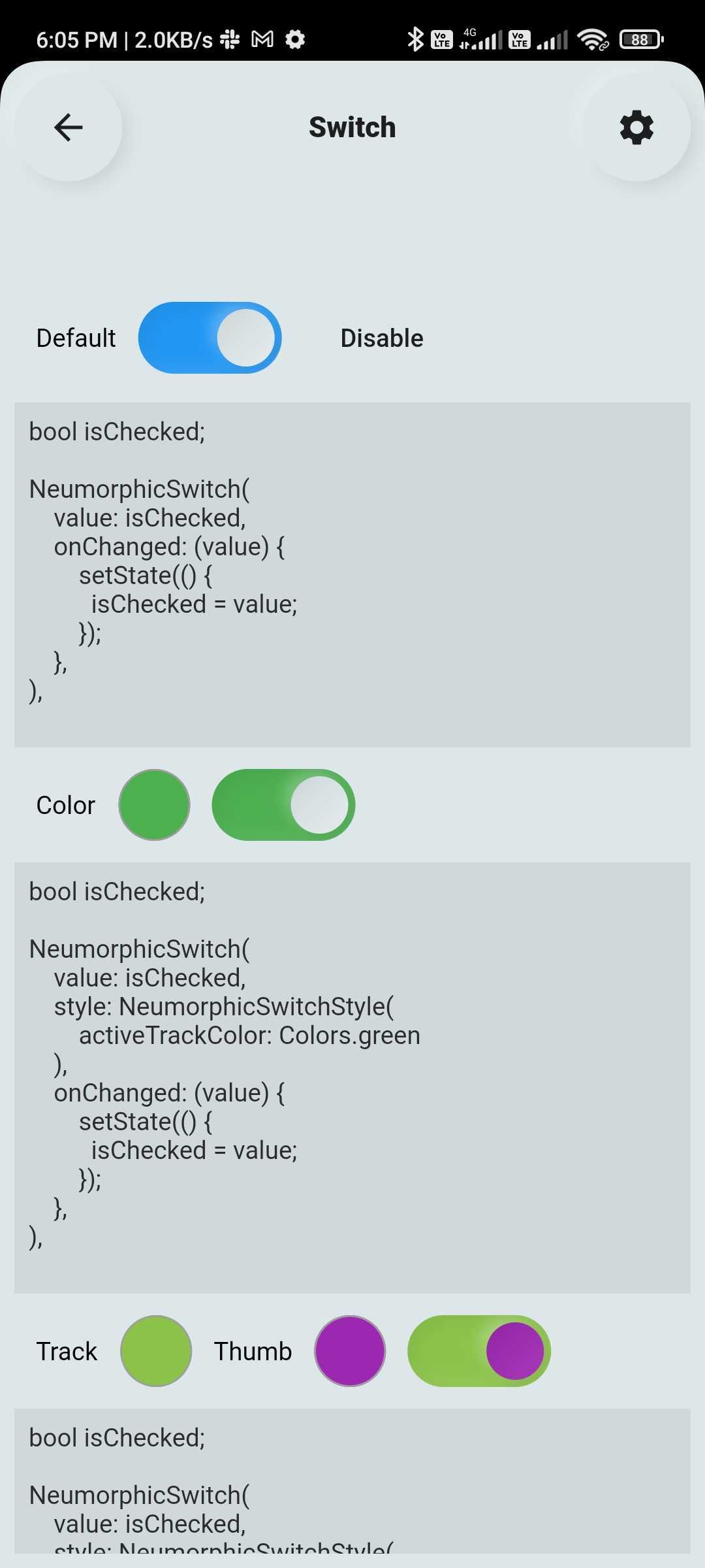
🔄 Custom Switch

Highly customizable Flutter switch widget:

  • Adjustable height, width, toggle size
  • Borders, colors, radius, icons, labels
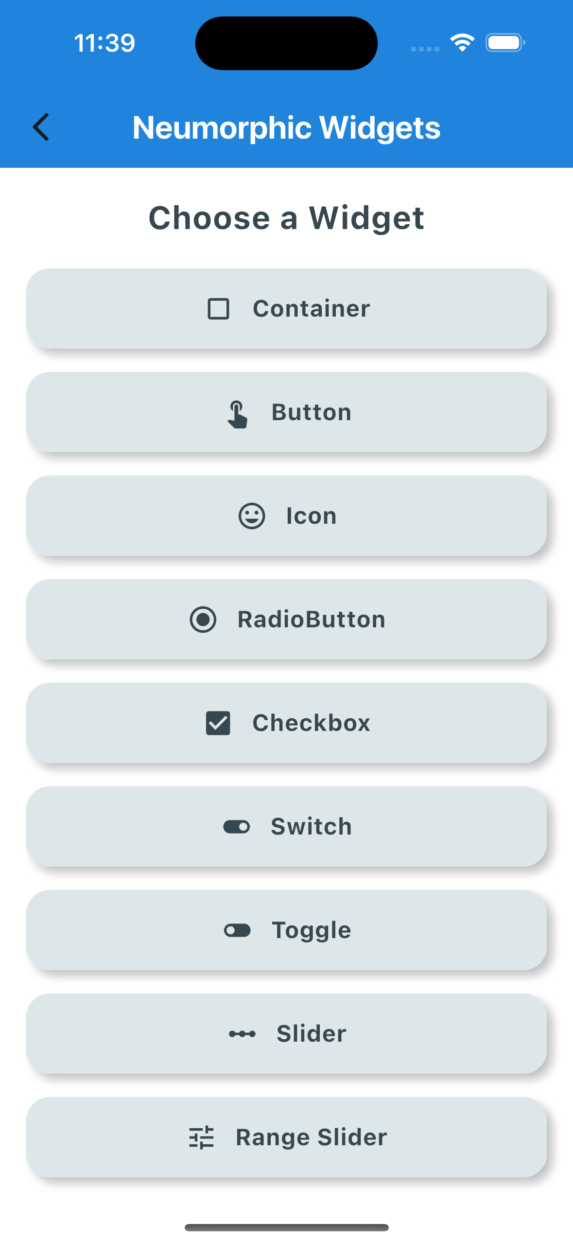
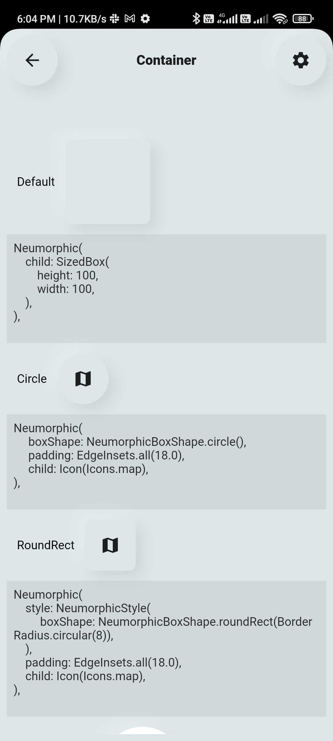
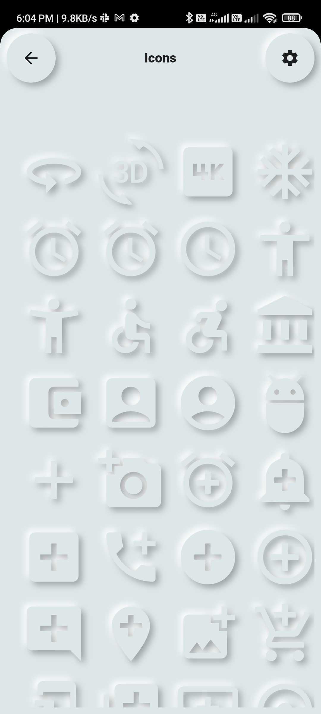
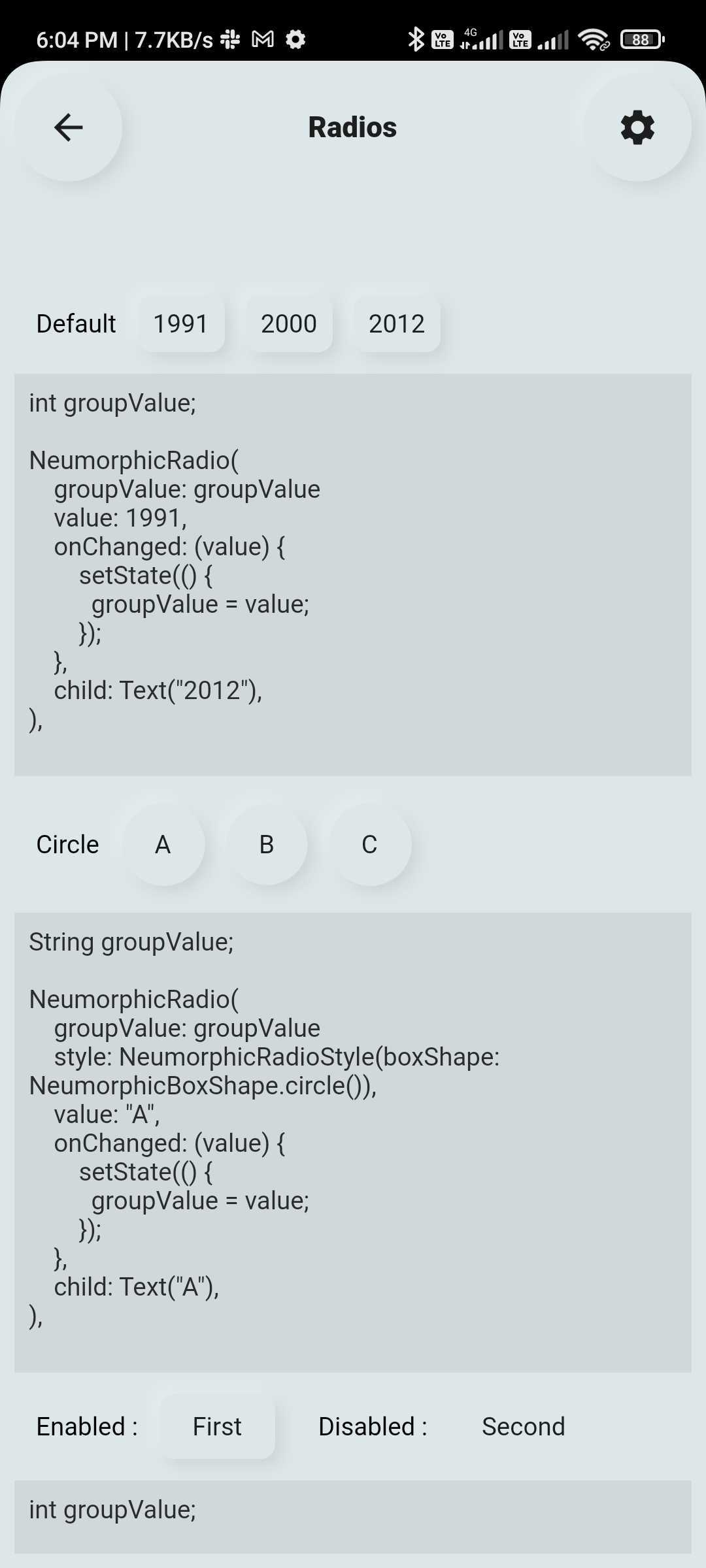
💠 Neumorphic UI Kit

Ready-to-use Neumorphic-styled widgets with glass mode:

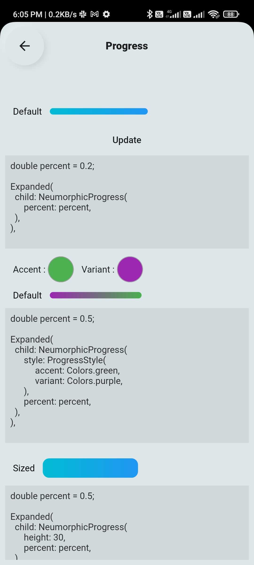
  • Buttons, Switches, Containers, Sliders, Texts, Icons
  • Checkboxes, Toggles, Indicators, Range Sliders, AnimatedList and more
🔤 Text Fields

Fully customizable and themeable text input fields:

  • Outline, filled, underlined, or borderless styles
  • Support for icons, hint text, labels
  • Password visibility toggle, character counter, input formatter support
  • Focus, validation, and keyboard behavior control

🆕 New Features (Latest Update 🚀)

📊 Customizable & Animated Layouts
  • Animated ListView
  • Animated GridView
  • Masonry Layout support
  • Quilted Layout support
  • Smooth UI transitions & effects
💎 Glass Effect in Neumorphic UI
  • Added Glassmorphism (blur + transparency) support view
  • Works with existing Neumorphic components
🔽 Advanced Custom Dropdowns
  • Multi-select dropdown with chips
  • Scrollable chip-based selection
  • Hierarchical dropdown (tree structure)
  • Autocomplete dropdown (e.g., locations)
  • Custom item UI (user profile, icons, etc.)
  • Custom header & builder support

📦 Installation

Add the dependency to your pubspec.yaml:

dependencies:
  flutter_widget_catalogue: <latest-version>

Then import it:

import 'package:flutter_widget_catalogue/flutter_widget_catalogue.dart';

🖼️ Screenshots

Neumorphic Widgets
Buttons
DropDown
Components
Switch TextField List & Grid

🧪 Usage

Buttons Example
SuccessButton(title: "Success Button", onPressed: () {});
ButtonWithIcon(
  icon: Icons.local_cafe,
  title: "Icon Button",
  color: Colors.white,
  buttonColor: Colors.cyan,
  onPressed: () {},
);
GradientButton(
  onPressed: () {},
  splashColor: Colors.orange,
  colors: [Colors.red, Colors.orange],
  title: "Gradient Button",
);
Switch Example
FlutterSwitch(
  width: 90.0,
  height: 45.0,
  toggleSize: 38.0,
  value: status,
  borderRadius: 24.0,
  padding: 2.0,
  toggleColor: Colors.white,
  switchBorder: Border.all(color: Colors.blueAccent, width: 3.0),
  activeColor: Colors.cyan,
  inactiveColor: Colors.grey.shade400,
  onToggle: (val) {
    setState(() {
      status = val;
    });
  },
);
TextField Example
FlutterTextField(
  borderRadius: 50,
  hintText: "Fill Color",
  hintStyling: TextStyle(color: Colors.black),
  readOnly: false,
  fillColor: Colors.pink,
  borderColor: Colors.transparent,
  cursorColor: Colors.black,
);
FlutterTextField(
  iconBackgroundColor: Colors.black,
  borderRadius: 20,
  customTextFieldIcon: Icon(
  Icons.lock,
  color: Colors.black,),
  hintText: "Enter your password",
  isPasswordField: true,
  isIconShow: true,
  readOnly: false,
  fillColor: Colors.white,
  borderColor: Colors.black,
  cursorColor: Colors.black,
  leadingIconColor: Colors.black,
  labelName: "Password",
);
FlutterTextField(
  isIconShow: false,
  iconBackgroundColor: Colors.white10,
  borderRadius: 30,
  isNumber: true,
  hintText: "Enter your number",
  readOnly: false,
  borderColor: Colors.yellow,
  labelName: "Phone number",
  labelNameTextStyle: const TextStyle(color: Colors.black, fontSize: 20, fontWeight: FontWeight.w600),
);
Dropdown Example
HierarchySearchableDropdown(
  items: _kSampleData,
  hint: 'Select Multiple Items',
  isMultiline: true,
  isMultiSelect: true,
  onChanged: (label) => setState(() => selectedLabel = label),
  validator: (value) {
    if (value == null || value.isEmpty) {
      return 'Please select at least one item';
    }
    return null;
  },
  itemSpacing: 2,
  listPadding: const EdgeInsets.symmetric(vertical: 16),
  itemTextStyle: const TextStyle(
    color: Colors.black,
    fontSize: 15,
  ),
);
HierarchySearchableDropdown(
  items: _kFilterData,
  hint: 'Select Filters',
  isMultiSelect: true,
  showChips: true,
  isMultiline: false,
  onChanged: (label) => setState(() => selectedFilters = label),
),

✅ Platform Support

Platform Supported
Android ✅
iOS ✅
Web ✅

📌 Changelog

Please see the CHANGELOG.md for a list of recent changes.


👨‍💻 Contributors


📃 License

This project is licensed under the MIT License.

श्रेणियाँ

निर्भरताएँ

निर्भरता सूची 1 आइटम

सोर्स रिपॉज़िटरी

इस पैकेज का उपयोग करने वाले प्रोजेक्ट

अभी कोई डेटा उपलब्ध नहीं है।