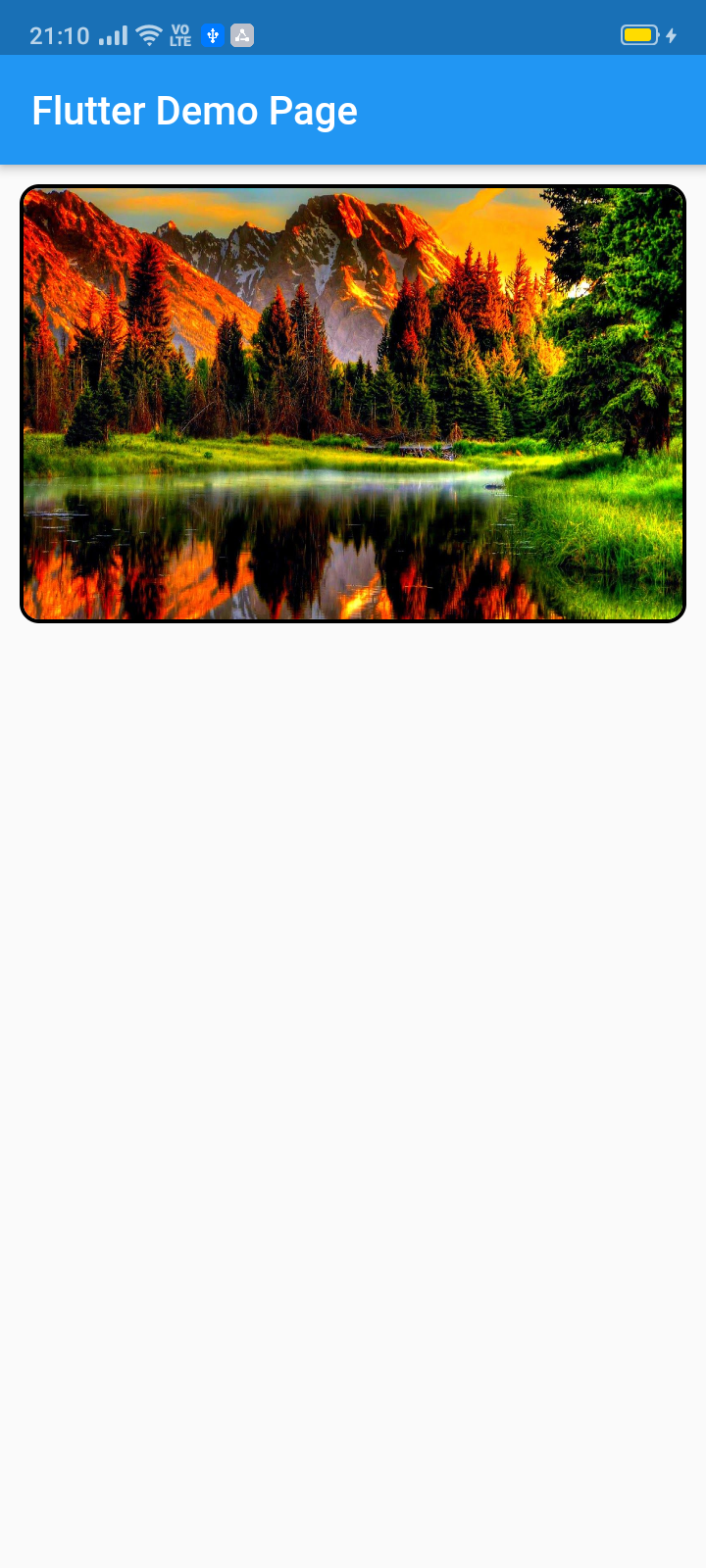
इस पब का उपयोग आपके द्वारा पूरी तरह से कस्टमाइज़ किए गए विजेट स्लाइडर (स्वचालित/हाथ से स्लाइडिंग) बनाने के लिए किया जा सकता है। मुख्य रूप से छवि स्लाइडर के लिए बनाया गया, यह सभी अन्य विजेट्स को भी स्वीकार करता है।
सार्वजनिक जानकारी से बना चयन मार्गदर्शन। केवल संदर्भ हेतु।
image_slider पैकेज फ्लटर में कस्टमाइज़ेबल स्लाइडर बनाने की अनुमति देता है, जो स्वचालित और हाथ से स्लाइडिंग ट्रांज़िशन का समर्थन करता है। यह मुख्य रूप से छवियों को दिखाने के लिए डिज़ाइन किया गया है, लेकिन किसी भी विजेट प्रकार को भी समर्थित करता है, जिससे सामग्री प्रस्तुत करने में लचीलापन मिलता है। पूरी तरह से कस्टमाइज़ेशन विकल्पों के साथ, विकासकर्ता स्लाइडर के दिखावट और व्यवहार को विभिन्न डिज़ाइन आवश्यकताओं के अनुसार ढाल सकते हैं। यह ऐप्स में गैलरी, उत्पाद प्रदर्शन या प्रचार सामग्री को प्रदर्शित करने के लिए आदर्श है। पैकेज ओपन-सोर्स है और GitHub पर बनाए रखा जाता है, जिससे समुदाय के योगदान और संशोधन के लिए उपलब्ध है।
उपयोग
इमेज गैलरी
उत्पाद कैरोसेल
प्रमोशनल बैनर
डायनामिक कंटेंट स्लाइड्स
इंटरैक्टिव यूआई तत्व
मुख्य विशेषताएँ
स्वचालित और हाथ से स्लाइड
पूर्ण विजेट कस्टमाइज़ेशन
किसी भी विजेट प्रकार का समर्थन
ओपन-सोर्स और समुदाय-चालित
pub add के माध्यम से आसान एकीकरण
इनके लिए उपयुक्त
मोबाइल ऐप विकासकर्ता
UI/UX डिजाइनर
ई-कॉमर्स एप्लिकेशन्स
सामग्री से भरपूर एप्लिकेशन
कस्टम कैरोसेल इंप्लीमेंटेशन
विचार योग्य बातें
सीमित प्लेटफॉर्म-विशिष्ट अनुकूलन
कोई निर्मित ओलाह पृष्ठ संकेतक नहीं है
उन्नत डिजाइन के लिए हस्तचालित स्टाइलिंग की आवश्यकता होती है
बाहरी रखरखाव पर निर्भर है
एनिमेशन के लिए अतिरिक्त निर्भरता की आवश्यकता हो सकती है
मूल README
संबंधित सोर्स रिपॉज़िटरी के मूल README का स्नैपशॉट। नवीनतम सामग्री के लिए रिपॉज़िटरी देखें।
image_slider
This pub lets you make a widget slider (automatic/manual sliding) with full customization. Mainly intended for image slider, this also accepts all other widgets.
ImageSlider(
/// Shows the tab indicating circles at the bottom
showTabIndicator: false,
/// Cutomize tab's colors
tabIndicatorColor: Colors.lightBlue,
/// Customize selected tab's colors
tabIndicatorSelectedColor: Color.fromARGB(255, 0, 0, 255),
/// Height of the indicators from the bottom
tabIndicatorHeight: 16,
/// Size of the tab indicator circles
tabIndicatorSize: 16,
/// tabController for walkthrough or other implementations
tabController: tabController,
/// Animation curves of sliding
curve: Curves.fastOutSlowIn,
/// Width of the slider
width: MediaQuery.of(context).size.width,
/// Height of the slider
height: 220,
/// If automatic sliding is required
autoSlide: false,
/// Time for automatic sliding
duration: newDuration(seconds: 6),
/// If manual sliding is required
allowManualSlide: true,
/// Children in slideView to slide
children: links.map((String link) {
returnnewClipRRect(
borderRadius: BorderRadius.circular(8.0),
child: Image.network(
link,
width: MediaQuery.of(context).size.width,
height: 220,
fit: BoxFit.fill,
));
}).toList(),
),
License
Copyright 2020 Jay Mehta

Licensed under the Apache License, Version 2.0 (the "License");
you may not use this file except in compliance with the License.
You may obtain a copy of the License at

    http://www.apache.org/licenses/LICENSE-2.0

Unless required by applicable law or agreed to in writing, software
distributed under the License is distributed on an "AS IS" BASIS,
WITHOUT WARRANTIES OR CONDITIONS OF ANY KIND, either express or implied.
See the License for the specific language governing permissions and
limitations under the License.
Getting Started
This project is a starting point for a Dart
package,
a library module containing code that can be shared easily across
multiple Flutter or Dart projects.
For help getting started with Flutter, view our
online documentation, which offers tutorials,
samples, guidance on mobile development, and a full API reference.
Example
As time based...
import'package:flutter/material.dart';
import'package:image_slider/image_slider.dart';
voidmain() {
runApp(MyApp());
}
classMyAppextendsStatelessWidget{
@overrideWidgetbuild(BuildContext context) {
returnMaterialApp(
title: 'Flutter Demo',
debugShowCheckedModeBanner: false,
theme: ThemeData(
primarySwatch: Colors.blue,
visualDensity: VisualDensity.adaptivePlatformDensity,
),
home: MyHomePage(title: 'Flutter Image Slider Demo Page'),
);
}
}
classMyHomePageextendsStatefulWidget{
MyHomePage({Key key, this.title}) : super(key: key);
finalString title;
@override_MyHomePageStatecreateState() => _MyHomePageState();
}
class_MyHomePageStateextendsState<MyHomePage>
withSingleTickerProviderStateMixin{
/// This pub allows you to make image_slider widget and also multiple other useful widgets like walkthrough etc.@overridevoidinitState() {
super.initState();
tabController = TabController(length: 3, vsync: this);
}
TabController tabController;
staticList<String> links = [
"https://i.pinimg.com/originals/cc/18/8c/cc188c604e58cffd36e1d183c7198d21.jpg",
"https://www.kyoceradocumentsolutions.be/blog/wp-content/uploads/2019/03/iStock-881331810.jpg",
"https://resources.matcha-jp.com/resize/720x2000/2020/04/23-101958.jpeg"
];
@overrideWidgetbuild(BuildContext context) {
returnScaffold(
appBar: AppBar(
title: Text(widget.title),
),
body: Column(
children: [
Container(
margin: EdgeInsets.all(10),
decoration: BoxDecoration(
borderRadius: BorderRadius.circular(10),
border: Border.all(width: 2)),
child: ImageSlider(
/// Shows the tab indicating circles at the bottom
showTabIndicator: false,
/// Cutomize tab's colors
tabIndicatorColor: Colors.lightBlue,
/// Customize selected tab's colors
tabIndicatorSelectedColor: Color.fromARGB(255, 0, 0, 255),
/// Height of the indicators from the bottom
tabIndicatorHeight: 16,
/// Size of the tab indicator circles
tabIndicatorSize: 16,
/// tabController for walkthrough or other implementations
tabController: tabController,
/// Animation curves of sliding
curve: Curves.fastOutSlowIn,
/// Width of the slider
width: MediaQuery.of(context).size.width,
/// Height of the slider
height: 220,
/// If automatic sliding is required
autoSlide: false,
/// Time for automatic sliding
duration: newDuration(seconds: 6),
/// If manual sliding is required
allowManualSlide: true,
/// Children in slideView to slide
children: links.map((String link) {
returnnewClipRRect(
borderRadius: BorderRadius.circular(8.0),
child: Image.network(
link,
width: MediaQuery.of(context).size.width,
height: 220,
fit: BoxFit.fill,
));
}).toList(),
),
),
Row(
mainAxisAlignment: MainAxisAlignment.spaceEvenly,
children: [
tabController.index == 0
? Container(
width: 0,
height: 0,
)
: RaisedButton(
onPressed: () {
tabController.animateTo(tabController.index - 1);
setState(() {});
},
child: Text("Previous"),
),
tabController.index == 2
? Container(
width: 0,
height: 0,
)
: RaisedButton(
onPressed: () {
tabController.animateTo(2);
setState(() {});
},
child: Text("Skip"),
),
tabController.index == 2
? Container(
width: 0,
height: 0,
)
: RaisedButton(
onPressed: () {
tabController.animateTo(tabController.index + 1);
setState(() {});
},
child: Text("Next"),
),
],
)
],
));
}
}