सार्वजनिक जानकारी से बना चयन मार्गदर्शन। केवल संदर्भ हेतु।
material3_layout पैकेज विकासकर्ताओं को मैटेरियल डिज़ाइन 3 सिद्धांतों के अनुरूप अनुकूल, प्रतिक्रियाशील एप्लिकेशन बनाने की अनुमति देता है। यह विभिन्न स्क्रीन आकारों और उपकरण प्रकारों के लिए स्वचालित रूप से अनुकूलित होने वाले कस्टमाइज़ेबल लेआउट कंपोनेंट और उपकरण प्रदान करता है, जिससे एंड्रॉइड, आईओएस, वेब, मैकओएस, विंडोज और लिनक्स पर सुसंगत उपयोगकर्ता अनुभव सुनिश्चित होता है। आधुनिक फ्लटर क्षमताओं का उपयोग करके, यह मैटेरियल 3 के दृश्य पदानुक्रम, अंतराल और लेआउट पैटर्न के कार्यान्वयन को सरल बनाता है। यह पैकेज बहु-प्लेटफॉर्म डेप्लॉयमेंट के साथ डिज़ाइन सुसंगतता बनाए रखने की कोशिश कर रही टीमों के लिए आदर्श है।
उपयोग
प्रतिक्रियाशील डैशबोर्ड बनाना
क्रॉस-प्लेटफॉर्म यूआई बनाना
अनुकूल लेआउट कार्यान्वयन
आधुनिक मोबाइल और वेब ऐप्स का डिज़ाइन करना
Material 3 सुसंगतता सुनिश्चित करें
मुख्य विशेषताएँ
अनुकूल लेआउट घटक
Material Design 3 समानता
बहुप्लेटफॉर्म समर्थन
कस्टमाइज़ किए गए स्पेसिंग और ग्रिड्स
प्रतिक्रियाशील ब्रेकपॉइंट्स
इनके लिए उपयुक्त
Flutter का उपयोग करने वाले UI डिज़ाइनर
क्रॉस-प्लेटफॉर्म ऐप डेवलपर्स
Material 3 दिशानिर्देशों का पालन करने वाली टीमें
पुनर्उपयोगी लेआउट पैटर्न की तलाश में विकासकर्ता
प्रतिक्रियाशील डिज़ाइन की आवश्यकता वाले परियोजनाएं
विचार योग्य बातें
Flutter SDK 3.0 या उच्चतर की आवश्यकता है
अतिरिक्त स्टाइल कस्टमाइज़ेशन की आवश्यकता हो सकती है
Material 3 थीम एकीकरण पर निर्भर करता है
आधुनिक फ्लटर अभ्यास के साथ सबसे अच्छा उपयोग किया जाता है
लेआउट-केंद्रित कार्यक्षमता तक सीमित
मूल README
संबंधित सोर्स रिपॉज़िटरी के मूल README का स्नैपशॉट। नवीनतम सामग्री के लिए रिपॉज़िटरी देखें।
I created this package to simplify the development of adaptive applications for compact, medium and large screens. This package is fully built on the Material Design 3 guideline.
Developing adaptive applications for different devices and form factors is not an easy task, but I have created a package that simplifies this development process and saves your time!
First step
To begin, change MaterialApp to GetMaterialApp and make sure to set useMaterial3 to true, otherwise the material design theme won't work.
Navigation Scaffold is essentially a modified Scaffold for managing primary navigation. Therefore, it will be your main widget, and there is no need to wrap it inside a regular Scaffold.
You can pass a regular AppBar() that will be displayed on every page of your application. This parameter is optional. However, if you choose the modal driver as the primary navigation, in that case, even if you do not specify it, it will be automatically added to display the icon for opening and closing the drawer.
As an argument for the theme parameter, you need to pass an instance of the ThemeData class. This is necessary for the Material 3 theme to work correctly, as well as for switching between dark and regular themes. This parameter is required, just pass Theme.of(context) into it and that's it.
This parameter is responsible for what will be displayed as primary navigation. As an argument for the navigationType parameter, you need to pass NavigationTypeEnum.
NavigationTypeEnum has 3 options:
1: drawer
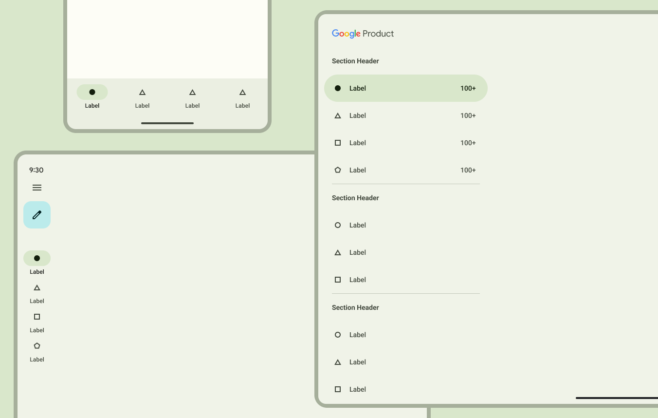
NavigationTypeEnum.drawer - On large and medium screens, NavigationDrawer will be displayed, on small screens, ModalDrawer will be displayed.
NavigationTypeEnum.modalDrawer - the same as a regular drawer, but this one is modal and will open by clicking on the menu icon in the appbar on any screen.
NavigationTypeEnum.railAndBottomNavBar - this is the default option. On large and medium screens, NavigationRail will be displayed, on small screens, NavigationBar (at the bottom of the screen) will be displayed.
If you do not explicitly specify NavigationTypeEnum, NavigationTypeEnum.railAndBottomNavBar will be selected.
NavigationSettings
The navigationSettings parameter is responsible for configuring and displaying your Primary navigation. It takes either a DrawerSettings or RailAndBottomSettings as an argument.
RailAndBottomSettings
RailAndBottomSettings takes only 2 required parameters and 7 optional ones. Let's take a closer look at each parameter:
pages - accepts a list of widgets for your app's pages
destinations - accepts a list of DestinationModel. This is an analog of the usual NavigationRailDestination/NavigationDestination/NavigationDrawerDestination
DestinationModel(
label: 'Home',
icon: constIcon(Icons.home_outlined),
selectedIcon: constIcon(Icons.home_filled),
tooltip: 'Home page',
badge: // Choose or badge or icon parameter
),
leading - shown only in NavigationRail on medium and large screens at the top of the NavigationRail. Accepts any widget
trailing - shown only in NavigationRail on medium and large screens below the last destination. Accepts any widget.
groupAlignment: If set to -1.0, the destinations in NavigationRail will be at the top, 0.0 will be in the middle, and 1.0 will be at the bottom
addThemeSwitcherTrailingIcon: If true, a button will be displayed at the bottom of NavigationRail to switch between dark and light themes. It works automatically, no logic needs to be written for it.
type: it accepts NavigationTypeEnum, and is already set as needed, it does not need to be changed.
showMenuIcon: If true, an icon will be displayed at the top of NavigationRail. Clicking on it will expand NavigationRail and clicking again will hide it. This works out of the box.
labelType: determines the display of the label in NavigationRail.
Use DrawerSettings if you have selected drawer or modalDrawer as the navigationType parameter. It accepts 3 required parameters: pages, destinations, and type.
pages - accepts a list of widgets for your app's pages
Select the same navigation type that you previously set in NavigationScaffold.
onDestinationSelected
You can pass your own business logic to the onDestinationSelected method, which will be executed when the user navigates to a certain page. IMPORTANT! You don't need to pass the code here to change the currently selected page, as it is already implemented out of the box.
returnNavigationScaffold(
onDestinationSelected: (int index) {
// Pass your bussiness logic here
}
);
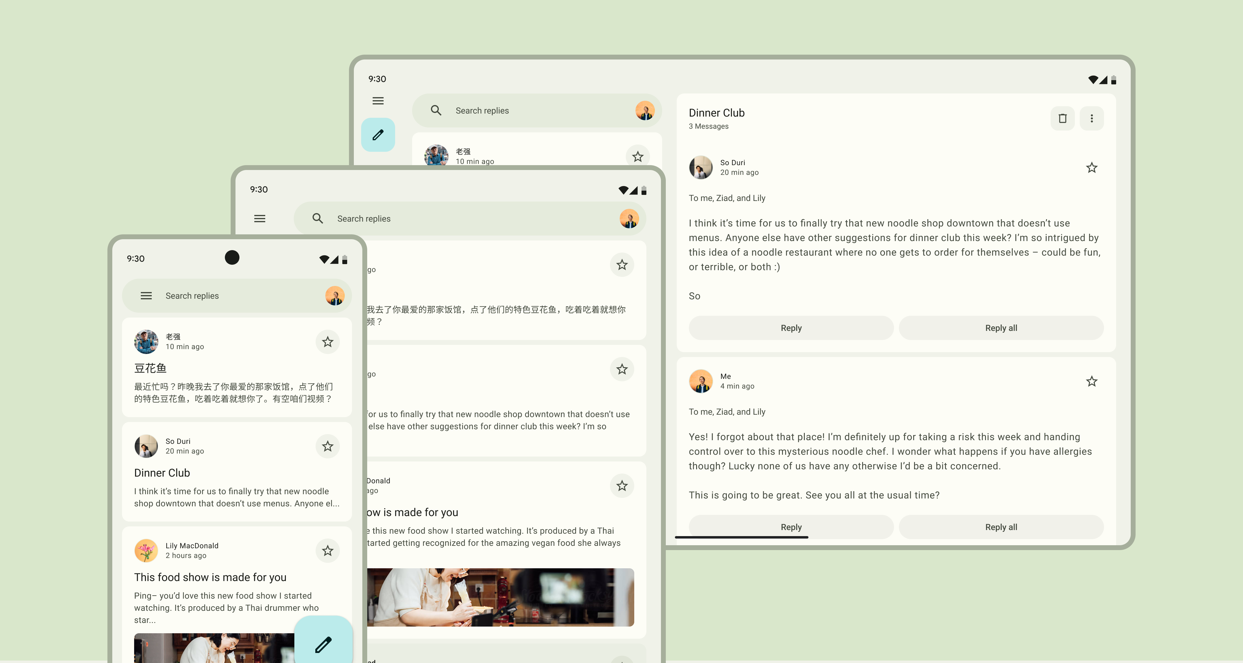
PageLayout is the main widget for the content of your page. It takes three parameters with type Layout, each of which controls how your widgets will be displayed on different screen sizes:
compactLayout - This parameter controls the layout on screens smaller than 600 dp.
mediumLayout - This parameter controls the layout on screens from 600 dp to 840 dp.
expandedLayout - This parameter controls the layout on screens larger than 840 dp.
The material design guideline presents 3 layout options for different needs. In this package, they are represented as 3 widgets:
Single pane layout
When using SinglePaneLayout, all the content of your page will be placed on a single pane that will stretch across the width of your screen.
Example
classProfilePageextendsStatelessWidget{
constProfilePage({super.key});
@overrideWidgetbuild(BuildContext context) {
returnconstPageLayout(
compactLayout: SinglePaneLayout(
// add some vertical padding to the page. // Horizontal padding is added out of the box, depending of screen size// By default is set to 0
verticalPadding: 10,
// Pass your widgets here
child: YourContentWidget(),
);
);
}
}
Two pane layout
TwoPaneLayout have two panes
Fixed pane with fixed 360 width
Flexible pane that takes all remaining space.
Also, there is a 24dp spacing between the two panes. You do not need to add it separately, it will be added automatically.
Example
classProfilePageextendsStatelessWidget{
constProfilePage({super.key});
@overrideWidgetbuild(BuildContext context) {
returnconstPageLayout(
compactLayout: ,
mediumLayout: ,
expandedLayout: TwoPaneLayout(
fixedPaneChild: YourFixedWidgetHere(),
flexiblePaneChild: YourFlexibleWidgetHere(),
// Fixed pane can be positioned either // on the left (by default) or on the right
fixedPanePosition: FixedPanePositionEnum.left,
verticalPadding: 0,
);
);
}
}
TwoPaneLayout is recommended to be used only for the expandedLayout.
Split pane layout
SplitPaneLayout is an alternative to TwoPaneLayout. It also takes 2 panes, but they have the same width.
Typically, it is used with the expandedLayout and sometimes with the mediumLayout.
The parameters of the PageLayout widget accept only the Layout type, which means only the SinglePaneLayout/TwoPaneLayout/SplitPaneLayout widgets.
Doing it as shown in the example below is not possible. That's because the MediumLayout widget doesn't have a Layout type.
classMediumLayoutextendsStatelessWidget{
constMediumLayout({super.key});
@overrideWidgetbuild(BuildContext context) {
returnSinglePaneLayout(
child: ...
)
}
}
classProfilePageextendsStatelessWidget{
constProfilePage({super.key});
@overrideWidgetbuild(BuildContext context) {
returnconstPageLayout(
// You can't do that because // the MediumLayout class has the type of// StatelessWidget, not Layout.
mediumLayout: MediumLayout(),
);
}
}
To make this code work, you need to add the Layout class mixin to your widget using the with keyword.
returnSinglePaneLayout(
child: PaneContainerWidget(
surfaceColor: SurfaceColorEnum.surfaceContainer,
child: // Put your widget here
),
);
Comparison
It is not required, but personally, I like it!
Conclusion
Thank you for watching until the end! I hope I was able to explain how this package works. But if you still have any questions, you can write to me on Telegram or GitHub, and I will try to help as much as possible.