सार्वजनिक जानकारी से बना चयन मार्गदर्शन। केवल संदर्भ हेतु।
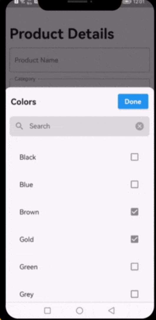
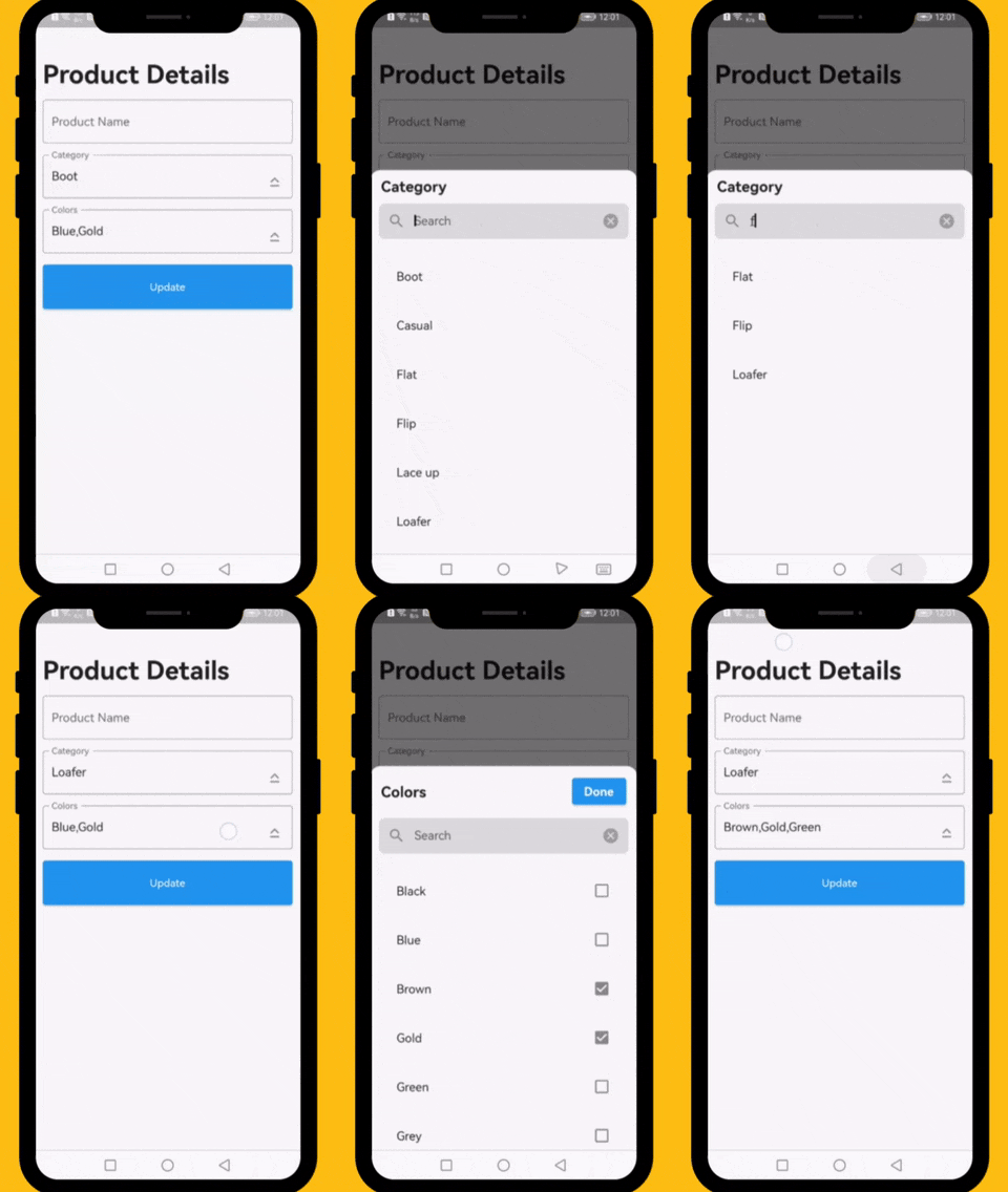
एक फ्लटर विजेट जो ड्रॉपडाउन सूची में एक या अधिक विकल्पों के माध्यम से खोज करने की प्रक्रिया को सरल बनाने के लिए डिज़ाइन किया गया है। यह बड़े डेटासेट से चयन करते समय उपयोगकर्ता अनुभव को बढ़ाने वाला एक स्वचालित, खोजयोग्य इंटरफेस प्रदान करता है। विजेट अत्यधिक कस्टमाइज़ेबल है और एंड्रॉइड, आईओएस, वेब, मैकओएस, विंडोज़ और लिनक्स जैसे विभिन्न प्लेटफॉर्मों का समर्थन करता है। दक्ष फ़िल्टरिंग और चयन की आवश्यकता वाले फॉर्म और डेटा एंट्री इंटरफ़ेस के लिए आदर्श है।
उपयोग
बड़े विकल्प सूचियों वाले फॉर्म इनपुट
प्रशासक डैशबोर्ड में डायनामिक फ़िल्टरिंग
श्रेणी चयन के साथ उपयोगकर्ता प्रोफ़ाइल सेटअप
खोजी योग्य बहु-चयन ड्रॉपडाउन
विस्तृत विकल्प वाले डेटा एंट्री एप्लिकेशन
मुख्य विशेषताएँ
रियल-टाइम सर्च फ़िल्टरिंग
एकल और बहुचयन का समर्थन
प्लेटफॉर्म के अनुकूलता
कस्टमाइज़ेबल यूआई और स्टाइलिंग
मौजूदा फॉर्म के साथ आसान एकीकरण
हल्का और कार्यक्षम
इनके लिए उपयुक्त
डेटा-भारी एप्लिकेशन बनाने वाले डेवलपर्स
प्रतिक्रियाशील खोज इंटरफेस की आवश्यकता वाली टीमें
बहु-चयन ड्रॉपडाउन की आवश्यकता वाले प्रोजेक्ट
UI/UX केंद्रित Flutter एप्लिकेशन
कई ऑपरेटिंग सिस्टम के लिए लक्षित एप्लिकेशन
विचार योग्य बातें
जटिल थीम के लिए अतिरिक्त स्टाइलिंग की आवश्यकता हो सकती है
सीमित निर्मित वैधता सुविधाएँ
प्रदर्शन डेटासेट के आकार पर निर्भर करता है
बहुत बड़े डेटासेट के लिए पृष्ठांकन के बिना अनअनुकूलित है
चयन कॉलबैक का हस्तचालित संभाल आवश्यक है
मूल README
संबंधित सोर्स रिपॉज़िटरी के मूल README का स्नैपशॉट। नवीनतम सामग्री के लिए रिपॉज़िटरी देखें।
Dropdown Searchable List Choices
A very useful widget for searching through single or multiple options from a drop-down list.
Platforms
This plugin has been successfully tested on iOS, Android & web.
Examples
The following examples are extracted from the example project available in the repository. More examples are available in this project.
This property takes List as a parameter and it is useful to display items in drop down list.
Optional parameters
listBuilder:
This property takes int value as a parameter. This is use to set the initial segment from [segmentNames].
enableMultipleSelection:
This property takes Color value as a parameter. You can change the background color of animated segment.
bottomSheetTitle:
This gives the bottom sheet title.
submitButtonChild:
You can set your custom submit button when the multiple selection is enabled.
selectedItems:
This will give the call back to the selected items from list.
dropDownBackgroundColor:
This will set the background color to the Dropdown Searchable.
searchWidget:
This property takes TextFormField value as a parameter. [searchWidget] is use to show the text box for the searching. If you are passing your own widget then you must have to add [TextEditingController] for the [TextFormField].
isSearchVisible:
This property takes bool value as a parameter. [isSearchVisible] is use to manage the search widget visibility. by default it is [True] so widget will be visible.
I would be happy if you send us feedback on your projects where you use our component. Just email amir.email@gmail.com and let me know if you have any questions or suggestions about my work.