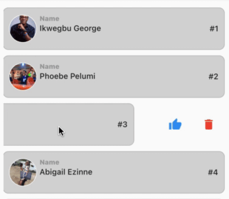
Flutter ऐप्स के लिए लचीला और कस्टमाइज़ करने योग्य स्लाइडेबल लिस्ट आइटम। कई एक्शन बटन जोड़ें, एनीमेशन को नियंत्रित करें, और खुले आइटम को आसानी से बंद करें।
सार्वजनिक जानकारी से बना चयन मार्गदर्शन। केवल संदर्भ हेतु।
Slideable एक लचीला और कस्टमाइज़ेबल Flutter पैकेज है जो कई क्रिया बटन के साथ स्वाइप करने योग्य सूची आइटम को संभव बनाता है। यह विकासकर्ताओं को कस्टम क्रियाएं परिभाषित करने, एनीमेशन व्यवहार को नियंत्रित करने और जब नए आइटम को सक्रिय किया जाता है तो खुले आइटम को स्वचालित रूप से बंद करने की अनुमति देता है। डिलीट, आर्काइव या संपादित विकल्प जैसे संदर्भ-आधारित क्रियाओं के साथ इंटरैक्टिव सूचियां बनाने के लिए उपयुक्त है। पैकेज सभी मुख्य प्लेटफॉर्मों के लिए समर्थन करता है, जिसमें Android, iOS, Web, macOS, Windows और Linux शामिल हैं, जिससे उपकरणों के बीच संगत व्यवहार सुनिश्चित होता है।
उपयोग
इंटरैक्टिव टो-डू लिस्ट आइटम
स्वाइप करके संदेश हटाएं
कस्टमाइज़ किए गए एक्शन पैनल
सूची आइटम प्रबंधन
संदर्भ संपादन इंटरफेस
मुख्य विशेषताएँ
प्रत्येक आइटम के लिए एकाधिक क्रिया संचालन बटन
कस्टमाइज़ेबल एनिमेशन
खुले आइटम को स्वचालित बंद करना
क्रॉस-प्लेटफॉर्म समर्थन
ListView के साथ आसान एकीकरण
निर्धारित करने योग्य स्लाइड प्रावधान
इनके लिए उपयुक्त
इंटरैक्टिव लिस्ट बनाने वाले डेवलपर्स
स्वाइप गतियों की आवश्यकता वाले ऐप
UI-भारी एप्लिकेशन
डायनामिक सूचियों वाले मोबाइल और वेब ऐप्स
सुसंगत उपयोगकर्ता अनुभव प्राथमिकता वाली टीमें
विचार योग्य बातें
बड़ी सूचियों के लिए प्रदर्शन ट्यूनिंग की आवश्यकता हो सकती है
एनिमेशन कस्टमाइजेशन का ध्यान से निपटना आवश्यक है
मूल उपयोग के अलावा सीमित दस्तावेज़न
अन्य गesture डिटेक्टर्स के साथ संभावित टकराव
अत्यधिक जटिल लेआउट के लिए अनअनुकूलित
मूल README
संबंधित सोर्स रिपॉज़िटरी के मूल README का स्नैपशॉट। नवीनतम सामग्री के लिए रिपॉज़िटरी देखें।
Slideable
This is a flexible slideable implementation that will allow you to pass simple widgets(icons or anything at all) as action items, and also control various backgrounds for the action item, and closes an already slide item in your list.
This is a side project that I have reused severally on lots of my project and decided to turn it into a package for anyone that wants more flexibility than the usual flutter_slidable package.
Features
Control flexibility on the type of widget to use as your action item.
A predefined callback function that automatically closes an already slid item in your list.
Can contain a maximum of 6 action items.
You can control the animation curver and animation speed.
Getting started
In the pubspec.yaml of you flutter project, add the following dependency:
dependencies:
 slideable: <latest_version>
In your screen or page, add the below import, to expose the package:
import'package:slideable/Slideable.dart';
Basic Usage
ActionItems, controls the actions widget you would want to have in the display. This is a List<ActionItems>, where, each actionItem consists of the requiredicon widget, which can be any accepted Flutter Widget, a requiredonPress function, that executes what you want that ActionItem to do, a defaulted backgroundColor of transparent, which is totally flexible to change and a radius, just incase you want to add a tweak to your design to match the Slidable child's borderRadius.
Slideable, requires the ActionItems item widget list and the child, which will be the initial point of contact in our case.
The other values includes the backgroundColor, which by default is set to transparent' but can be changed to suit your design. resetSlide, which is a boolean value used to notifiy the Slideable to close all the slid item, unless set to false by an external false. A duration, which is used to control the the slide time and the curve, which is used to control the speed or motion of the slide animation.