सार्वजनिक जानकारी से बना चयन मार्गदर्शन। केवल संदर्भ हेतु।
एक फ्लटर पैकेज जो उपयोगकर्ताओं को संक्षिप्त संदेश या सूचनाएँ दिखाने के लिए एक कस्टमाइज़ करने योग्य टिप डायलॉग प्रदान करता है। सरलता और एकीकरण में आसानी के लिए डिज़ाइन किया गया, यह एंड्रॉइड, आईओएस, वेब, मैकओएस, विंडोज़ और लिनक्स सहित कई प्लेटफॉर्मों को समर्थन देता है। डायलॉग का उपयोग उपयोगकर्ताओं को उपयोगी सुझाव, स्थिति अपडेट या चेतावनी दिखाने के लिए किया जा सकता है, एक साफ और आधुनिक शैली में। यह हल्का है और न्यूनतम, अप्रत्यक्ष प्रतिक्रिया तंत्र की आवश्यकता वाले एप्लिकेशन के लिए आदर्श है। पैकेज inrush.cn द्वारा बनाए जाता है और pub.dev के माध्यम से उपलब्ध है।
उपयोग
उपयोगकर्ता मार्गदर्शन टिप्स प्रदर्शित कर रहे हैं
अस्थायी स्थिति संदेश दिखा रहे हैं
ऑनबोर्डिंग सुझाव प्रदान करना
क्रियाओं के बारे में उपयोगकर्ताओं को सूचित करना
UI प्रतिक्रिया में सुधार करना
मुख्य विशेषताएँ
प्लेटफॉर्म के अनुकूल समर्थन
कस्टमाइज़ेबल उपस्थिति
सरल API
हल्का डिज़ाइन
Flutter ऐप्स के साथ आसान एकीकरण
कॉन्फ़िगरेबल अवधि और एनीमेशन
इनके लिए उपयुक्त
मोबाइल और वेब एप्लिकेशन
ऑनबोर्डिंग फ्लो
उपयोगकर्ता शिक्षा सुविधाएँ
न्यूनतम उपयोगकर्ता इंटरफेस डिज़ाइन
त्वरित प्रतिक्रिया प्रणाली
विचार योग्य बातें
मूल बातचीत कार्यक्षमता तक सीमित
कोई निर्मित स्थानीयीकरण नहीं
बंद करने की तर्क को हस्तकला से संभालने की आवश्यकता है
जटिल फॉर्म या मोडल्स के लिए उपयुक्त नहीं
लघु और महत्वपूर्ण संदेश के लिए सबसे अच्छा
मूल README
संबंधित सोर्स रिपॉज़िटरी के मूल README का स्नैपशॉट। नवीनतम सामग्री के लिए रिपॉज़िटरी देखें।
TipDialog
Please use 3.0.0 or above version, because earlier versions have serious performance issues
You can install packages from the command line:
with Flutter:
$ flutter packages get
3. Import it
Now in your Dart code, you can use:
import'package:tip_dialog/tip_dialog.dart';
4. Use
Available attributes
/// [TipDialogContainer]@requiredthis.child,
/// automatically disappear timethis.duration: constDuration(seconds: 3),
/// mask layer alphathis.maskAlpha: 0.3// outside touchable, default false// if true and onOutsideTouch not set, when use TipDialogHelper.loading(), you can touch mask layer to dismiss// if true and onOutsideTouch set, when touching the mask layer, onOutsideTouch will be called.this.outsideTouchable: false// outside touch callback {@link OutsideTouchCallback}this.onOutsideTouch
Global Use
/// Use [TipDialogContainer] globally/// This widget can be globally supportedvoidmain() => runApp(newMyApp());
classMyAppextendsStatelessWidget{
@overrideWidgetbuild(BuildContext context) {
returnnewMaterialApp(
title: 'TipDialog Demo',
theme: newThemeData(),
home: Stack(
children: <Widget>[
MyHomePage(title: 'TipDialog Demo Home Page'),
// add [TipDialogContainer] widget hereTipDialogContainer(duration: constDuration(seconds: 2))
],
),
);
}
}
/// use TipDialogHelper to show or dismiss tipWidgetbuild(BuildContext context) {
returnnewScaffold(
appBar: newAppBar(
title: newText(widget.title),
elevation: 0.5,
),
body: newListView(children: <Widget>[
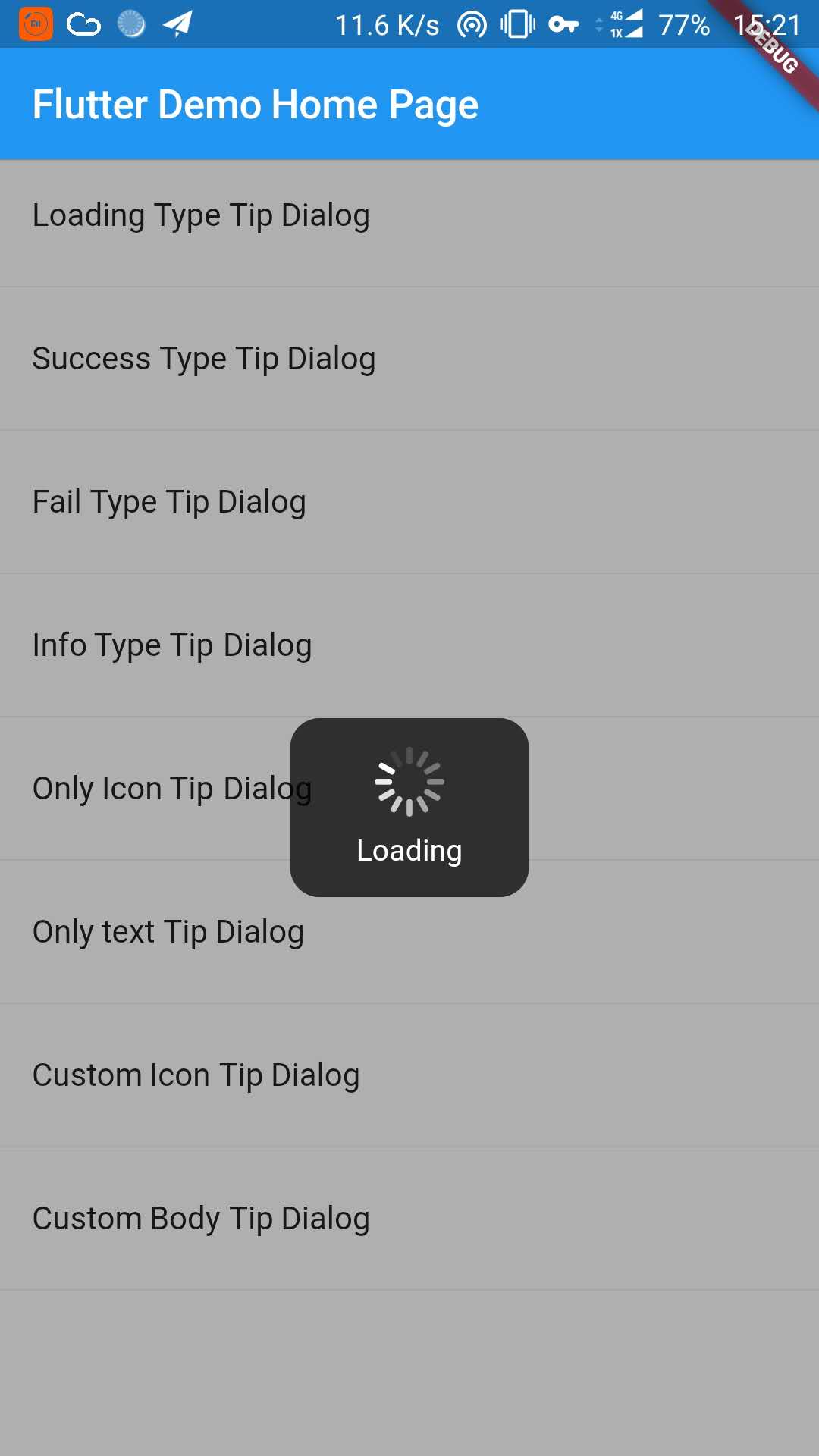
_buildItem("Loading Type Tip Dialog", () async {
TipDialogHelper.loading("Loading");
awaitnewFuture.delayed(newDuration(seconds: 5));
TipDialogHelper.dismiss();
}),
newDivider(),
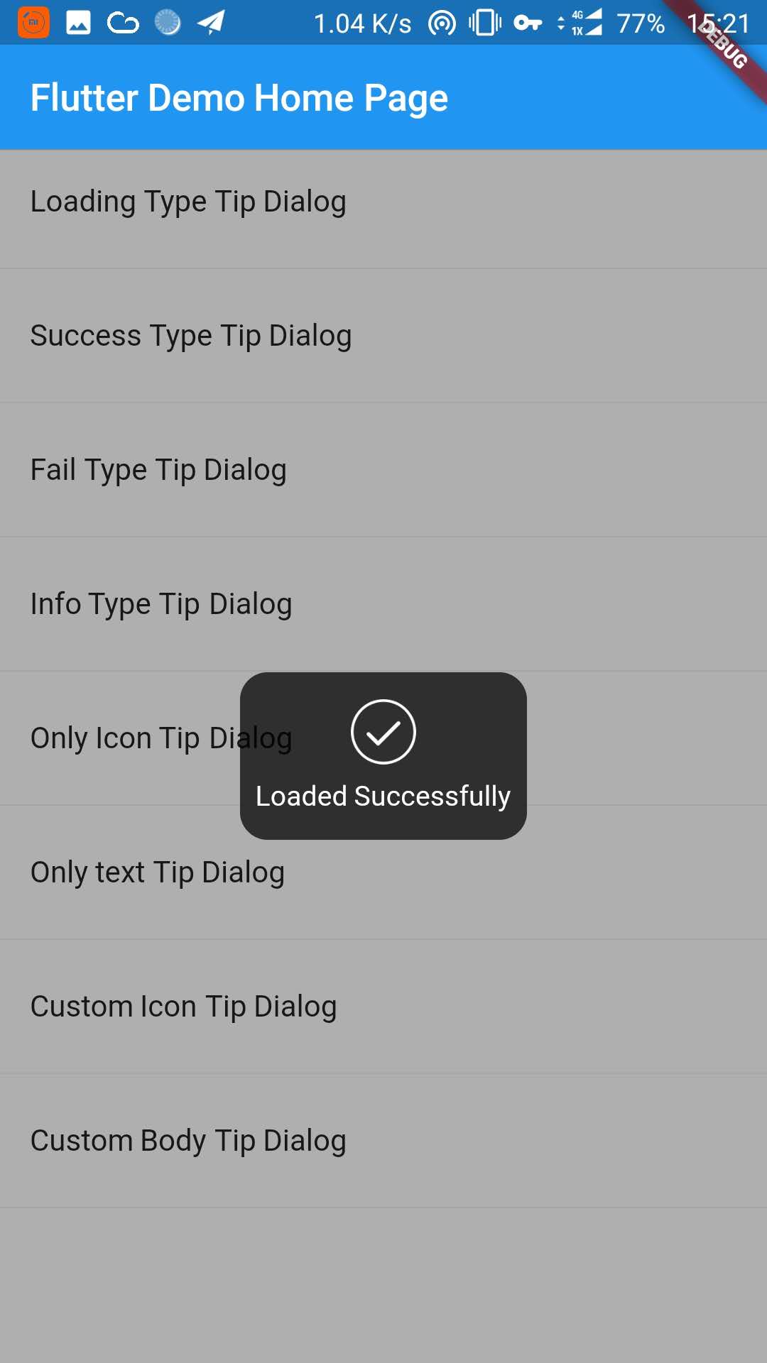
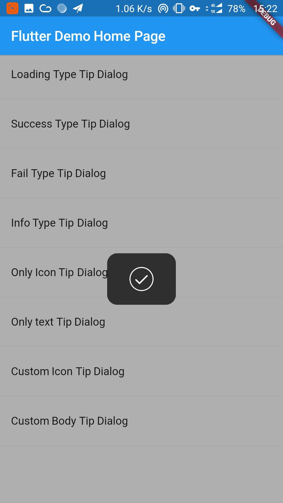
_buildItem("Success Type Tip Dialog", () async {
TipDialogHelper.success("Loaded Successfully");
}),
newDivider(),
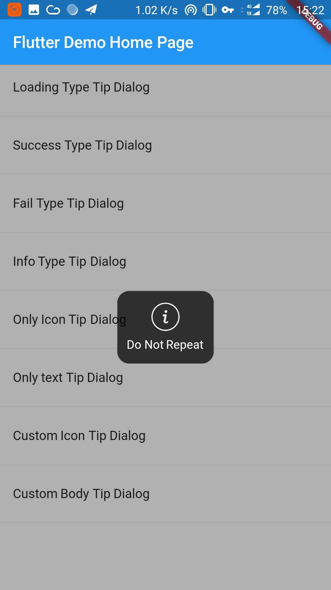
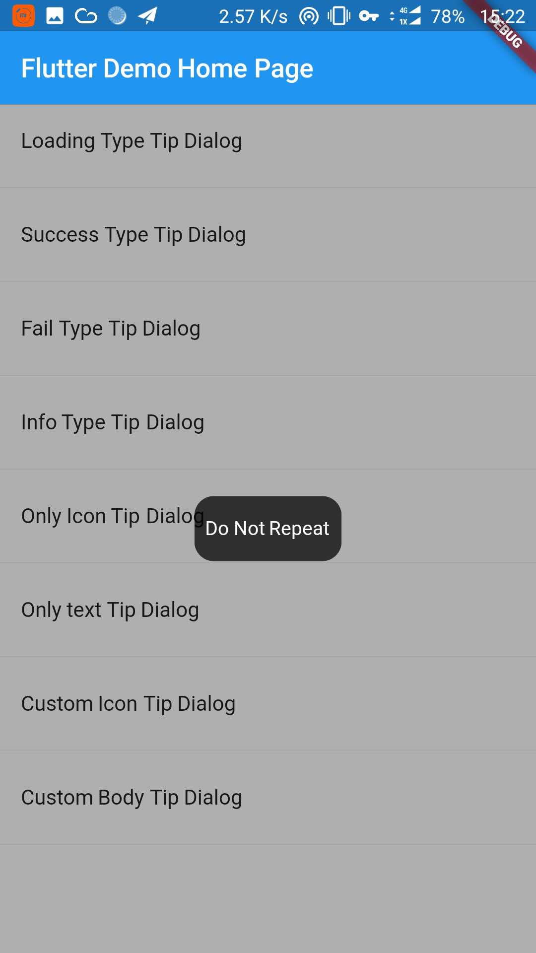
_buildItem("Only text Tip Dialog", () async {
TipDialogHelper.show(newTipDialog(
type: TipDialogType.NOTHING,
tip: "Do Not Repeat",
));
}),
newDivider(),
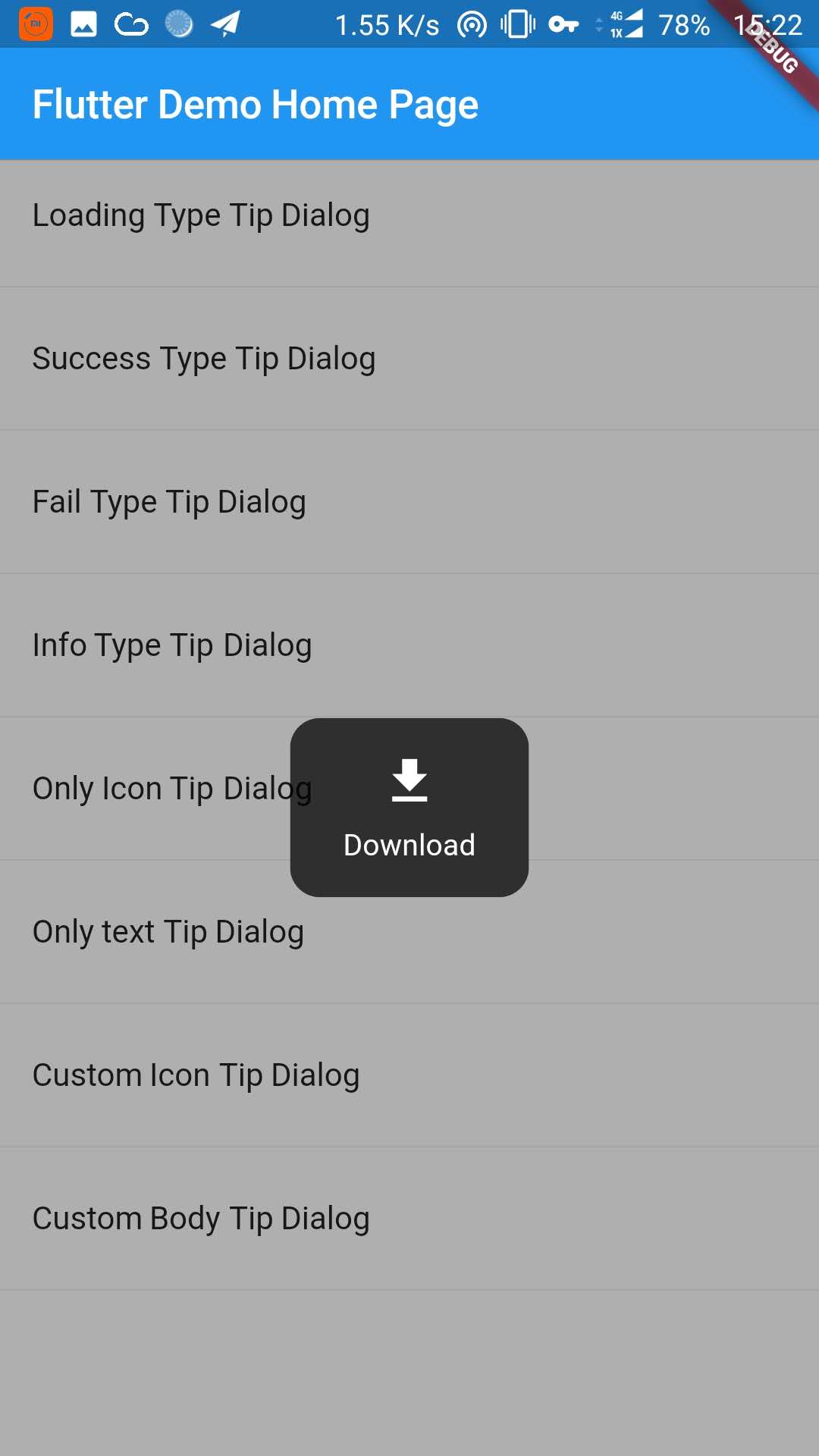
_buildItem("Custom Icon Tip Dialog", () async {
TipDialogHelper.show(newTipDialog.customIcon(
icon: newIcon(
Icons.file_download,
color: Colors.white,
size: 30.0,
textDirection: TextDirection.ltr,
),
tip: "Download",
));
}),
newDivider(),
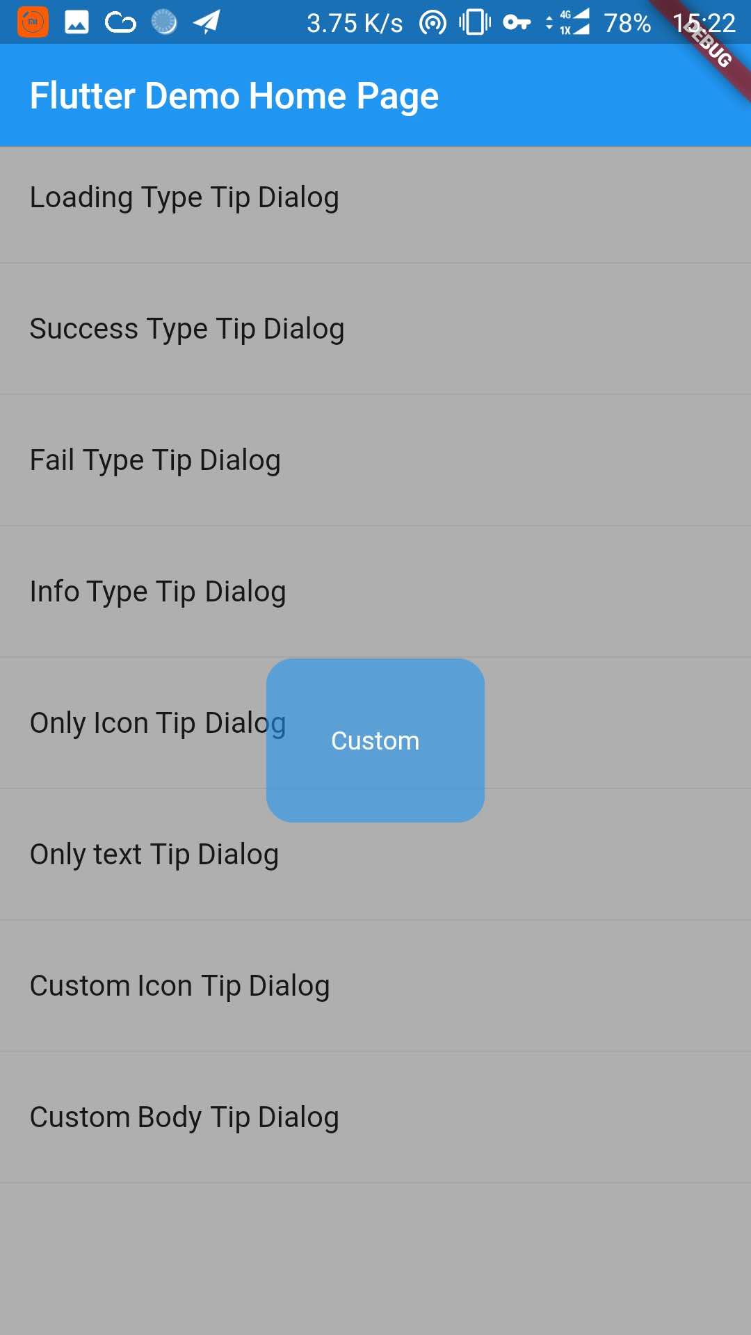
_buildItem("Custom Body Tip Dialog", () async {
TipDialogHelper.show(newTipDialog.builder(
bodyBuilder: (context) {
returnnewContainer(
width: 120.0,
height: 90.0,
alignment: Alignment.center,
child: newText(
"Custom",
style: newTextStyle(color: Colors.white),
/// if TipDialogContainer are outside of MaterialApp,/// here is a must to set
textDirection: TextDirection.ltr,
),
);
},
color: Colors.blue.withAlpha(150),
));
}),
newDivider(),
]));
}
Use a custom widget when using [TipDialogContainer] globally, there may be appear some unexpected errors.
such as Text or Icon, will appear similar to the following error.
No Directionality widget found.
Just set TextDirection just fine. See the custom Widget in the example for details.
5. Default Dialog Type
enumTipDialogType { NOTHING, LOADING, SUCCESS, FAIL, INFO }
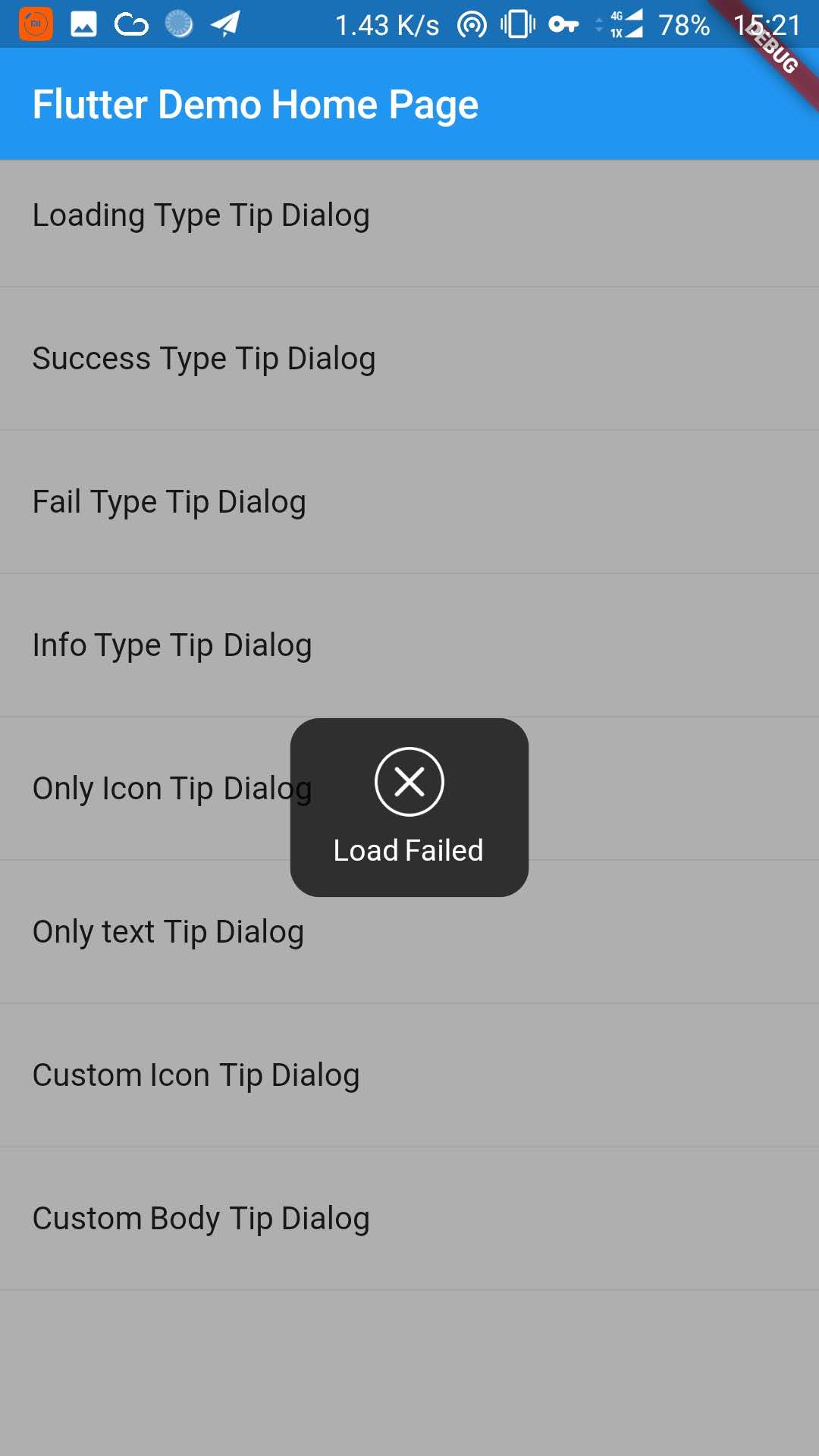
NOTHING:noiconLOADING:havealoadingiconSUCCESS:haveasuccessiconFAIL:haveafailiconINFO:haveainfoiconCUSTOM:customtipdialogtype,justasign,donothing
6. TipDialogHelper Method
/// tipDialog: Need to display the widget////// isAutoDismiss: decide whether to disappear automatically, default is true/// if true, the dialog will not automatically disappear/// otherwise, the dialog will automatically disappear after the [Duration] set by [TipDialogContainer]voidshow(Widget tipDialog, {bool isAutoDismiss: true});
/// dismiss dialogvoiddismiss();
/// show info dialogvoidinfo(String tip);
/// show fail dialogvoidfail(String errMsg);
/// show success dialogvoidsuccess(String success);
/// show loading dialogvoidloading(String loadingTip);
See the example directory for more details.
7. Change log
[4.0.0]
migrating to null safety
[3.1.0]
add outside touchable features
[3.0.0]
fix performance issues
easier way to call
[2.1.0]
add TipDialogHelper and deprecated TipDialogConnector