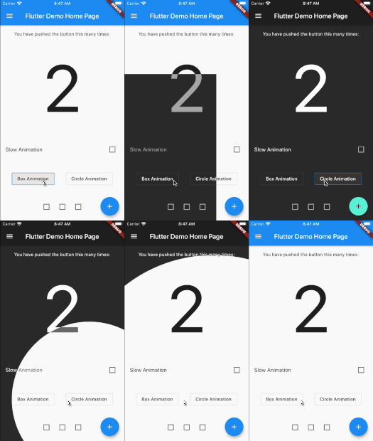
animated_theme_switcher
Animated theme switcher.
This library starts from Peyman's stackoverflow question how-to-add-animation-for-theme-switching-in-flutter
Getting started
Add animated_theme_switcher: "^2.0.8" in your pubspec.yaml dependencies.
dependencies:
 animated_theme_switcher: "^2.0.8"
How To Use
Import the following package in your dart file
import 'package:animated_theme_switcher/animated_theme_switcher.dart' ;
Wrap MaterialApp with ThemeProvider widget, as it has shown in the following example:
ThemeProvider (
initTheme: initTheme,
builder: (context, myTheme) {
return MaterialApp (
title: 'Flutter Demo' ,
theme: myTheme,
home: MyHomePage (),
);
}),
),
But if all you want is to provide a theme, use as follows:
ThemeProvider (
initTheme: initTheme,
child: SomeCoolPage (),
),
Wrap the screen where you whant to make them switch with ThemeSwitchingArea widget, as it has shown in the following example:
ThemeSwitchingArea (
child: Builder (builder: (context) {
return ...,
},
);
Wrap every switcher with ThemeSwitcher builder, and use ThemeSwitcher.of(context).changeTheme function to switch themes;
ThemeData newTheme = ThemeData (
primaryColor: Colors .amber
);
...
ThemeSwitcher (
builder: (context) {
...
onTap: () => ThemeSwitcher .of (context).changeTheme (
theme: newTheme,
isReversed: false
);
...
},
);
Alternatively you could use ThemeSwitcher.switcher() or ThemeSwitcher.withTheme().
ThemeSwitcher .switcher (
builder: (context, switcher) {
...
onTap: () => switcher.changeTheme (
theme: newTheme,
);
...
},
);
ThemeSwitcher .withTheme (
builder: (context, switcher, theme) {
...
onTap: () => switcher.changeTheme (
theme: theme.brightness == Brightness .light
? darkTheme
: lightTheme,
);
...
},
);
Use optional named parameter clipper to pass the custom clippers.
...
ThemeSwitcher (
clipper: ThemeSwitcherBoxClipper (),
builder: (context) {
...
},
);
Notes:
This package is not intended to persist selected theme on the local device. But we added special example to show how to do it using shared_preferences package.
Use the CanvasKit rendering engine to use it on web , more about it..