パッケージ、リポジトリ、アプリカテゴリを検索

auto_size_widget のカバー
パッケージ詳細v0.0.4

auto_size_widget

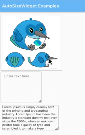
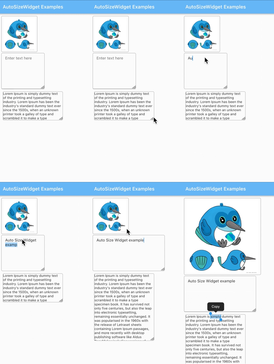
ウィジェットの角をドラッグすることで子ウィジェットのサイズを変更できるFlutterウィジェットです。

AndroidiOSWebmacOSWindowsLinux
30日間ダウンロード
153
いいね数
38
Pub ポイント
130

パッケージをインストール

flutter pub add auto_size_widget

パッケージ概要

公開情報に基づく選定ガイドです。参考としてご利用ください。

auto_size_widget パッケージは、隅をドラッグすることで子要素のサイズを動的に変更できる Flutter ウィジェットを提供し、直感的なレイアウト調整を可能にします。アプリ内での要素の手動リサイズが必要なインタラクティブUI向けに設計されています。Android、iOS、Web、macOS、Windows、Linuxなど複数のプラットフォームをサポートしており、クロスプラットフォーム開発に適しています。既存のFlutterレイアウトとシームレスに統合され、直接操作によるユーザー体験の向上を実現します。

用途

  • インタラクティブなUIデザイン
  • 動的レイアウト調整
  • ユーザー主導のウィジェットリサイズ
  • クロスプラットフォーム対応のレスポンシブインターフェース
  • インタラクティブなレイアウトのプロトタイピング
  • リアルタイムUIカスタマイズ

主な機能

  • コーナーのドラッグによるリサイズ機能
  • クロスプラットフォーム互換性
  • Flutter ウィジェットとの簡単な統合
  • すべての主要プラットフォームをサポートしています
  • 最小限のセットアップが必要
  • レスポンシブレイアウト動作

適している対象

  • UIデザイナーがインタラクティブなレイアウトをプロトタイピングしています
  • カスタマイズ可能なダッシュボードを構築する開発者
  • 手動でウィジェットのサイズを変更する必要があるアプリ
  • ダイナミックUIを備えたクロスプラットフォームアプリケーション
  • インタラクティブな要素を備えた教育的または創造的なツール

注意事項

  • 他のジェスチャーディテクタと競合する可能性があります
  • 複雑な子要素によるパフォーマンスへの影響
  • ネストされたレイアウトでは注意が必要です
  • 静的または読み取り専用のUIには適していません
  • 追加の論理なしで単一子要素のリサイズに制限
  • タッチジェスチャーにおけるアクセシビリティの課題

元の README

関連するソースリポジトリの README 原文のスナップショットです。最新の内容はリポジトリをご覧ください。

Auto Size Widget

A Flutter widget that can resize the child widget by dragging the widget corner.

Installation

  1. Add the latest version of the package to your pubspec.yaml (and run 'dart pub get'):
dependencies:
    auto_size_widget: ^0.0.3
  1. Import the package and use it in your Flutter app.
import 'package:auto_size_widget/auto_size_widget.dart';

Example

  1. To resize both the height and the width of the widget

initialWidth and initialHeight should be different from maxWidth and maxHeight respectively.

AutoSizeWidget(
  initialWidth: 120,
  initialHeight: 120,
  maxWidth: 320,
  maxHeight: 320,
  boxDecoration: BoxDecoration(
    border: Border.all(width: 1, color: Colors.grey),
    borderRadius: BorderRadius.circular(5)),
  child: Image.network(
    'https://docs.flutter.dev/assets/images/dash/early-dash-sketches2.jpg',
    fit: BoxFit.fill,
  ),
),
  1. To resize the height of the widget

initialWidth and maxWidth should be same to ensure that the width does not change on resize.

AutoSizeWidget(
  initialWidth: 250,
  initialHeight: 120,
  maxWidth: 250,
  maxHeight: 280,
  boxDecoration: BoxDecoration(
    border: Border.all(width: 1, color: Colors.grey),
    borderRadius: BorderRadius.circular(5),
  ),
  child: const SelectableText(
    "Lorem Ipsum is simply dummy text of the printing and typesetting industry. Lorem Ipsum has been the industry's standard dummy text ever since the 1500s, when an unknown printer took a galley of type and scrambled it to make a type specimen book. It has survived not only five centuries, but also the leap into electronic typesetting, remaining essentially unchanged. It was popularised in the 1960s with the release of Letraset sheets containing Lorem Ipsum passages, and more recently with desktop publishing software like Aldus PageMaker including versions of Lorem Ipsum."
  ),
),           
  1. To resize the width of the widget

initialHeight and maxHeight should be same to ensure that the height does not change on resize.

AutoSizeWidget(
  initialWidth: 150,
  initialHeight: 200,
  maxWidth: 300,
  maxHeight: 200,
  boxDecoration: BoxDecoration(
    border: Border.all(width: 1, color: Colors.grey),
    borderRadius: BorderRadius.circular(5)),
  child: TextFormField(
    keyboardType: TextInputType.multiline,
    maxLines: 3 * 120,
    textAlign: TextAlign.start,
    decoration: const InputDecoration(
      focusedBorder: InputBorder.none,
      contentPadding:
        EdgeInsets.symmetric(vertical: 11, horizontal: 15),
      hintText: "Enter text here"
    ),
  ),
),                  

カテゴリー

ソースリポジトリ

このパッケージを使用しているプロジェクト

データはまだありません。