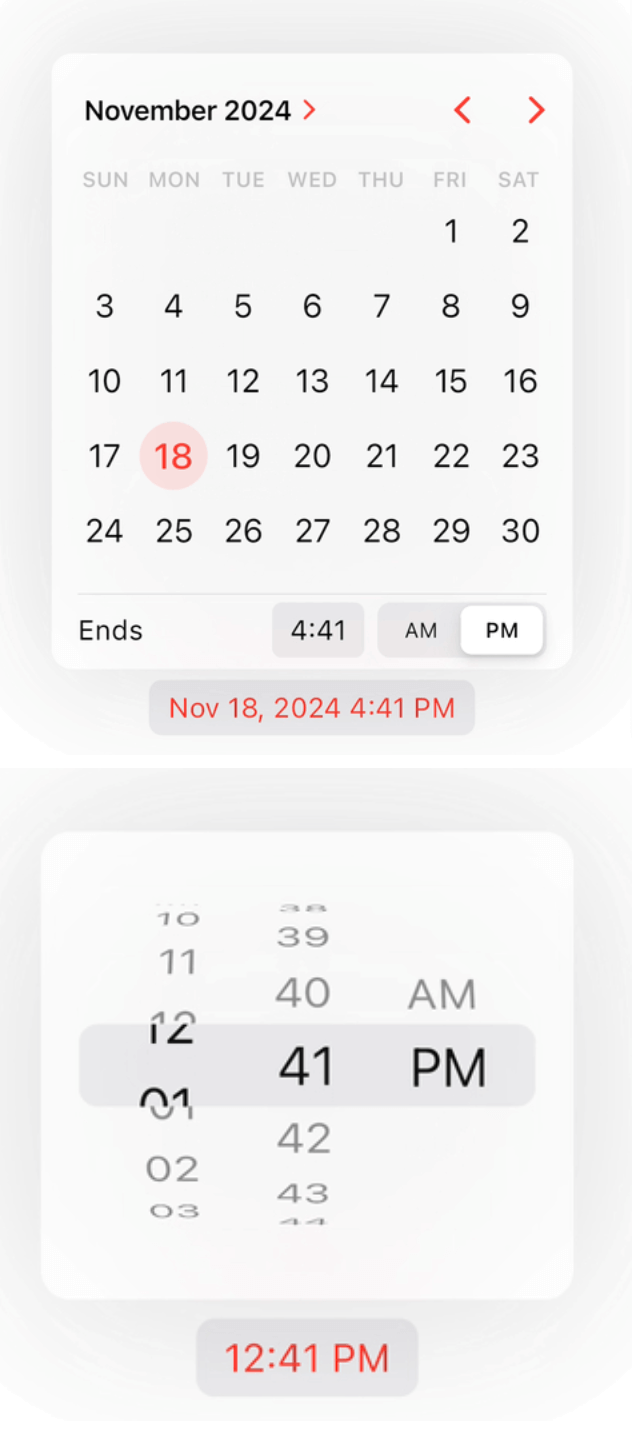
The package provides a sleek and stylish cupertino calendar widgets designed to mimic the aesthetics of iOS. With smooth animations and intuitive user interactions, it seamlessly integrates into your Flutter app to deliver a delightful user experience.

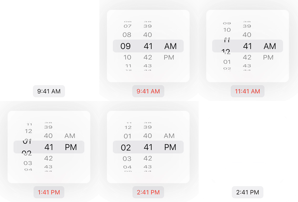
Features
- iOS Style: The cupertino calendar picker follows the design principles of iOS, ensuring consistency and familiarity for iOS users.
- Smooth Animations: Enjoy fluid animations that enhance the overall look and feel of the calendar, providing a polished user experience.
- Customizable: Easily customize the appearance of the calendar to match your app's theme and branding.
- Intuitive Interactions: Users can effortlessly navigate through years, months and interact with the calendar thanks to its intuitive design.
Getting started
In the pubspec.yaml of your flutter project, add the following dependency:
dependencies:
  cupertino_calendar_picker: ^2.2.6
Import it:
import 'package:cupertino_calendar_picker/cupertino_calendar_picker.dart';
In your CupertinoApp or MaterialApp add the localizationsDelegates
CupertinoApp(
  localizationsDelegates: const [
    GlobalMaterialLocalizations.delegate,
    GlobalWidgetsLocalizations.delegate,
    GlobalCupertinoLocalizations.delegate,
  ],
);
Widgets
This package offers three convenient widgets for integrating pickers directly into your app.
CupertinoCalendar Widget.
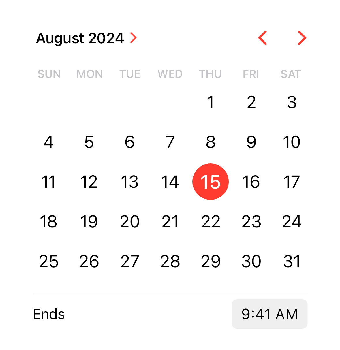
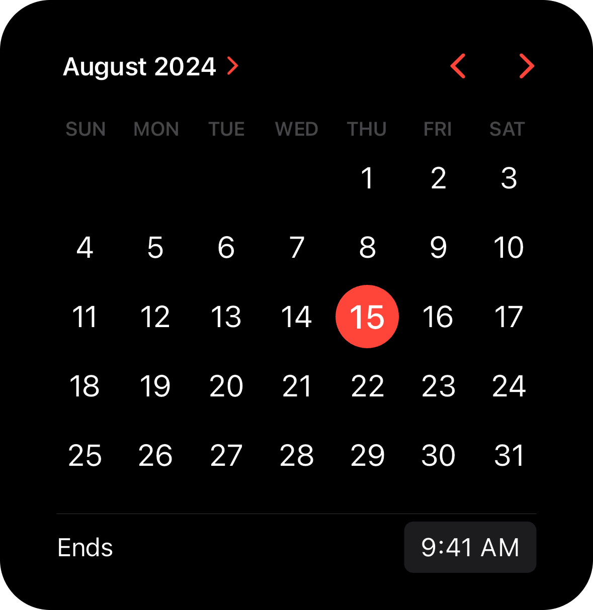
The CupertinoCalendar widget provides an inline calendar that can be displayed directly within your screen.
Usage Example
SizedBox(
  width: 350,
  child: CupertinoCalendar(
    minimumDateTime: DateTime(2024, 7, 10),
    maximumDateTime: DateTime(2025, 7, 10),
    initialDateTime: DateTime(2024, 8, 15, 9, 41),
    currentDateTime: DateTime(2024, 8, 15),
    timeLabel: 'Ends',
    mode: CupertinoCalendarMode.dateTime,
  ),
),
CupertinoCalendarPickerButton Widget.
The CupertinoCalendarPickerButton widget allows users to open a cupertino calendar picker when the button is pressed.
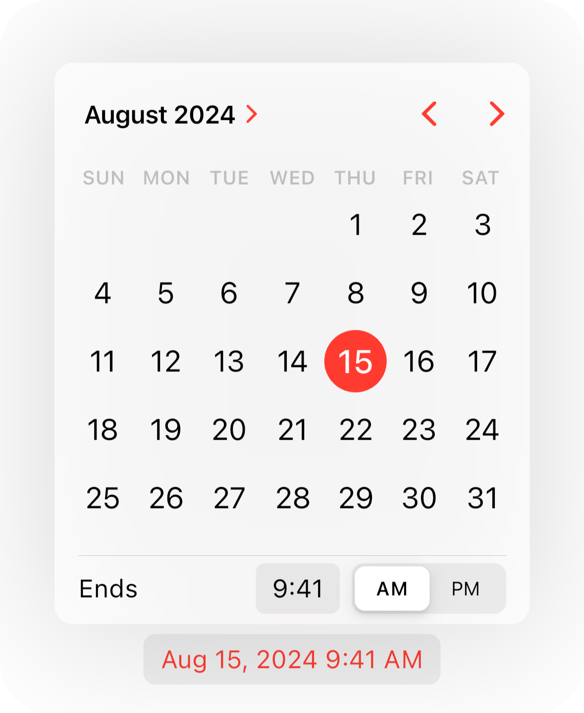
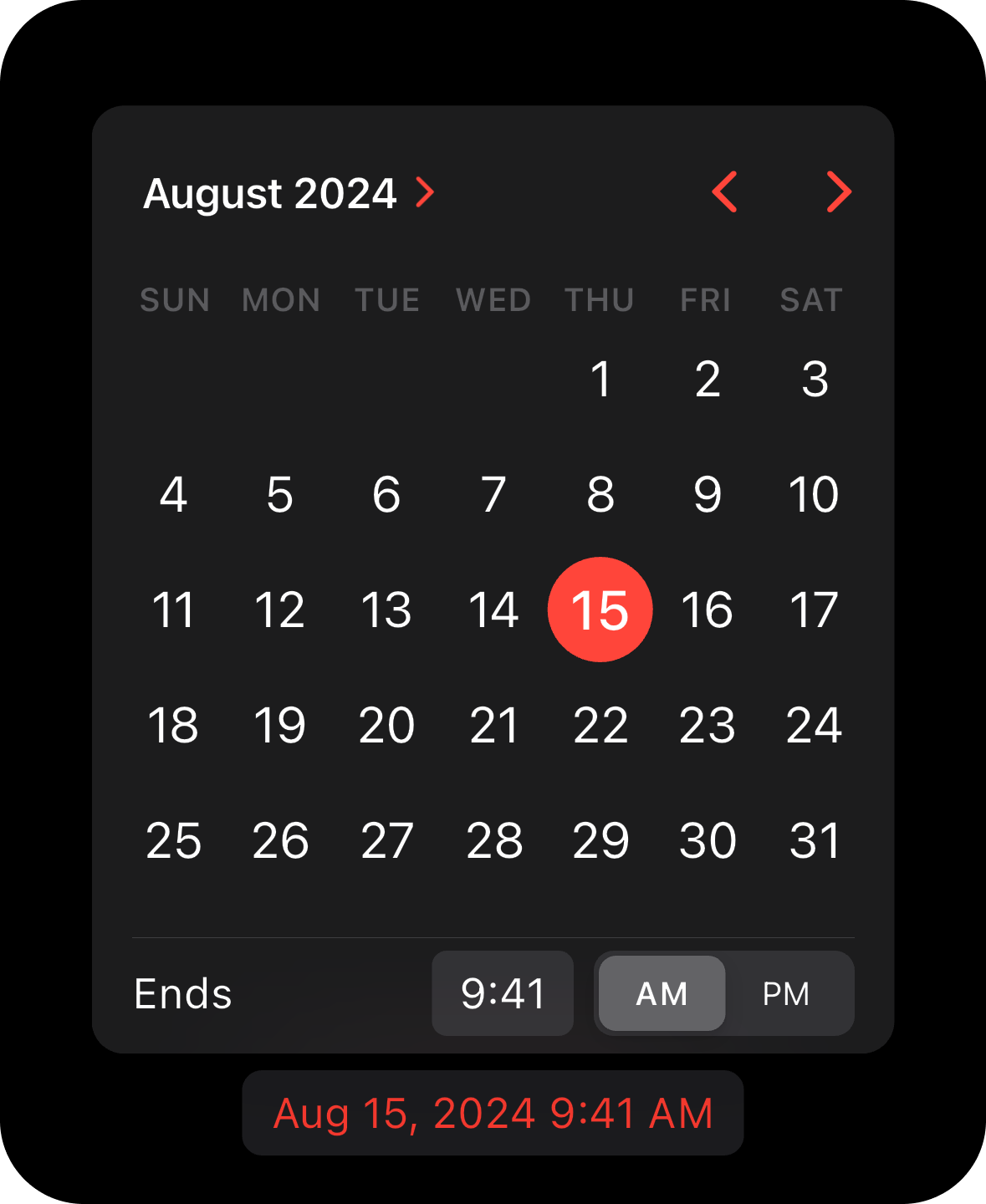
Usage Example
CupertinoCalendarPickerButton(
  minimumDateTime: DateTime(2024, 7, 10),
  maximumDateTime: DateTime(2025, 7, 10),
  initialDateTime: DateTime(2024, 8, 15, 9, 41),
  currentDateTime: DateTime(2024, 8, 15),
  mode: CupertinoCalendarMode.dateTime,
  timeLabel: 'Ends',
  onDateTimeChanged: (date) {},
),
CupertinoTimePickerButton Widget.
The CupertinoTimePickerButton widget lets users select a time via the calendar time picker that appears when the button is pressed.
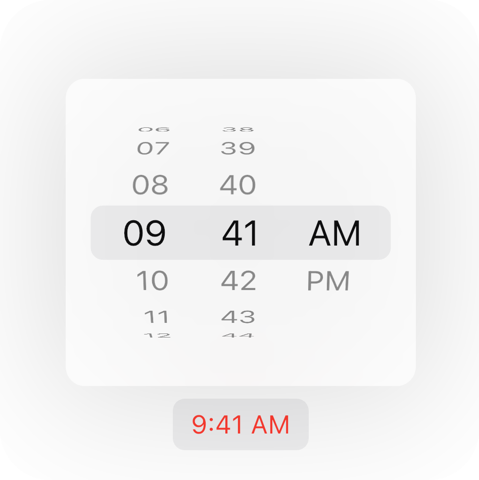
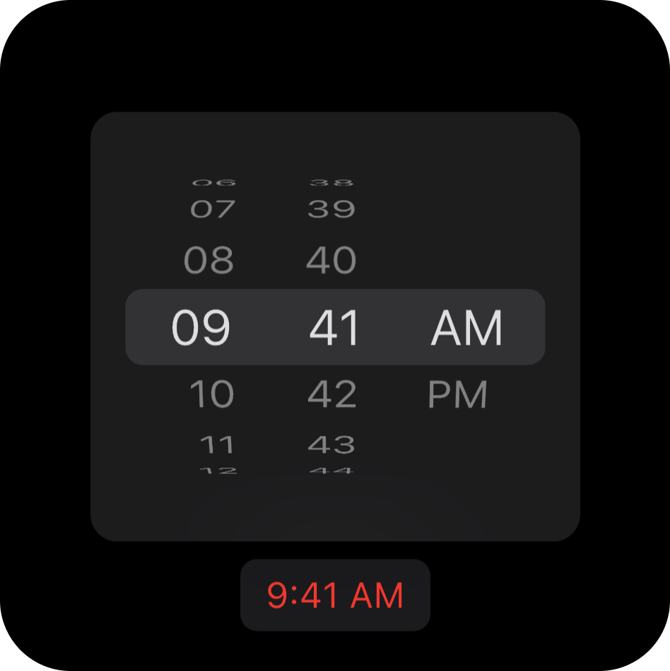
Usage Example
CupertinoTimePickerButton(
  initialTime: const TimeOfDay(hour: 9, minute: 41),
  onTimeChanged: (time) {},
),
Functions
This package also includes two functions for displaying pickers from your widgets.
showCupertinoCalendarPicker function.
The showCupertinoCalendarPicker function displays a calendar picker around your widget.
- From version 2.0.0, you can specify the
CupertinoCalendarMode to allow selection of both date and time.
Usage Example
Future<DateTime?> onCalendarWidgetTap(BuildContext context) async {
  final RenderBox? renderBox = context.findRenderObject() as RenderBox?;
  final nowDate = DateTime.now();

  return showCupertinoCalendarPicker(
    context,
    widgetRenderBox: renderBox,
    minimumDateTime: nowDate.subtract(const Duration(days: 15)),
    initialDateTime: nowDate,
    maximumDateTime: nowDate.add(const Duration(days: 360)),
    mode: CupertinoCalendarMode.dateTime,
    timeLabel: 'Ends',
    onDateTimeChanged: (dateTime) {},
  );
}
Actions
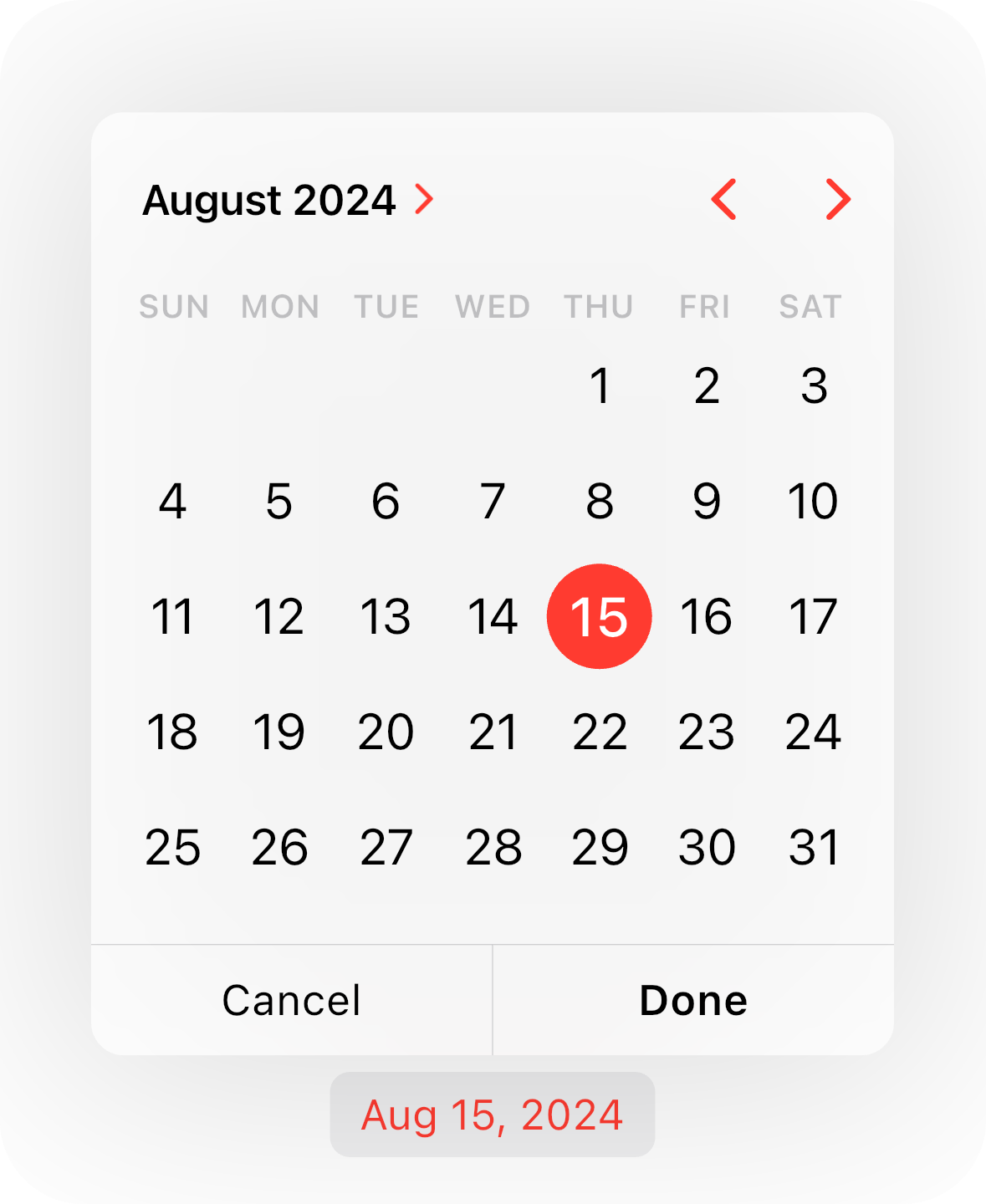
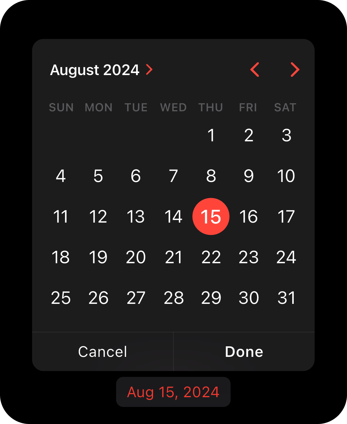
You can add actions to the calendar picker by passing a list of CupertinoCalendarAction objects.
The package provides two built-in actions: CancelCupertinoCalendarAction and ConfirmCupertinoCalendarAction.
Usage Example
Future<DateTime?> onCalendarWidgetTap(BuildContext context) async {
  final RenderBox? renderBox = context.findRenderObject() as RenderBox?;
  final nowDate = DateTime.now();

  return showCupertinoCalendarPicker(
    context,
    widgetRenderBox: renderBox,
    minimumDateTime: nowDate.subtract(const Duration(days: 15)),
    initialDateTime: nowDate,
    maximumDateTime: nowDate.add(const Duration(days: 360)),
    timeLabel: 'Ends',
    actions: [
      CancelCupertinoCalendarAction(
        label: 'Cancel',
        onPressed: () {},
      ),
      ConfirmCupertinoCalendarAction(
        label: 'Done',
        isDefaultAction: true,
        onPressed: (dateTime) {},
      ),
    ],
  );
}
[!NOTE]
Works only when the calendar is in the CupertinoCalendarType.compact mode.
showCupertinoTimePicker function.
The showCupertinoTimePicker function shows a time picker around your widget.
Usage Example
Future<TimeOfDay?> onTimeWidgetTap(BuildContext context) async {
  final RenderBox? renderBox = context.findRenderObject() as RenderBox?;

  return showCupertinoTimePicker(
    context,
    widgetRenderBox: renderBox,
    onTimeChanged: (time) {},
  );
}
Functions Usage Example
Call the showCupertinoCalendarPicker passing date constrains and widget's RenderBox of the widget above/below which you wish to display the calendar.
@override
Widget build(BuildContext context) {
return CupertinoApp(
localizationsDelegates: const [
GlobalMaterialLocalizations.delegate,
GlobalWidgetsLocalizations.delegate,
GlobalCupertinoLocalizations.delegate,
],
home: CupertinoPageScaffold(
child: Builder(
builder: (context) {
return YourWidget(
onTap: () => onTap(context),
);
},
),
),
);
}
Future<void> onTap(BuildContext context) {
final renderBox = context.findRenderObject() as RenderBox?;
final nowDate = DateTime.now();
return showCupertinoCalendarPicker(
context,
widgetRenderBox: renderBox,
minimumDate: nowDate.subtract(const Duration(days: 15)),
initialDate: nowDate,
maximumDate: nowDate.add(const Duration(days: 360)),
);
}
How to get a RenderBox?
There are 3 simple ways of how you can get the widget's render box to pass it to the showCupertinoCalendarPicker or showCupertinoTimePicker function.
You can choose any of these.
- Wrap your widget with
Builder widget.
Builder(
builder: (context) {
return YourWidget(
onTap: () => onTap(context),
);
},
);
Future<void> onTap(BuildContext context) {
final renderBox = context.findRenderObject() as RenderBox?;
return showCupertinoCalendarPicker(...);
}
- Use a
GlobalKey.
final globalKey = GlobalKey();
@override
Widget build(BuildContext context) {
return CupertinoApp(
localizationsDelegates: const [
GlobalMaterialLocalizations.delegate,
GlobalWidgetsLocalizations.delegate,
GlobalCupertinoLocalizations.delegate,
],
home: CupertinoPageScaffold(
child: YourWidget(
key: globalKey,
onTap: onTap,
),
),
);
}
Future<void> onTap(BuildContext context) {
final renderBox = globalKey.currentContext?.findRenderObject() as RenderBox?;
return showCupertinoCalendarPicker(...);
}
- Pass a
BuildContext directly from your widget's build method.
class YourWidget extends StatelessWidget {
const YourWidget({
required this.onTap,
});
final void Function(BuildContext context) onTap;
@override
Widget build(BuildContext context) {
return GestureDetector(
onTap: () => onTap(context),
child: ...,
);
}
}
Future<void> onTap(BuildContext context) {
final renderBox = context.findRenderObject() as RenderBox?;
return showCupertinoCalendarPicker(...);
}
Maintainers
Philip Dmitruk