パッケージ、リポジトリ、アプリカテゴリを検索

dialogs のカバー
パッケージ詳細v0.0.7

dialogs

このFlutterパッケージは、カスタマイズ可能なオプションを備えた注意深く設計されたダイアログを提供しています。

AndroidiOSWebmacOSWindowsLinux
30日間ダウンロード
137
いいね数
26
Pub ポイント
130

パッケージをインストール

flutter pub add dialogs

パッケージ概要

公開情報に基づく選定ガイドです。参考としてご利用ください。

dialogs パッケージは、Flutter アプリケーション向けに美しいデザインでカスタマイズ可能なダイアログコンポーネントのコレクションを提供します。細部までこだわり、ユーザー体験に重点を置いた構築により、すべてのプラットフォームで一貫性があり、モダンなダイアログインターフェースを実現します。開発者は、アプリのデザイン言語に合わせて簡単に統合・カスタマイズでき、スタイル、アニメーション、動作のオプションも備えています。Android、iOS、Web、macOS、Windows、Linux をサポートしており、クロスプラットフォーム互換性を確保しています。警告、確認、カスタムモーダルを洗練された形で表示するのに最適です。

用途

  • アラートメッセージの表示
  • ユーザーの確認の処理
  • カスタムモーダルダイアログの作成
  • 読み込みインジケーターを表示する
  • フォーム検証フィードバックの実装
  • 複数プラットフォーム間でのUIの一貫性の向上

主な機能

  • 美しい、モダンなデザイン
  • 広範なカスタマイズオプション
  • クロスプラットフォーム対応
  • Flutter との簡単な統合
  • 組み込みアニメーション
  • レスポンシブレイアウトの処理

適している対象

  • 洗練されたダイアログを探しているFlutter開発者
  • 複数のプラットフォーム間で一貫したUIを必要とするアプリ
  • ユーザー体験に重点を置くプロジェクト
  • 迅速なダイアログ実装を望む開発者
  • デザインの一貫性に注力するチーム
  • 軽量なダイアログソリューションを必要とするアプリケーション

注意事項

  • ダイアログコンポーネントのみに制限
  • カスタマイズには特定のAPIを学ぶ必要がある場合があります
  • 複雑なナビゲーションフローには適していません
  • Flutter の Material または Cupertino テーマに依存しています
  • 非標準的な使用ケースには追加のスタイリングが必要になる場合があります
  • 組み込みの国際化サポートなし

元の README

関連するソースリポジトリの README 原文のスナップショットです。最新の内容はリポジトリをご覧ください。

Dialogs - dialogs

This flutter package provides aesthetically designed dialog box with customization options.

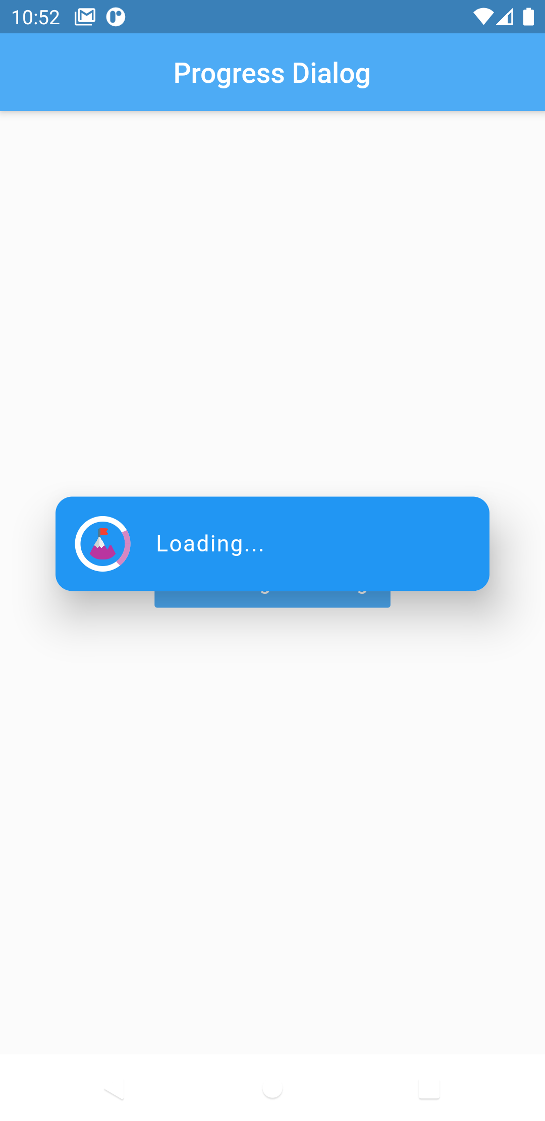
Now comes with legacy_progress_dialog

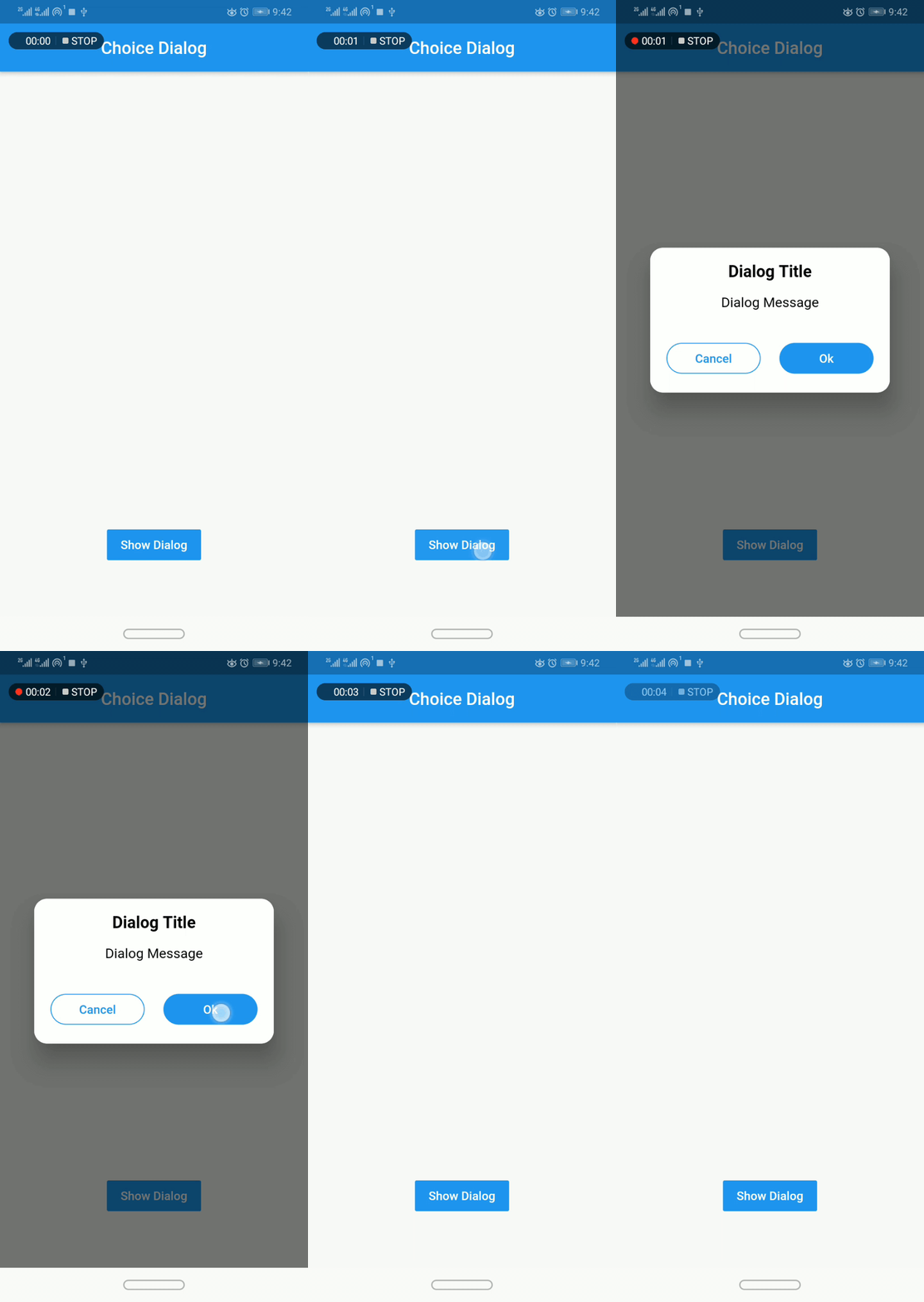
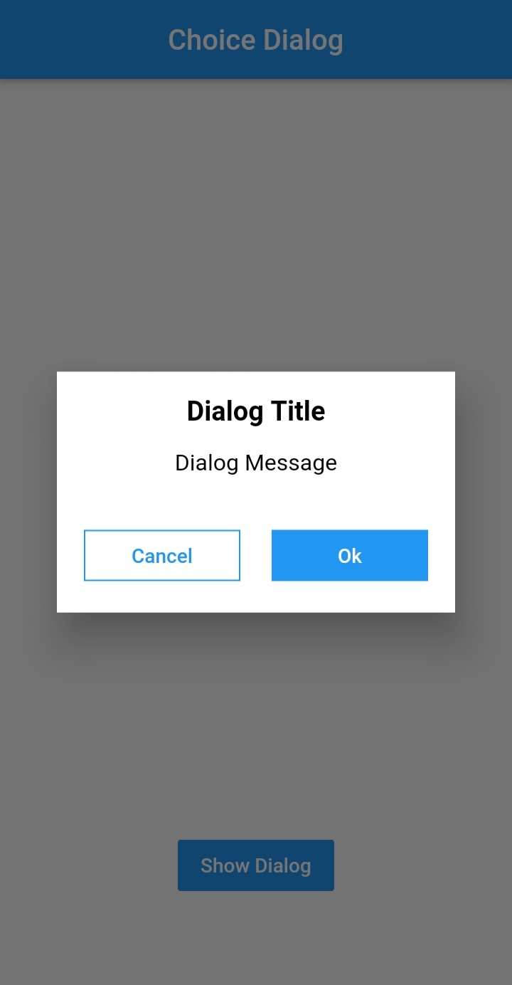
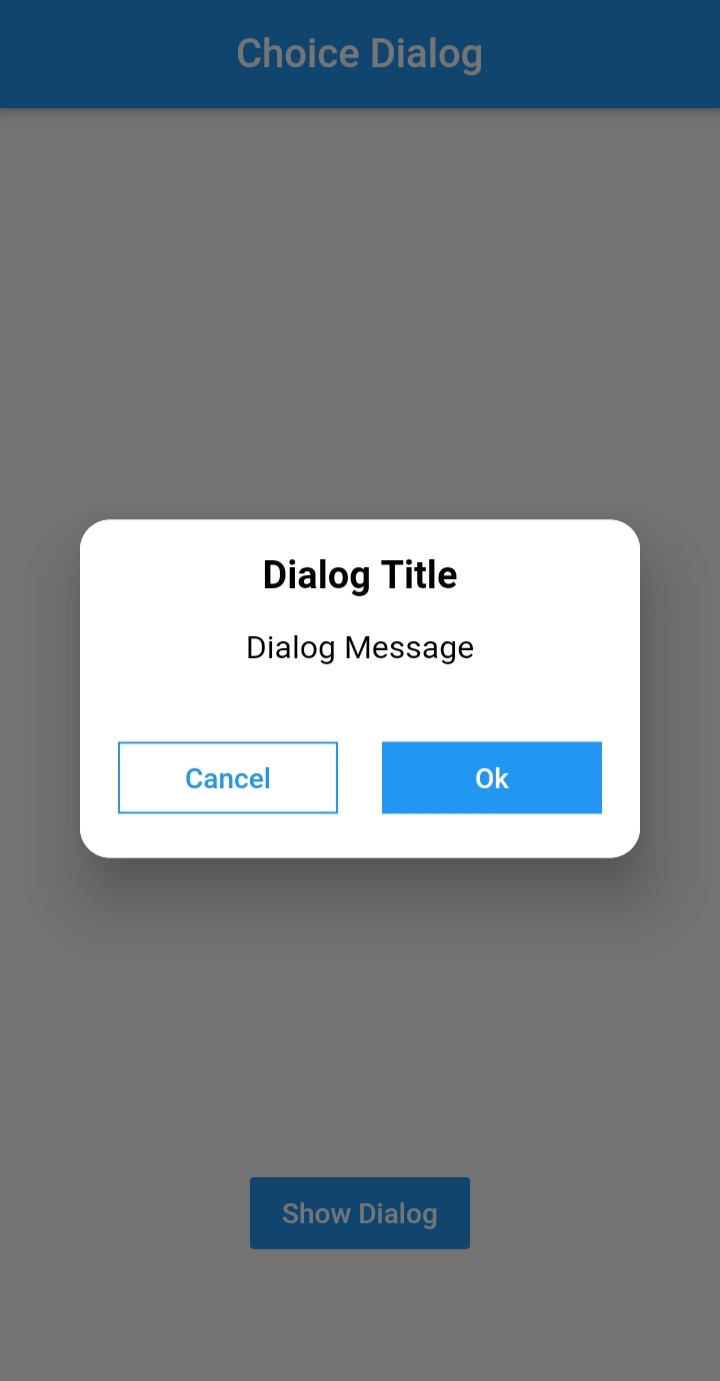
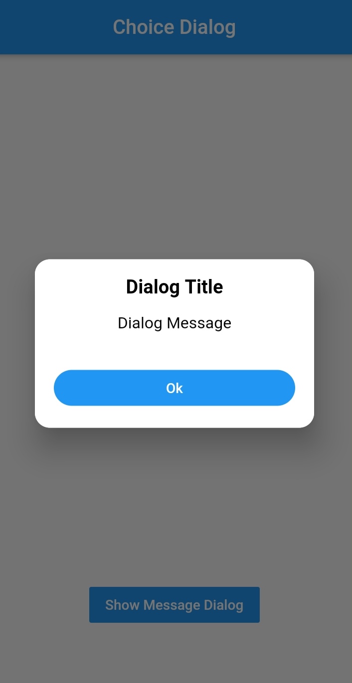
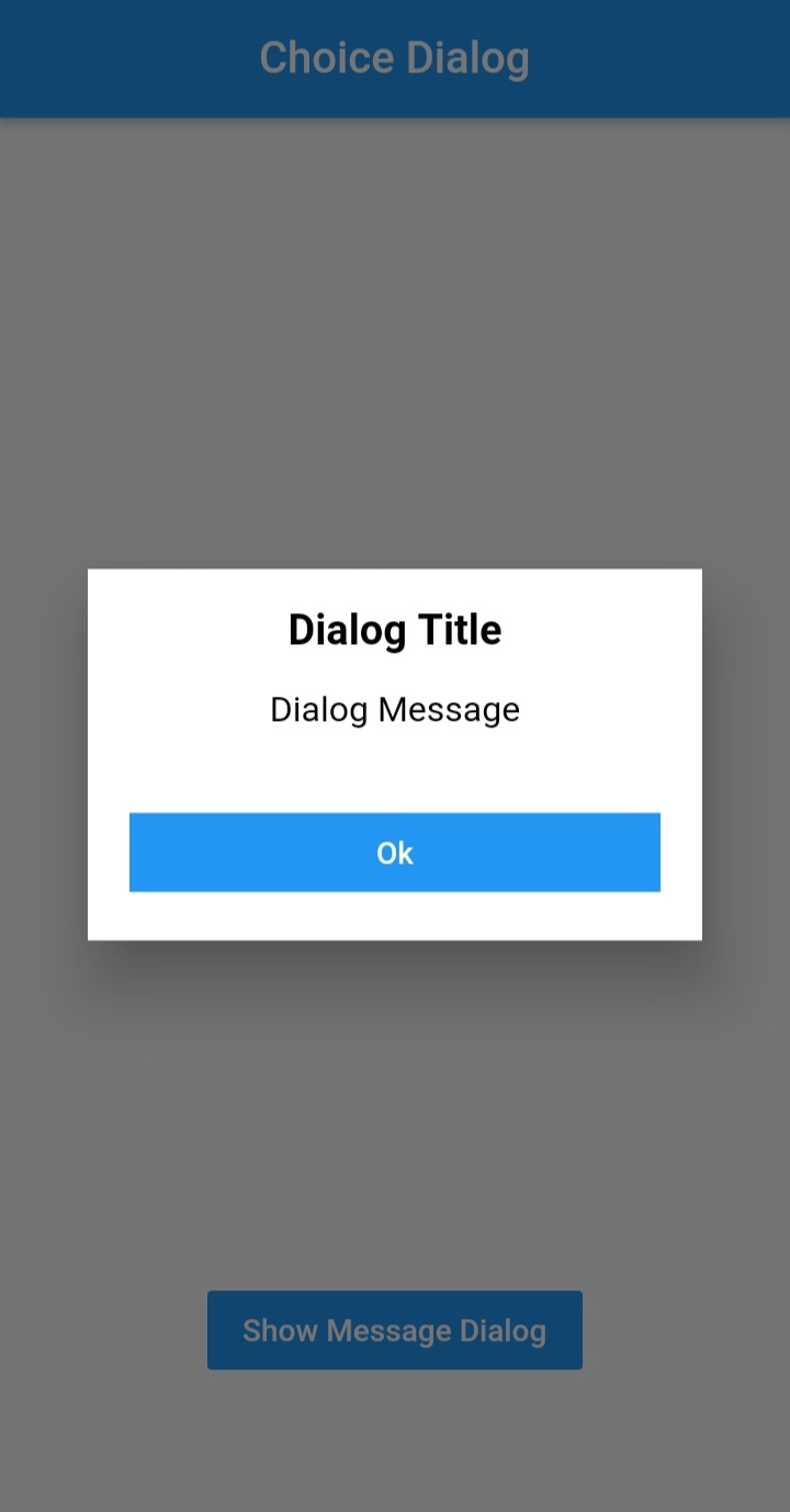
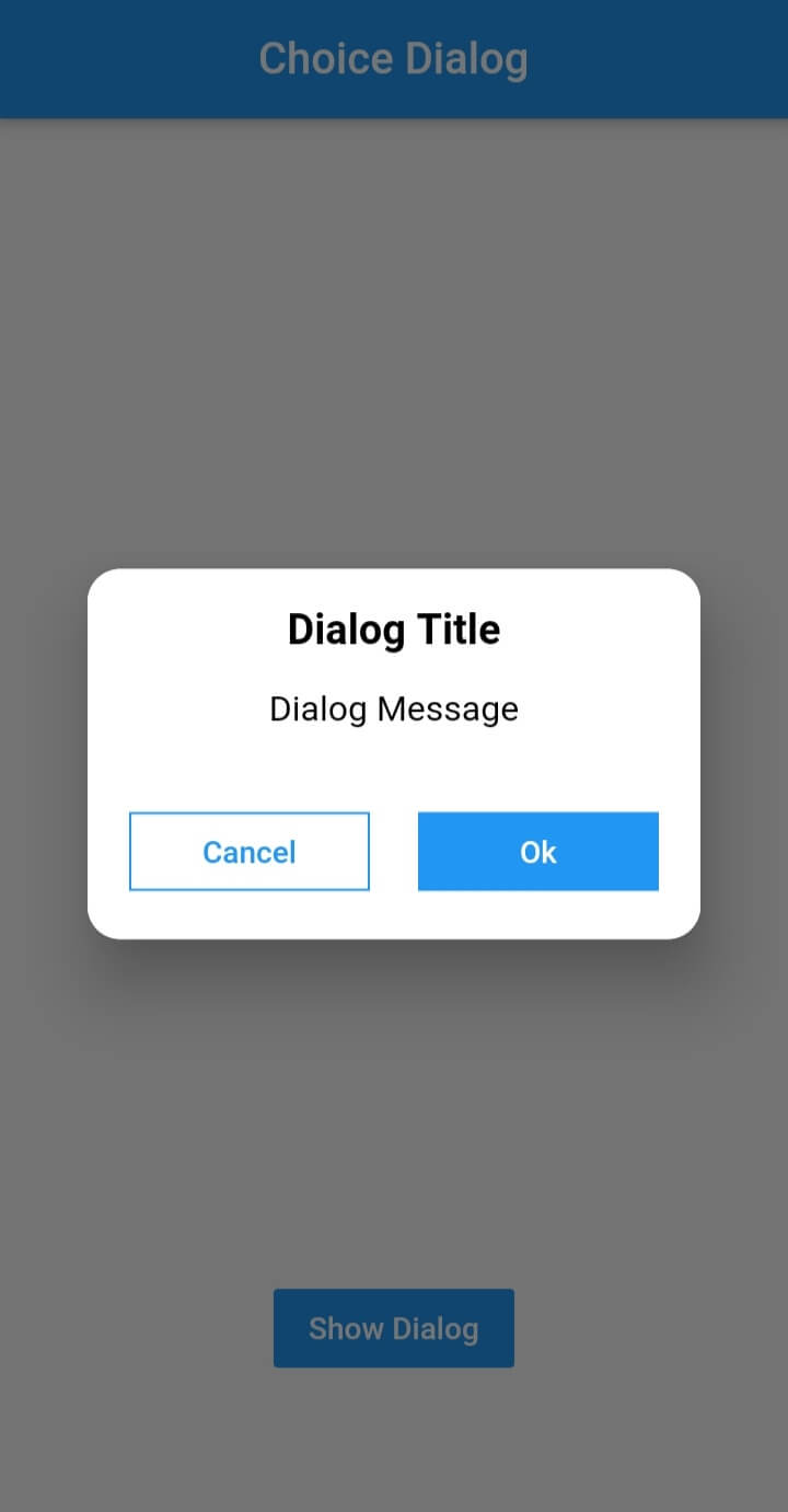
Choice Dialog

Choice Dialog Choice Dialog Rectangular Choice Dialog Rectangular Buttons

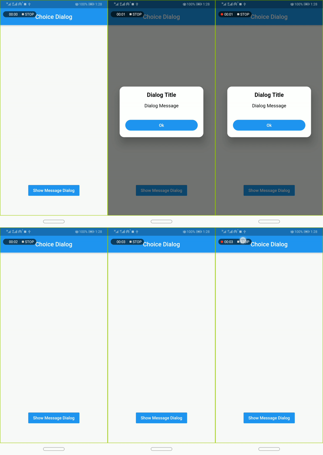
Message Dialog

Message Dialog Gif Message Dialog Message Dialog

Pub Version GitHub Workflow Status Github Stars GitHub

Simple Usage

To use this plugin, add dialogs as a dependency in your pubspec.yaml file.

Implementation:
  • import 'package:dialogs/dialogs.dart';
ChoiceDialog
  • use ChoiceDialog().show() function to display the dialog.

ChoiceDialog().show(context);

##OR


final choiceDialog = ChoiceDialog();
choiceDialog.show(context);

MessageDialog
  • use MessageDialog().show() function and call the Choice Dialog .

MessageDialog().show(context);

OR


final messageDialog = MessageDialog();
choiceDialog.show(context);

Show progress dialog :
//Create an instance of ProgressDialog
ProgressDialog progressDialog = ProgressDialog(
                  context: context,
                  backgroundColor: Colors.blue,
                  textColor: Colors.White,
                );
// show dialog
progressDialog.show();

//close dialog
progressDialog.dismiss();

You are good to go 💯


In order to add the ChoiceDialog, MessageDialog to your app, there are several attributes that are important parameters that you might need frequently:

Attribute Type Default Required Description
buttonOkOnPressed Function() Navigator.pop(context) No This function will be registered as the callback of 'Ok' button.
buttonCancelOnPressed Function() Navigator.pop(context) No This function will be registered as the callback of 'Cancel' button.
dialogRadius double 15.0 No Determines the borderRadius of dialog box.
buttonRadius double 18.0 No Determines the borderRadius of action buttons.
iconButtonOk Icon null No Renders a FlatButton with the provided icon for positive action.
iconButtonCancel Icon null No Renders a FlatButton with the provided icon for negative action.


show() also provides some useful parameters of showDialog() function

Attribute Type Default Required Description
context BuildContext Null Yes The context argument is used to look up the Navigator and Theme for the dialog.
barrierDismissible bool true No Indicates whether tapping on the barrier will dismiss the dialog.
barrierColor Color Colors.black54 No Specifies the color of the modal barrier that darkens everything below the dialog.

CREDITS

Contributors

Made with contributors-img.

カテゴリー

ソースリポジトリ

このパッケージを使用しているプロジェクト

データはまだありません。