flutter_expandable_fab
English , 日本語
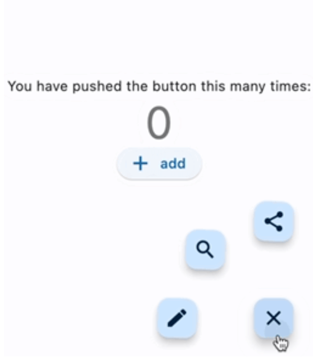
flutter_expandable_fab is a speed dial FAB (Floating Action Button) that can animate the display and hiding of multiple action buttons.
Migration from 1.x to 2.x
In version 2.x, I have made changes to enable free customization of the open/close buttons by setting builders.
Code before migration:
ExpandableFab (
child: const Icon (Icons .account_box),
foregroundColor: Colors .amber,
backgroundColor: Colors .green,
closeButtonStyle: const ExpandableFabCloseButtonStyle (
child: Icon (Icons .abc),
foregroundColor: Colors .deepOrangeAccent,
backgroundColor: Colors .lightGreen,
)
expandedFabSize: ExpandedFabSize .small,
collapsedFabSize: ExpandableFabSize .regular,
expandedFabShape: const CircleBorder (),
collapsedFabShape: const CircleBorder (),
)
Code after migration:
ExpandableFab (
openButtonBuilder: RotateFloatingActionButtonBuilder (
child: const Icon (Icons .account_box),
fabSize: ExpandableFabSize .regular,
foregroundColor: Colors .amber,
backgroundColor: Colors .green,
shape: const CircleBorder (),
),
closeButtonBuilder: DefaultFloatingActionButtonBuilder (
child: const Icon (Icons .close),
fabSize: ExpandableFabSize .small,
foregroundColor: Colors .deepOrangeAccent,
backgroundColor: Colors .lightGreen,
shape: const CircleBorder (),
),
)
Showcase
Fan style & Blur overlay
Vertical style & Color overlay
Horizontal style & Custom buttons
Center Fan style
floatingActionButton: ExpandableFab (
type: ExpandableFabType .fan,
pos: ExpandableFabPos .center,
fanAngle: 180 ,
Getting started
import 'package:flutter_expandable_fab/flutter_expandable_fab.dart' ;
Scaffold (
floatingActionButtonLocation: ExpandableFab .location,
floatingActionButton: ExpandableFab (
children: [
FloatingActionButton .small (
heroTag: null ,
child: const Icon (Icons .edit),
onPressed: () {},
),
FloatingActionButton .small (
heroTag: null ,
child: const Icon (Icons .search),
onPressed: () {},
),
],
),
),
Open/Close programmatically
class _FirstPageState extends State <FirstPage > final _key = GlobalKey <ExpandableFabState >();
@override
Widget build (BuildContext context) {
return Scaffold (
floatingActionButtonLocation: ExpandableFab .location,
floatingActionButton: ExpandableFab (
key: _key,
children: [
FloatingActionButton .small (
child: const Icon (Icons .edit),
onPressed: () {
final state = _key.currentState;
if (state != null ) {
debugPrint ('isOpen:${state.isOpen} ' );
state.toggle ();
}
},
),
],
),
);
}
}
Customize
You can customize the open/close buttons with your preferred Widget using FloatingActionButtonBuilder.
By using DefaultFloatingActionButtonBuilder, you can easily set up the FloatingActionButton.
RotateFloatingActionButtonBuilder provides a FloatingActionButton with a rotating animation.
Also, the items specified in children don't necessarily have to be FloatingActionButton; you can set any Widget freely.
ExpandableFab (
openButtonBuilder: RotateFloatingActionButtonBuilder (
child: const Icon (Icons .account_box),
fabSize: ExpandableFabSize .regular,
foregroundColor: Colors .amber,
backgroundColor: Colors .green,
shape: const CircleBorder (),
),
closeButtonBuilder: FloatingActionButtonBuilder (
size: 56 ,
builder: (BuildContext context, void Function ()? onPressed,
Animation <double > progress) {
return IconButton (
onPressed: onPressed,
icon: const Icon (
Icons .check_circle_outline,
size: 40 ,
),
);
},
),
children: [
FloatingActionButton .large (
heroTag: null ,
child: const Icon (Icons .edit),
onPressed: () {},
),
IconButton (
onPressed: () {
final state = _key.currentState;
if (state != null ) {
debugPrint ('isOpen:${state.isOpen} ' );
state.toggle ();
}
},
icon: const Icon (
Icons .share,
size: 30 ,
),
),
],
)
Since children is an array of widgets, you can place any widget you like, not limited to FloatingActionButton.
floatingActionButton: ExpandableFab (
key: _key,
type: ExpandableFabType .up,
childrenAnimation: ExpandableFabAnimation .none,
distance: 70 ,
overlayStyle: ExpandableFabOverlayStyle (
color: Colors .white.withOpacity (0.9 ),
),
children: const [
Row (
children: [
Text ('Remind' ),
SizedBox (width: 20 ),
FloatingActionButton .small (
heroTag: null ,
onPressed: null ,
child: Icon (Icons .notifications),
),
],
),
Row (
children: [
Text ('Email' ),
SizedBox (width: 20 ),
FloatingActionButton .small (
heroTag: null ,
onPressed: null ,
child: Icon (Icons .email),
),
],
),
Row (
children: [
Text ('Star' ),
SizedBox (width: 20 ),
FloatingActionButton .small (
heroTag: null ,
onPressed: null ,
child: Icon (Icons .star),
),
],
),
FloatingActionButton .small (
heroTag: null ,
onPressed: null ,
child: Icon (Icons .add),
),
],
),
Properties
ExpandableFab
Property
Description
Default
distance
Distance from children
100
duration
Animation duration
250ms
fanAngle
Angle of opening when fan type
90
initialOpen
Open at initial display
false
type
The type of behavior of this widget
fan
pos
Position for displaying the widget
right
closeButtonBuilder
Builder for the close button
openButtonBuilder
Builder for the open button
childrenOffset
For positioning of children widgets
childrenAnimation
Types of animations for Children
rotate
children
The widgets below this widget in the tree
onOpen
Will be called before opening the menu
afterOpen
Will be called after opening the menu
onClose
Will be called before the menu closes
afterClose
Will be called after the menu closes
overlayStyle
Provides the style for overlay. No overlay when null.
openCloseStackAlignment
Defines how [openButtonBuilder] and [closeButtonBuilder] are aligned in a [Stack]
Alignment.center
FloatingActionButtonBuilder
Property
Description
Default
builder
Callback to build the Widget
size
Size of the Widget
DefaultFloatingActionButtonBuilder
Property
Description
Default
fabSize
Size of the button
regular
foregroundColor
Foreground color of the button
backgroundColor
Background color of the button
shape
Shape of the close button
heroTag
Tag to apply to the [Hero] widget of the button
child
Child widget of the button
RotateFloatingActionButtonBuilder
Property
Description
Default
angle
Angle of rotation (in radians)
math.pi / 2
...
Same as DefaultFloatingActionButtonBuilder
Thanks
I referred to the code from this article:
https://docs.flutter.dev/cookbook/effects/expandable-fab