パッケージ、リポジトリ、アプリカテゴリを検索

group_button のカバー
パッケージ詳細v5.3.4

group_button

Flutterカスタムウィジェットでボタングループを作成します。ラジオボタンとチェックボックスボタンを含みます。

AndroidiOSWebmacOSWindowsLinux
30日間ダウンロード
26.9万
いいね数
622
Pub ポイント
160

パッケージをインストール

flutter pub add group_button

パッケージ概要

公開情報に基づく選定ガイドです。参考としてご利用ください。

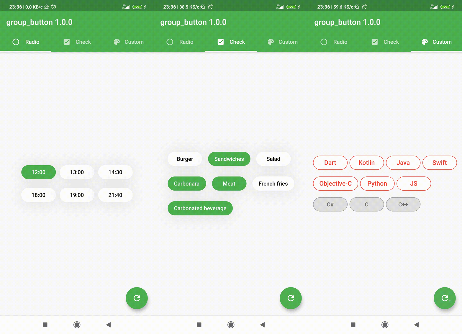
Flutterのカスタムウィジェットで、グループ化されたボタンを作成でき、ラジオボタンおよびチェックボックススタイルをサポートします。相互排他的または複数選択可能なオプションを、洗練され、再利用可能な形式で実装しやすくします。フォーム、フィルター、設定インターフェースなど、ユーザーがセットから1つ以上選択する必要がある場面に最適です。このパッケージはすべての主要プラットフォームと互換性があり、既存のFlutterプロジェクトにスムーズに統合できます。

用途

  • グループ化された選択肢を持つフォーム入力
  • UI におけるフィルターオプション
  • ユーザーの好み設定
  • 複数選択または単一選択のボタングループ
  • 動的フォームビルダ

主な機能

  • ラジオボタンおよびチェックボックスボタンタイプをサポートしています
  • Flutter との簡単な統合
  • クロスプラットフォーム互換性
  • カスタマイズ可能なスタイル
  • グループ選択用の組み込み状態管理
  • すべてのデバイス向けのレスポンシブデザイン

適している対象

  • インタラクティブなフォームを構築する開発者
  • グループ化されたボタンコンポーネントを必要とするUIデザイナー
  • フィルターや好みの選択が必要なアプリ
  • 複数のプラットフォームをターゲットにするプロジェクト

注意事項

  • 選択コールバックの手動処理が必要
  • 制限された組み込み検証
  • スタイルには追加のカスタマイズが必要になる場合があります
  • 追加の論理がなければ、複雑な動的グループには適していない

元の README

関連するソースリポジトリの README 原文のスナップショットです。最新の内容はリポジトリをご覧ください。

Flutter widget to create a group of buttons fast 🚀

Included Radio and CheckBox buttons models with custom groping types 🤤
Show some ❤️ and star the repo to support the project!

Pub License: MIT Repository views Pub

Pub likes Pub popularity Pub points


GroupButtonController GroupButtonBuilder GroupButtonOptions

Getting Started

Follow these steps to use this package

Add dependency
dependencies:
  group_button: ^5.4.0
Add import package
import 'package:group_button/group_button.dart';
Easy to use

Simple example of use GroupButton
Put this code in your project at an screen and learn how it works 😊

GroupButton(
    isRadio: false,
    onSelected: (index, isSelected) => print('$index button is selected'),
    buttons: ["12:00", "13:00", "14:30", "18:00", "19:00", "21:40"],
)
Controller

Starting from version 4.1.0
You can control your Group Button using the controller

final controller = GroupButtonController();

Column(
  children: [
    GroupButton.checkbox(
      controller: controller,
      buttons: ['12:00', '13:00', '14:00'],
      onSelected: (i, selected) => debugPrint('Button #$i $selected'),
    ),
    TextButton(
      onPressed: () => controller.selectIndex(1),
      child: const Text('Select 1 button'),
    )
  ],
),
Generic button value

In new 5.0.0 version you can set custom buttons value type
It can be int, DateTime, double or YourCustomClass
Button text will be result of .toString() model method in common button display case

GroupButton<DateTime>(
  buttons: [DateTime(2022, 4, 9), DateTime(2022, 4, 10)],
)
Button builders

Also you can use generic button values with cutsom buttonBuilder
In order to turn values into any widget

GroupButton<DateTime>(
  buttons: [DateTime(2022, 4, 9), DateTime(2022, 4, 10)],
  buttonBuilder: (selected, date, context) {
    return Text('${date.year}-${date.month}-${date.day}');
  },
),

In this package, there are four different possibilities for customizing your buttons through builders

  • 1 buttonBuilder It will build a fully custom button based on the value parameter
  • 2 buttonIndexedBuilder same as buttonBuilder. But based on button index.
  • 3 buttonTextBuilder It will replace the text of your button, which is constructed based on the style parameters passed in GroupButtonOptions. The appearance of the button remains the same, but the text is changed. Based on button value.
  • 4 buttonIndexedTextBuilder same as buttonTextBuilder. But based on button index.
Fully Customize

In order to customize your buttons inside GroupButton you can use GroupButtonOptions

GroupButtonOptions(
  selectedShadow: const [],
  selectedTextStyle: TextStyle(
    fontSize: 20,
    color: Colors.pink[900],
  ),
  selectedColor: Colors.pink[100],
  unselectedShadow: const [],
  unselectedColor: Colors.amber[100],
  unselectedTextStyle: TextStyle(
    fontSize: 20,
    color: Colors.amber[900],
  ),
  selectedBorderColor: Colors.pink[900],
  unselectedBorderColor: Colors.amber[900],
  borderRadius: BorderRadius.circular(100),
  spacing: 10,
  runSpacing: 10,
  groupingType: GroupingType.wrap,
  direction: Axis.horizontal,
  buttonHeight: 60,
  buttonWidth: 60,
  mainGroupAlignment: MainGroupAlignment.start,
  crossGroupAlignment: CrossGroupAlignment.start,
  groupRunAlignment: GroupRunAlignment.start,
  textAlign: TextAlign.center,
  textPadding: EdgeInsets.zero,
  alignment: Alignment.center,
  elevation: 0,
),

Examples

You can check more examples of using this package here


Thanks to all contributors of this package


For help getting started with 😍 Flutter, view online documentation, which offers tutorials, samples, guidance on mobile development, and a full API reference.

カテゴリー

ソースリポジトリ

このパッケージを使用しているプロジェクト