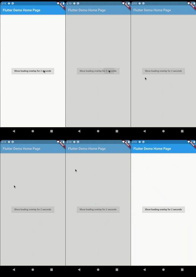
Have you ever found yourself in the situation of doing some async processing your screen and wanting
to prevent the user from interacting with the screen while the application is loading? If so, this
package was made just for you.
Basic Usage
The most simple usage is just wrap the widget that you want an overlay on LoaderOverlay. Default
loader will be shown.
This simple step will already configure the loader overlay for use.
After that configuration you can just call:
context.loaderOverlay.show();
This will show the overlay with the default loading indicator. The default loading configured is to
just show a centered CircularProgressIndicator
To hide the overlay (after the async processing, for example), just call:
context.loaderOverlay.hide();
You can check if overlay is visible:
final isVisible = context.loaderOverlay.visible;
*Note: You will always need the context to show or hide the loader overlay
Basic Usage on Navigation
To use this package with named routes you can just wrap your MaterialApp with GlobalLoaderOverlay.
This widget has all the features of LoaderOverlay but it is provided for all the routes of the app.
Your overlay loader widget can be any widget you want. For example you can import the
package flutter_spinkit and customise your widget like this.
To do that just pass your widget to overlayWidget and set useDefaultLoading to false.
Another customisation you can do is configure the color and opacity of the overlay.
The default opacity is grey with 0.4 opacity, but you can change it with
the overlayColor: Colors.yellow.withValues(alpha: 0.8).
If you pass widget to context.loaderOverlay.show, then defaultLoader and widgetOverlay will be
ignored;
Progress
If you want to show some progress while the loader overlay is visible, you can do it with the
context.loaderOverlay.show(progress: 'Doing progress #0',) for an initial progress, and with
context.loaderOverlay.progress('Doing progress #1'); every time the progress need to change.
Both this methods pass the progress to the current widgetBuilder on every call.
You can also remove by complete the overlayColor (set to transparent), set the useDefaultLoading to false,
and use a fully personalized overlayWidgetBuilder to make your own 100% customizable overlay.
By default, the overlay does not animate in or out. You can enable animations by passing the
appropriate parameters to LoaderOverlay. Internally, an AnimatedSwitcher is used to manage
animations, so the parameters are passed directly to the AnimatedSwitcher. By specifying
a duration and reverseDuration, the overlay will animate in and out using a fade (the default
transition used by AnimatedSwitcher). You can also pass curves, a transition builder and a layout
builder for further customisation.