パッケージ、リポジトリ、アプリカテゴリを検索

neon_circular_timer のカバー
パッケージ詳細v0.0.8

neon_circular_timer

美しいUIで素早くタイマーを構築するのを手伝うパッケージです。高度にカスタマイズ可能で、タイマーの色、太さ、時計のテキストスタイルを変更できます。

AndroidiOSWebmacOSWindowsLinux
30日間ダウンロード
308
いいね数
69
Pub ポイント
140

パッケージをインストール

flutter pub add neon_circular_timer

パッケージ概要

公開情報に基づく選定ガイドです。参考としてご利用ください。

NeonCircularTimer は、最小限の努力で視覚的に魅力的な円形タイマーを作成するために設計された Flutter パッケージです。ユーザーが色、ストロークの太さ、テキストスタイルを調整できる洗練されたカスタマイズ可能なインターフェースを提供します。カウントダウンやフィットネスアプリ、または任意の動的時間インジケーターが必要なアプリに最適であり、Android、iOS、Web、macOS、Windows、Linux を含むすべての主要プラットフォームをサポートしています。滑らかなアニメーションとモダンなネオン風の美学により、ユーザー体験を向上させます。

用途

  • フィットネストラッキング
  • 学習セッションタイマー
  • ゲームカウントダウン
  • イベントのリマインダー
  • インタラクティブなアプリインターフェース

主な機能

  • 高度にカスタマイズ可能な外観
  • スムーズなアニメーション遷移
  • 複数のプラットフォームをサポートしています
  • 調整可能なストローク幅と色
  • カスタマイズ可能なテキストスタイル
  • ネオン風のビジュアルエフェクト

適している対象

  • カウントダウン機能を構築する開発者
  • デザイン重視のアプリケーション
  • クロスプラットフォーム用タイマー実装
  • 魅力的なUI要素を必要とするアプリ
  • 美的側面に重点を置いたプロジェクト

注意事項

  • 低スペックデバイスではパフォーマンスチューニングが必要になる場合があります
  • カスタマイズオプションは複雑さを増す可能性があります
  • 円形タイマー設計に限定
  • カウントダウン以外の時間表示には適していない
  • 高度な効果を実現するために、外部のアニメーションライブラリに依存しています

元の README

関連するソースリポジトリの README 原文のスナップショットです。最新の内容はリポジトリをご覧ください。

neon_circular_timer

Make a timer application with a fancy neon effect and beautiful UI

v0.0.3 and above now the timer has also a neumorphic border

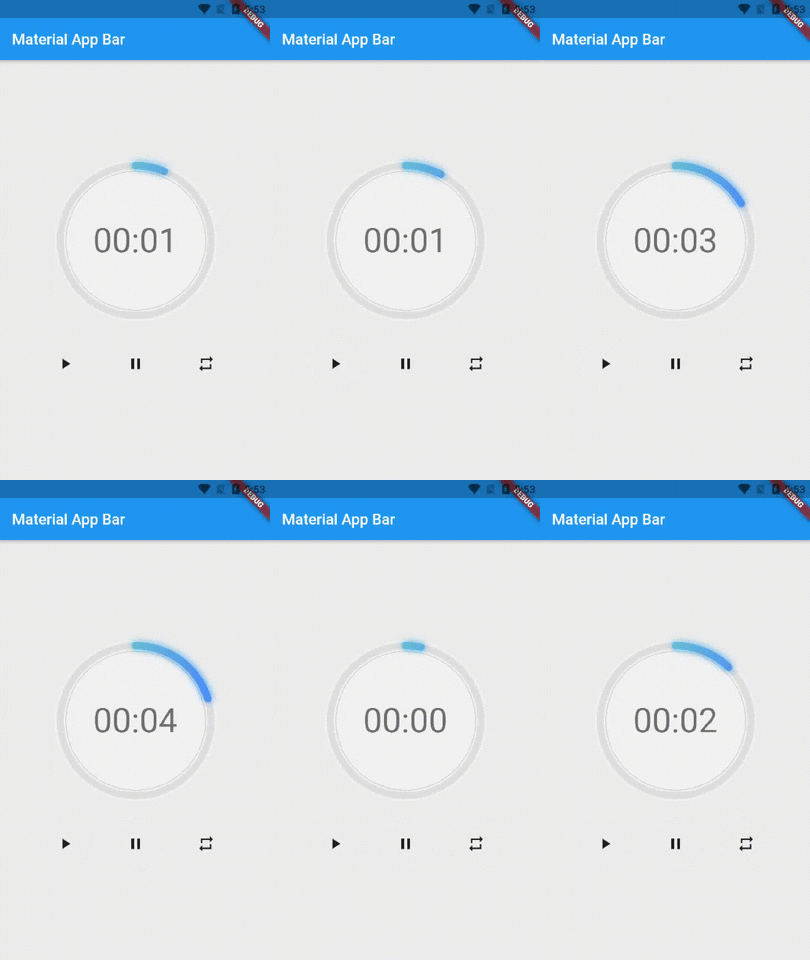
Preview of example

example preview

Usage

Use neumorphicEffect to show or hide the neumorphic border

Use isTimerTextShown to show or hide the text

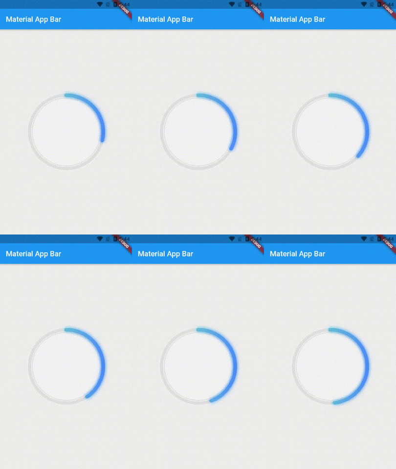
With neumorphicEffect is true and isTimerTextShown is false


  NeonCircularTimer(
                width: 200,
                    duration: 20,
                    controller : your_controller
                    isTimerTextShown: false,
                    neumorphicEffect: true,
                    innerFillGradient: LinearGradient(colors: [
                      Colors.greenAccent.shade200,
                      Colors.blueAccent.shade400
                    ]),
                    neonGradient: LinearGradient(colors: [
                      Colors.greenAccent.shade200,
                      Colors.blueAccent.shade400
                    ]),
                   ),

neum no text

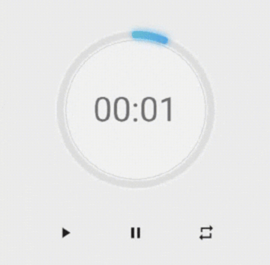
with neumorphicEffect is false and isTimerTextShown is false
  NeonCircularTimer(
                width: 200,
                    duration: 20,
                    controller : your_controller
                    isTimerTextShown: false,
                    neumorphicEffect: false,
                    innerFillGradient: LinearGradient(colors: [
                      Colors.greenAccent.shade200,
                      Colors.blueAccent.shade400
                    ]),
                    neonGradient: LinearGradient(colors: [
                      Colors.greenAccent.shade200,
                      Colors.blueAccent.shade400
                    ]),
                   ),

no txt nor neum

Parameters

Name Type Default Value Description
key Key null Key for Countdown Timer.
neon double 4.0 The itensity of the neon
duration int required Countdown duration in Seconds.
initialDuration int 0 Countdown initial elapsed Duration in Seconds.
controller CountDownController required Controls (i.e Start, Pause, Resume, Restart) the Countdown Timer.
width double required Width of the rectangle that surrounds the circle ( Diameter of the Countdown Timer).
neonColor Color Colors.white54 neon Color for Countdown Widget.
neonGradient Gradient null neon Gradient for Countdown Widget. Note that neonColor will not be effective if gradient is provided.
neumorphicEffect bool true show neumorphic border
innerFillColor Color Colors.black12 Filling Color for Countdown Widget.
innerFillGradient Gradient null Filling Gradient for Countdown Widget. Note that fillColor will not be effective if gradient is provided.
outerStrokeColor Color Colors.white border Color for Countdown Widget.
backgroundColor Color Colors.white54 must be provided if you choose to use neumorphic effect .
outerStrokeGradient Gradient null border Gradient for Countdown Widget. Note that backgroundColor will not be effective if gradient is provided.
strokeWidth double 10.0 Border Thickness of the Countdown Ring.
strokeCap StrokeCap StrokeCap.round Begin and end contours with a flat edge and no extension.
textStyle TextStyle Theme.of(context).textTheme.headline3 Text Style for Countdown Text.
textFormat String TextFormat.MM_SS Format for the Countdown Text.
isReverse bool false Handles Countdown Timer (true for Reverse Countdown (max to 0), false for Forward Countdown (0 to max)).
isReverseAnimation bool false Handles Animation Direction (true for Reverse Animation, false for Forward Animation).
isTimerTextShown bool true Handles visibility of the Countdown Text.
autoStart bool true Handles the timer start.
onStart VoidCallback null This Callback will execute when the Countdown Starts.
onComplete VoidCallback null This Callback will execute when the Countdown Ends.

About the Controller

to get the time in seconds use :

controller.getCurrentTimeInSeconds();

to get the time formated into the selected TextFormat use:

controller.getTime();

to control the timer use :

controller.restart(); // to reset the timer
controller.start(); // to start the timer from 0
controller.pause(); // to pause the timer
controller.resume(); // to continue from the value where the timer stopped

カテゴリー

ソースリポジトリ

このパッケージを使用しているプロジェクト

データはまだありません。