パッケージ、リポジトリ、アプリカテゴリを検索

slidable_button のカバー
パッケージ詳細v3.0.0+1

slidable_button

シンプルでカスタマイズ可能なFlutterスライドボタンウィジェット。

AndroidiOSWebmacOSWindowsLinux
30日間ダウンロード
46
いいね数
65
Pub ポイント
160

パッケージをインストール

flutter pub add slidable_button

パッケージ概要

公開情報に基づく選定ガイドです。参考としてご利用ください。

Flutter向けのシンプルでカスタマイズ可能なスライドボタンウィジェットで、ユーザーがトラック上でサムをドラッグしてアクションをトリガーできます。カスタムスタイル、アニメーション、およびスライダーが移動または解放されたときに呼び出されるコールバックイベントをサポートしています。マルチプラットフォームアプリにおけるトグル、確認、インタラクティブなコントロールに最適です。パッケージは軽量で、最小限の構成で簡単に統合可能です。

用途

  • フォーム確認スライダー
  • トグルスイッチ
  • インタラクティブなオンボーディング要素
  • カスタマイズ可能なアクショントリガー
  • ユーザー同意のプロンプト

主な機能

  • 完全にカスタマイズ可能な外観
  • ドラッグジェスチャーのサポート
  • ドラッグおよびリリース時のコールバック
  • スムーズなアニメーション
  • クロスプラットフォーム互換性
  • シンプルな API インテグレーション

適している対象

  • 軽量スライダーを探している開発者
  • インタラクティブな要素を必要とするUIデザイナー
  • ユーザーの確認操作を必要とするアプリ
  • マルチプラットフォーム Flutter プロジェクト
  • カスタムフォームコンポーネント

注意事項

  • 制限された組み込みテーマ
  • 組み込みのアクセシビリティ機能なし
  • エッジケースの手動処理が必要です
  • 複雑なスライダー操作には適していない
  • 基本的な使用法を超える最小限のドキュメント

元の README

関連するソースリポジトリの README 原文のスナップショットです。最新の内容はリポジトリをご覧ください。

slidable_button

Pub support

A simple flutter plugin for Slidable Button.


Note : This plugin is cloned and remade from swipe_button.

Getting Started

Add dependency
dependencies:
  slidable_button: ^3.0.0+1
Simple to use

Import this library on your code.

import 'package:slidable_button/slidable_button.dart';

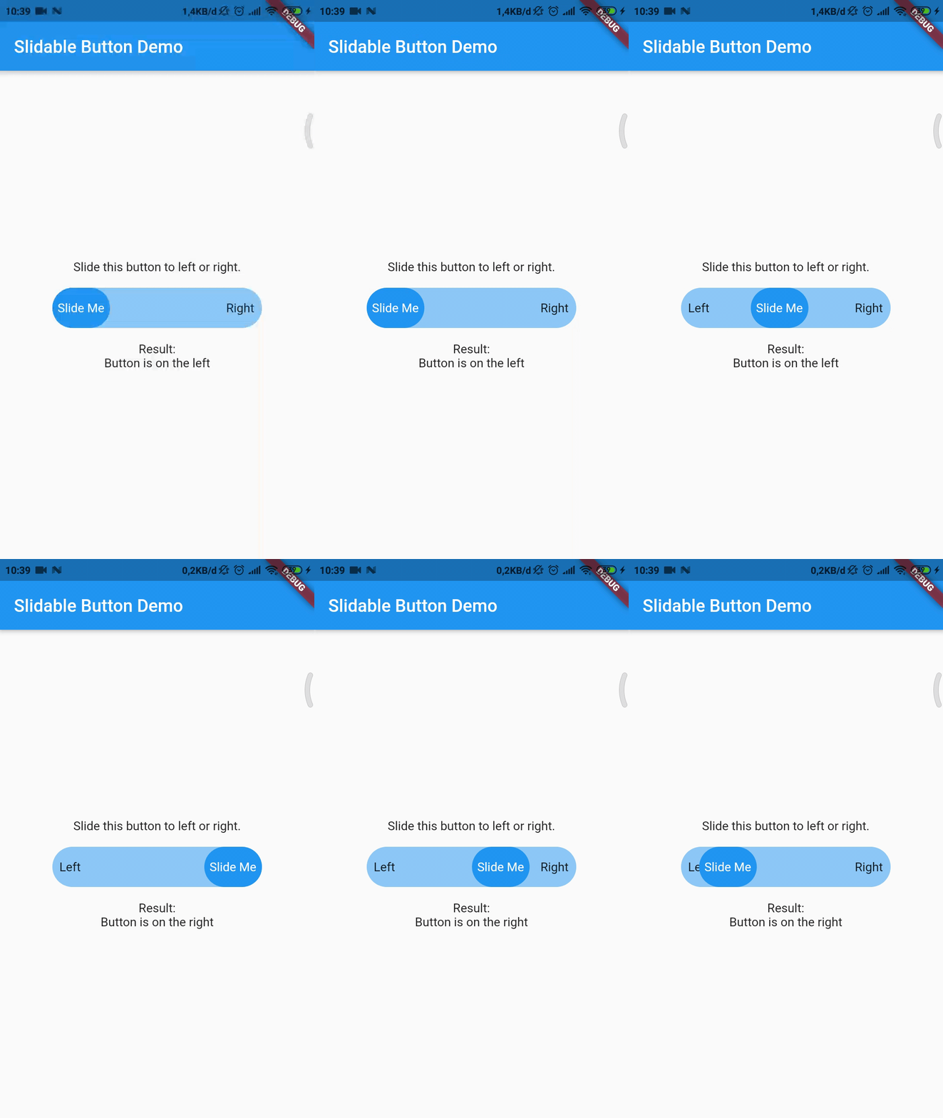
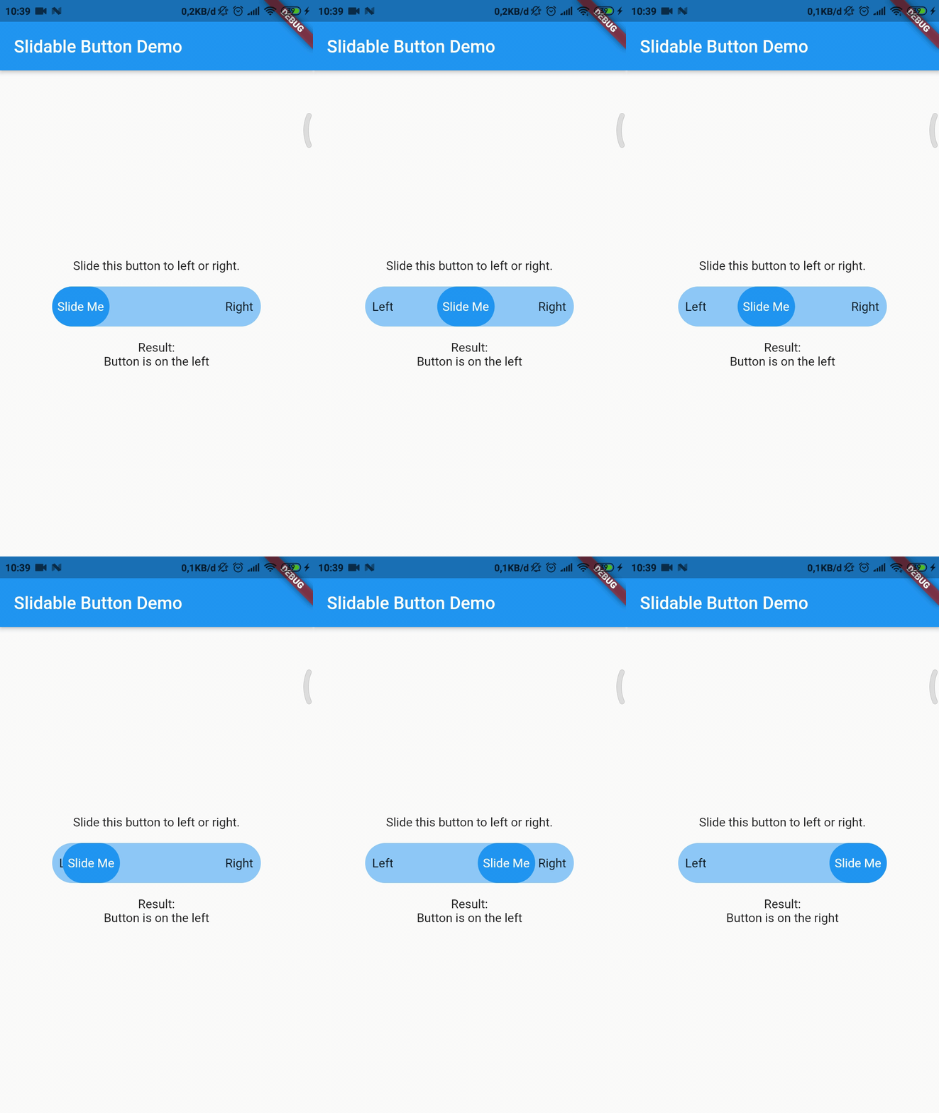
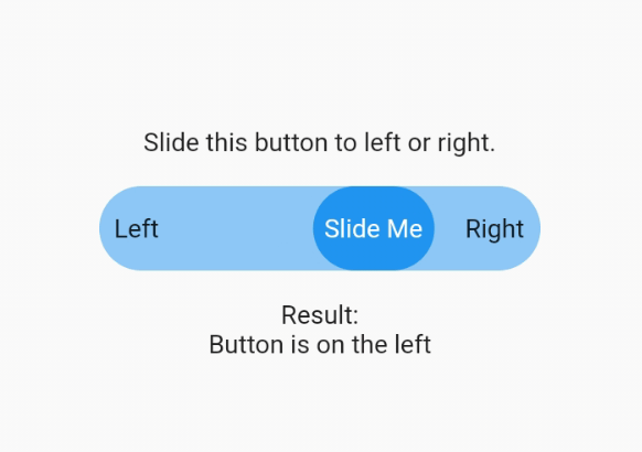
Now you can make your slidable button vertically or horizontally by using one of them widget. For horizontal usage example :

    HorizontalSlidableButton(
      width: MediaQuery.of(context).size.width / 3,
      buttonWidth: 60.0,
      color: Theme.of(context).accentColor.withOpacity(0.5),
      buttonColor: Theme.of(context).primaryColor,
      dismissible: false,
      label: Center(child: Text('Slide Me')),
      child: Padding(
        padding: const EdgeInsets.all(8.0),
        child: Row(
          mainAxisAlignment: MainAxisAlignment.spaceBetween,
          children: [
            Text('Left'),
            Text('Right'),
          ],
        ),
      ),
      onChanged: (position) {
        setState(() {
          if (position == SlidableButtonPosition.end) {
            result = 'Button is on the right';
          } else {
            result = 'Button is on the left';
          }
        });
      },
    ),

Vertical usage example :

    VerticalSlidableButton(
      height: MediaQuery.of(context).size.height / 3,
      buttonHeight: 60.0,
      color: Theme.of(context).accentColor.withOpacity(0.5),
      buttonColor: Theme.of(context).primaryColor,
      dismissible: false,
      label: Center(child: Text('Slide Me')),
      child: Padding(
        padding: const EdgeInsets.all(8.0),
        child: Column(
          mainAxisAlignment: MainAxisAlignment.spaceBetween,
          children: [
            Text('Top'),
            Text('Bottom'),
          ],
        ),
      ),
      onChanged: (position) {
        setState(() {
          if (position == SlidableButtonPosition.end) {
            result = 'Button is on the bottom';
          } else {
            result = 'Button is on the top';
          }
        });
      },
    ),
Migration Guide

If you already use this package before v3.x.x you may need to migrate your code to HorizontalSlidableButton or VerticalSlidableButton for specific direction usage because SlidableButton class has been removed start from v3.0.0.

カテゴリー

ソースリポジトリ

このパッケージを使用しているプロジェクト

データはまだありません。