パッケージ、リポジトリ、アプリカテゴリを検索

steps_indicator のカバー
パッケージ詳細v1.3.0

steps_indicator

シンプルなステップインジケーターラインウィジェットを表示するためのFlutterプラグイン。

AndroidiOSWebmacOSWindowsLinux
30日間ダウンロード
1270
いいね数
59
Pub ポイント
150

パッケージをインストール

flutter pub add steps_indicator

パッケージ概要

公開情報に基づく選定ガイドです。参考としてご利用ください。

Flutterプラグインで、一連のステップを通過する進行状況を視覚的に表現するためのシンプルでカスタマイズ可能なステップインジケーターラインウィジェットを提供します。インジケーター、ライン、ラベルのさまざまなスタイルオプションをサポートしており、オンボーディングフロー、チェックアウトプロセス、または任意のマルチステップユーザー体験に最適です。このパッケージは軽量であり、Android、iOS、Web、macOS、Windows、Linuxなどすべての主要プラットフォームと互換性があります。

用途

  • オンボーディングウィザード
  • チェックアウトプロセスのトラッキング
  • 複数ステップフォームナビゲーション
  • アプリケーション内の進行状況の可視化
  • チュートリアルのウォークスルー

主な機能

  • カスタマイズ可能なステップインジケーター
  • カスタマイズ可能なラインスタイル
  • ラベルおよびアイコンのサポート
  • クロスプラットフォーム互換性
  • シンプルな API インテグレーション

適している対象

  • ガイド付きユーザー・フローを構築する開発者
  • 視覚的な進行状況の追跡を必要とするアプリ
  • 複数ステップインターフェースを持つプロジェクト
  • ミニマリストなプログレスインジケータを求めるデザイナー
  • クロスプラットフォームアプリケーション

注意事項

  • 線形ステップ進行に制限される
  • 組み込みのアニメーションサポートなし
  • ステップの状態変更を手動で処理する必要があります
  • 複雑な分岐ワークフローには適していません
  • 基本的なスタイリングオプションと高度なUIライブラリの比較

元の README

関連するソースリポジトリの README 原文のスナップショットです。最新の内容はリポジトリをご覧ください。

steps_indicator

pub package

A simple steps indicator widget

Installation

Add steps_indicator: ^1.3.0 in your pubspec.yaml dependencies. And import it:

import 'package:steps_indicator/steps_indicator.dart';

How to use

Simply create a StepsIndicator widget and pass the required params:

StepsIndicator(
  selectedStep: 1,
  nbSteps: 4
)

Do not forget to check that the selectedStep is not lower than 0 and is not higher than the total number of steps (nbSteps).

Params

Animations are disabled by default if you want to enable them remember to pass properties to true.

StepsIndicator(
  selectedStep: 1,
  nbSteps: 4,
  selectedStepColorOut: Colors.blue,
  selectedStepColorIn: Colors.white,
  doneStepColor: Colors.blue,
  doneLineColor: Colors.blue,
  undoneLineColor: Colors.red,
  isHorizontal: true,
  lineLength: 40,
  doneStepSize: 10,
  unselectedStepSize: 10,
  selectedStepSize: 14,
  selectedStepBorderSize: 1,
  doneStepWidget: Container(), // Custom Widget 
  unselectedStepWidget: Container(), // Custom Widget 
  selectedStepWidget: Container(), // Custom Widget 
  lineLengthCustomStep: [
    StepsIndicatorCustomLine(nbStep: 3, length: 80)
  ],
  enableLineAnimation: true,
  enableStepAnimation: true,
)

For a more detail example please take a look at the example folder.

Example

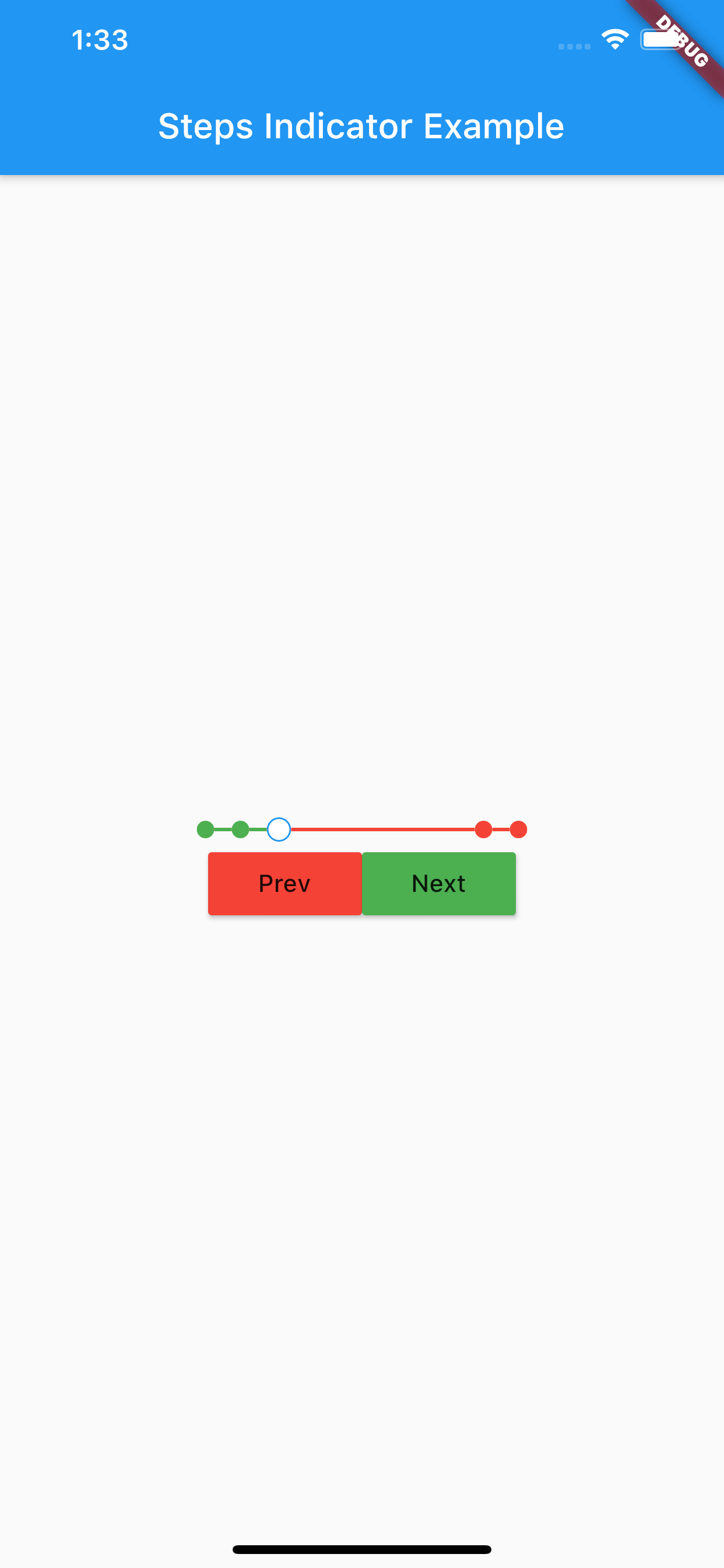
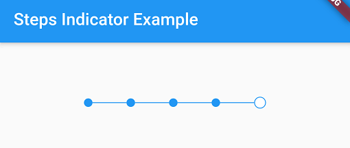
Steps indicator:

-

If something is missing, feel free to open a ticket or contribute!

カテゴリー

ソースリポジトリ

このパッケージを使用しているプロジェクト

データはまだありません。