パッケージ、リポジトリ、アプリカテゴリを検索

universal_stepper のカバー
パッケージ詳細v1.0.0+1

universal_stepper

Flutter用のユニバーサルステッパー小道具を提供します。この小道具は、水平および垂直のステッパーの作成に使用できます。

AndroidiOSWebmacOSWindowsLinux
30日間ダウンロード
7
いいね数
5
Pub ポイント
160

パッケージをインストール

flutter pub add universal_stepper

パッケージ概要

公開情報に基づく選定ガイドです。参考としてご利用ください。

水平および垂直レイアウトをサポートするユニバーサルステッパーライブラリを提供する、汎用的なFlutterパッケージです。フォーム、オンボーディングフロー、またはマルチステージプロセスのステップバイステップインターフェースの作成を、すべての主要プラットフォームで簡単に実現できます。カスタマイズ可能で、既存のFlutterアプリにスムーズに統合可能です。柔軟性と使いやすさを重視して設計されており、最小限のコードで一貫したUIパターンを維持できます。クロスプラットフォーム互換性により、Android、iOS、Web、macOS、Windows、Linuxで均一な動作が保証されます。

用途

  • オンボーディングウィザード
  • マルチステップフォームのナビゲーション
  • チェックアウトプロセスの設計
  • 進行状況のトラッキングインターフェース
  • セットアップウィザード

主な機能

  • 水平および垂直方向をサポートしています
  • クロスプラットフォーム互換性
  • カスタマイズ可能なスタイル
  • シンプルな API インテグレーション
  • 再利用可能なステップコンポーネント

適している対象

  • ガイド付きワークフローを構築する開発者
  • 一貫したステッパーUIを必要とするチーム
  • 複数ステップのユーザー入力を必要とするアプリ
  • 再利用可能なコンポーネントでデザインシステムを構築する
  • クロスプラットフォームアプリケーション

注意事項

  • 複雑なテーマに対応するためには追加のスタイル設定が必要になる場合があります
  • 制限された組み込みアニメーションオプション
  • 線形ステップシーケンスに最適
  • 非常に動的なステップ論理には適していない
  • ステップ制御には適切な状態管理に依存しています

元の README

関連するソースリポジトリの README 原文のスナップショットです。最新の内容はリポジトリをご覧ください。

A simple package to build steppers with custom elements. You can set up your own body content, badges, and paths using indexed builders.

Vertical Stepper

To create a vertical stepper, set stepperDirection to Axis.vertical.

UniversalStepper(
  inverted: false,
  stepperDirection: Axis.vertical,
  elementBuilder: (context, index) {
    return Expanded(
      child: Container(
        padding: const EdgeInsets.only(left: 10, bottom: 15),
        child: ... // your element
      ),
    );
  },
  badgeBuilder: (context, index) {
    return Container(
      width: 30,
      padding: const EdgeInsets.all(6),
      decoration: const BoxDecoration(
        color: Colors.green,
        borderRadius: BorderRadius.all(Radius.circular(30)),
      ),
      child: const FittedBox(child: Icon(Icons.fastfood, color: Colors.white)),
    );
  },
  pathBuilder: (context, index) {
    return Container(
      color: index == stepperData.length - 1
          ? Colors.transparent
          : (index < currentStep ? Colors.green : Colors.grey),
      width: 4,
    );
  },
  subPathBuilder: (context, index) {
    return Container(
      color: index == stepperData.length - 1
          ? Colors.transparent
          : (index < currentStep ? Colors.green : Colors.grey),
      width: 4,
    );
  },
  elementCount: stepperData.length,
  badgePosition: StepperBadgePosition.start,
)

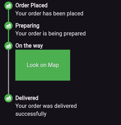
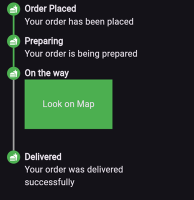
Here’s an example of what the result might look like:

Parameters

  • elementBuilder: A builder for the content of the stepper.

  • badgeBuilder: A builder for the badge.

  • badgePosition: Determines the alignment of the badge. Options include StepperBadgePosition.start, StepperBadgePosition.center, or StepperBadgePosition.end.

  • pathBuilder: A builder for the main path (e.g., a line, dotted line, etc.). This is the most commonly used path.

  • subPathBuilder: A builder for the secondary path, used when badgePosition is set to StepperBadgePosition.center. This path is displayed under the badge and allows you to control its visibility based on the active step.

  • elementCount: The number of elements in the stepper.

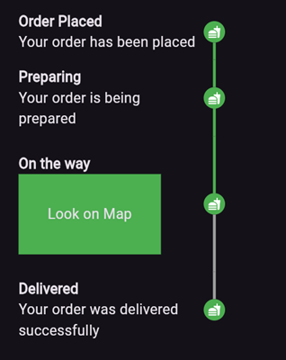
  • inverted: A flag to invert the position of the path and badge relative to the element. By default, this is false, and for vertical steppers, the path appears on the left. When set to true, the path appears on the right. For horizontal steppers, the path appears on the top and when set to true, the path appears on the bottom.

For example, if you set inverted to true and badgePosition to StepperBadgePosition.center, the result will look like this:

Horizontal Stepper

To create a horizontal stepper, set stepperDirection to Axis.horizontal.

Here’s an example of a horizontal stepper:

And here’s the inverted variant:

For full examples, check out the example app.

カテゴリー

ソースリポジトリ

このパッケージを使用しているプロジェクト

データはまだありません。