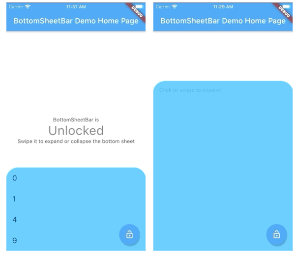
BottomSheetBar는 화면 하단에 고정된 도구 모음을 제공하는 Flutter 패키지로, 전체 하단 시트로 확장할 수 있습니다. 컴팩트 상태와 확장 상태 사이의 부드러운 전환을 제공하여 탐색, 컨트롤 또는 추가 콘텐츠 접근에 이상적입니다. 사용자 정의가 가능하며 Android, iOS, Web, macOS, Windows, Linux 등 주요 플랫폼에서 작동합니다. 직관적인 사용자 상호작용을 위해 설계되어 메인 인터페이스를 혼잡하게 만들지 않으면서 핵심 작업을 쉽게 접근할 수 있도록 합니다.
사용 사례
컨트롤에 빠르게 접근
접을 수 있는 메뉴를 갖춘 탐색
확장 가능한 패널이 있는 폼 입력
미디어 재생 컨트롤
동적 콘텐츠 필터링
주요 기능
하단 정렬 도구 모음
하단 시트로 부드럽게 확장
크로스 플랫폼 호환성
사용자 정의 가능한 외관
제스처로 제어하는 열기/닫기
반응형 디자인
적합한 대상
모바일 중심 앱
인터랙티브 대시보드
콘텐츠가 풍부한 인터페이스
사용자 중심의 탐색
접을 수 있는 도구 모음이 필요한 앱
고려 사항
다른 하단 오버레이와 충돌할 수 있습니다
신중한 레이아웃 계획이 필요합니다
많은 콘텐츠로 인한 성능 영향
기본 상태에서 사용자 지정이 제한됨
전체 화면 모달 사용에 적합하지 않습니다
원본 README
연결된 소스 저장소의 README 원문 스냅샷입니다. 최신 내용은 저장소에서 확인하세요.
bottom_sheet_bar
A toolbar that aligns to the bottom of a widget and expands into a bottom sheet.
Widget body - The toolbar will be aligned to the bottom of the body Widget. Padding equal to height is added to the bottom of this widget.
Function(ScrollController) expandedBuilder - A function to build the widget displayed when the bottom sheet is expanded. If the expanded content is scrollable, pass the provided ScrollController to the scrollable widget.
Optional
Widget collapsed - A Widget to be displayed on the toolbar in its collapsed state
BottomSheetBarController controller - A controller can be used to listen to events, and expand and collapse the bottom sheet.
Color color - The background color of the toolbar and bottom sheet. Defaults to Colors.white
Color backdropColor - The backdrop color that overlays the [body] widget when the bottom sheet is expanded. Defaults to Colors.transparent (no backdrop)
BorderRadius borderRadius - Provide a border-radius to adjust the shape of the toolbar
BorderRadius borderRadiusExpanded - Provide a border-radius to adjust the shape of the bottom-sheet when expanded
List<BoxShadow> boxShadows - Provide shadow decoration to the bottom sheet
double height - The height of the collapsed toolbar. Default to kToolbarHeight (56.0)
bool isDismissable - If true, the bottom sheet can be dismissed by tapping elsewhere. Defaults to true
bool locked - If true, the bottom sheet cannot be opened or closed with a swipe gesture. Defaults to true
bool willPopScope - If true, the bottom sheet widget will be wrapped in a WillPopScope widget to handle back-gestures. Defaults to false
bool backButtonListener - If true, the bottom sheet widget will be wrapped in a BackButtonListener widget to handle back-gestures. Defaults to false
BottomSheetBarController
A controller used to expand or collapse the bottom sheet of a BottomSheetBar. Listeners can be added to respond to expand and collapse events. The expanded or collapsed state can also be determined through this controller.
bool get isCollapsed - Only returns [true] if the bottom sheet if fully collapsed
bool get isExpanded - Only returns [true] if the bottom sheet if fully expanded
TickerFuture collapse() - Collapse the bottom sheet built by BottomSheetBar.expandedBuilder
TickerFuture expand() - Expand the bottom sheet built by BottomSheetBar.expandedBuilder
void addListener(Function listener) - Adds a function to be called on every animation frame
void removeListener(Function listener) - Removes a previously added listener
void dispose() - Removes all previously added listeners
void attach(AnimationController animationController) - Used internally to assign the AnimationController created by BottomSheetBar to the controller. Unless you're using advanced animation techniques, you probably won't ever need to use this method.
Example
A quick demonstration can be found in the example directory. To run the example: