연결된 소스 저장소의 README 원문 스냅샷입니다. 최신 내용은 저장소에서 확인하세요.



[!IMPORTANT]
Hi everyone,
I'm sorry to announce that I'm no longer maintaining the chips_choice package. It's been a great project, but it's become too difficult to maintain.
In its place, I've released a new package called choice. The combination to smart_select and chips_choice with cleaner, more flexible, and composable API for creating inline or prompted choice widgets with single or multiple selection.
I hope you'll check out choice. I think you'll find it to be a great replacement for chips_choice.
Thanks for your understanding.
Lite version of smart_select package, zero dependencies, an easy way to provide a single or multiple choice chips.
What's New in Version 3.x.x
- Changed default chip to flexi_chip
- C2Chip is alias to
FlexiChip now
- C2ChoiceStyle changed to C2ChipStyle and alias to
FlexiChipStyle
- Removed
ChipsChoice.choiceActiveStyle and C2Choice.activeStyle since the C2ChipStyle can be an event driven properties
- Removed
C2ChoiceStyle.useCheckmark, changed to ChipsChoice.choiceCheckmark
- Removed
ChipsChoice.choiceAvatarBuilder
- Added
ChipsChoice.choiceLeadingBuilder
- Added
ChipsChoice.choiceTrailingBuilder
- Added
C2Choice.delete
- Added
C2Choice.avatarImage
- Added
C2Choice.avatarText
- Fixed issue #26, add leading and trailing widget
- Improved performance
- More flexibility on styling
Demo
Preview
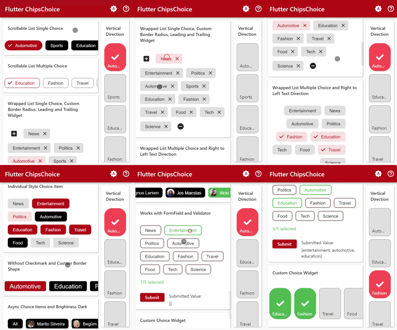
Demo
Features
- Select single or multiple choice
- Display in scrollable or wrapped list
- Build choice items from any
List
- Customizable choice widget
Usage
For a complete usage, please see the example.
To read more about classes and other references used by chips_choice, see the API Reference.
Single Choice
ChipsChoice<T>.single({
@required T value,
@required C2Changed<T> onChanged,
@required List<C2Choice<T>> choiceItems,
C2ChoiceLoader<T> choiceLoader,
...,
...,
})
Simple usage
int tag = 1;
List<String> options = [
  'News', 'Entertainment', 'Politics',
  'Automotive', 'Sports', 'Education',
  'Fashion', 'Travel', 'Food', 'Tech',
  'Science',
];

@override
Widget build(BuildContext context) {
  return ChipsChoice<int>.single(
    value: tag,
    onChanged: (val) => setState(() => tag = val),
    choiceItems: C2Choice.listFrom<int, String>(
      source: options,
      value: (i, v) => i,
      label: (i, v) => v,
    ),
  );
}
Multiple Choice
ChipsChoice<T>.multiple({
@required List<T> value,
@required C2Changed<List<T>> onChanged,
@required List<C2Choice<T>> choiceItems,
C2ChoiceLoader<T> choiceLoader,
...,
...,
})
Simple usage
List<String> tags = [];
List<String> options = [
  'News', 'Entertainment', 'Politics',
  'Automotive', 'Sports', 'Education',
  'Fashion', 'Travel', 'Food', 'Tech',
  'Science',
];

@override
Widget build(BuildContext context) {
  return ChipsChoice<String>.multiple(
    value: tags,
    onChanged: (val) => setState(() => tags = val),
    choiceItems: C2Choice.listFrom<String, String>(
      source: options,
      value: (i, v) => v,
      label: (i, v) => v,
    ),
  );
}
Style Configuration
See the API References, to find out all of the parameters.
ChipsChoice<T>.[single|multiple]({
...,
...,
C2ChipStyle choiceStyle,
...,
...,
})
Custom Builder
ChipsChoice<T>.[single|multiple]({
...,
...,
C2Builder<T> choiceLabelBuilder,
C2Builder<T>? choiceLeadingBuilder;
C2Builder<T>? choiceTrailingBuilder;
C2Builder<T> choiceBuilder,
WidgetBuilder spinnerBuilder,
WidgetBuilder placeholderBuilder,
WidgetBuilder errorBuilder,
...,
...,
})
Container Configuration
ChipsChoice<T>.[single|multiple]({
...,
...,
bool wrapped,
EdgeInsetsGeometry padding,
Axis direction,
VerticalDirection verticalDirection,
TextDirection textDirection,
ScrollPhysics scrollPhysics,
MainAxisSize mainAxisSize,
MainAxisAlignment mainAxisAlignment,
CrossAxisAlignment crossAxisAlignment,
WrapCrossAlignment wrapCrossAlignment,
WrapAlignment alignment,
WrapAlignment runAlignment,
double spacing,
double runSpacing,
Clip clipBehavior,
String placeholder,
TextStyle placeholderStyle,
TextAlign placeholderAlign,
TextStyle errorStyle,
TextAlign errorAlign,
double spinnerSize,
Color spinnerColor,
double spinnerThickness,
...,
...,
})
Build Choice List
choiceItems property is List<C2Choice<T>>, it can be input directly as in the example below, more info about C2Choice can be found on the API Reference
ChipsChoice<T>.[single|multiple](
  ...,
  ...,
  choiceItems: <C2Choice<T>>[
    C2Choice<T>(value: 1, label: 'Entertainment'),
    C2Choice<T>(value: 2, label: 'Education'),
    C2Choice<T>(value: 3, label: 'Fashion'),
  ],
);
choiceItems also can be created from any list using helper provided by this package, like the example below
List<Map<String, String>> days = [
  { 'value': 'mon', 'title': 'Monday' },
  { 'value': 'tue', 'title': 'Tuesday' },
  { 'value': 'wed', 'title': 'Wednesday' },
  { 'value': 'thu', 'title': 'Thursday' },
  { 'value': 'fri', 'title': 'Friday' },
  { 'value': 'sat', 'title': 'Saturday' },
  { 'value': 'sun', 'title': 'Sunday' },
];

ChipsChoice<T>.[single|multiple](
  ...,
  ...,
  choiceItems: C2Choice.listFrom<T, Map<String, String>>(
    source: days,
    value: (index, item) => item['value'],
    label: (index, item) => item['title'],
  ),
);
Use choiceLoader to easily load choice items from async function
import 'package:dio/dio.dart';

String value;

Future<List<C2Choice<String>>> getChoices() async {
  String url = "https://randomuser.me/api/?inc=gender,name,nat,picture,email&results=25";
  Response res = await Dio().get(url);
  return C2Choice.listFrom<String, dynamic>(
    source: res.data['results'],
    value: (index, item) => item['email'],
    label: (index, item) => item['name']['first'] + ' ' + item['name']['last'],
    meta: (index, item) => item,
  )..insert(0, C2Choice<String>(value: 'all', label: 'All'));
}

@override
Widget build(BuildContext context) {
  return ChipsChoice<String>.single(
    value: value,
    onChanged: (val) => setState(() => value = val),
    choiceItems: null,
    choiceLoader: getChoices,
  );
}

