패키지, 저장소 및 앱 카테고리 검색

contained_tab_bar_view 표지
패키지 상세v0.8.0

contained_tab_bar_view

TabController, TabBar 및 TabBarView를 하나의 사용자 지정 가능한 위젯으로 캡슐화합니다.

AndroidiOSWebmacOSWindowsLinux
30일 다운로드
6천
좋아요
189
Pub 점수
160

패키지 설치

flutter pub add contained_tab_bar_view

패키지 개요

공개 정보를 바탕으로 생성한 선택 가이드입니다.

ContainedTabBarView는 TabController, TabBar, TabBarView를 하나의 통합된 구성 요소로 결합한 사용자 정의 가능한 Flutter 위젯입니다. 상태 관리와 레이아웃을 자동으로 처리함으로써 탭 인터페이스 구현을 간소화하여 개발자가 디자인과 콘텐츠에 집중할 수 있도록 합니다. 이 패키지는 Android, iOS, Web, macOS, Windows, Linux 등 주요 플랫폼을 모두 지원하며 크로스플랫폼 애플리케이션에 적합합니다. 깔끔하고 직관적인 API를 통해 코드 가독성을 향상시키고 반복 코드를 줄입니다. 여러 탭을 포함하는 네비게이션 중심의 UI를 만들 때 특히 유용합니다.

사용 사례

  • 모바일 및 웹 앱에서 탭 기반 탐색 만들기
  • 복잡한 탭 인터페이스 구현 간소화
  • 프로젝트 간에 재사용 가능한 탭 컴포넌트 구축
  • 동적 탭 레이아웃 구현
  • 반응형 탭 대시보드 설계

주요 기능

  • TabController, TabBar 및 TabBarView의 단일 위젯 래핑
  • 탭용 내장 상태 관리
  • 사용자 정의 가능한 외관 및 동작
  • 크로스 플랫폼 지원
  • 필요한 최소한의 보일러플레이트
  • 동적 탭 추가/제거를 지원

적합한 대상

  • 간편한 탭 UI를 원하는 개발자
  • 일관된 탭 탐색이 필요한 프로젝트
  • 크로스 플랫폼 플러터 애플리케이션
  • 재사용 가능한 탭 로직이 필요한 UI 구성 요소
  • 유지보수 가능한 코드를 우선시하는 팀

고려 사항

  • 고급 사용자 정의를 위해 추가 스타일링이 필요할 수 있습니다
  • 심층 사용자 정의 없이 표준 탭 패턴에 제한됨
  • Flutter의 내장 탭 위젯에 의존합니다
  • 매우 비표준 탭 동작에 적합하지 않음
  • 일반적인 탭 기반 탐색 흐름에 가장 적합

원본 README

연결된 소스 저장소의 README 원문 스냅샷입니다. 최신 내용은 저장소에서 확인하세요.

ContainedTabBarView

pub package

ContainedTabBarView encapsulates TabController, TabBar and TabBarView into a single, easy to use Widget and lets you customize its appearance without worrying about internal workings of "TabBar ecosystem".


Usage

All of the below examples can be found under example, each written as a simple StatelessWidget.

Basic

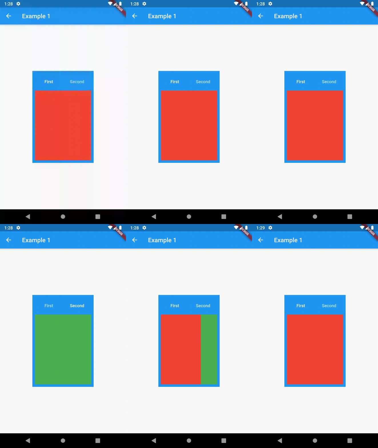
Basic usage includes putting a ContainedTabBarView into a Container whose constraints it will obey. Putting a ContainedTabBarView directly into a body of a Scaffold will, expectedly, draw it full-screen.

// Example 1
import 'package:contained_tab_bar_view/contained_tab_bar_view.dart';

...

Container(
  padding: const EdgeInsets.all(8.0),
  color: Colors.blue,
  width: 200,
  height: 300,
  child: ContainedTabBarView(
    tabs: [
      Text('First'),
      Text('Second'),
    ],
    views: [
      Container(color: Colors.red),
      Container(color: Colors.green)
    ],
    onChange: (index) => print(index),
  ),
),

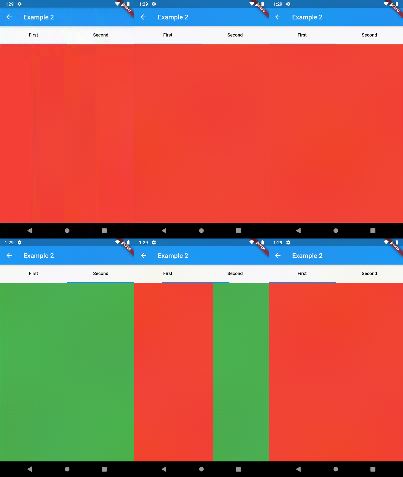
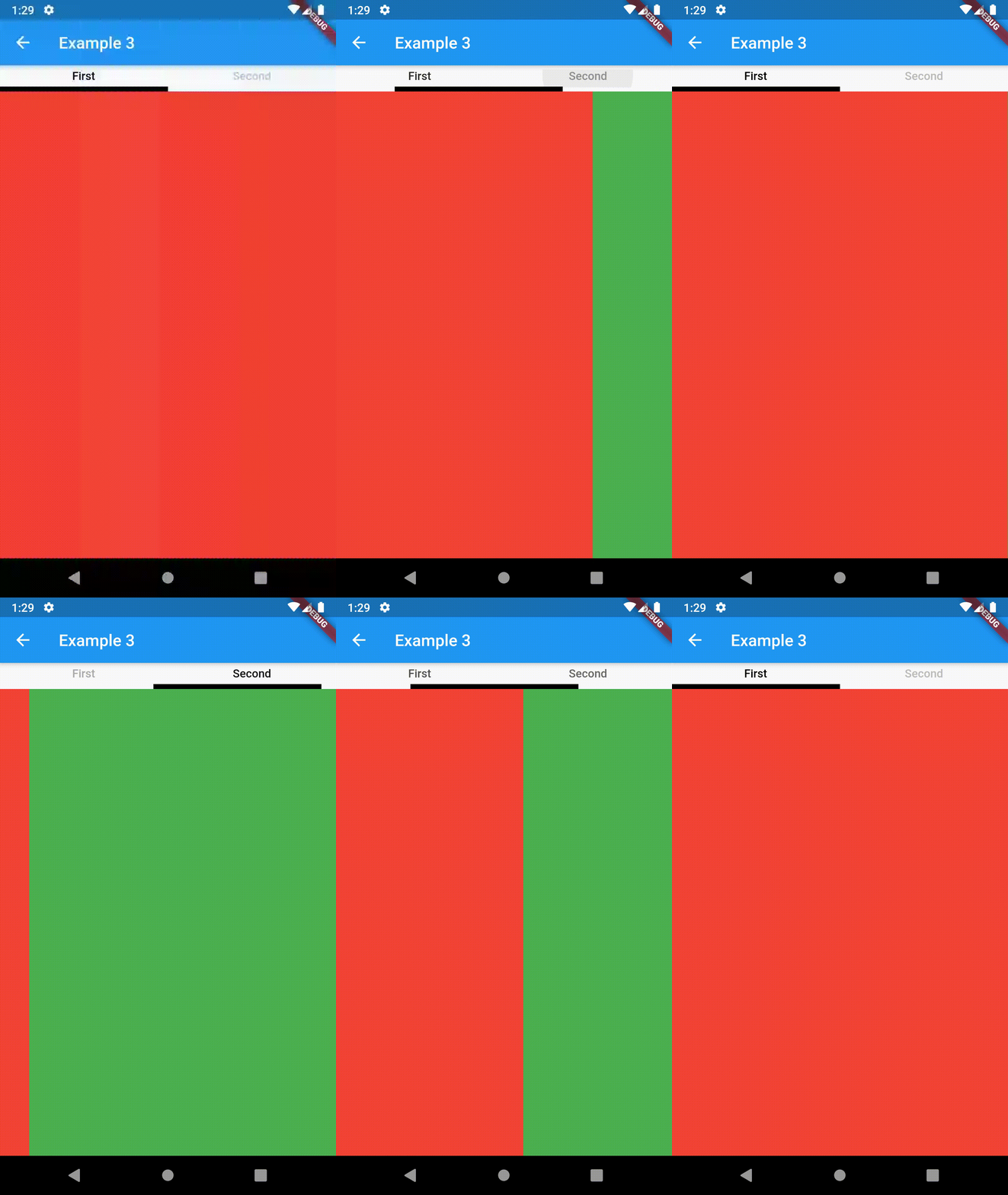
example 1 example 2 example 3

Intermediate

TabBarProperties

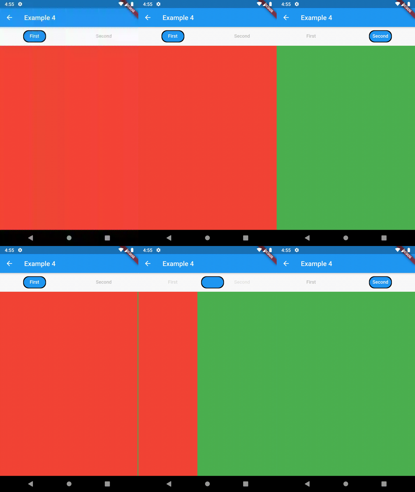
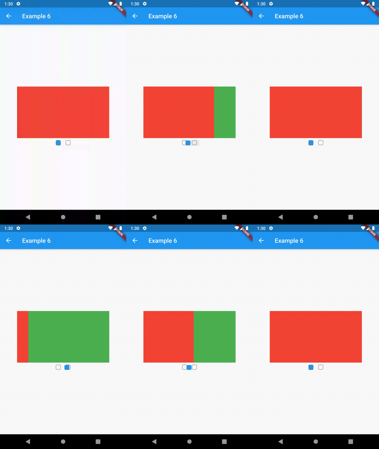
All the properties that can be set for a TabBar are accessible for setting via tabBarProperties. Also, there are many more for the customization of TabBar's appearance. To create your own ("container-based") indicator, you can use ContainerTabIndicator decoration (see examples 4 and 6) which is a part of this package, but also a separate package whose documentation can be found here. Of course, you can use any other tab bar indicator of your liking.

Property Type Default value Description
width double / The width of TabBar. If not set, it's full available width.
height double kToolbarHeight The height of TabBar. The TabBarView takes the available height minus this value.
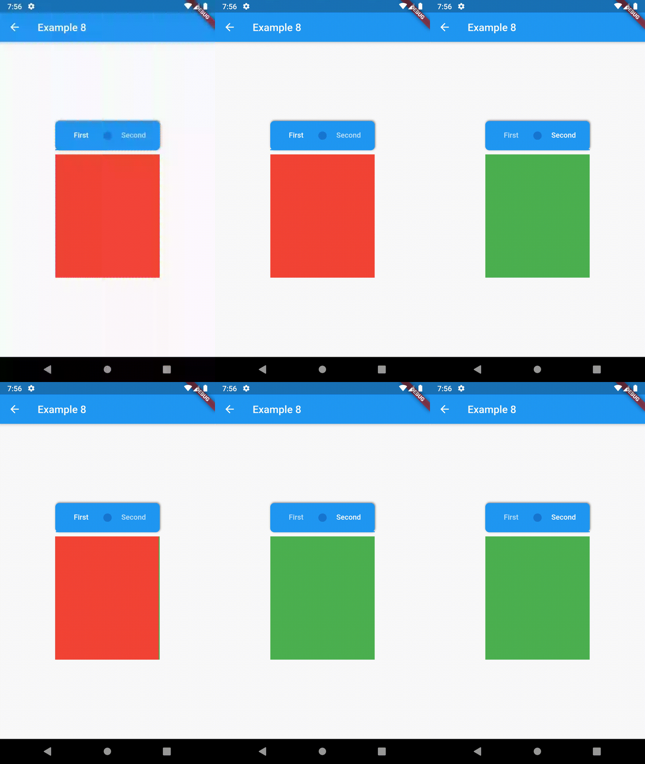
background Container / Container that is behind the tabs. See example 8.
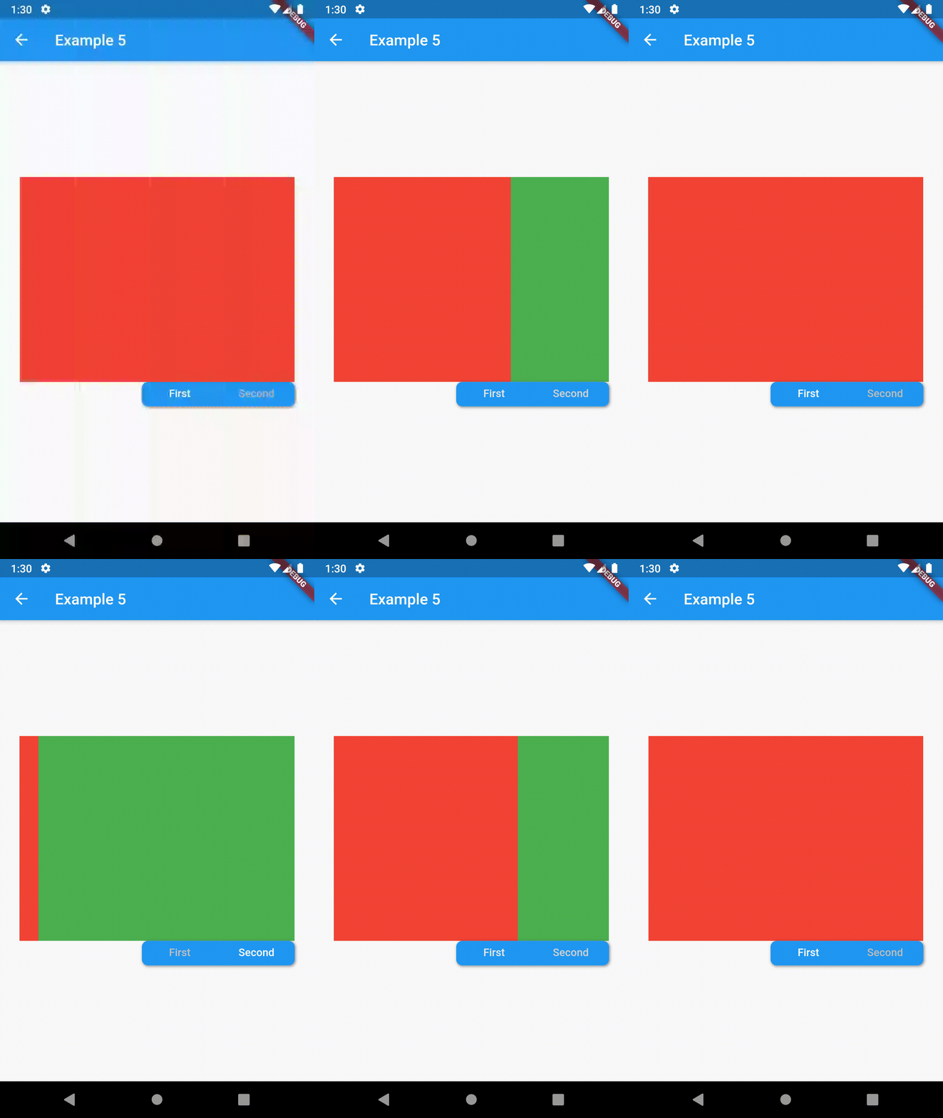
position TabBarPosition TabBarPosition.top Position of TabBar in respect to it's TabBarView. See example 5.
alignment TabBarAlignment TabBarAlignment.center Alignment of TabBar (if it's width is not full available) within TabBar-TabBarView flex. See example 5.
padding EdgeInsets const EdgeInsets.all(0.0) The TabBars padding. See example 4.
margin EdgeInsets const EdgeInsets.all(0.0) The TabBars margin. See example 8.
indicator Decoration / The decoration for the active tab. You can use ContainerTabIndicator for various customization. See example 4. Also, see TabBar documentation
indicatorColor Color / see TabBar documentation
indicatorPadding EdgeInsetsGeometry const EdgeInsets.all(0.0) see TabBar documentation
indicatorSize TabBarIndicatorSize / see TabBar documentation
indicatorWeight double 2.0 see TabBar documentation
isScrollable bool false see TabBar documentation
labelColor Color / see TabBar documentation
labelPadding EdgeInsetsGeometry const EdgeInsets.all(0.0) see TabBar documentation
labelStyle TextStyle / see TabBar documentation
unselectedLabelColor Color / see TabBar documentation
unselectedLabelStyle TextStyle / see TabBar documentation
TabBarViewProperties

All the properties that can be set for a TabBarView are accessible for setting via tabBarViewProperties.

Property Type Default value Description
dragStartBehavior DragStartBehavior DragStartBehavior.start See TabBarView documentation
physics ScrollPhysics (platform specific) See TabBarView documentation

For example, if you want to disable swiping behavior on the TabBarView, set the option like this:

ContainedTabBarView(
  ...
  tabBarViewProperties: TabBarViewProperties(
    physics: NeverScrollableScrollPhysics(),
  ),
)
TabBarPosition
enum TabBarPosition { top, bottom, left, right }
TabBarAlignment
enum TabBarAlignment { start, center, end }
Intermediate Examples
// Example 5
ContainedTabBarView(
  tabs: [
      Text('First'),
      Text('Second'),
  ],
  tabBarProperties: TabBarProperties(
    width: 200,
    height: 32,
    background: Container(
      decoration: BoxDecoration(
        color: Colors.blue,
        borderRadius: BorderRadius.all(Radius.circular(8.0)),
        boxShadow: [
          BoxShadow(
            color: Colors.black.withOpacity(0.4),
            spreadRadius: 0.5,
            blurRadius: 2,
            offset: Offset(1, -1),
          ),
        ],
      ),
    ),
    position: TabBarPosition.bottom,
    alignment: TabBarAlignment.end,
    indicatorColor: Colors.transparent,
    labelColor: Colors.white,
    unselectedLabelColor: Colors.grey[400],
  ),
  views: [
    Container(color: Colors.red),
    Container(color: Colors.green),
  ],
)

example 4 example 5 example 6

Advanced

Change tab from another Widget

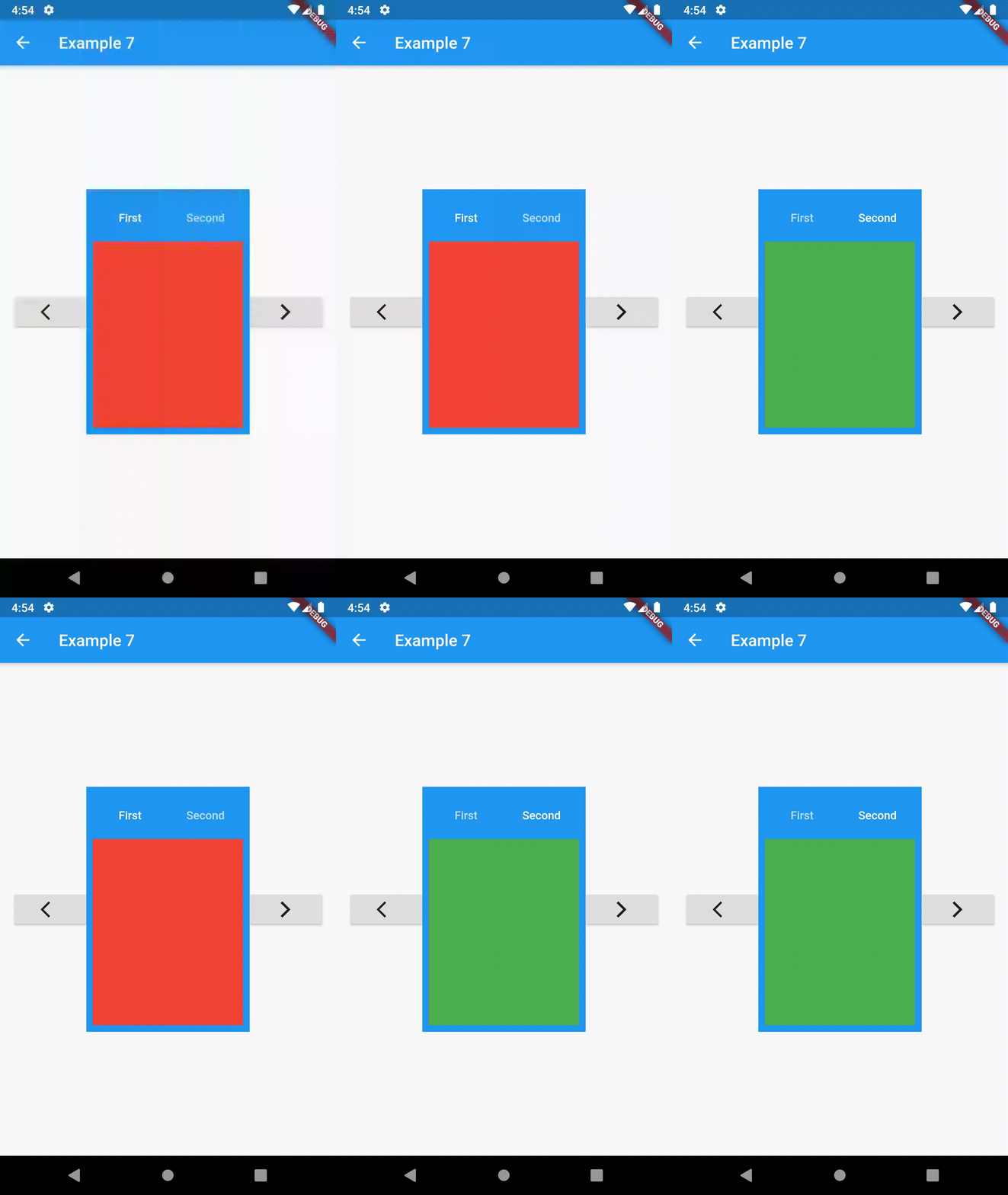
To control the state, i.e. move to another tab, from outside of ContainedTabBarView create it with a GlobalKey and then use methods exposed from state: animateTo(), next() and previous().

// Example 7
class Example7 extends StatelessWidget {
  @override
  Widget build(BuildContext context) {
    GlobalKey<ContainedTabBarViewState> _key = GlobalKey();
    ContainedTabBarView containedTabBarView = ContainedTabBarView(
      key: _key,
      tabs: [
        Text('First'),
        Text('Second'),
      ],
      views: [
        Container(color: Colors.red),
        Container(color: Colors.green),
      ],
    );

    return Scaffold(
      appBar: AppBar(
        title: Text('Example 7'),
      ),
      body: Row(
        mainAxisAlignment: MainAxisAlignment.center,
        children: [
          ElevatedButton(
            onPressed: () => _key.currentState?.previous(),
            child: Icon(Icons.arrow_back_ios),
          ),
          Center(
            child: Container(
              padding: const EdgeInsets.all(8.0),
              color: Colors.blue,
              width: 200,
              height: 300,
              child: containedTabBarView,
            ),
          ),
          ElevatedButton(    
            onPressed: () => _key.currentState?.next(),
            child: Icon(Icons.arrow_forward_ios),
          ),
        ],
      ),
    );
  }
}
Advanced Examples

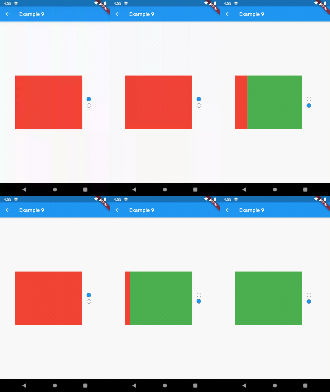
example 7 example 8 example 9

Contributing

This package is still in early stages. If you notice any bugs, please file an issue. If you are willing to fix or enhance things yourself, you are very welcome to make a pull request.

카테고리

의존성

의존성 목록 1 개

소스 저장소

이 패키지를 사용하는 프로젝트